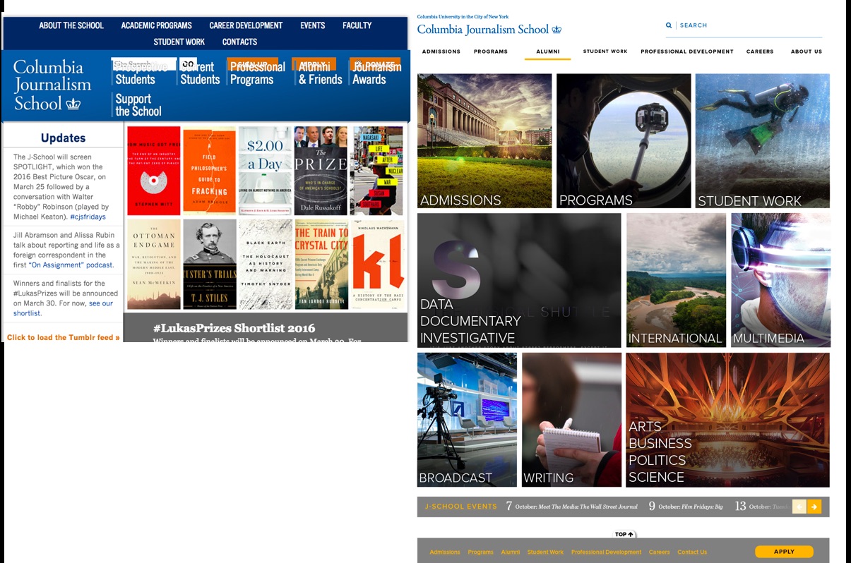
Before and after images of the home page: the former site was built more than a decade ago
The new Columbia School of Journalism website has launched with its new look, and we are hoping that prospective and current students, faculty and alums will find it easy to navigate, more pleasant to the eyes, and, definitely a more contemporary offering than the previous one.
“Our former site was built more than a decade ago and served as a digital magazine with an attractive and frequently updated cover. But that model no longer reflects how or where our users get information. Most site visitors today arrive from links posted on social media and land directly on an internal webpage rather than on the homepage. With our audience increasingly on social media (mostly Facebook and Instagram), we must meet them there,” commented Steve Coll, Dean of the School of Journalism.
As readers of the blog know, I am a Senior Adviser on News Design/Adjunct Professor at the School. It was in that capacity that Dean Coll and our Dean of Academic Affairs, Sheila Coronel, invited me to work with an internal team on reimagining the new website. Our Garcia Media for this project was David Ok, Columbia '15, who was a student in my Multiplatform Design & Storytelling class last year, and who served as my Teaching Assistant this past Spring semester.
Over the past 7 months we met regularly to go through the various phases of the rethinking process: briefing, sketching, prototyping and implementing.
Our aim was to make sure that the first encounter of prospective students with the website would provide a pleasant experience, with functionality to navigate through various areas of interest.
Making information easier to find was our top goal. The former site had 40,000 pages, which made it confusing and difficult to navigate. The new site has closer to 300 pages.
Design details
Color palette
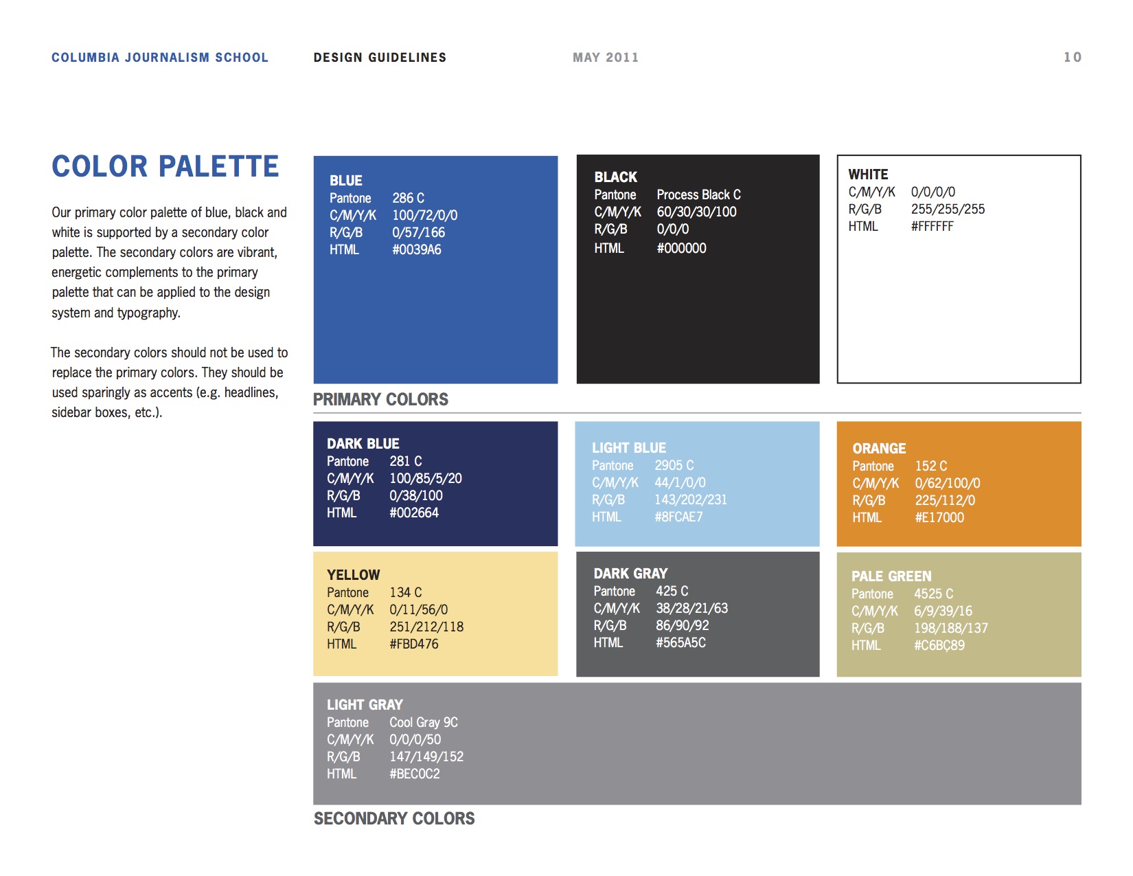
Our primary color palette of blue, black and white is supported by a secondary color palette. The secondary colors are vibrant, energetic complements to the primary palette that can be applied to the design system and typography.
Typographic palette
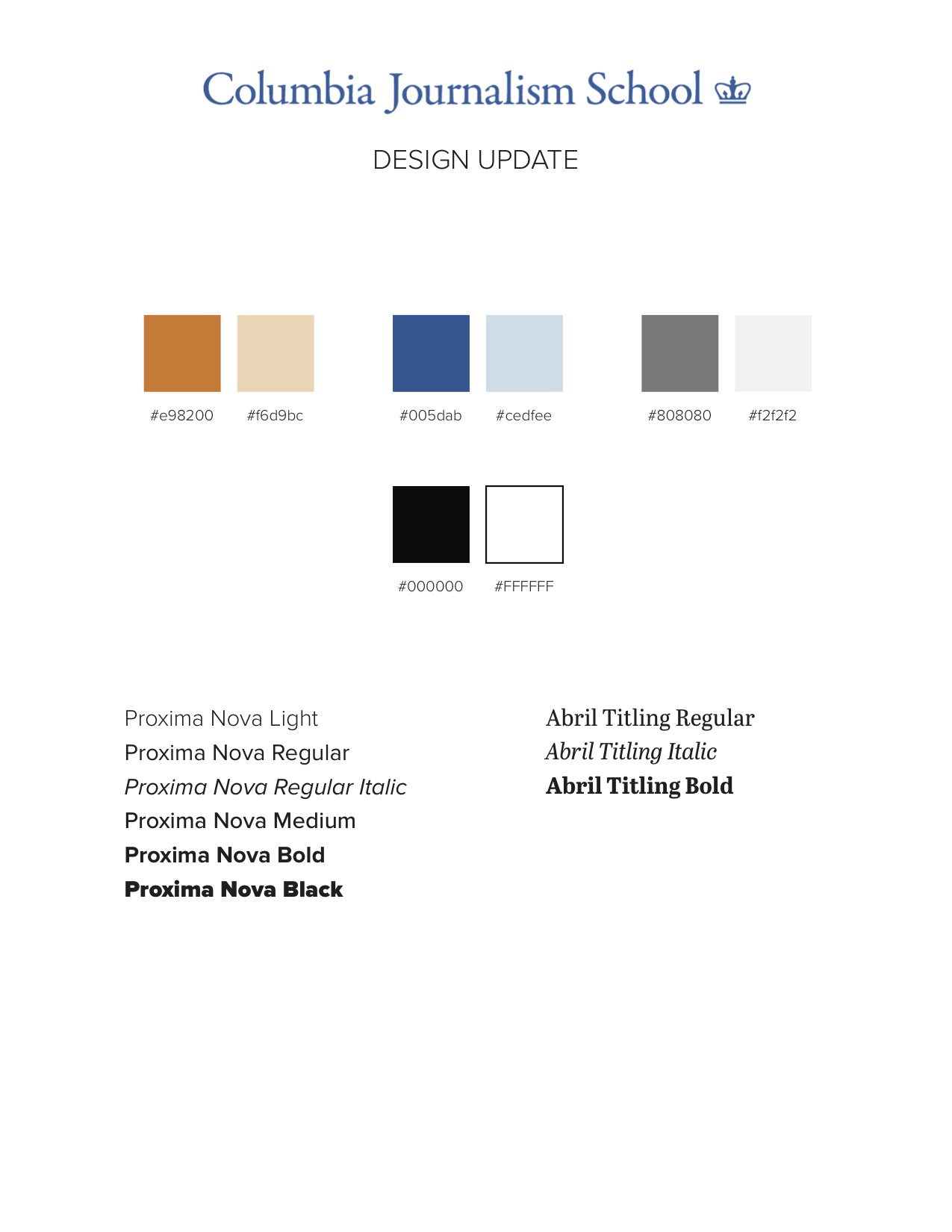
Proxima Nova and Abril Titling are the principal fonts used. Proxima Nova is the main font used throughout the site, and Abril Titling is used as a secondary font.
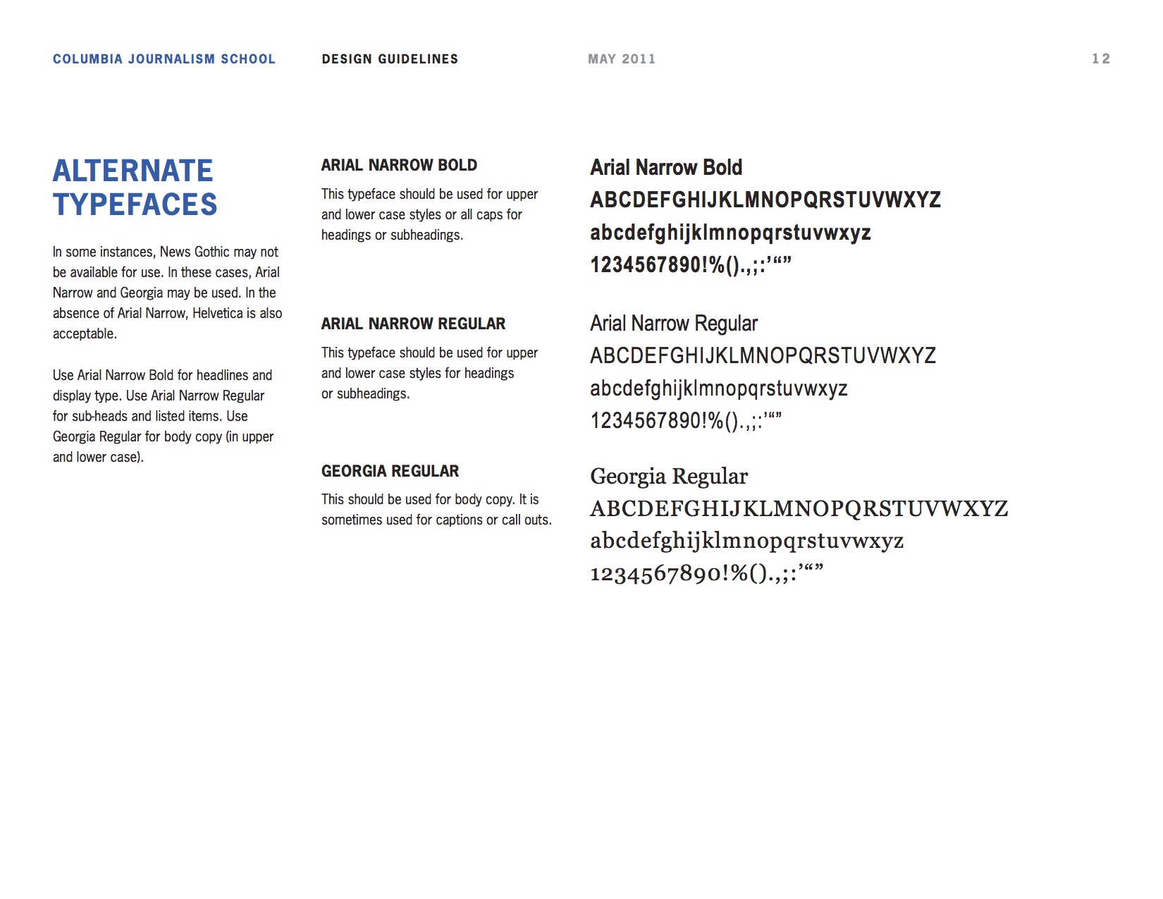
In some instances, News Gothic may not be available for use. In these cases, Arial Narrow and Georgia may be used. In the absence of Arial Narrow, Helvetica is also acceptable. Use Arial Narrow Bold for headlines and display type. Use Arial Narrow Regular for sub-heads and listed items. Use Georgia Regular for body copy (in upper and lower case).
Overall design
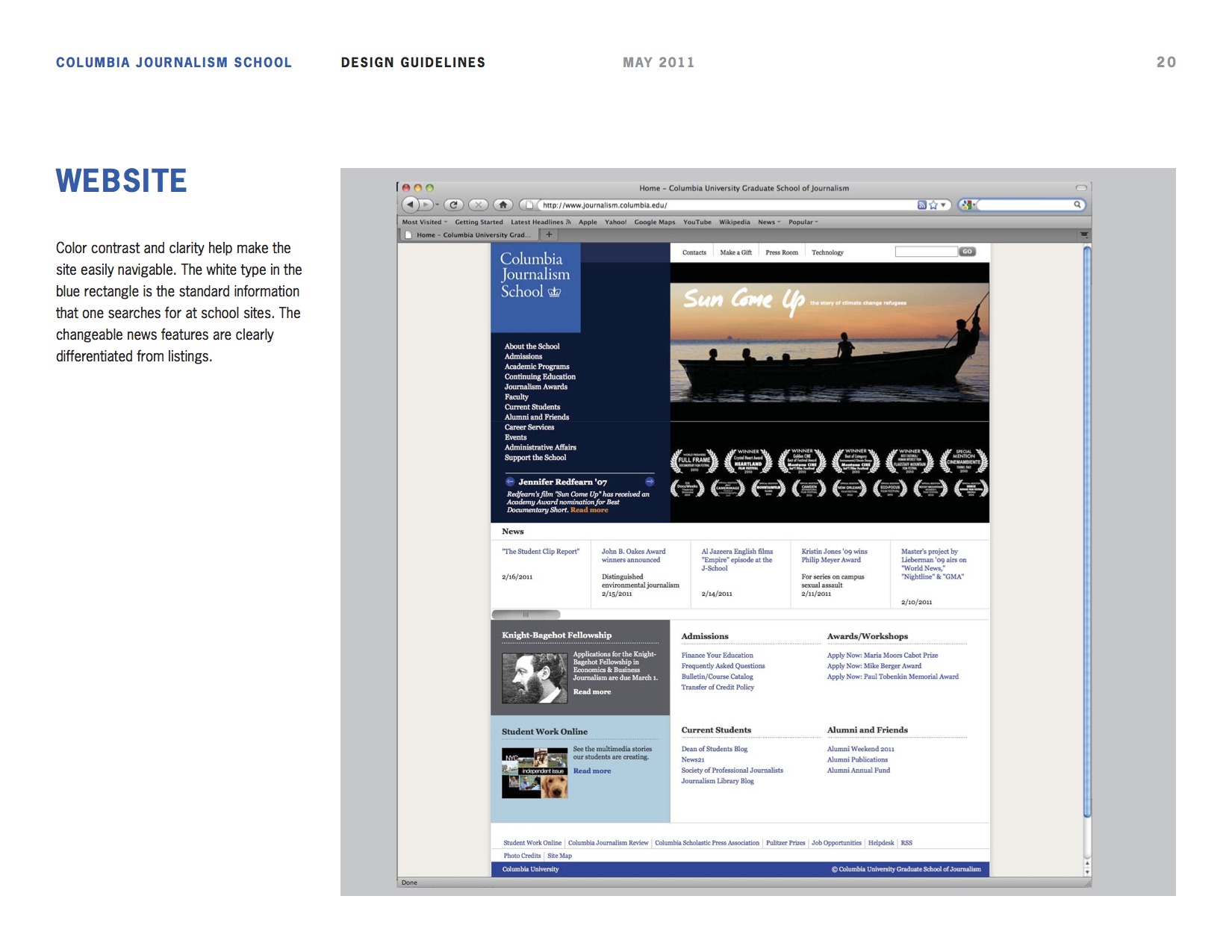
Color contrast and clarity help make the site easily navigable. The white type in the blue rectangle is the standard information that one searches for at school sites. The changeable news features are clearly differentiated from listings.
Navigation

This window panel which slides from the right of screen allows for prospective students to immediately take a look at the most sought sections of the website, as per our extensive testing.
The team
Our Garcia Media team worked closely with the School of Journalism's team.
The new site reflects an updated communication strategy developed by a team formed last summer, led by Sheila Coronel, Dean of Academic Affairs. The team also included Jeff Sieben, Amy Singer and Aimee Rinehart. CUIT built the site, and Karen Bray, Lauren de la Fuente and Brittany Jackson uploaded all the new content.