This is the weekend edition of TheMarioBlog and will be updated as needed. The next blog post is Monday, December 14


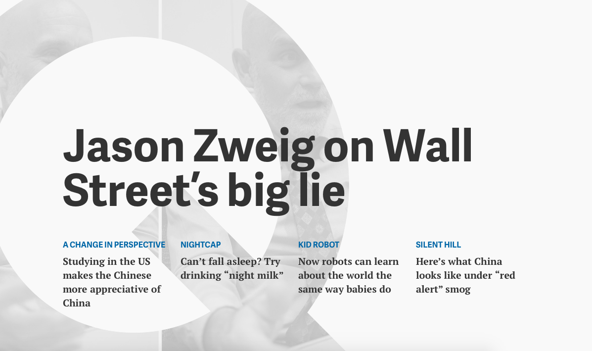
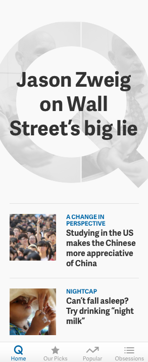
At a time when many are saying goodbye to their brand's website homepage in favor of everything mobile, here is qz.com unveiling version 2.0 of its landing page in an attempt to win users over to start their journey with the always-interesting Quartz content.
“Homepages, it turns out, aren’t dead so much as reborn,” says Zach Seward, Quartz’s VP of product and executive editor .”As we’ve been testing this new one, we’ve been struck by how well it represents everything Quartz is about, from worldly journalism to high-quality advertising. That’s to the credit of Daniel Lee, who designed it, and Joe Chagan, Micah Ernst, Yitz Jordan, and John West, who developed it.
One thing that is immediately noticeable with the newbsite is the bolder and bigger headlines. A highlight for me is the labeling of stories, which facilitate navigating through topics. Photos play a key role. Compared to its previous iteration, the new qz.com makes stories palatable through the headlines, the fonts and the images utilized.
Another interesting aspect of the design of the new qz.com is making room for more sponsored content and other advertisements. Here is another tip that should inspire publishers, editors and designers.
While Zach mentions that the homepage is not dead, I would add that perhaps we can say that the old website designs are gone. This one is a design that adapts to mobile well. It is, in my view, as if the designer here aimed for a mobile experience which is easily accessible on a PC. I buy that.
Seward said to Fast Company: “The idea of a strictly traditional homepage that people bookmark to find stories is, we think, outdated. But at the same time, we don't want to be defeatist about it. There's still a large number of people coming to the homepage each day. So we've asked ourselves, ‘If you start throwing out the old conventions, what can you do instead?’”
It is the end of the year, and I know that many publishers, editors and designers will be looking at what the experts predict for 2016. I will do my own predictions here later this month, but, while on the subject of websites and homepages. I think we will see many changes in how we treat homepages. Not that they will disappear, but when users come to them they will find less of what I describe as the window of the hardware store, and more simplified, mobile friendly treatments of stories that stand on their own whether seen on a phone, tablet or PC. More on the subject in an upcoming blog post.
Of interest this weekend
Roughly 50 million US adults say they go online almost constantly
http://qz.com/569021/roughly-50-million-us-adults-say-they-go-online-almost-constantly/
Second generation Apple Watch could ship as soon as April
http://qz.com/569103/the-second-generation-apple-watch-could-ship-as-soon-as-april/