I confess my addiction to all things Quartz.
Ever since qz.com arrived in 2012, I have come to it religiously each morning for a good briefing, and to enjoy the headlines for each item, which are among the best in the market. If the purpose of a headline is to seduce while informing, then Quartz does it in a magnificent way.
Now qz.com unveiled a new design for its website August 1.
Two observations :
- This is the fifth redesign of the site in six years, which shows that in the digital world change is swift and frequent, and the audience does not seem to mind. And to think that I used to encounter skepticism from newspaper publishers only a decade ago if a proposed redesign was coming “only” ten years after the previous redesign. But, of course, four months in the digital era is the equivalent of 12 calendar months!
- Quartz seems to be reverting itself in terms of what should go on a homepage, as in more promos to inside stories.
Let’s take a look at three important redesigns in the life of qz.com:
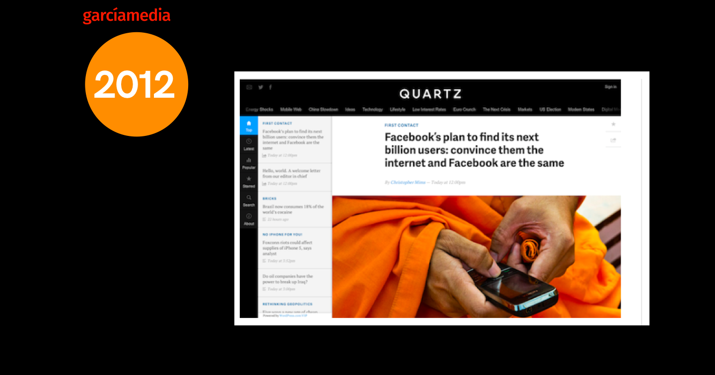
In 2012, for its first website, Quartz opted for a sort of no home page. You would open your page and would be thrown directly into the site’s top story. Rather than the usual back-and-forth of website navigation — homepage, click, back arrow, click again, back arrow — Quartz wanted you to scroll from story to story.
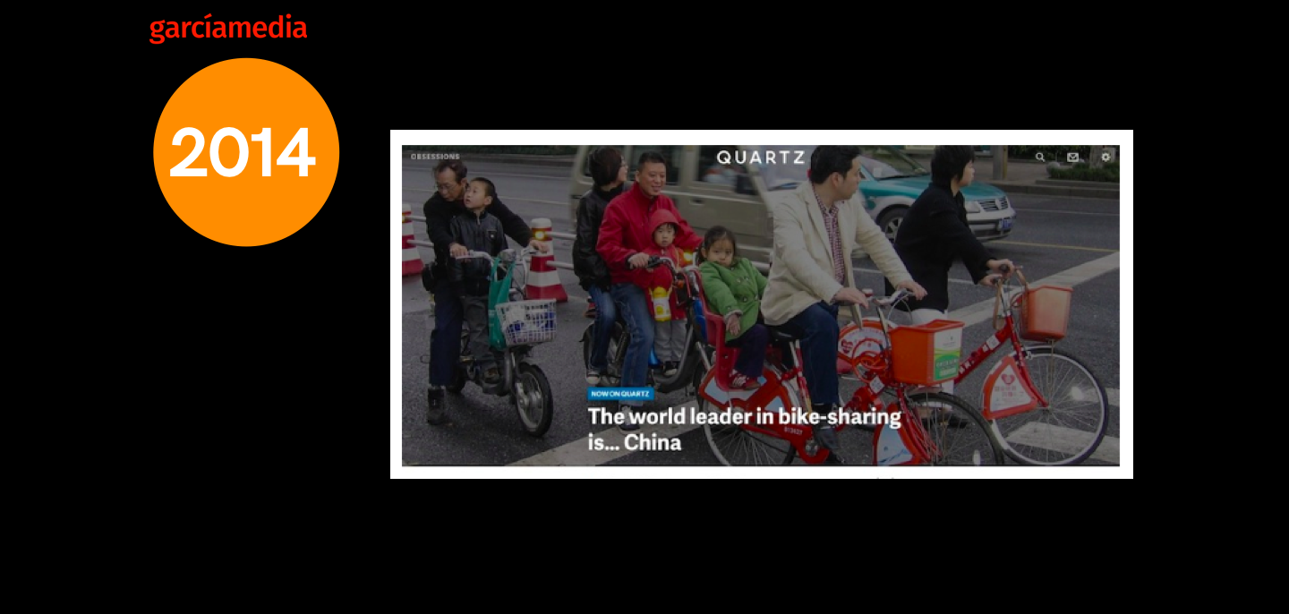
However, in 2014, Quartz adopted a more traditional website style, although the editors wanted you to zero in on one important story right away. Rather than the usual arrangement of links to top stories, the new Quartz homepage was centered on The Brief, a tailored summary of business and international news under the rubric of “Your world right now.”
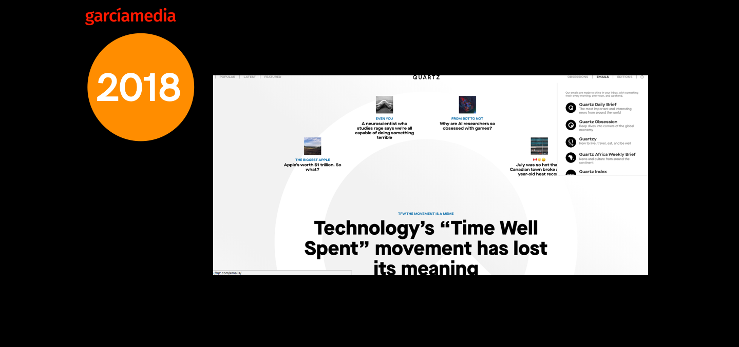
Now, in 2018, the new version aims at increasing newsletter subscribers, keeping readers on site longer and delivering advertising through private programmatic marketplaces.
And, very important, the new redesign is a sort of prelude to implementing a paywall, since Quartz, like almost every other publication, is going after subscription revenue. Notice here that top right of screen there is a drop down navigator to other content categories.
Perhaps we can call this version of the Quartz home page “retro”. While there is still emphasis on the big story of the day, there are also four prominently displayed stories to choose from, albeit with rather small images, which I find difficult to read. Could these images not be a bit larger, perhaps more landscape? Overall, however, we do see a clean, minimalist approach, an easy to navigate home page with the enormous Q in the background, reminding us of the brand.
I am somewhat disappointed that once you jump into an article page, it is very text driven, as we see below, with no attempt to incorporate visual assets:.
Mario’s Speaking Engagements
October 6, 20, 27–King’s College, New York City
The Basics of Visual Journalism seminars
October 25, Eidos Media Keynote, New York City

Garcia Media: Over 25 years at your service