It is pure coincidence that this week my Columbia class devotes class to looking at typography, studying examples of what works and what does not, with tips for how to select type.
Then, as I prepared my class Sunday, here comes The Sunday New York Times, complete with its always superb New York Times Magazine.
I put the magazine on my coffee table and was immediately lured by the cover story: A Guide to the Winter Olympics, which open soon in South Korea.
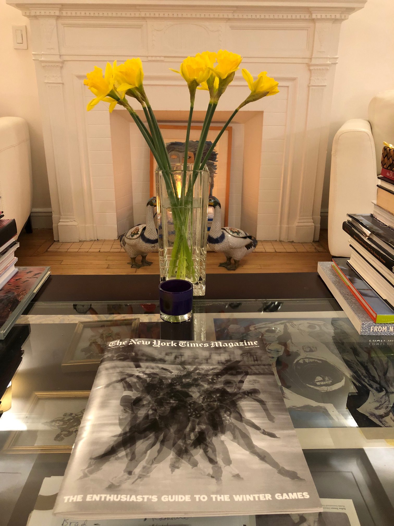
As soon as I looked inside, however, I was disappointed with the choice of font for this Guide. It all began with the number 2018 in the Table of Contents. This type is just hard to read.
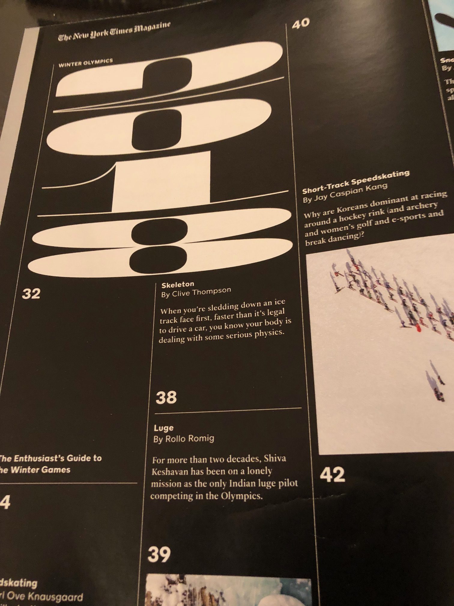
Then it did not get any easier to read the names of the various sports.
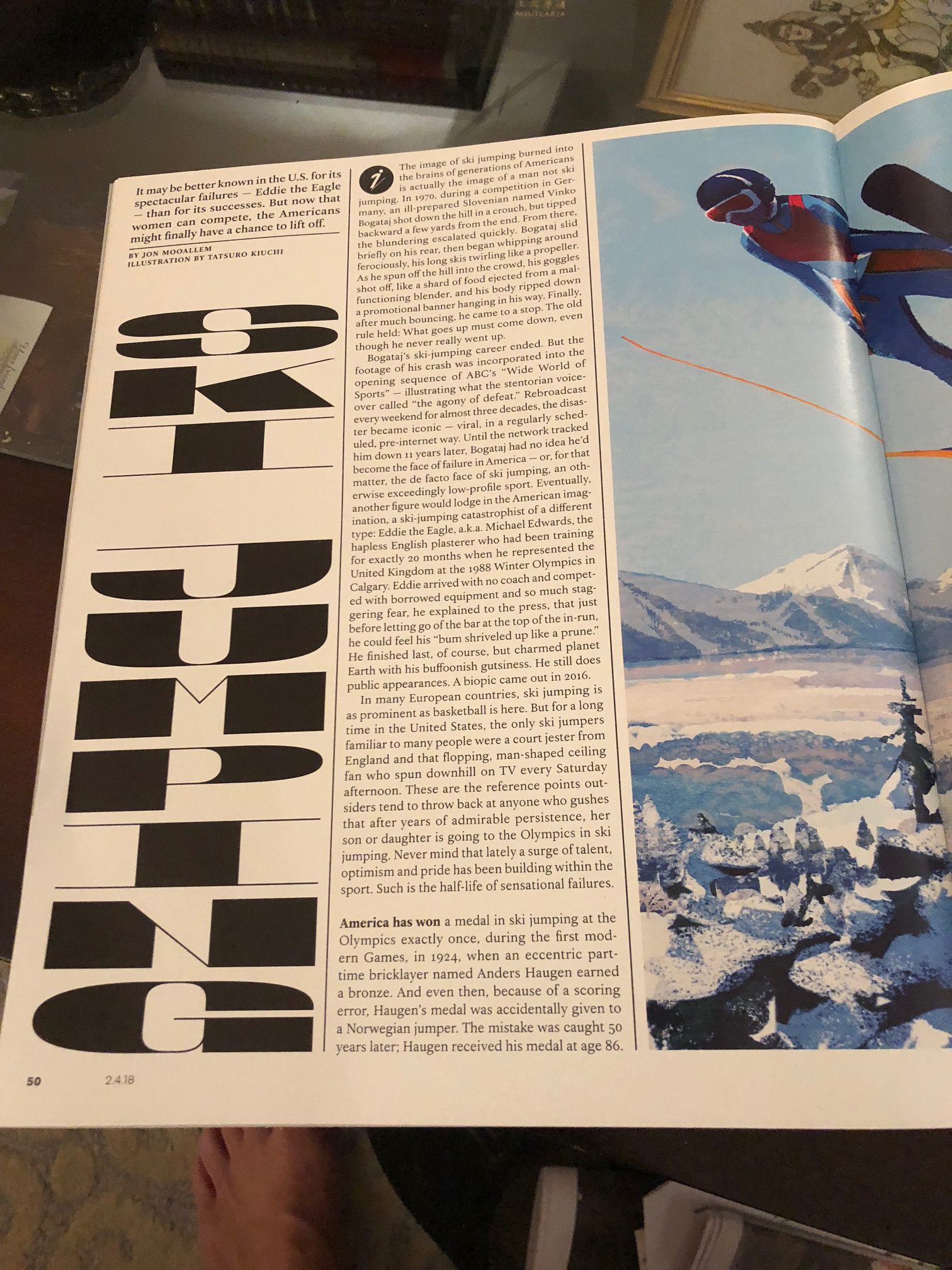
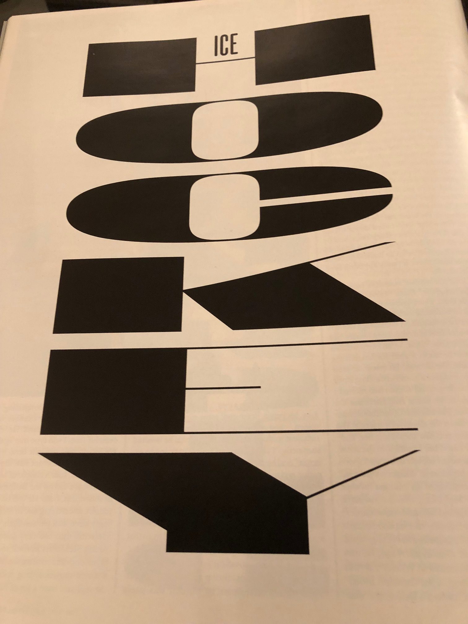
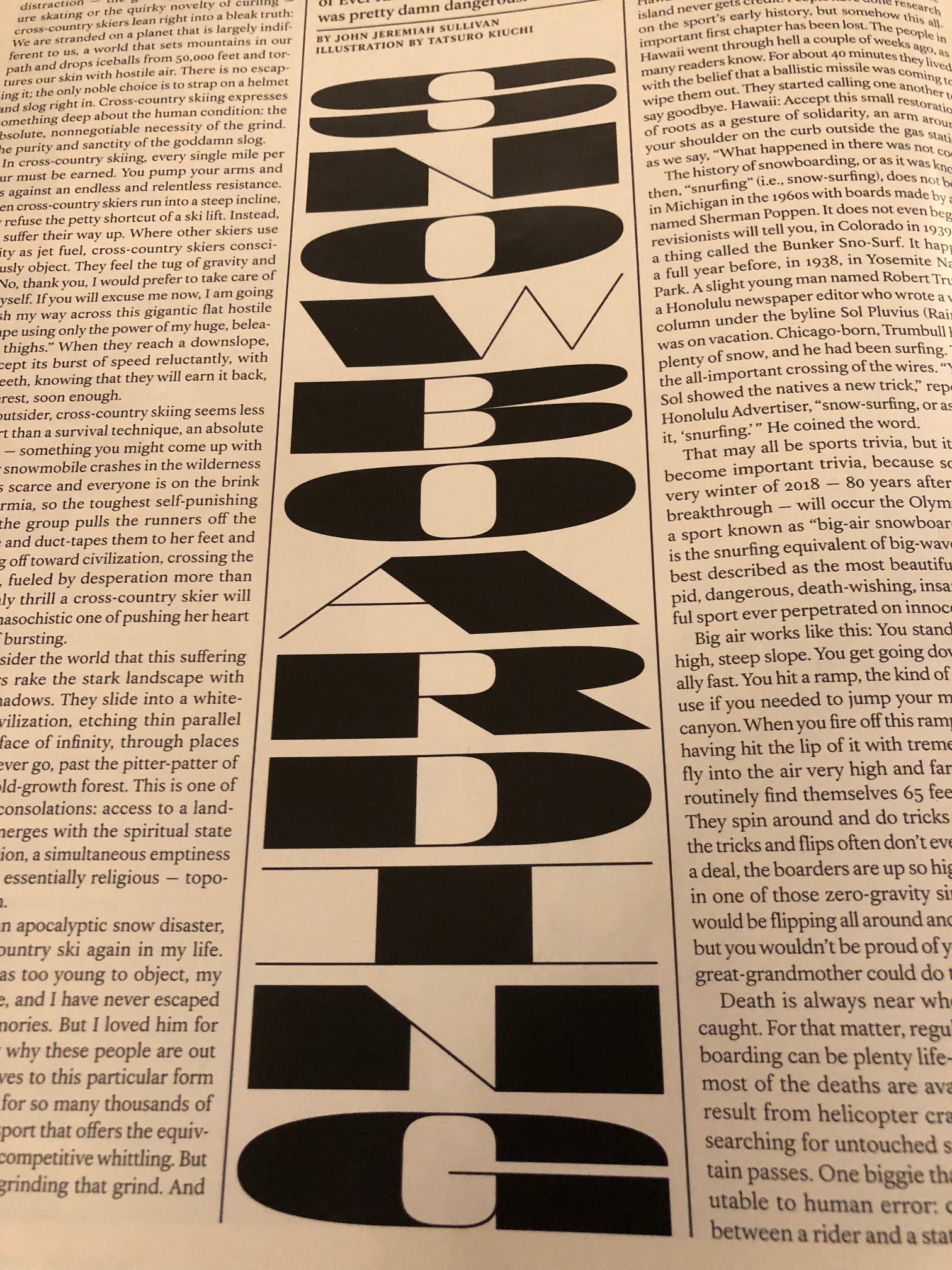
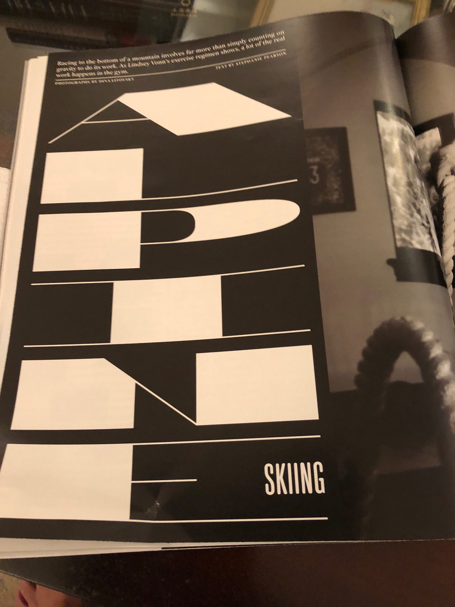
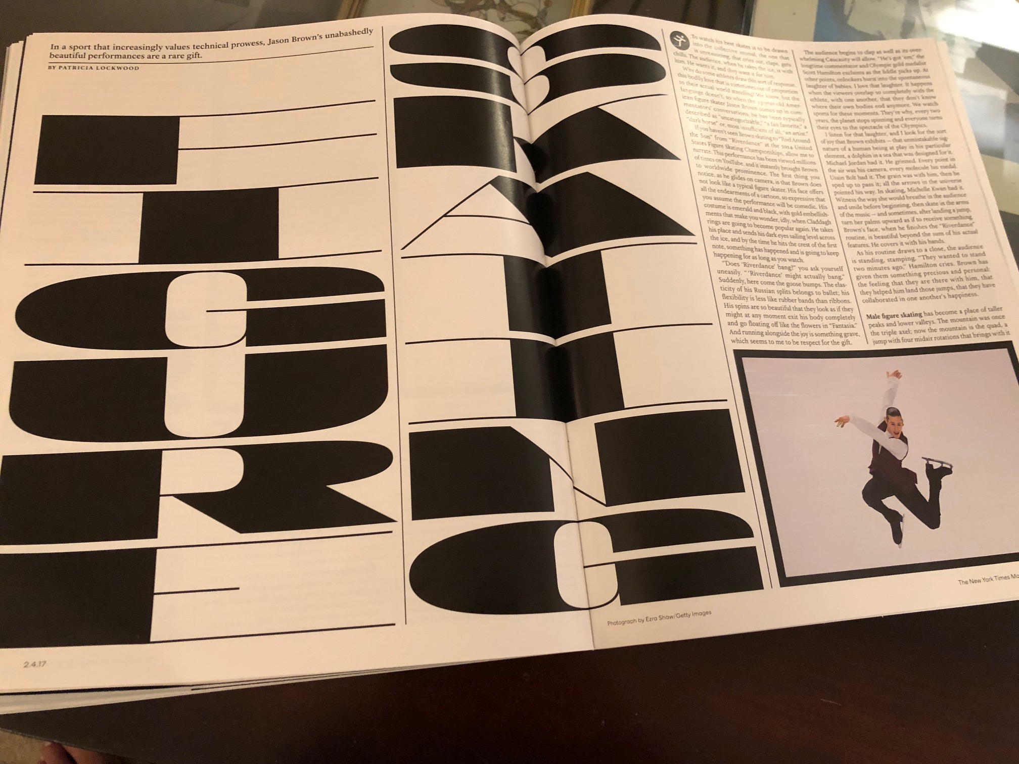
While I can probably understand the choice of this font because of its boldness to depict a world of “bold” sports,I still think that the letter forms are hard to read, which should be the top priority of the designer making the font selection.
Explaining to the class
When showing an example such as this from the Times, one must explain that this is a one-off type of presentation. This is not a font chosen to appear regularly as part of the publication’s type palette (a good thing!).
I also explain to the students that this is a heavily art-directed publication and it would have been interesting to be part of the discussion that led to this font getting selected.
There will also be many of you who truly like the use of this font and consider it appropriate for the story it conveys.
Let me hear from you!
Mario’s Speaking Engagements
April 18-19, 2018-–Newscamp ,Augsburg, Germany.

May 26, 2018 —Associacion Riograndense de Imprensa, Univesidad de Santa Cruz (Unisc), Brazil

June 3-6, 2018—The Seminar, San Antonio, Texas.

Garcia Media: Over 25 years at your service
TheMarioBlog post #2772