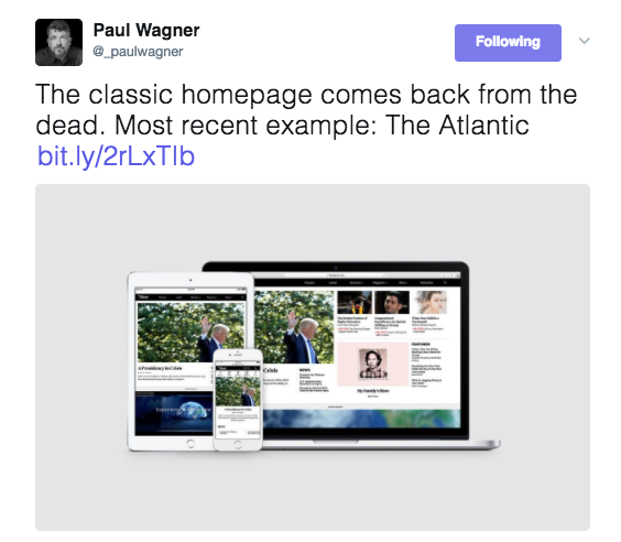
I get The Atlantic in its print edition at home in New York and it is always a total lean back print experience for me.
For reasons that escape me, this is one of the few publications that I am used to consuming in its traditional print format and that is that. I usually enjoy the cover images the moment I pick up the magazine in my mailbox.

I don’t think I had ever visited theatlantic.com. So, when someone on Twitter made a reference to the new design of The Atlantic’s homepage, I was curious and had to take a look.

That’s how I found the article by DJ Brinkerhoff, who leads product design for The Atlantic, in which he explains how he and his team went about redesigning The Atlantic’s website, a process that included, in his words “a series of user tests in 2016 to help us better understand how readers use the homepage. We spent two days with 10 readers where we tried to contextualize their habits and bring nuance to our quantitative data. ” Some highlights:
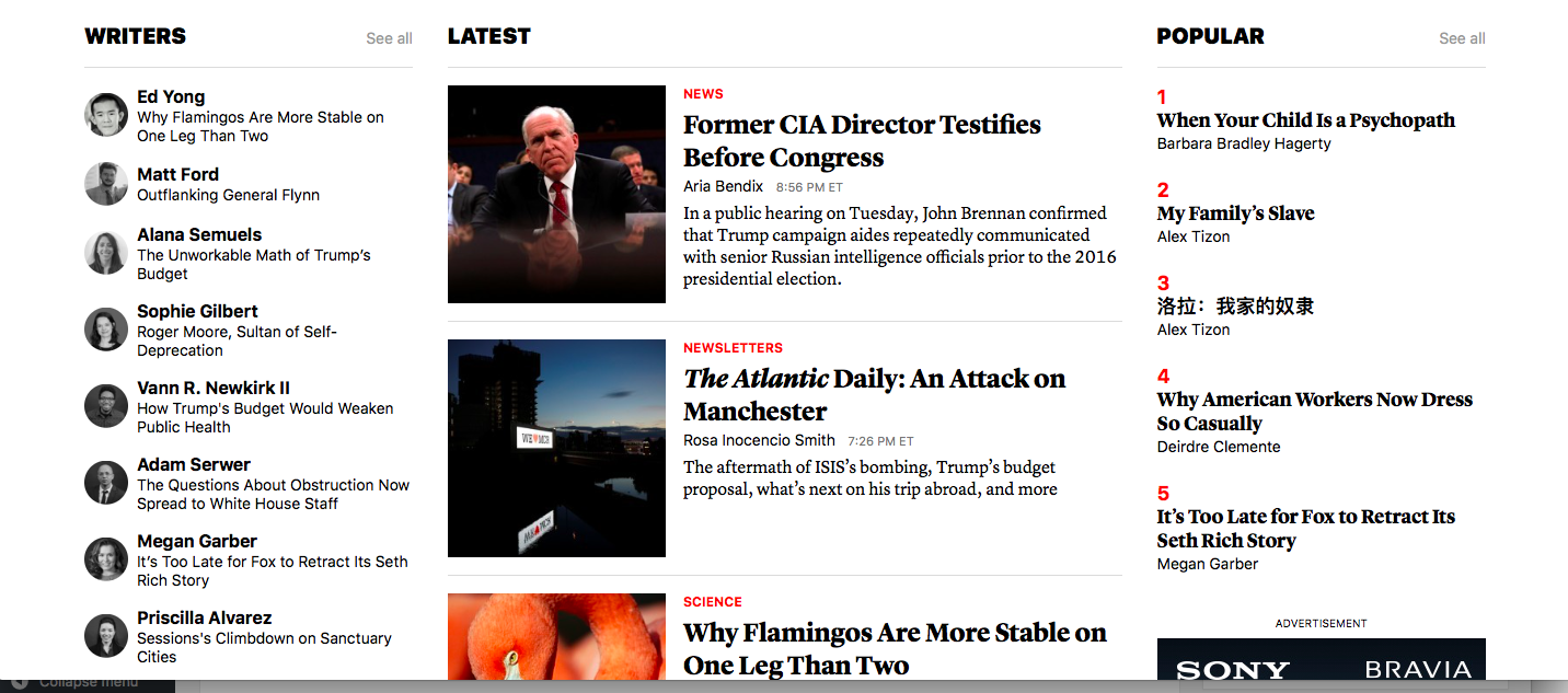
- Readers mental model is much different than our own. Those that use the homepage treat it as an index of the site’s content, not a subset.
- Readers often have preferred writers that they look for.
- When browsing on a traditional computer, e.g. something with a keyboard and mouse, they almost all had two modes: discovery and consumption.
And this most interesting observation: Those who watch video tend to do so in the evenings.
Brinkerhoff wrote that he also consulted the editorial team about the possible changes:
We interviewed the editorial team to find out how The Atlantic editorial strategy has changed and what we can do to improve their workflow. We discovered that an entirely curated homepage, while nice in theory, is operationally difficult and taxing on the team. However, it was clearly expressed that they wanted to maintain a curated presence, albeit a dramatically reduced one. The other request was more density and clearer hierarchy so that they could be more flexible when there are multiple stories that they want to highlight.
The result


I find the new homepage to be classically elegant, well organized and easy to follow. There is a good sense of hierarchy, good dose of white space to separate the various elements and just enough to sample on the top portion of the homepage. I like the solutions in terms of hierarchy: important and curated (top) and new and programmatic (bottom). The lead story appears on the left hand corner of the screen, in the traditional but familiar spot. There is also an inline video module to showcase the latest content.
One question: size of the logo
It is true that contemporary websites do not overemphasize the logo of the publication, but I find that the logo of The Atlantic is easy to miss, almost like a whisper. Take a look!

I asked DJ Brinkerhoff, who leads product design, about the size of the logo:
The small logo is a result of a recent navigation redesign. We wanted to unify the navigation component across the site and for now, that meant making a trade off on the size of the logo. Some brands might be timid about the logo being too small, but we think that our stories speak for themselves, and that a small logo isn’t necessarily a bad thing.
That said, we will be exploring alternative treatments for the logo and navigation on the homepage, because the use case is different from other parts of the site. I suspect that will result in the logo being bigger, but you never know!
Speaking Engagements Coming Up

SIPConnect 2017, to be held in Miami June 21-23, is a program of the Inter American Press Association, IAPA, or SIP (Sociedad Interamericana de Prensa). The venue will be the Hilton Miami Downtown Hotel.
Details:
Join us at the SIPConnect Hemispheric Conference 2017. Organized by the IAPA, SIPConnect is a gathering of media and digital businesses to encourage more audiences and higher revenues. It’s a laboratory for new ideas and successful experiences for the digital transformation. As in the 2016 successful meeting that was attended by media from the US, Latin America and the Caribbean, experts in digital businesses and representatives of innovative companies will participate in this event.
For more information: http://www.sipiapa.org/notas/1211078-llamado-sipconnect-2017
TheMarioBlog post #2638