American City Business Journals, USA
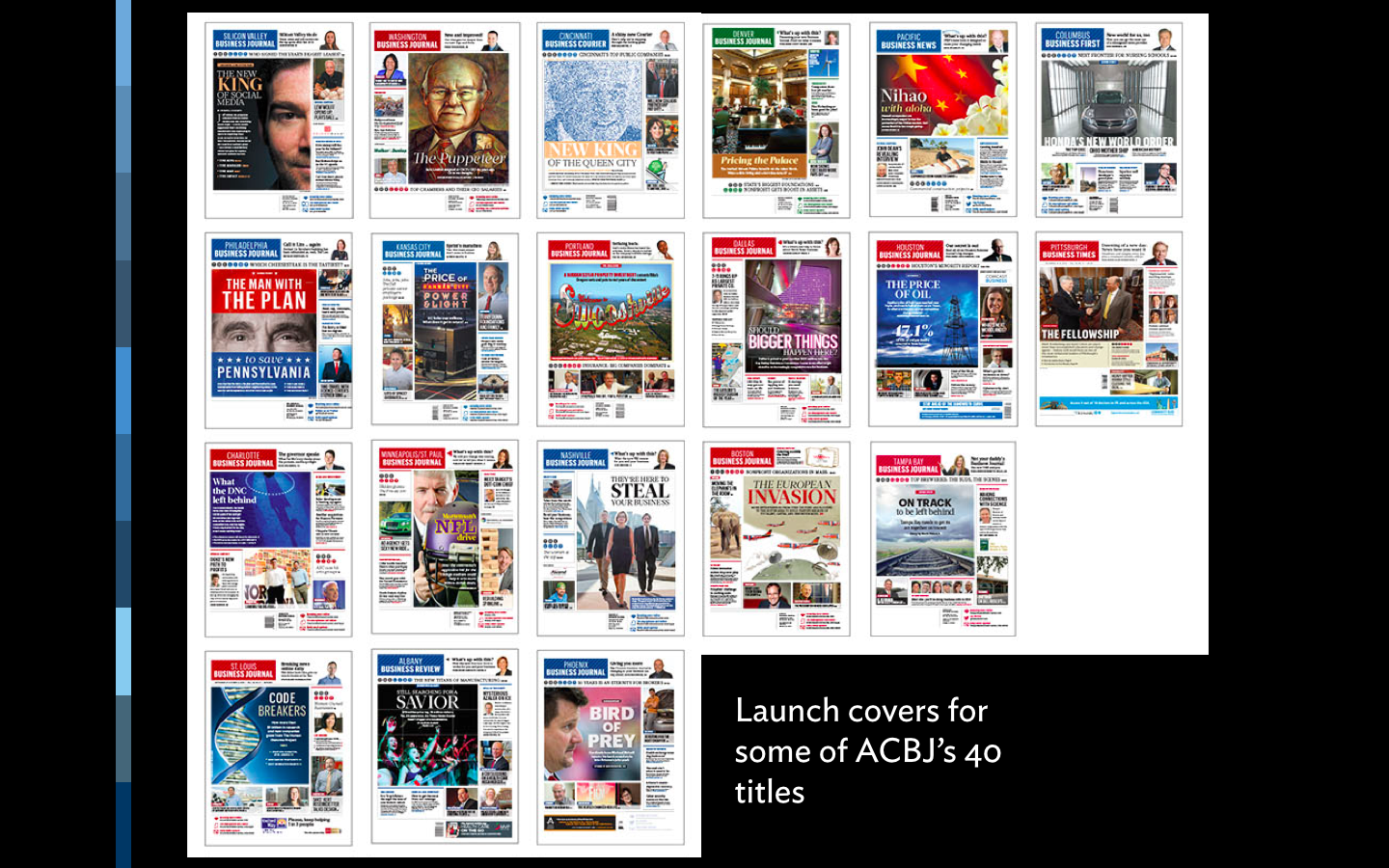

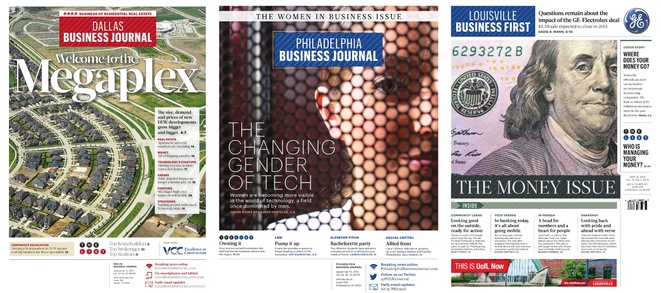
American City Business Journals the best of the project pinstripe is here
We continue to feel great pride with the work produced by the team of the American City Business Journals. Well crafted pages that show that you can do print happily and well, while observing a digital first philosophy for the flow of news.
La Nueva Provincia, Argentina
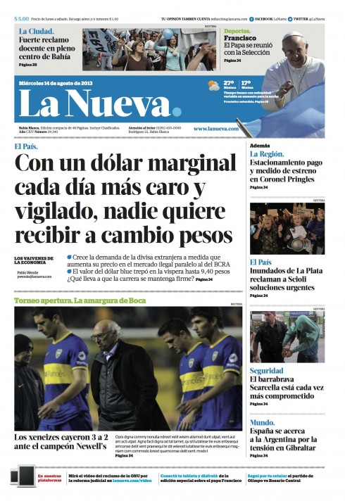
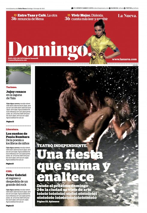
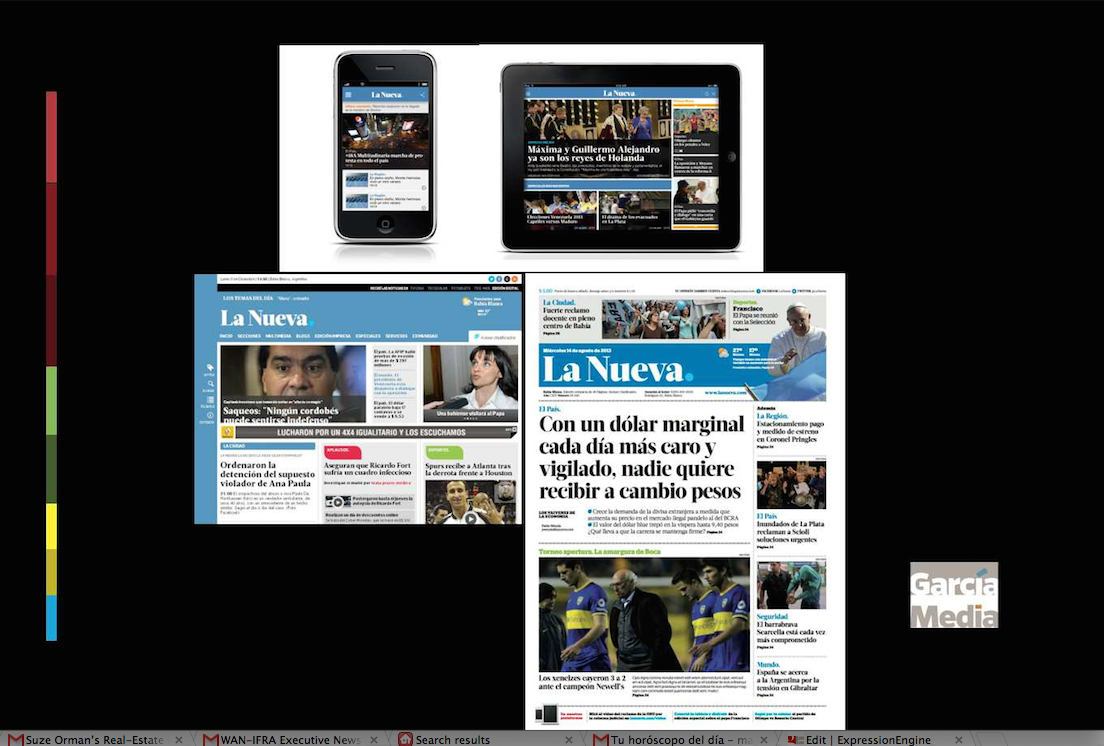
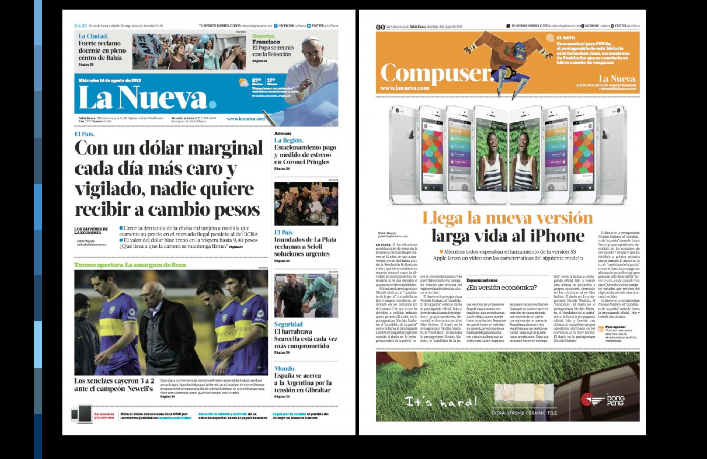
Argentina's La Nueva Provincia: its new look across platforms
https://garciamedia.com/blog/pargentinas_la_nueva_provincia_its_a_new_look_across_platforms_p
Three decades after I first redesigned La Nueva, here we were again: taking this prestigious regional newspaper to the digital age. What great memories were captured during the course of this project in Bahia Blanca.
Postmedia of Canada
Ottawa Citizen

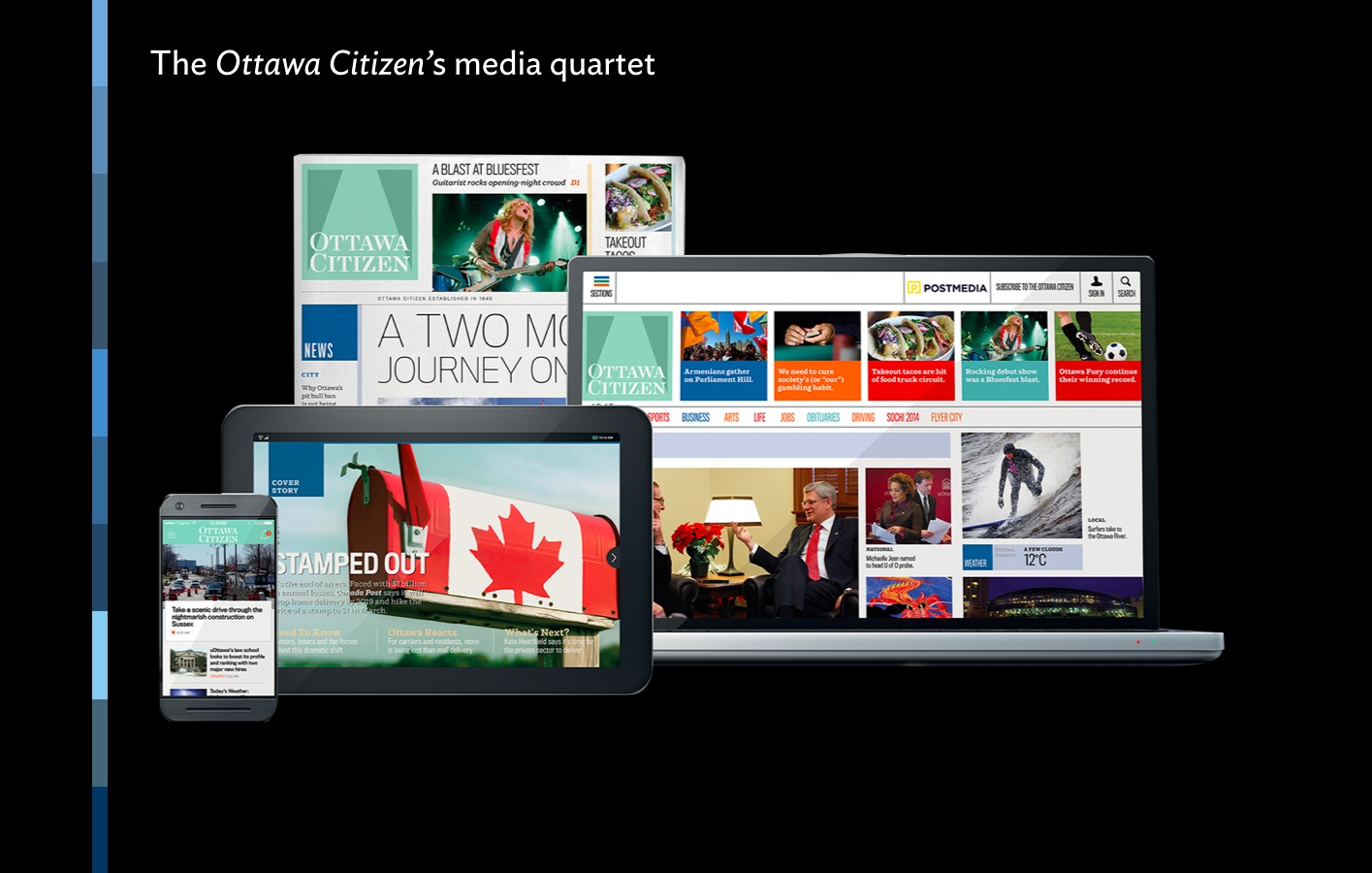
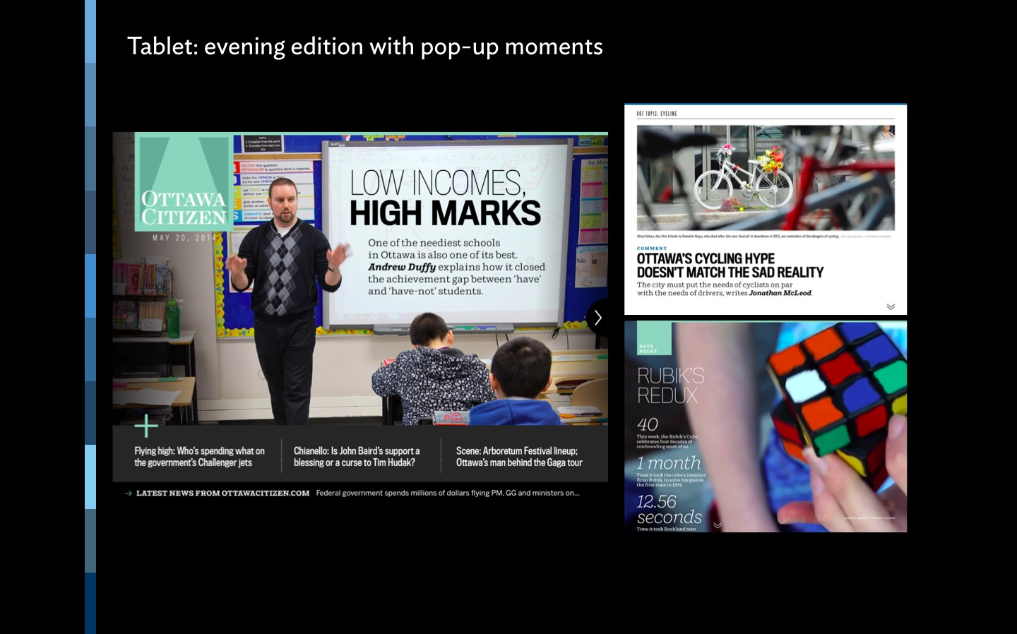
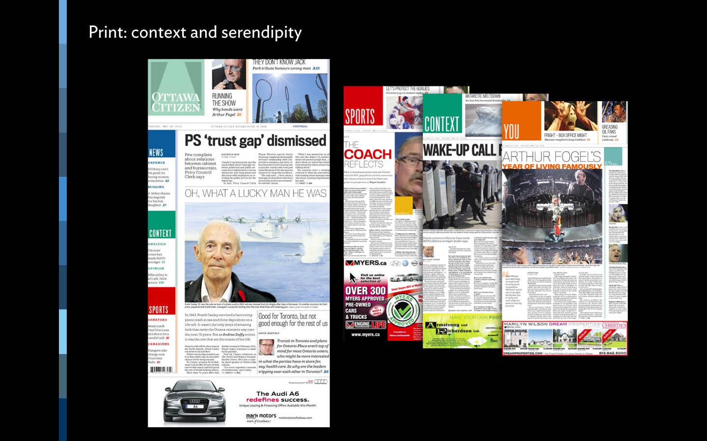
Postmedia unveils the reimagined Ottawa
http://http://www.postmedia.com/2014/05/20/postmedia-unveils-the-reimagined-ottawa-citizen/
https://www.garciamedia.com/blog/in_canada_multi_platform_transformation_ottawa_citizen_postmedia
Ottawa Citizen for iPad: Precisely what a tablet edition should be
https://www.garciamedia.com/blog/ottawa_citizen_for_ipad_precisely_what_a_tablet_edition_should_be
The Ottawa Citizen was the first of the Postmedia newspapers to launch what is not just a new look, but an overall philosophy of presenting news in the digital age. Of special interest: one of the best evening tablet editions anywhere in the world.
The Montreal Gazette
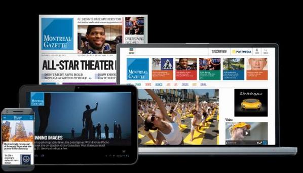

Montreal Gazette: new look, new strategy across four platforms
https://www.garciamedia.com/blog/montreal_gazette_new_look_new_digital_strategytablet_first
Tablet editions: 4 years later, less finger-happy
https://www.garciamedia.com/blog/categories/postmedia
The Montreal Gazette was the second of eight Postmedia newspapers of Canada to introduce a new look and visual identity. It is also a total rethinking of how news is edited, designed and distributed in the digital age. Its evening tablet edition continues to be profiled in this blog for its excellence. Don't miss it.
Calgary Herald
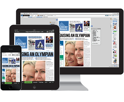

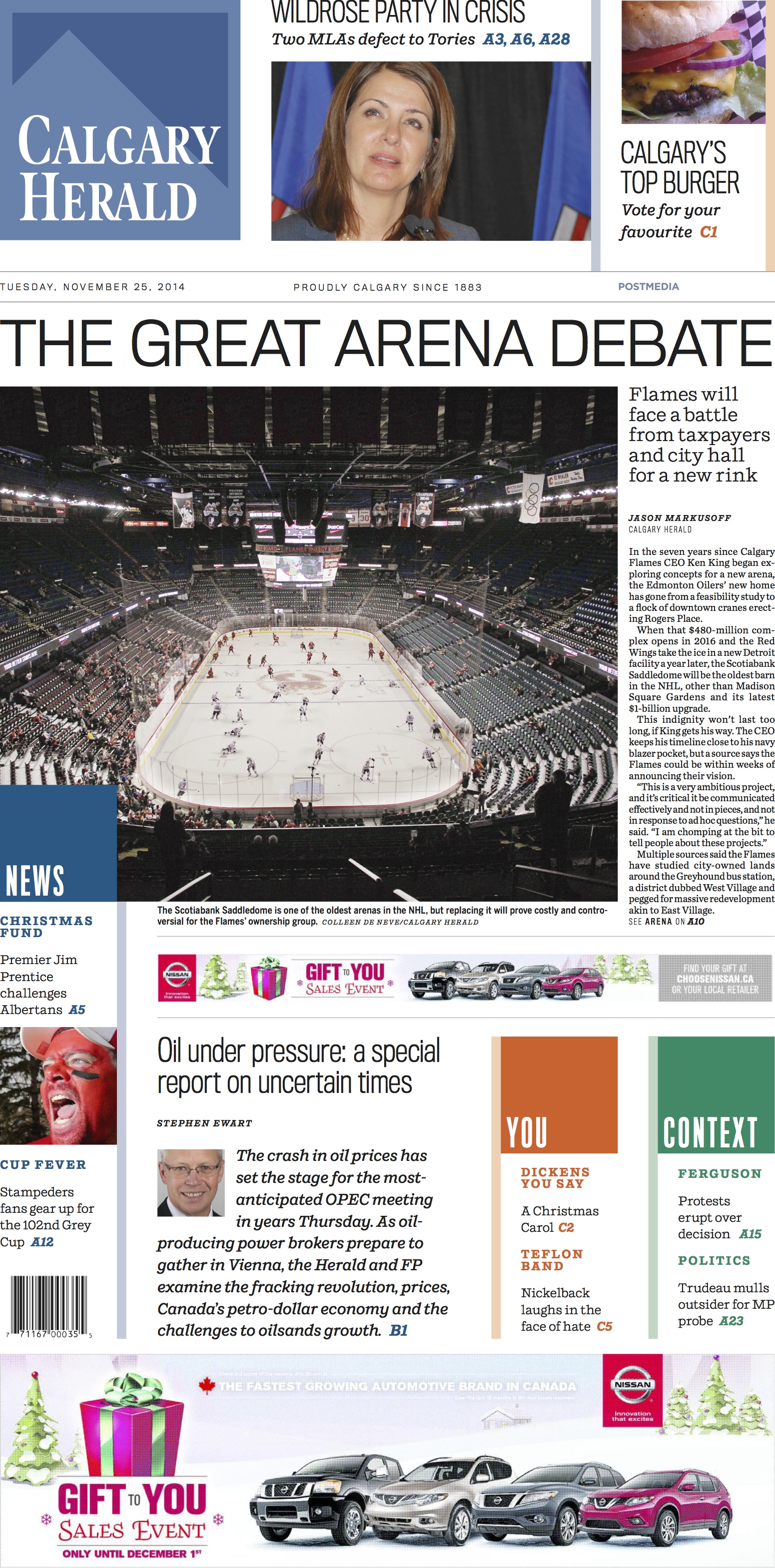
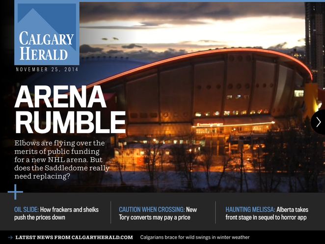
Calgary Herald: the latest Postmedia relaunch
https://garciamedia.com/blog/calgary_herald_the_latest_postmedia_relaunch
And then there were three of Postmedia's titles going to a new way of presenting information, along with a unified look and feel. The mandate for us at Garcia Media was to work with the Postmedia team to develop a philosophy for a digital first approach to news presentation. The project involved a series of transformational changes for eight of its newspaper titles.
Aftenposten, Norway
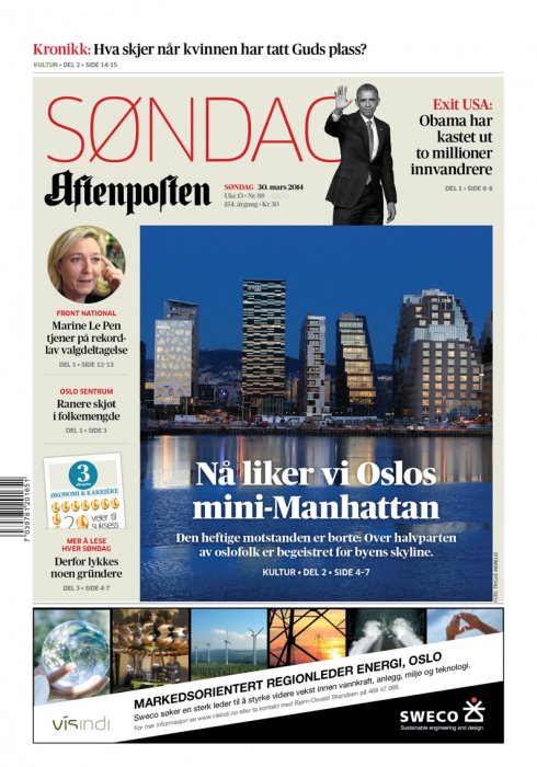
https://garciamedia.com/projects/aftenposten
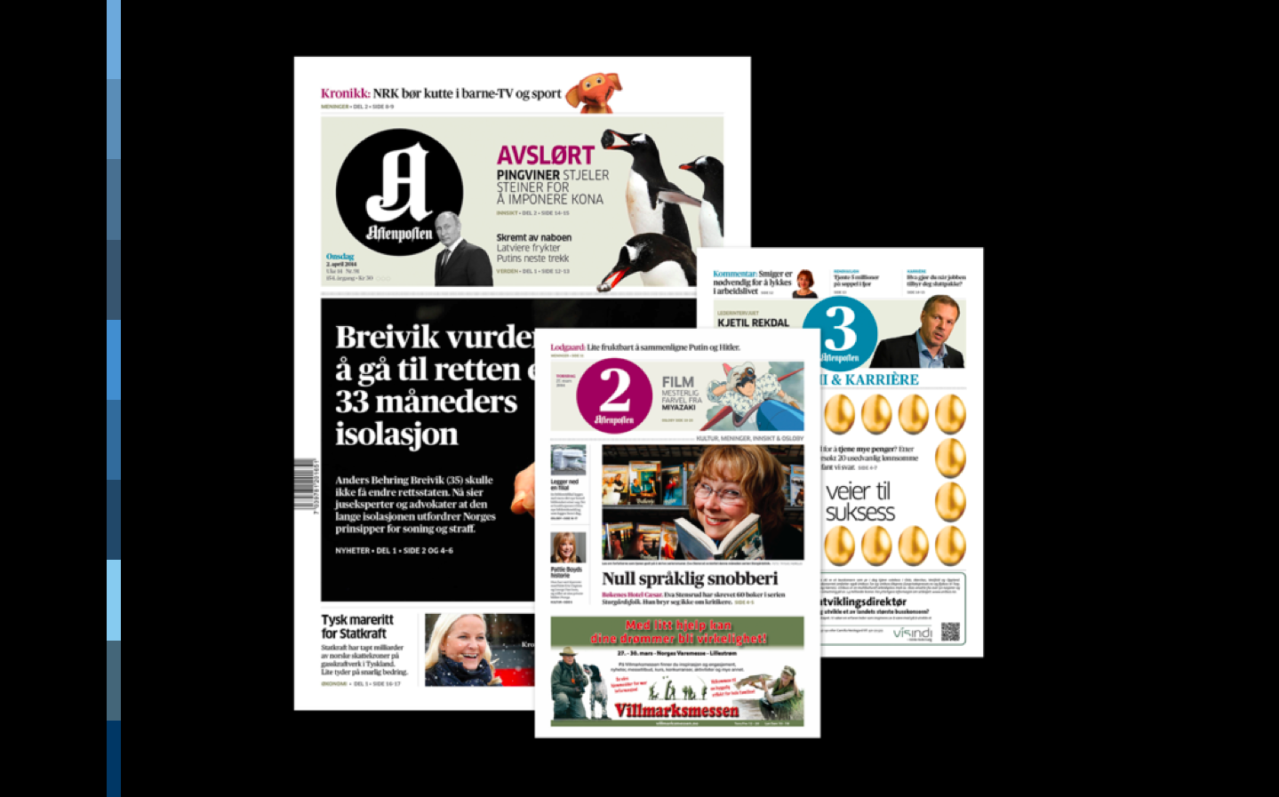
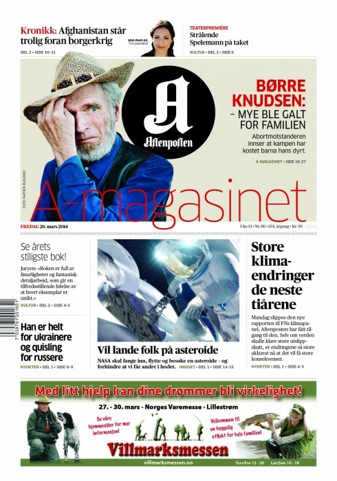
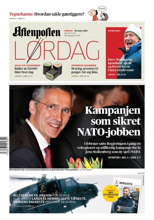
Aftenposten: The rethink of those weekend editions
https://garciamedia.com/blog/norways_aftenposten_the_rethink_of_those_weekend_editions
Aftenposten’s, Norway’s leading daily, introduced a series of changes that we referred to as a “total rethink,” involving some tweaks in the look & feel, but,more importantly innovation in storytelling, content flow and sectioning. For me, personally, perhaps the most fascinating project of 2014, complete with a digitally minded editor, Espen Egil Hansen, whom I would describe as the ultimate modern newspaper editor.
De Telegraaf, Netherlands

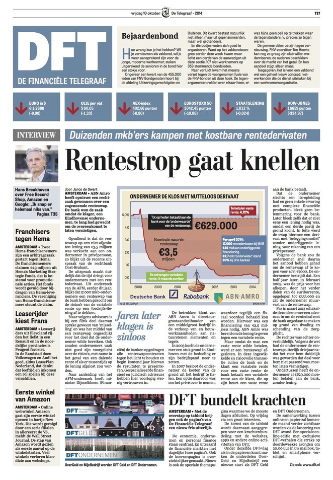

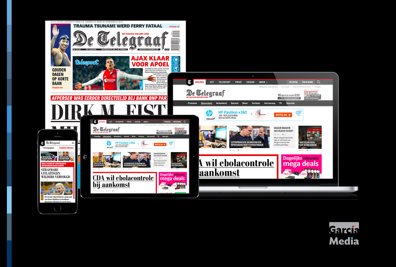
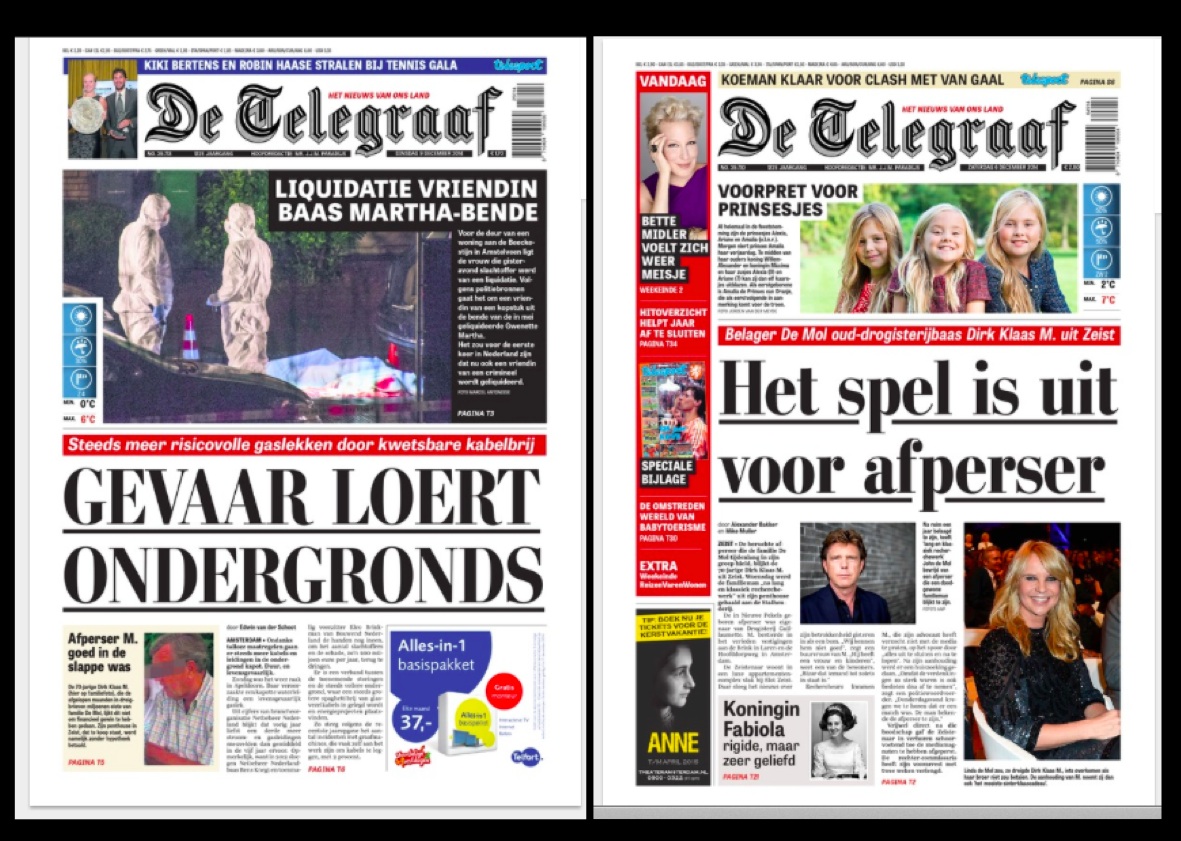
De Telegraaf: Launch of a new tabloid format today
https://garciamedia.com/blog/de_telegraaf_launch_of_a_new_tabloid_format_today
https://garciamedia.com/blog/archives
The biggest success story perhaps with readers. The Netherland's most read daily newspaper, De Telegraaf, introduced its new tabloid format concept October 10. It took months of rethinking, preparation, creation of prototypes and testing with readers. Finally, it happened: a compact, friendlier and easier to navigate De Telegraaf. And with the same bold attitude it has had since 1893. The result? Resounding success and over 63,000 new subscribers attracted in two months. Bravo, De Telegraaf team!
La Estrella de Panama and El Siglo
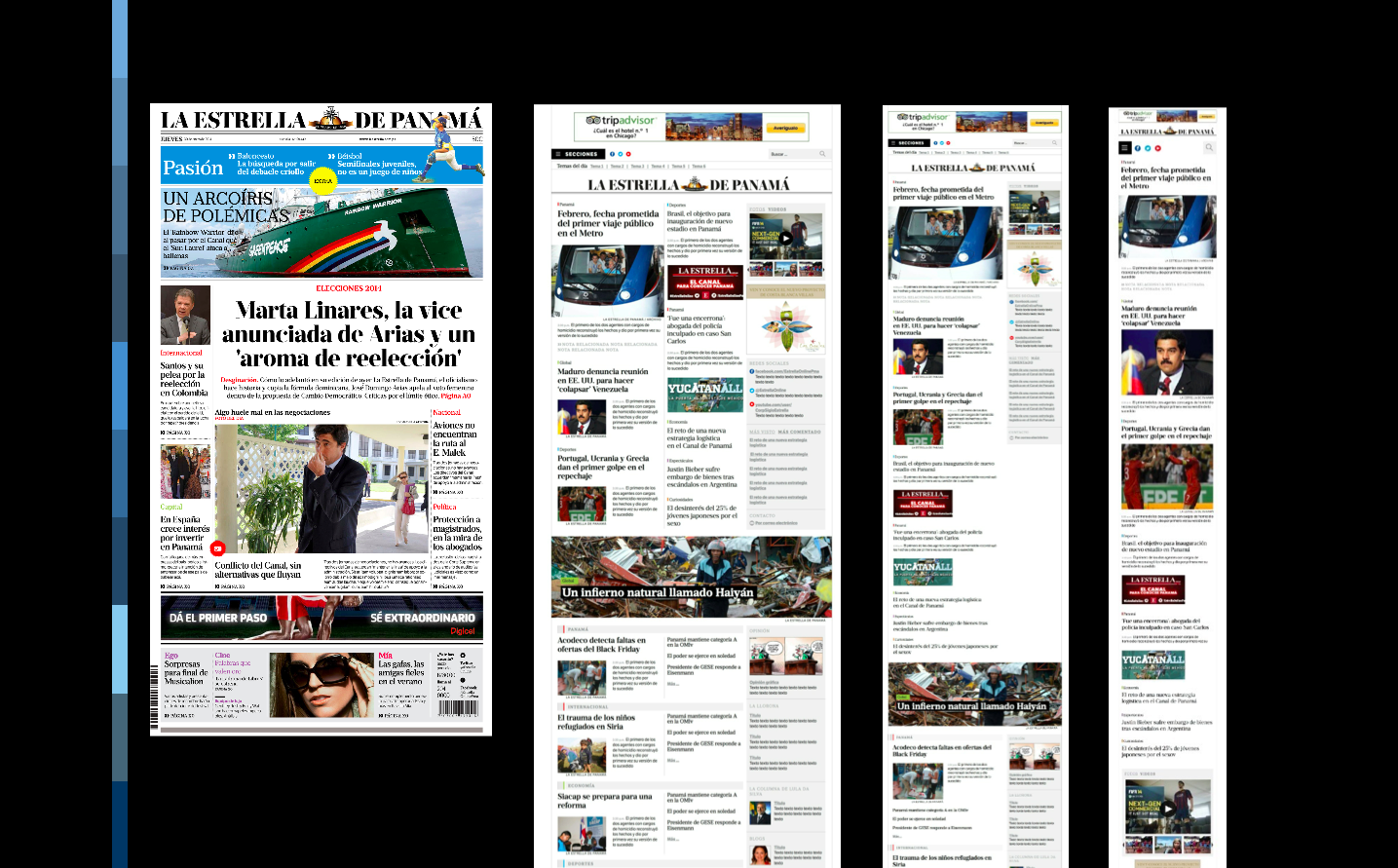
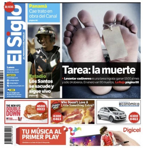
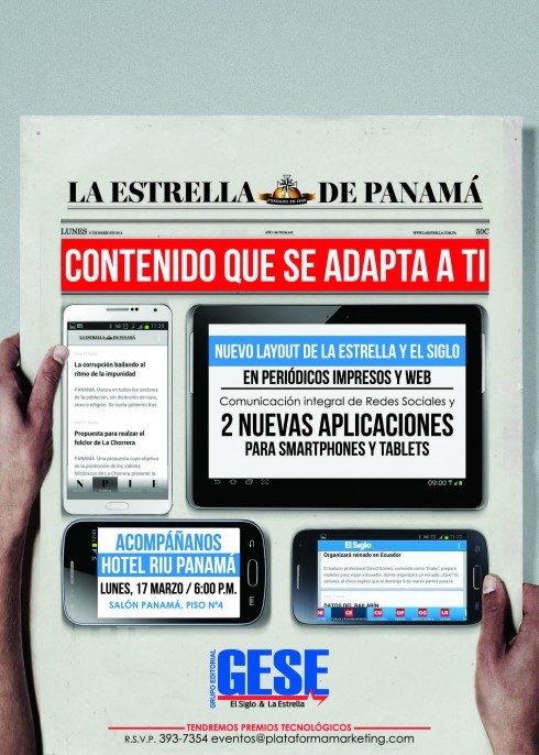
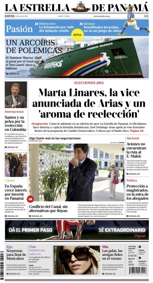
In Panama: a new start for La Estrella and El Siglo
https://www.garciamedia.com/blog/in_panama_it_is_a_new_start_for_la_estrella_el_siglo
It was a new chapter in 2014 for La Estrella de Panama, the 165- year-old oldest newspaper of Panama, a newspaper with a rich history, and a unique one: a newspaper in a Central American Spanish-speaking country that began as a publication in English, then French, before it switched to Spanish. The newspaper originally began in 1853 as a Spanish language translation insert of an English daily, The Panama Star, which had been formed in 1849. Also a newspaper tied to that historic landmark that is the Panama Canal. In its new version, La Estrella introduced better navigation a more contemporary look & feel, and better content flow across platforms.