TAKEAWAY: Irreverent energy—two words that are not usually associated with design, but which can be, oh, so appropriate.
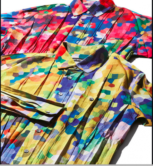
Issay Miyake’s designs are called irreverent for their use of color and a non-conforming approach to fashion
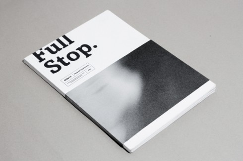
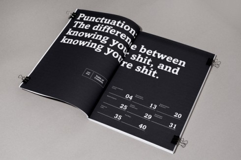
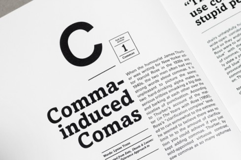
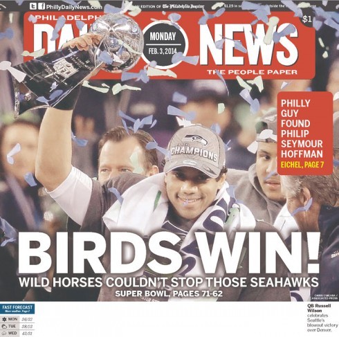
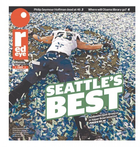
Red Eye: Chicago’s eye for irreverence

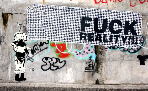
Irreverence lives in street art, such as that of Sr. X
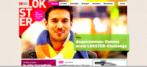
A colorful a la Miyake website from those wonderful guys at Kircher-Burkhardt studio in Berlin; http://www.kircher-burkhardt.com/en/#!/serviceshttp://lokster.deutschebahn.com

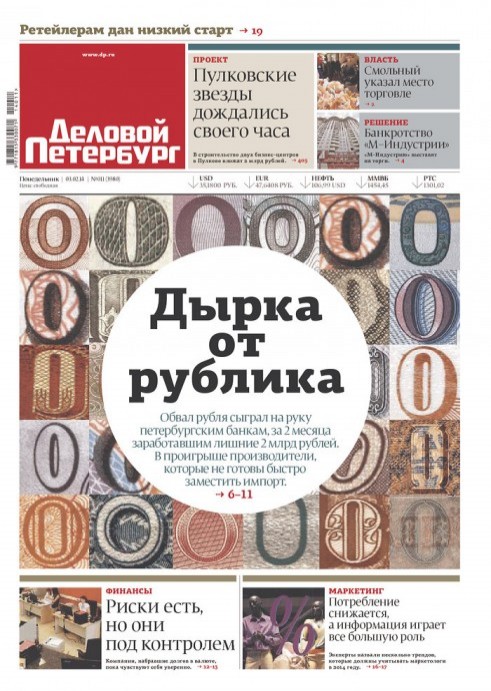
From Brazil’s Diario Catarinense (a newspaper that Garcia Media is very proud to have been involved in creation of original design)

Now there is even a magazine called Irreverent Design: https://www.facebook.com/IrreverentDesigns
I came across these two words while reading a profile of Issay Miyake, the Japanese designer, in the last edition of the Financial Times’ glossy magazine, How To Spend It.
It is not that I am particularly interested in Mr. Miyake’s design. However, the cover story lured me with his interesting photograph of the subject and then a first paragraph of the story in which Mr. Miyake is quoted as saying that he finds the notion of the word “fashion” ludicrous.
“I prefer the term ‘making things’,” he tells the reporter during the interview. “I want to represent the action of thinking. We are working towards the concept of …..no fashion.”
More and more, we media designers are not so much in the business of design, as we are in that of creating things that must then adapt to a variety of platforms. I notice that the interaction between traditional design functions get forever more intertwined with those of technology. Design and technology are embraced tightly, a tango full of possibilities, and one in which the proverbial “it takes two to tango” was never more true.
True, designers in traditional print publications always had to have conversations with the guys in production and printing, mostly about reproduction issues. That was the extent of the interaction with technology.
Today, however, technology guys sit at the table with designers and editors at the time of conception. No idea can formulated fully and considered for implementation without the “amen” from those tech guys. IN most cases, I find the relationship to be a positive and usual one. Technology and editorial depend on each other, and those involved in those areas know it.
The irreverence of it all
But that brings me to the two words “irreverent energy”, which in the case of Mr. Miyake’s creations is used to describe what the author of the interview refers to as “presentations full of laughter, dance and joie de vivre.”
What constitutes irreverent energy in the world of media design?
A good question which I asked myself while sampling a variety of publications both in print and online.
I don’t see a lot that is irreverent in what is coming out of newspapers and magazines today. If irreverent implies a sort of disruption, this is not so present today. It is more like a conforming attitude that prevails. There is a sameness.
Irreverent energy is likely to be found in some non legacy websites, such as Breaking News, Circa or Hearts and Foxes.
The irreverence is often more in the content treatment, or in a headline, than in the design itself. But, of course, when one takes the entire page or screen in, that sense of irreverence surfaces.
Circa’s irreverent energy comes from abandoning the article, that basic unit of news as we have known it: a headline, quotes, facts, texts and a photo/graphic. Instead, Circa has ditched the linear article completely, opting for object-oriented news.
Breaking News goes for an emphasis on “time saved” and not “time spent”, which could constitute a new way of looking at things for journalists who are usually more concerned with time spent by users to consume the content they produce. The Breaking News concept is to curate stories, provide short summaries that are updated frequently, then send the user to the original source. In many cases, a three line alert appears, and there is nothing else there to read.
Hearts & Foxes is pure irreverent energy, and how appropriate, as this is content about teen celebrities presented with all the joie de vivre of a Miyake creation.
I am hoping that some of what is different and vibrant—-perhaps not necessarily irreverent, although quite energetic—about the samples above, will start trickling down to more traditional publications as they create new digital versions of their products.
TheMarioBlog post #1425