TAKEAWAY: Alberto Cairo is a journalistic visualizer with an eye for beauty but two hands on function. We talk to Cairo about the roles of function and beauty in information graphics and showcase his new book, The Functional Art. ALSO: Take a look at this new preview of my new digital book, almost ready to come out very soon.
Here is new trailer for The iPad Design Lab: Storytelling in the Age of the Tablet
“iPad Design Lab” trailer on Vimeo.
Sign up here to be the first to know when the book is released:
http://ipaddesignlab.com
A chat with Alberto Cairo: information graphics and visualization expert
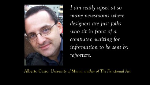
I sat through one of the most enriching presentations about info graphics that I have ever heard. It took place at the Cumbre Mundial de Diseño 2012 (the yearly World Design Summit) in Mexico City.
The speaker was Alberto Cairo, who teaches visualization at the University of Miami (my graduate school alma mater), and who truly knows what he is talking about, presents it with conviction and now has a book everyone can get, titled, appropriately, The Functional Art.
Alberto’s presentation contained no thrills, no portfolios with 250 double page spreads of beautiful images you could hang in your den. No, this was not another one of those “The best of me, followed by the superior me and ending with nobody does it like me” types of presentation.
Instead, there was a lot of common sense, some simple graphics with bars and circles that told stories, grabbed your brain and took it for a wild ride—-as in making you understand complicated stories.
Not that Alberto does not believe in beauty and its role in info graphics. He, too, knows that beauty seduces.
But he also tells you that before infographics get into the aesthetics, the info graphics artist needs to put her journalistic hat on, dig for the information, sketch how function will determine fun, then, when it is all done, reach out for the crayon box.
Two questions for Alberto Cairo
Mario:
Why is it so difficult to separate art from function in graphics?
It’s because beauty -in design, in literature, in life…- is usually a byproduct of good structure, good organization, good information, and good design choices (which depend on the publication you work for, and who your audience is). Function comes first, aesthetics come later, but you cannot have one without the other.
In one of the interviews in The Functional Art, Moritz Stefaner, a famous European data visualizer, told me that he presents himself to clients as a “truth and beauty operator”. I love that. As Eric Gill said once, and Edward Tufte has repeated throughout the years: “If you care about goodness and truth, beauty takes care of itself”. I am not a minimalistic, as Tufte is, though. I think that there’s a place for little visual jokes sometimes, in the elegant style of Nigel Holmes.
Mario:
When did the aesthetics take over? Who decided that the illustrations would carry the day?
I think that the problem is that in many newsrooms you have a perfect storm: Editors/writers who think that graphics are “stuff that designers and artists do” and designers who think that their goal is just to make pages look prettier, without worrying about the information. There are many exceptions, obviously, but this “perfect storm” is very common.
I’ve tried to fight both trends in my career because I am both a journalist and a designer. Designers and journalists are in the same business. My classes and workshops are always “infographics and visualizations for non-designers” and I specifically ask my clients to send their reporters and editors, who are at first skeptical when I say that anybody (literally) can do graphics, at least to a point.
I also ask designers in the room, to make them understand how important it is to sit down with journalists and think as journalists themselves. I am really upset at so many newsrooms where designers are just folks who sit in front of a computer, waiting for information to be sent by reporters.
So I make designers and journalists to sit together and work together on one or two simple projects. When they see how this approach can (should!) be applied to the day-to-day work in the newsroom, they are amazed.
Two Cairo favorites
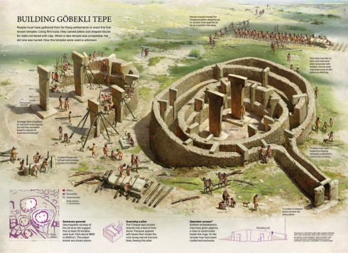
Cairo: The National Geographic illustrated infographic (by Fernando Baptista) is one of the most amazing examples of the power of reporting. They spent literally weeks gathering information, talking to sources, making sure that every detail of the drawing was accurate, precise. This is not just a beautiful infographic in the common sense of the word. It’s an example of true precision journalism
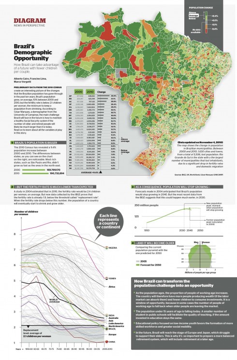
Cairo: The graphic about population, from Epoca magazine (Editora Globo) where I was the infographics director between 2010 and 2011—-is an example I usually try to tell a story by means of charts and maps. It’s structured like a narration, guided by the headlines: Brazil’s population grew between 2000 and 2010 (first big map and graph), but the fertility rate is dropping (big line chart at the bottom left); that will eventually lead to a smaller and older population (graphics on the bottom right); and it also includes a short sidebar on how Brazil can take advantage of this situation. We did a lot of reporting for this piece. I went to the World Bank and the Brazilian Census Bureau for the data, and then analyzed it in Excel, and made the graphics in Illustrator.
It’s not all about aesthetics
I sat in the audience mesmerized by the examples and happy to find an information graphics and visualization expert who thinks like a journalist but who starts his show by demonstrating admiration for Michelangelo’s Moses.
Alberto carries the beauty component in his bag of tools, but he carries the hammer that hits at function in his hand. It is satisfying to know that this young and talented man is teaching at a university where his message can have everlasting influence.
For years, when people ask me what is universal about newspaper design, I have answered quickly with these three criteria: make the content easy to find, make it easy to read, make it easy on the eyes.
Making information attractive is important, it accounts for a lot of what we do as designers, but it is not the first or second criteria.
Alberto Cairo seems to agree.
Take a look at Alberto’s new book here
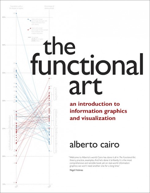
This is the cover for The Functional Art: An Introduction to Information Graphics and Visualization
Download 60 pages for free from here. They are the intro, the first chapter, and the interviews with John Grimwade and the folks at The New York Times:
http://www.thefunctionalart.com/2012/09/download-three-chapters-of-functional.html
1st Middle East News Design Conference
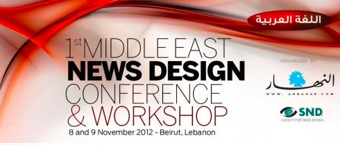
It promises to be a great program, and a historic one, too: the first SND Middle East gathering. Put it on your calendars: November 8 & 9, in Beirut, Lebanon. Sponsored by An-Nahar and SND.
For more information:
http://www.snd20events.com/conference/