When we live in a multi-platform environment, we must try to learn as much as possible about those qualities and characteristics of each platform so that we can take full advantage of it.
First, there is the issue of space: a printed newspaper or magazine page will always be a larger, more welcoming canvas for photos and large infographics.
The tablet allows for the very intuitive turning of the pages for when we read a book, or even an e-paper edition of a newspaper or magazine. Photos and graphics have more ample space on a tablet screen then they do on that of a phone.
Yet, we know that so many of our users are consuming all types of information, including graphics, on that small screen of their constant companion smartphone.
This is a topic of interest at all my workshops.
My take:
I think we need to face the reality of that small smartphone screen, and therefore we must customize infographics for the phone. This is a fact that every designer, infographic artist and editor must understand.
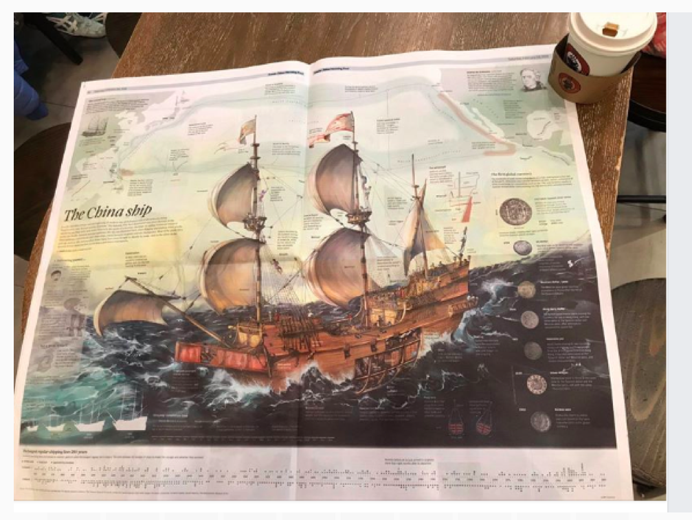
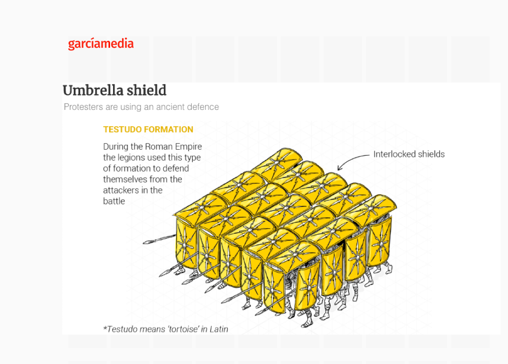
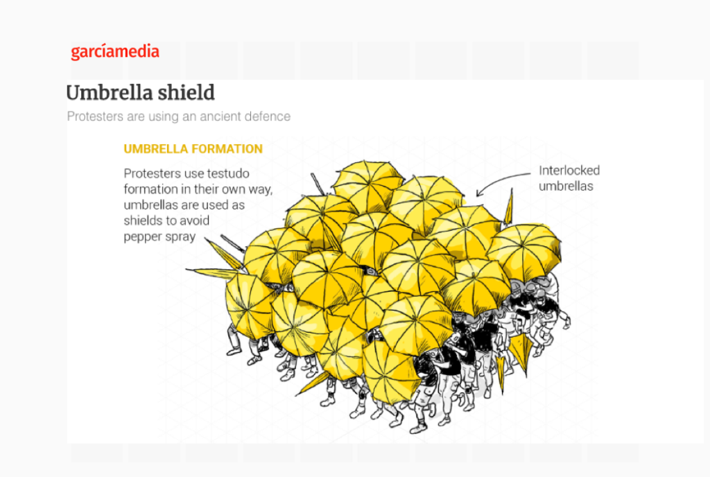
For example, this beautiful two-page infographic from the South China Morning Post, by artist Adolfo Arranz, would have to be rethought for mobile consumption:
I think that perhaps more than two thoughts per screen will overwhelm the user visually and otherwise.
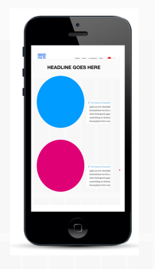
Let’s take a look at this rough sketch of a graphic aimed for print that includes four pies with information. Simply too much to assimilate.
How much is too much?

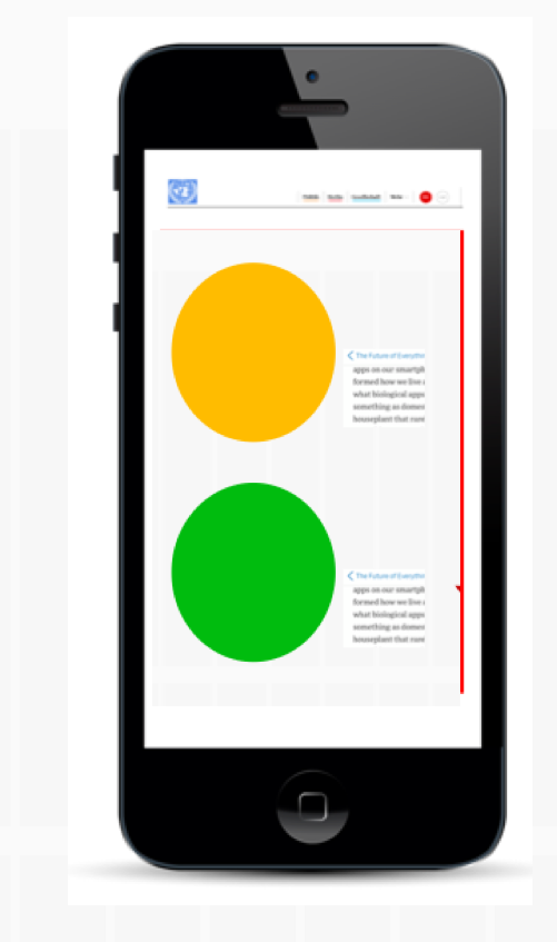
So why not use two pies maximum per screen, allowing for the next screen to carry two other images.
It is a simple equation, what may be a simple, beautiful rectangular infographic in print, may turn out to be two or more screens of the phone.
So think vertically, linearly, if you will. In 2019, users know that if you scroll, the next sequence (screen) appears.
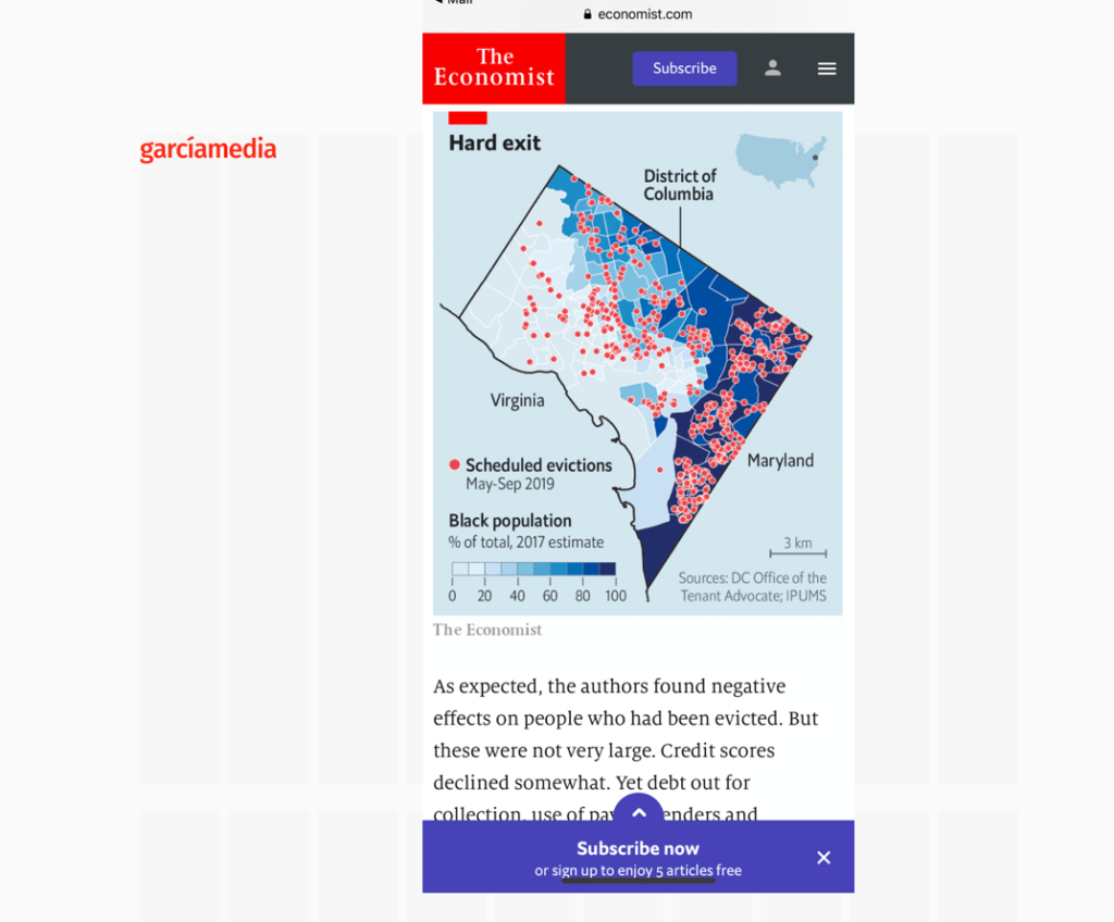
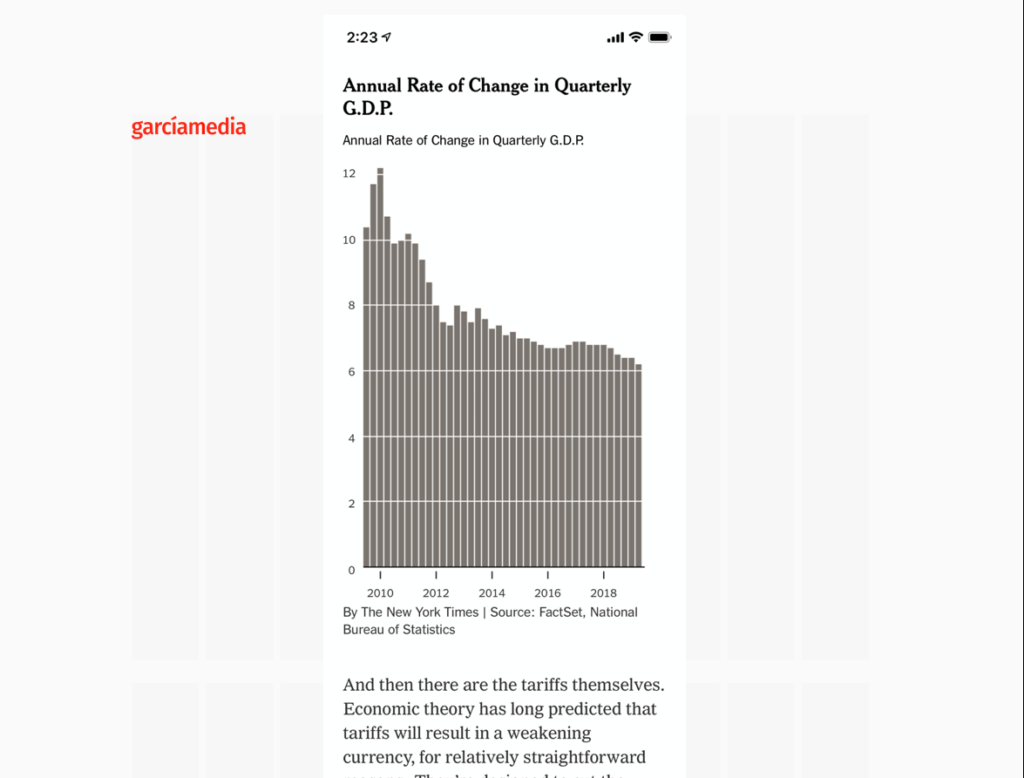
Look at these very simple graphics from The Economist and The New York Times. One major thought per screen:
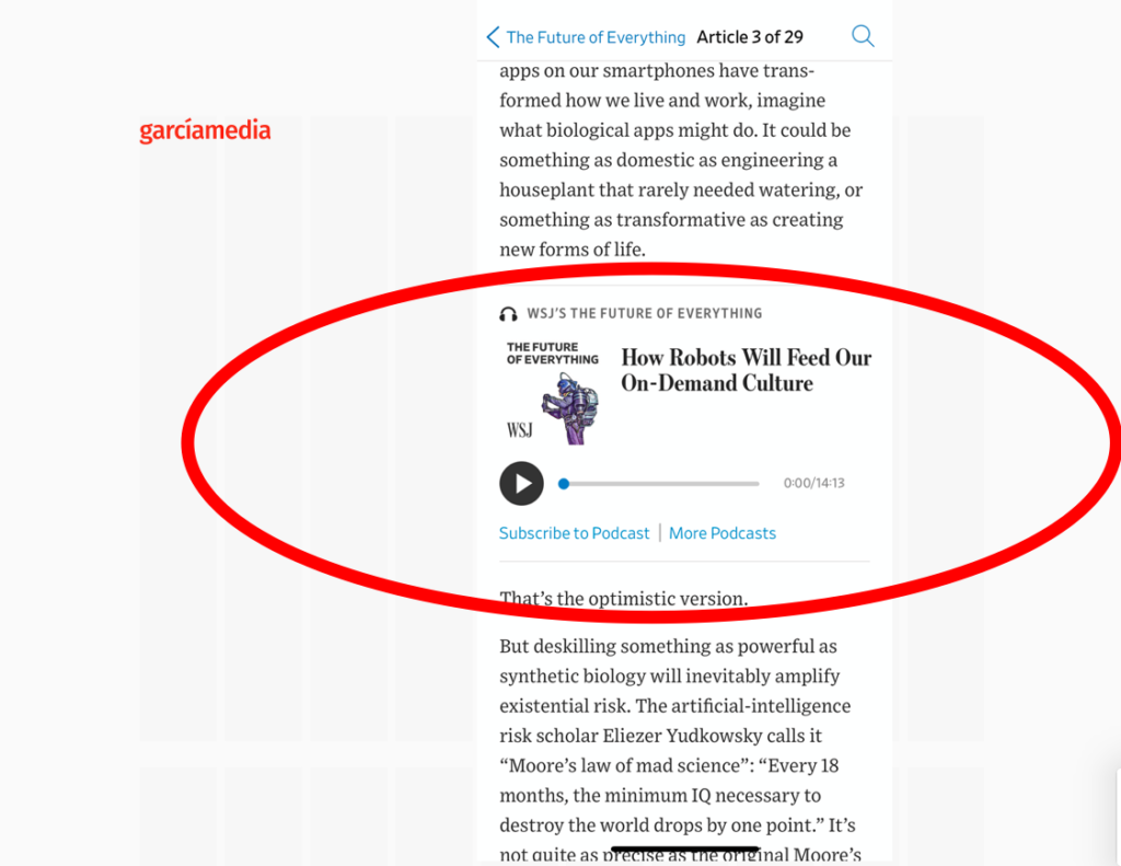
Another interesting strategy is to include the graphics as part of a video presentation, as we see in this example from The Wall Street Journal:
I had a chat about this with Adolfo Arranz, the award-winning infographic artist, previously of the South China Morning Post and now with Mediacorp of Singapore. I asked Adolfo if he takes in consideration the limited canvas of the smartphone screen when creating his graphics:
“Indeed, for us it is always very difficult with the mobile version of our projects. Many times we opt to execute very different versions for print and desktop and mobil. And sometimes it is impossible to accommodate the information that is available for larger formats into a mobile version. The important thing is to discriminate the information, and to show that which is essential, the most relevant part of the story. It is easier to concentrate on the essentials for mobile.”
Let’s take a look at some of Adolfo’s creations here: Notice that here he uses two different images, one per screen, to make a point:
Less is best should be the guiding philosophy when creating mobile-friendly infographics.
One thought or idea per screen.
Remember, a graphic that may be four columns wide in the print edition of a newspaper could be four screens on the small canvas of the phone screen.
And if you can add animation, movement and sound, that should more than make up for the reduction in size.
It is almost 2020. We can’t continue to assume that one size fits all—not in terms of the narratives, and, even less in terms of the graphics.
My interview with CNN en Español
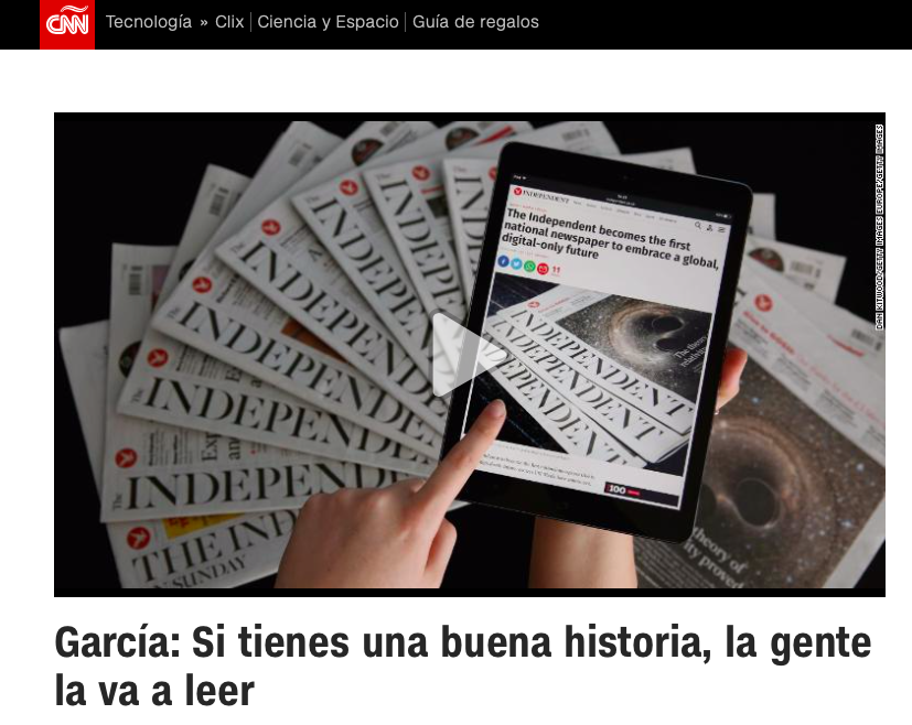
I was a guest in the program Encuentro, hosted by Guillermo Arduino daily at CNN en Español. The interview was about how we read on mobile devices and my introduction of my new mobile storytelling book, The Story, to a Spanish-language audience.
Mario’s speaking engagements

Keynote Luncheon Speech: Ad Club of Toronto, Newspaper Day
October 25, 2019
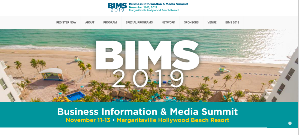
Keynote presentation: Business Information & Media Summit (BIMS).
November 12, 2019
Order print edition of The Story from Amazon
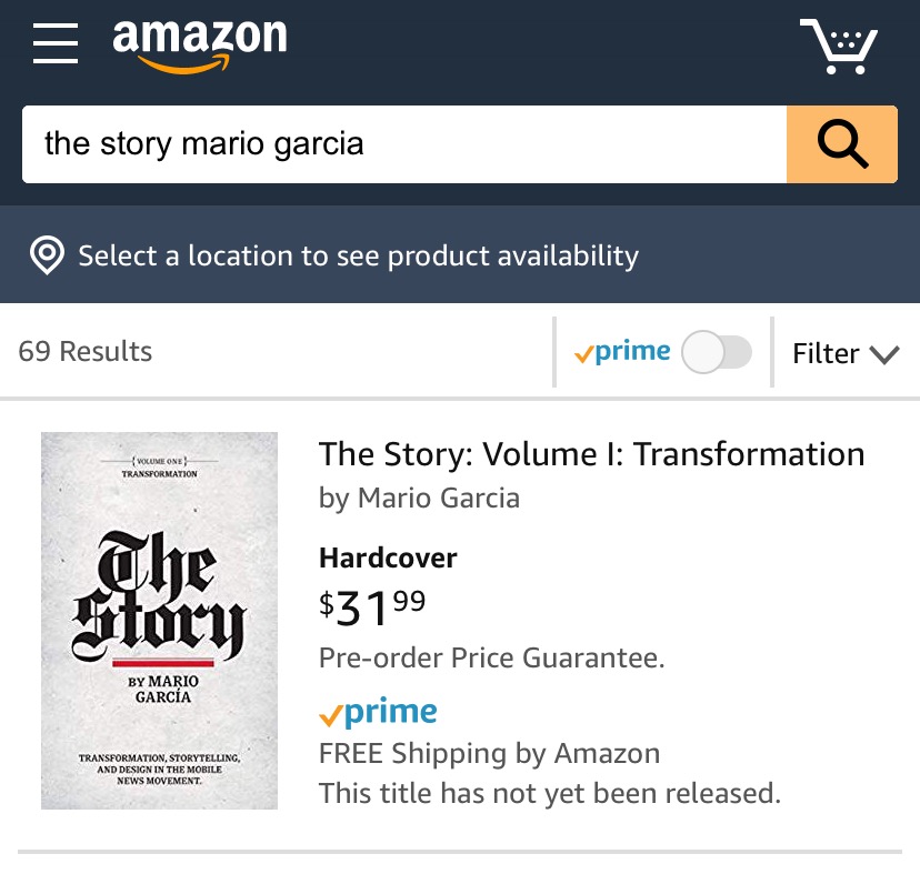
You can order the print edition of my new mobile storytelling book, The Story, from Amazon already here:
Pre-order The Story
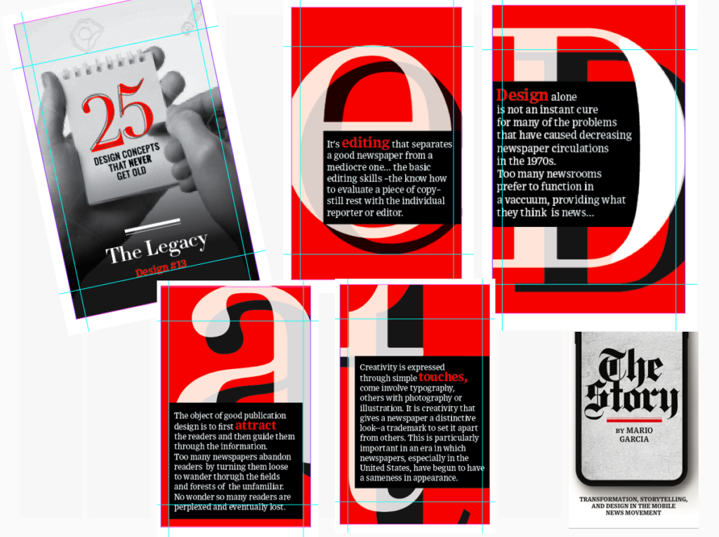
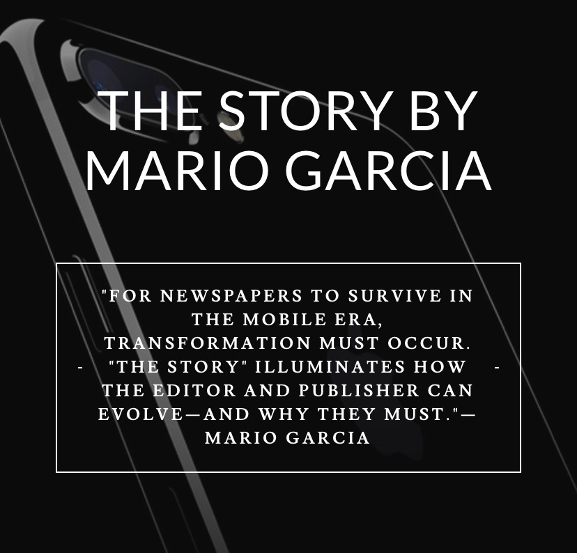
The newspaper remains the most powerful source of storytelling on the planet. But technology threatens its very existence. To survive, the Editor must transform, adapt, and manage the newsroom in a new way. Find out how, pre-orderThe Story by Mario Garcia, chief strategist for the redesign of over 700 newspapers around the world.
Order here:
https://thaneandprose.com/shop-the-bookstore?olsPage=products%2Fthe-story
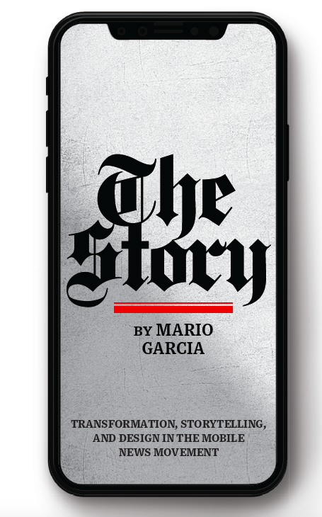
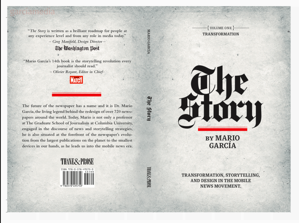
The Story will also appear in print
I am happy to announce that we will, indeed, have a print edition of my mobile storytelling book, The Story. I thank you for expressing your interest to our publisher, Thane Boulton, of Thane & Prose. Now the print edition will be a reality, and you can already see the cover and back cover here:
An interview of interest
http://www.itertranslations.com/blog/2019/3/11/fd60ybflpvlqrgrpdp5ida5rq0c3sp
TheMarioBlog post # 3104