*This is a celebratory week for Garcia Media, with launches of two publications taking place almost simultaneously, in Saudi Arabia, the daily newspaper Asharq Al-Awsat, and in India, the weekly magazine SportStar.
It would be difficult to find a sports fan in India who is not reading SportStar every week, collecting its famous and popular posters and devouring every page.
Indeed, the SportStar website gets about 10 million visitors per month.
The audience is in that most desirable of age groups, the 25-54 readers that advertisers crave.
In 2022, we at Garcia Media were invited to participate in a total rethink of SportStar, which was part of a year-long project with The Hindu Group, publishers of the sports weekly, but also, The Hindu, Business Line and Frontline magazine, all of which we analyzed and redesigned for print and digital platforms. It has been invigorating work with a team of dedicated journalists and designers eager to learn, to improve their publications and to aim for a more digital/mobile first approach to content creation. *See link to case studies for the Hindu Group titles below.
What SportStar means to readers
During my trips to India over the years, I have heard readers of SportStar tell me that they wait in anticipation for every edition of the magazine simply to get the big poster that is a collectible item.
Let’s hear SportStar editor in chief, Ayan Sengupta, relate his own experience as a child reading the magazine:
I discovered a treasure trove on my recent trip back home. Tucked away in a corner of our Kolkata home was a box full of Sportstar posters that, for much of my childhood, were my most prized possessions.
The posters of Kapil, Sachin, Maradona, which adorned every free wall of the house, made them a part of my daily life and not just some stars whom I watched occasionally on blackandwhite TV.
The Sportstar posters brought our heroes closer to millions like me.
This was the pull out poster in the first relaunch edition:

Why the change?
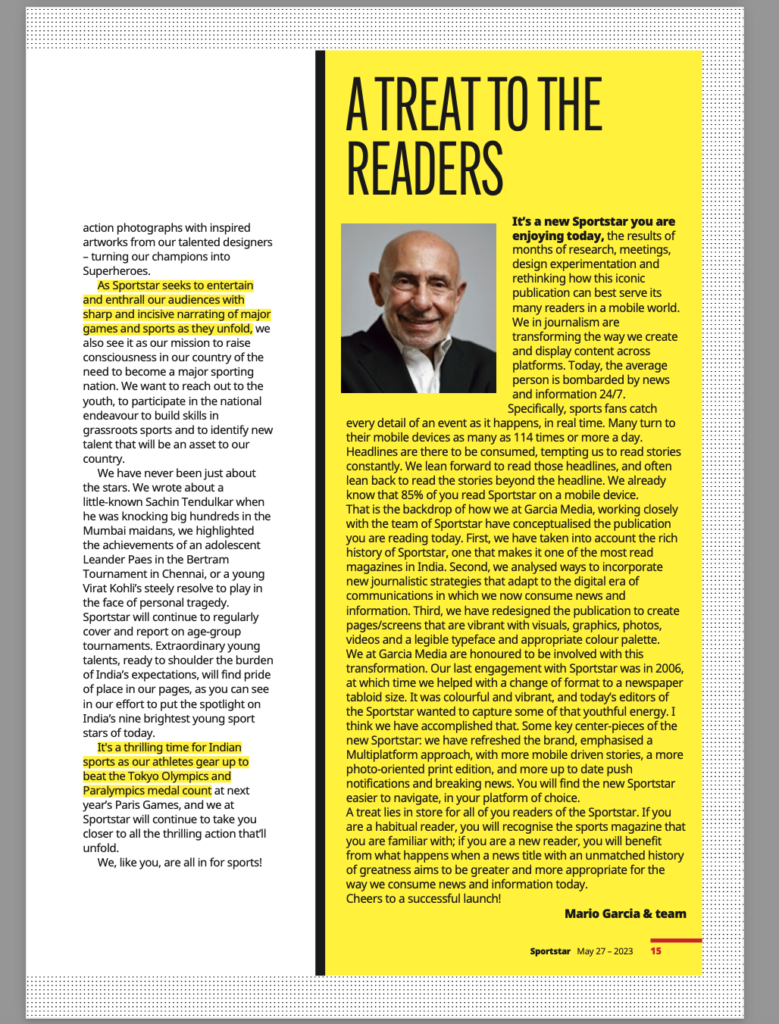
When we were invited to participate as consultants in a rethink of SportStar, it was obvious that the loyal readers of the magazine had not abandoned it. Quite the contrary. However, as editor Sengupta put it to me:
We need to be more visual, include more photography and graphics. We have great content but sometimes I don’t think we package it the right way. In fact, I think that while our content is as good as ever, we tend to be a museum piece of the 1990s when it comes to the design. I want us to be vibrant and colorful.
We have combined new journalistic features that have become a staple in the digital era, where we consume a lot of our news and information on handheld devices. We have brought the best of mobile storytelling to the print pages of the magazine, creating layouts that are vibrant with visuals, graphics, quotes, bolder colours, closer crops and a daring and more legible typeface that we feel would best accentuate the drama and passion that sports evoke.
Our 2006 design for SportStar inspires the new look
Sometimes you shake hands with the past to welcome the future. My Garcia Media team and I had completed a redesign of SportStar in 2006, with Jan Kny as art director in our team. The format at the time was tabloid newspaper. It was splashy, with big photos and emphasis on color, especially yellow. Take a look here at what that 2006 product looked like:
Editor Ayan Sengupta liked this overall look, particularly its extensive use of yellow to highlight headlines and quotes. I remember that we put several issues of the 2006 editions on the table, pointing out key visual elements that could be revived for this relaunch, as we did.
Elements of the new design
- The format is that of a glossy magazine.
- We have emphasized larger photos.
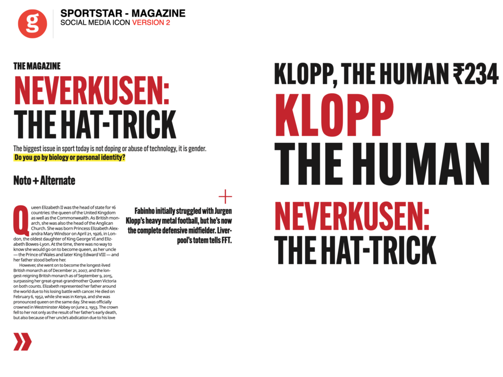
- We underline key statements in yellow, knowing that many readers in the younger age group scan the pages, hopping from place to place. The yellow highlights will direct the eye to the story’s essentials.
- Better hierarchy with a dominant image per page.
- Borders in color and various textures frame pages and give the magazine its own identity.
- Color plays a key role, with a bright color hue as the dominant element.
- Covers display people, with large headline and yellow highlight.
The covers
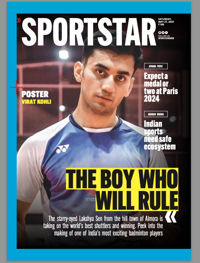
Belos is the cover for the first edition of SportStar after redesign:
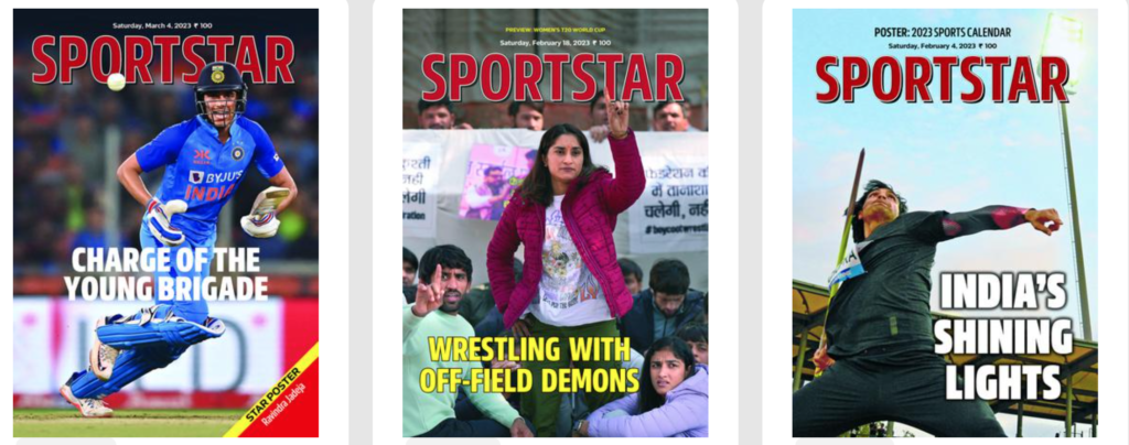
Here are the 9 covers published accordion style for launch issue:
Editors decided to offer a surprise for the readers on the day of the launch–an accordion displaying 9 covers as seen below.


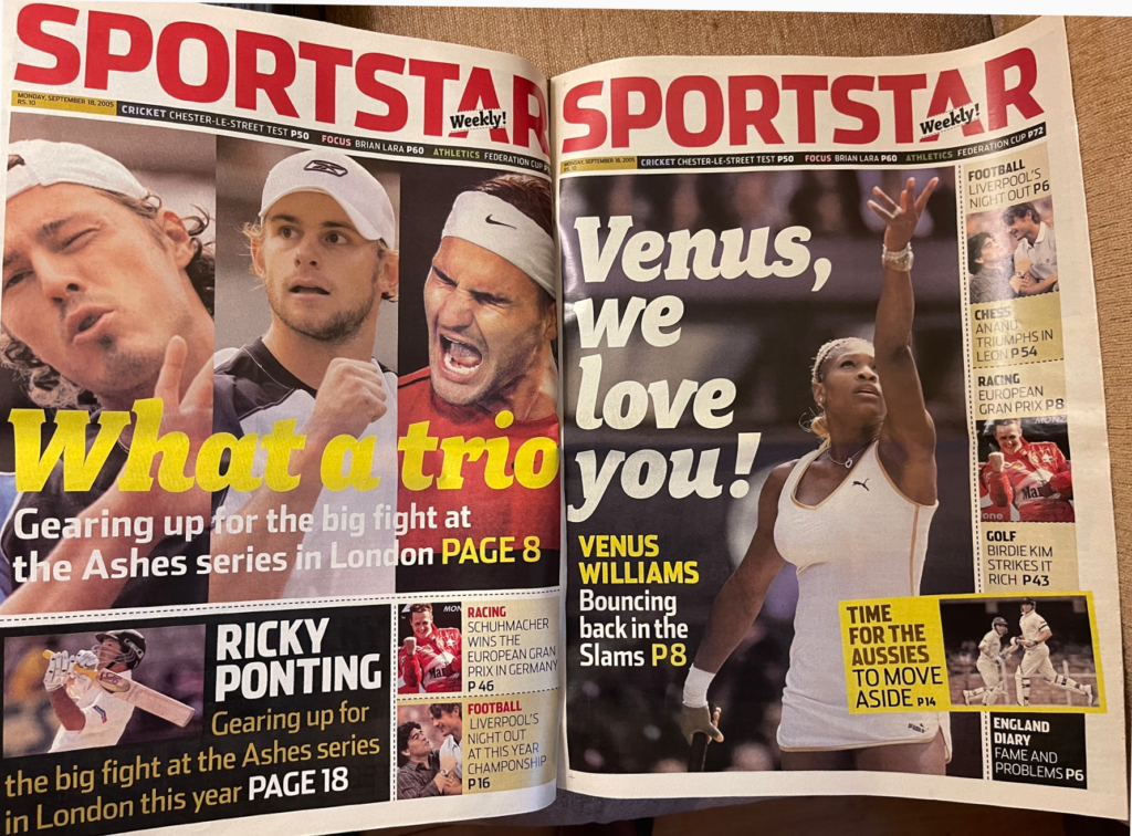
Assorted covers before the relaunch
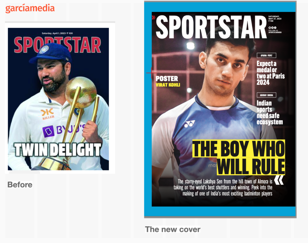
Here is the before and after cover comparison
Inside pages
Emphasis on hierarchy, robust headlines and well displayed photos. The grid allows for generous use of white space as needed.

Framing
We designed a system of frames, some with colors, others with texture, to package certain content throughout the magazine.
The role of color
Inspired by the 2006 tabloid design we had completed for SportStar, we used elements of that color palette for type accessory items as well as for full page backgrounds. An interesting element of color use is the highlighting of certain paragraphs in the text:

Opinion pages/columnists
These pages emphasize effective use of white space.

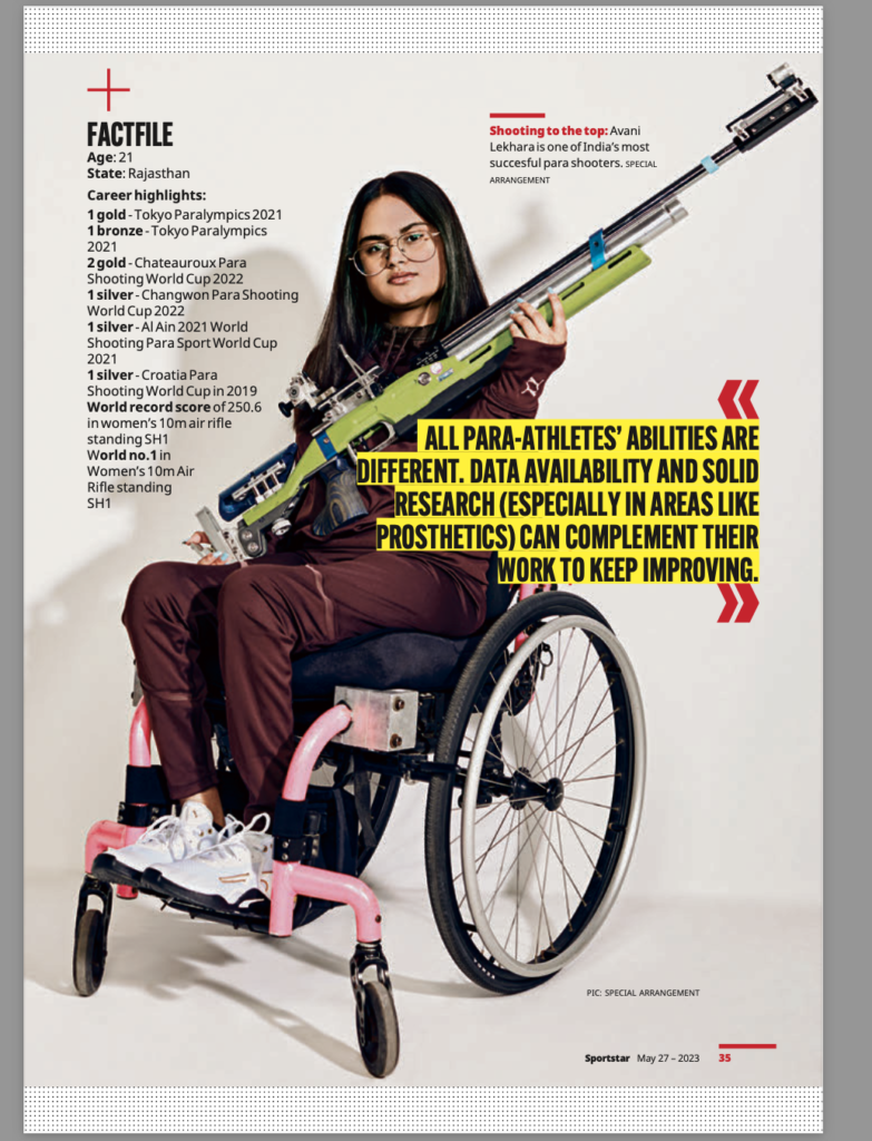
Strong photography
What print editions can do best is to display large images, and our new design of SportStar capitalizes on that feature throughout:

The typographic palette
We believe that a sports publication must use type to convey the essence and vibrancy that comes with sports content: competition, sweat, sometimes blood and tears. We felt that Alternate provided a commanding presence for headlines.
The color palette
Bright colors prevail.
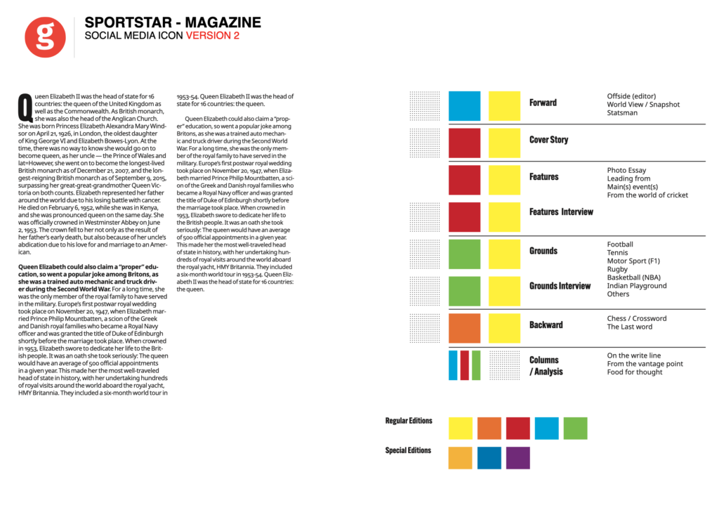
The grid
Generous wide columns for text, but also a grid that makes the use of white space easy and practical.

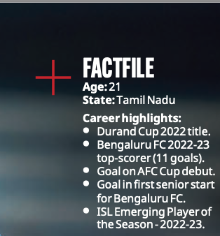
The Fact File
We created a special story structure to highlight complimentary information that scanners favor. Good for stats, bio snippets and other short information pertinent to a story.

The scores and tables
A very important component in the design of a sports publication is how numbers and statistics are handled. Here is our concept:


Assorted pages that show the full dynamics of the design concept

The avatar/icon for use with social media, etc.
Our original design concept
These are the concepts that we presented to the team based on the briefings received. As you can see, 95% of the original design became reality with the launch of SportStar.
The team
The SportStar team included many talented members, with Pundi S Sriram serving as project manager and liaison with Garcia Media:
Ayon Sengupta, Editor
V. V. Rajasekhara Rao, Convergence Editor
Karan Pillai, Chief Sub-Editor
Ayan Acharya, Senior Sub-Editor
R. Ravikannan, Senior Deputy Editor (Design)
Kannan Sundar, National Design Editor, The Hindu
The Garcia Media team included Mario Garcia, chief project designer; Rodrigo Fino and Paula Ripoll, senior art directors.
The digital relaunch
Be on the lookout for the digital/mobile relaunch of SportStar in the next few days.
Columns to introduce the new look
The editor in chief of SportStar, Ayan Sengup, and I, wrote columns to describe details involved in the new look. See those columns below:

Of related interest: our relaunches of other Hindu Group titles
Our relaunch in Saudi Arabia this week
Bring our mobile storytelling workshop to train, inspire teams in your newsroom, corporate communications departments.
It is a mobile world, and 82% of all content is consumed on a mobile device worldwide, not just news, but all sorts of documents, especially pdfs. If your company is in the business of creating content, then you need to start thinking from small to large. Create that content for the smallest platform, where a majority of the users are consuming it.
Newsrooms around the planet have gone mobile-first after a Garcia Media workshop!
Our Garcia Media Mobile Storytelling workshops are proven to introduce your editorial team to the way we write, edit and design for mobile platforms. It is a one-day program that involves a presentation (where I summarize my Columbia University class content), and follow it with a hands on workshop.
Did you read The Story yet?
I urge you to consult my latest book, The Story, a trilogy full of tips and explanations about mobile storytelling, which represents the latest genre for journalists to explore. See information below:
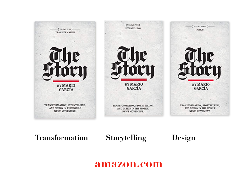
The full trilogy of The Story now available–3 books to guide you through a mobile first strategy. Whether you’re a reporter, editor, designer, publisher, corporate communicator, The Story is for you! https://amazon
Volume 1: Transformation
https://books.apple.com/us/book/the-story-volume-i/id1480169411
Volume Two: Storytelling
https://books.apple.com/us/book/the-story-volume-ii/id1484581220
Volume Three: Design
https://books.apple.com/us/book/the-story-volume-iii/id1497049918
Order the print edition of The Story, from Amazon, here:
The Story, en español:
TheMarioBlog post # 3370