TAKEAWAY: It does not happen often: the rebranding of a newspaper through a dramatic logo change. The San Diego Union Tribune has done it, with Jim Parkinson performing his usual magic.
Relaunching the Union Tribune in San Diego


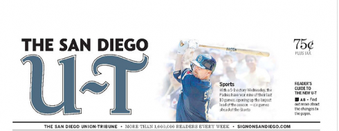
The new logo for the Union Tribune created by Jim Parkinson

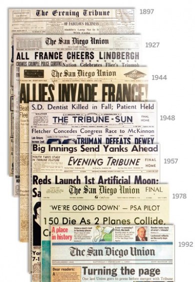
The graphic evolution of the San Diego Union’s logo through the years
One can only imagine the behind the scenes deliberations at the San Diego Union Tribune when someone proposed a major and dramatic change of the newspaper’s flag.
And, because the traditional San Diego Union Tribune has displayed an Old English style flag for many years, the change to a simple two letters, as in U-T, must have caused more than a dozen raised eyebrows. It is to the credit of the team in charge that it has happened.
Our friend Jim Parkinson was in charge of creating the new logo, so I asked him why it came about:
As usual, I started with minor tweaks to the existing logo which I had tweaked before, like about ten years ago.I was surprised when Kris Veisselman asked me to push it a lot further and even more surprised when the more radical changes were favored by the paper.
Here is how the Union Tribune’s website describes the change of the logo:
The new logo signals the ongoing evolution of our company – as we change to meet the needs of our readers. However, the history of San Diego and its newspapers is the treasured foundation of our work. Therefore, we have freshened the logo while maintaining some visual connections to those of the past.
The result is a crisp, modern and elegant logo. It will be interesting to hear how the readers reacted. Such changes go beyond what I would call a “redesign” to be more like a total relaunching of the product, to attract new audiences, to make a statement that this is a newspaper willing to move forward.
Hopefully, its readers will see it that way.
In their own words:
Read about the San Diego Union Tribune’s redesign here
http://www.signonsandiego.com/news/redesign/
TheMarioBlog post #614