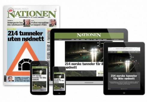
This is the weekend edition of TheMarioBlog and will be updated as needed. The next blog post is Monday, February 17.
TAKEAWAY: It’s responsive design for the Norwegian agricultural daily Nationen. We talk to Alexander Schindler, who was the lead designer on the project.

It was more than introducing the concept of responsive design for the website when Alexander Schindler and his colleagues at Infomaker Scandinavia AB began their work with Nationen, Norway’s agricultural daily newspaper. According to Alexander, before they could even tackle the proposal for responsive design, they had to deal with such issues as establishing consistency and getting the internal team to a change of mentality, as in improvising less and following a style. That has now happened.
“I saw my job in two parts,” says Alexander.“Build a stronger visual identity to the printed paper and keep as much freedom for the editorial users as possible, while at the same time maintaing a more coherent visual identity.”
How did Alexander achieve these goals?
“I ended up defining a set of article types or building blocks in sizes. A-articles take 12 columns, B-articles take 8, C-articles take 6 and D-articles take 4. In addition, the height of a B-article is the same as two D-articles placed atop each other. Every article type also has 4 different layout variations, controlling the length and style of headlines and the sizes of pictures. This way, I wanted to make sure all the different building blocks harmonized, without fighting for attention.
“It’s still very big and loud, but there are at least a few violins in there, if the editorial staff use them,” he said.”
Responsive design

I know that the notion of responsive design, while gaining momentum, is not yet universally accepted, and specifically not in Norway, a market I am familiar with. So, I asked Alexander a few questions about it:
Mario:
Whose idea was to go responsive design for this?
Alexander:
The idea to go responsive was very much a collective one. The company I work for (Infomaker) offers a responsive solution with our CMS, I wanted to do responsive, the client wanted to go down that road also.
Mario:
Was it difficult to implement?
Alexander:
We built our parts on WordPress and Bootstrap, so the responsive framework was already there, making the basic implementation pretty easy for our code wizards.
Mario:
Is responsive design now common in Norway? Catching on ?
Alexander:
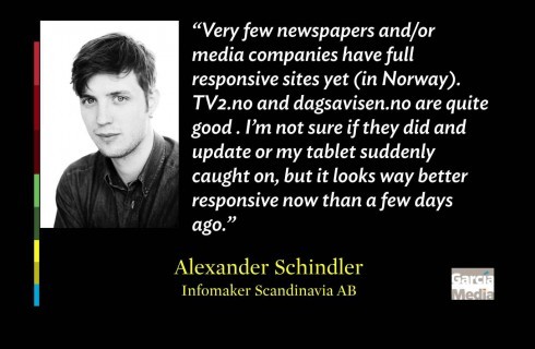
“Yes, it is catching on. But very few newspapers and/or media companies have full responsive sites yet.
“ TV2.no and dagsavisen.no are quite good ”. I’m not sure if they did and update or my tablet suddenly caught on, but it looks way better responsive now than a few days ago.”
Mario:
What would you say was the most important lesson you learned, and tip for those trying RD for the first time?
Alexander:
The most important lesson I learned through this project was to think much more structured about my design. Because it is responsive and should be coherent across different devices, every solution, every colour, every icon or button should serve a purpose and be recognizable for the user/reader. Tip: Start broad and narrow it down – and don’t be afraid to kill your darlings.
The project for Infomaker Scandinavia AB did not involve redesign of the print edition, which is under the leadership of Swedish designer Jacob Nordström.
TheMarioBlog post # 1433
—