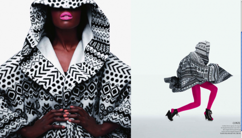
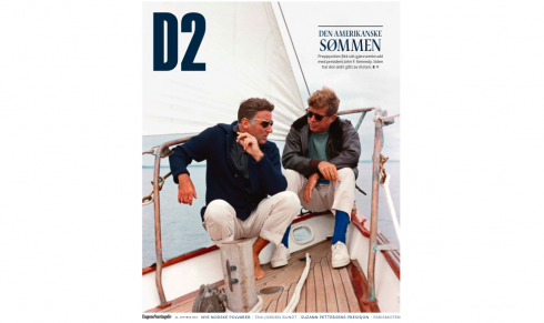
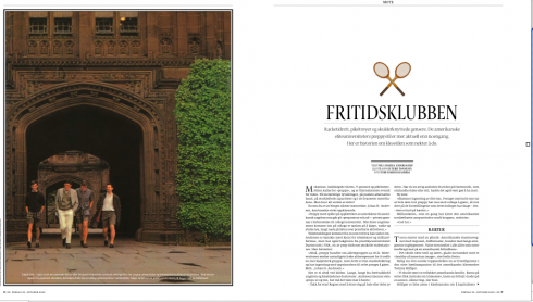
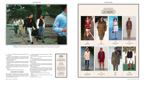
TAKEAWAY: It is printed on glossy paper, white space and large photos are the protagonists, and the stories are a mixture of style, luxury, people and the good life in Norway and beyond. Take a look at D2, the weekly magazine of the financial daily Dagens Naeringsliv
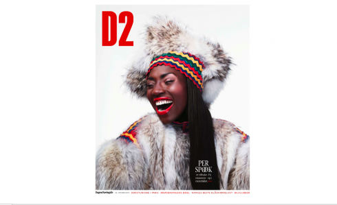
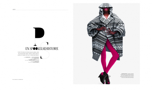
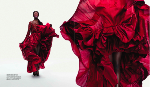
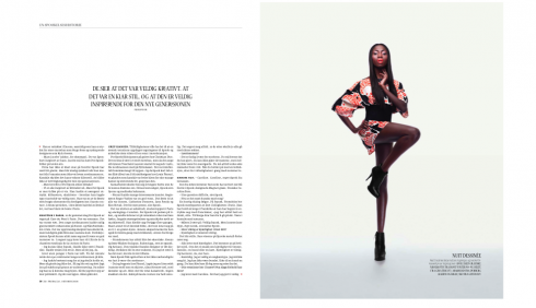
While visiting the financial daily Dagens Naeringsliv in Oslo yesterday, I had a chance to take a peek at the end of a staff meeting of the weekend magazine D2.
The staff of relatively young men and women were wrapping up their planning meeting and it is no surprise that this enthusiastic group produces one of the most visually appealing newspaper magazines I have seen in a long time.
Under the tutelage of editor Gry Egenes, a stylish woman who also handles features content for the DN, the group sets out to produce a weekly that has the look and feel of a monthly. I had to ask twice if it was a weekly, as I could not imagine such robust content, imaginative photography and superb design—-executed by art directors Anne Brun,Adam Billyeald and their team of designers—-done so consistently magnificent on a weekly basis.
“We cover a variety of subjects in D2,” Gry told me as we looked at a wall display of covers. “We can do fashion one week, but then do architecture and homes the next. And if you look at this one here of a man holding a piece of meat, it is all about people who go in the wilds of Norway and survive on whatever they can find.”
That cover story(see illustration below), by the way, was totally different from the ones with the beautiful models or scenery, and carried a headline that read: Picnic under duress.
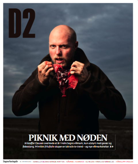
D2, the magazine of nice style, can also stop to show the less glamorous side of a picnic in the wilds of Norway
Variety, indeed, is what readers of D2 get every week. As I mentioned in my blog post yesterday, DN, the best read financial daily of Norway, uses a compact format and a style with bold headlines set in sans serif type, that many would not even remotely consider for the look of a business newspaper. But not only does DN thrive, but it is a study in contrasts, presenting this weekly D2 magazine in what could be a luxury magazine produced to sell on its own to the highest of elite readerships and upscale advertisers.
I would dare say that D2 seems even more sophisticated that its counterparts at the Financial Times (how to spend it) and the Wall Street Journal (Style).
However, the luxurious look, wtth those rivers of white space that cut through the pages like the Nordic winds of winter in Scandinavia and with the relaxed visual ambience created by the design, also allows for useful service items, such as tips, recipes, how to do it advice, which are used at every opportunity.
A visual treat, D2 is also content and marketing savvy. It is not every reader of the D2 who can probably afford the luxury items advertised——even in rich Norway!—-but if a magazine is supposed to allow you to take a break from reality and allow you to dream a little, D2 does that splendidly.
Even if your dream of the moment is a picnic in the rough somewhere in the wilds of scenic Norway.