A design that updates, makes reading easier
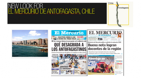
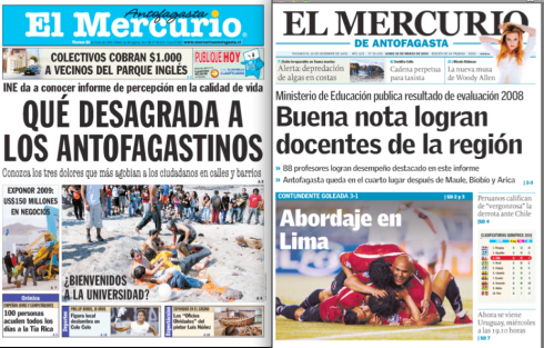
Before and after redesign front pages of El Mercurio de Antofagasta
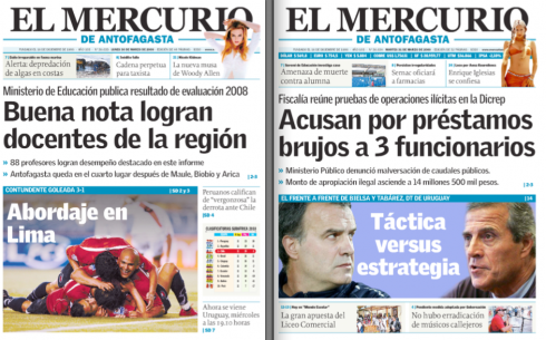
Two new front pages of El Mercurio de Antofagasta
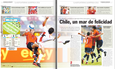
Two new sports pages of El Mercurio de Antofagasta
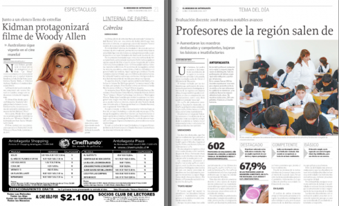
Two inside pages of El Mercurio de Antofagasta
Javier Devilat, one of my former students at The Poynter Institute for Media Studies, and with whom I have worked on the design of El Mercurio of Santiago de Chile, the parent publication to the regional El Mercurios, sends me the results of his latest work. “This is part of the work we are doing with about 20 of El Mercurio’s regional dailies,” he tells me.
If one looks at the front page of El Mercurio before and after this redesign, which was introduced March 29, one sees that the major function of this new look was to abandon a 1950s look, primary colors and a mixture of old typographic fonts, to usher in a streamlined, clean, modular and more white-space oriented design. This was accomplished. If one comes here looking for the “next” wave of design trends, he may be disappointed. There is nothing in this design that we have not seen many times before. In this case, and rightly so, the formula was to bring a sense of the contemporary for a regional newspaper that was visually stuck in the past.
In fact, the new look of El Mercurio takes it up a few nudges into a more elegant and classic look, as opposed to the down market look that prevailed. How this may change the fortunes of the newspaper, or attract new readers, is left for time to tell. If the goal of a redesign exercise is to improve the publication, to make it easier for readers to find the content, to read the stories, and to get better packaging that enhances the storytelling process, then this redesign has vastly accomplished those goals.
For now, El Mercurio’s editor, Mauro Robles, had this to say about the change:
“So far, the comments we get, both internally and outside are extremely positive. The readers were expecting a change, but not as radical as this has been. Everything is different and better.”
Designer Javier Devilat adds:
People comment that the newspaper abandoned its provincial image and can now be compared to the national dailies. Readers appreciate the use of white space, the easier navigation and are even claiming that the quality of the paper used to print the newspaper is better, cleaner, even though it was not changed at all.
El Mercurio facts at a glance
Daily circulation: Monday thru Friday—6500; Saturdays, 11500; Sundays, 23500
Redesign process: three months
Typographic scheme: Griffith Gothic and Proforma
Format: tabloid; number of typical pages, 24
Competition: La Estrella del Norte, owned by the same El Mercurio group
Most important changes carried out by the redesign:
Better navigation and more organized content throughout; typographic changes to Griffin Gothic and Proforma; dramatic changes on Page One, to highlight the fact that El Mercurio sells primarily in kiosks in the street, and, more importantly, a change of the newspaper’s logo. In the economic section, a new style for the economic indicators was created.
Rethinking your product a worthwhile effort at this time
My observation: Here is another example of a regional newspaper that thrives, connects with its readers and thinks forward——making radical changes to its content and design——while so many other major metropolitan newspapers are simply in a funk, floating from day to day in a sea of uncertainty about their future.
I have said it repeatedly—-and I know that many of my colleagues disagree——a redesign in the traditional definition of the term will not do much to advance the fortunes of a newspaper in peril due to the bad economy. However, a RETHINKING of how news is handled, packaged, and distributed across the various platforms IS, indeed, a course of action worth considering.
For more details and other work by Javier Devilat, go here: http://www.devilat.com/devilat.php?seccion=5&categoria=11
Mario Garcia Jr’s new blog post:

How ESPN Chicago sticks another nail in the newspaper coffin … and what to do about it
http://garciainteractive.com/blog/view/42/
:
To read TheRodrigoFino blog, in Spanish, go:
https://garciamedia.com/latinamerica/blog/
Rodrigo Fino to speak in Power of Print conference
Our Rodrigo Fino, president of Garcia Media Latinoamerica, will be one of the featured speakers in WAN’s Power of Print conference in Barcelona, May 27-28. Rodrigo will introduce the case study of our project in Venezuela, El Informador, a real success story in times of economic downturn.
More information about the WAN conference:
Power of Print Showcases Newspapers That Increase Readership
The Daily Sun, South Africa¹s largest selling newspaper, is at times
controversial, but its success is beyond dispute: launched in 2002, it has
a readership of nearly 5 million, or a sixth of the country¹s adult
population.
And it is doing it in print.
Fergus Sampson, who helped build it, will explain how newspapers in print
can grow, even in the digital age, at the upcoming Power of Print
conference, a new event organised by the World Association of Newspapers in
Barcelona, Spain, on 27 and 28 May next. Full details can be found at
http://www.wan-press.org/powerofprint2009/home.php
The Power of Print conference, on 27 and 28 May, will be followed by the
World Newspaper Advertising Conference, on the 28th and 29th May, at the
Hotel Rey Juan Carlos I in the heart of Barcelona. Full details of the Power
of Print conference can be found at
http://www.wan-press.org/powerofprint2009/home.php . Details of the
Advertising conference can be found at
http://www.wan-press.org/advertising2009/home.php
Inquiries to: Larry Kilman, Director of Communications, WAN, 7 rue Geoffroy
St Hilaire, 75005 Paris France. Tel: +33 1 47 42 85 00. Fax: +33 1 47 42 49
48. Mobile: +33 6 10 28 97 36. E-mail: lkilman@wan.asso.fr
TheMarioBlog posting #240