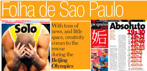


According to Marcio Freitas, the challenge for him and his colleagues at Folha de Sao Paulo was an incredible excess of news, and very small space in which to present it.
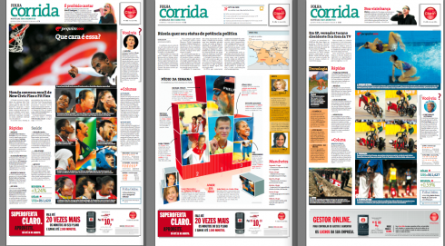
As a result, he says, “we created a constant: briefs. However, this did not keep us from using big and inviting photos.”
Folha’s pages also show great emphasis on the summaries that accompany each article, as well as the many colors used, and designs with plenty of movement. White space is used judiciously here, but it helps the overall design when used.
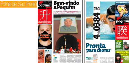
Notice that the cover of the special Olympic supplement utilizes an icon emblematic of Chinese culture, which, says Marcio, gave the publication a special feel and personality. This logo treatment allows it to be moved anywhere on the page, allowing the designers great flexibility.
Overall, interesting use of type, photos, imposing headlines. The Folha team, with whom I have had the pleasure and honor of working, is Brazilian creativity at its best.
Their enthusiasm, sense of collegiality and the fun they have when producing the daily pages of the newspaper allow them to make the best of even difficult situations and deadlines, as was the case with daily coverage of the Olympics.
TheMarioBlog posting #78