
Who says you need to embark into a total redesign when perhaps all you need is a rethinking of your front page?
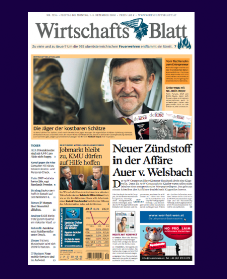
When we at Garcia Media were first approached to work with the team of the Wirtschafts Blatt, the Austrian financial daily, the project involved primarily a series of workshops to integrate the print and online operations, a project on which are still collaborating. However, from the start, editor in chief, Wolfgang Unterhuber, expressed to me a desire to do something about Page One. “it is not a bad front page,’ he told me in that first meeting, “but we know it could be better, more colorful, have greater impact.”
So, together with art director Jan Schwieger, who had created the original design of the WB, we again conducted a series of workshops to address issues pertaining to page one, in a variety of possible scenarios. At the end, we ended up with better navigation, an increase in the use of color, and even more headlines on the front page. The first front page with the new look premiered Dec. 4 and we show it here.
Here is what members of the team had to say about the launch of this new front page:
From Wolfgang Unterhuber, editor in chief:
“You feel, there is much more dynamics to the new Page 1. You have far more possibilities and flexibility by creating it. The new layout allows us today, to open the newspaper with a story of deluxe, our monthly magazine. This story and its layout on page 1, will keep the newspaper fresh for four days. (Friday, Weekend, and Monday is holiday in Austria). Ih addition, we present more headlines, a clearer navigational structure, and, therefore ,reach a higher information content on Page 1 than we did in the past. This new Page 1 is the answer of Print to a new dynamic we face coming from the digital world.”
From Dr. Hans Gasser, CEO:
“It is a perfect new face for our circulation-best-seller, the Friday-weekend-edition of WirtschaftsBlatt.”
Refreshingly full of surprises: TheDailyBeast.com

Maybe Reader’s Digest had the original idea: compiling good pieces from a variety of sources. It still does, and one always finds at least one story he did not see anywhere before. In addition, the editors of RD always knew how to write that headline that would pull you into the story, whether you cared about the topic or not. Try: The Disease You May Have and Not Know, for example.
Now, Tina Brown resurfaces with a vibrant, stylish online product, http://www.thedailybeast.com/, which is full of surprises. The headlines are well written, and are a cross between the typical newspaper headlines and the more provocative style of magazines. In today’s edition: Caroline to Senate?, Castro to Obama: Let’s Talk, How I Got Myself a Sugar Daddy (I confess I read at least the summary of this one, which is one of the good things about this site. If you wish to read an entire piece, it is there; if, however, you are happy with just the intro, it is also there, and quite meaty. No, I did not have to read the entire article about the young, “classy” woman from Pennsylvania with her sugar daddies).
The design of the site is stylish, easy to navigate, and full of miniature photos that act as sort of a visual alphabet to move the eye around a site that is heavily populated with people stories.
Perhaps I am the last person to discover TheDailyBeast, but, just in case, I am not, I pass the information to you. It is a good read.
it is, indeed, the kind of stuff that printed newspapers should take a look at and study carefully. My favorite: The Daily Beast’s “Big Fat Story,” which takes one major story, such as today’s The Big Three on the Hill, about the potential bailout of the carmakers. It surrounds the story with a complete gallery of photos, pop-up pull quotes, and links to more coverage.
It is all that the “long story” can be, without announcing that it is long and hard to follow, as is the case in so many printed newspapers.

To read TheRodrigoFino blog, in Spanish, go:
https://garciamedia.com/latinamerica/blog/
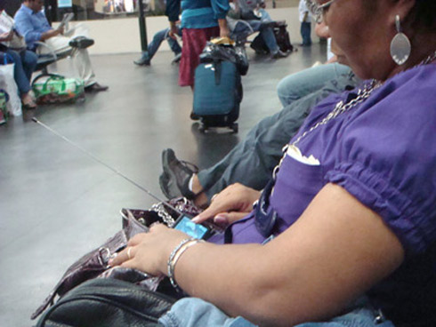
Today, Rodrigo Fino writes about small screens and how they seem to dominate our world.

A woman watching television on her mobile telephone screen in Manaos, Brasil


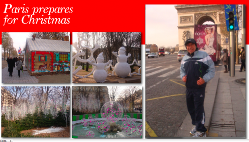
When my first meeting got pushed back two hours today, I saw this as a window of running opportunity, and, in Paris, this is an incredibly window, with the best view running shoes can ever hope for. Out I went, and, to my delight, saw Paris sprucing up for Christmas, one lamp post at a time; workers were putting up decorations all along the Champs D’Elysees, which, by the way, is already lined up with small white kiosks, all identical, forming a Christmas market with the aroma of roasted chestnuts, warm wine, and every possible arts and craft item. Yes, it is Paris, so you can get that Edith Piaf CD with her signature song, La Vie En Rose, as well as the CD by France’s own singing first lady, Carla Bruni Sarkozy.The image here gives you glimpses of what I saw during my one-hour run thru the center of this beautiful city. Yes, 4 degrees today.
TheMarioBlog posting #149