TAKEAWAY: WirtschaftsBlatt is one of Austria’s leading newspapers. Its managers have concentrated the past year to organize the flow of information across various platforms; it has gone aggressively after subscribers for its printed edition, using online as a major channel to do so. It is seeing results. PLUS: Pure Design download: Real Simple magazine, a case study UPDATE: Former Real Simple art director, Bob Newman, comments on state of the magazine’s design
Austrian financial daily uses brand power
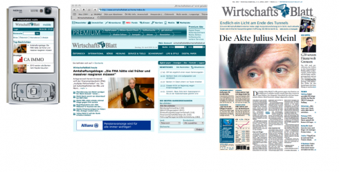
How information travels at the WirtschaftsBlatt: mobile, online, print
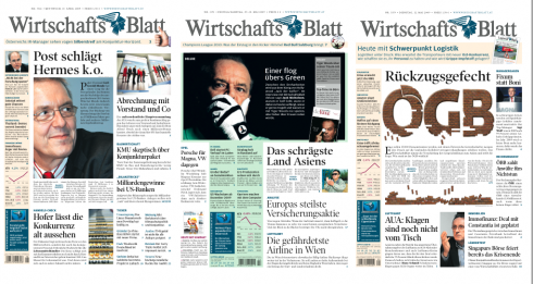
Three recent front pages from the WirtschaftsBlatt
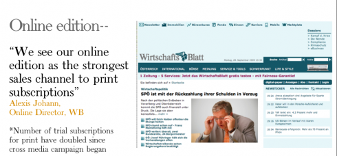
Online edition of the WirtschaftsBlatt: used to bring in subscribers to the print edition
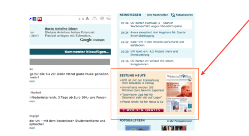
This element appears on website daily, inviting users to try a three-week free subscription to the WB print edition
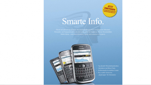
Promotion the WirtschaftsBlatt’s mobile information services
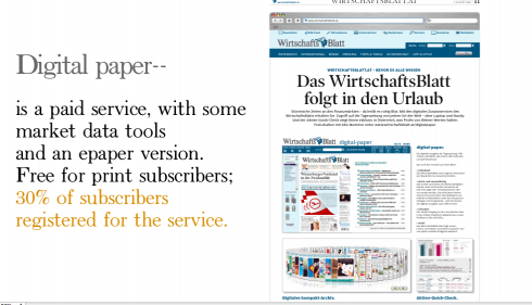
The Digital Paper: is a paid-for service that publishes market data tools plus an E-paper version. It is free for print subscribers, and 30% of all subscribers are registered for this service
Sometimes gaining new readers is an effort that involves ONE subscriber a a time. In Austria, the financial daily WirtschaftsBlatt , published in Vienna, is an example of a media house where management first studied the possibilities to create a more seamless print to online to mobile model, then carefully monitored how such a model could bring in more subscriptions for both, the printed edition, as well as its mobile and other digital offerings.
“We have done it slowly, but with success,” writes me Alexis Johann, WB’s online manager, and a person with whom I have worked closely as we conducted a series of in house workshops with the print/online/business teams to bring about what has become a success story of its own.
I believe strongly that the WirtschaftsBlatt model is one worthy of observation and study.
Our workshops at the WirtschaftsBlatt were organized about three centerpieces:
1. Making the strategies for “the path of the story” clear to all; from alerts to reports to what appears online and what the printed newspaper publishes.
2. Creating some effective methods to bring subscribers to print through the online offerings.
3. Promoting the brand across various platforms.
Today, one year after the start of our workshops, the WirtschaftsBlatt thrives, and it is one example of a newspaper that manages to attract subscribers to its print edition via online.
“We use our online edition as a main channel to generate subscriptions for print. People who like the content, order à free trial subscription and the number of such trial subscriptions has doubled to about 700-1000/month due to the cross media efforts we conducted together with you and Garcia Media.”
WB’s general manager, Dr. Hans Gasser, agrees:
“Our success shows that it is very possible to use the brand for cross media fertilization, to get users from one medium to the other. It does require coordination and a good marketing strategic plan. It it about letting things evolve through time and a coordinated effort. Not something you realize overnight.”
In my own experience with the WirtschaftsBlatt I saw how the editorial team progressed from being a bit remote towards online, to warming up voluntarily and eventually start a process of integrating ideas and the flow of news in an organic manner, leading to the good example of cross media planning and thinking that is obvious today—-and which lead to the great success WirtschaftsBlatt shows in attracting new readers to the printed edition.
The process is not in any way completed yet. As Alexis Johann tells it, the company continues to create new products, such as the Digital Newspaper, with paid content for some of its offerings.
“The model is one of charging for some of our valuable content. Perhaps there is no such thing as a free lunch anymore, not just for us, but for media generally.”
See the illustrations above to get a sense of how the WirtschaftsBlatt
uses its brand across platforms. In the case of the WB, management committed to create the ultimate information tool and, most importantly, a complete fusion of online/print organization in the newsroom, making this a case study of what is possible to achieve.
Pure Design download: Case Study of Real Simple Magazine
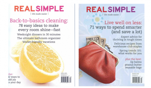
Recent Real Simple covers: simplifying your life, simplifying your thinking, teaching design lessons along the way
I believe that with Real Simple, the real job of this beautifully designed magazine is fulfilled the moment one gets a copy and flips through its pages. Instantly, relaxation sets in.
Bob Newman’s design of Real Simple holds up very well. There have been tweaks here and there since we profiled this case study in Pure Design, but the basic elements still shine through:
tons of white space (a requirement for a publication that attempts to simplify its readers’ lives by first uncluttering everything in sight) those pastel colors that are soothing and never too overwhelming, the minimalist approach to typography and page architecture. Real Simple’s design in print lives up to its name.
Because Real Simple’s design is based on the organic properties of its content, this is a design that will never go out of style.
Just like that: really simple, easy, and fulfilling its job : indeed, we can all read the article on organizing one’s desk’s drawers and think that he, too, can do it before the next edition of Real Simple comes out, which we all know well enough we won’t do. Real Simple does the next thing that good magazines of its kind do: empower you to think that, you, too can have a real simple life.
That, friends, is my idea of content that seduces.
This month’s headlines are typical of Real Simple’s fare which we enjoy so much:
The forever HOW story:
How to Apply Makeup (and Get Out the Door) in Just 5 Minutes
The NUMBERS story, Real Simple’s forté; does anyone do it better?:
30 Ways to Decorate With Candles
6 Can’t-Go-Wrong Paint Colors
Six Steps to Painting a Room
The SAVE YOUR MONEY story:
$100 Fall Outfits: Weekend
The GET DOWN TO BUSINESS organizing story:
Show Us Your Mess
(this one, for those with courage, invites readers to show the messiest part of the house, for Real Simple consultants to do the make over. Interactive was never more humiliatingly fun!)
Bob Newman on Real Simple’s design then, now and to come
I contacted Bob Newman today to see if he would give us a little perspective on Real Simple. He had some news about Real Simple as well: Newman believes that Real Simple will be debuting a redesign with their upcoming issue. Janet Froelich, late of The New York Times Magazine is now their creative director, and has been directing the redesign..
One of the unique things about the design of Real SImple is that it’s no longer anyone’s “design.” The launch design was done by Robert Valentine, who was the original creative director. He left with the founding editor after three issues, but now even after 5 or 6 creative directors, the magazine still has his design DNA. It’s reminiscent of Vibe, in the way that Gary Koepke did the distinctive launch, and each successive design director tweaked and developed it and made it their own, yet kept the fonts and essential essence of the original. It’s the same thing with Real Simple. By my count there were six CDs after Valentine, and while each improved and streamlined, they also each kept the basic fonts and the concept of simplicity, organization, and essentialness. It will be interesting to me how they build on this tradition. But the essence of the design has always been to provide an engaging, tactile design experience for the reader, to create a visual environment that feels “simple” and achievable, calming and relaxing, beautiful and serviceable all at the same time.
Real Simple website: not so simple?
As much as I like the design of Real Simple for its printed product, I am less enthused about its current website. I found it less powerful than the print version, with intrusive pop up windows that get on the way of my navigating through the site. I miss a full home page with all the excitement that the content of this forever young magazine provides. Here is a classic example of a publication where the printed table of contents is more navigation friendly than its own website. Ironically for Real Simple, the website is anything but simple.
WAN/IFRA conference in Prague
I am honored to be one of the speakers this week at the WAN/IFRA conference, The 2015 Newsroom: High Standards with Low-Cost Solutions, in Prague, Czech Republic, Oct. 1-2.
I will keynote a segment of the conference titled “Visual journalism: the rise of non-narrative news”., a discussion about the industry today, the importance of convergence as a state of mind in the newsroom, and case studies of recent projects dealing with print/online/mobile.
By the way, the Wirtschafts Blatt case study, will be one I will present at this conference, with more detail.
For more information: http://www.wan-press.org/article18218.html
http://www.wan-press.org/article18218.html

Who is Jacky?
Jacky belongs to Frank Deville. The Luxembourg-based pooch is an “avid reader” of the German newspaper, Bild Am Sonntag. Every Sunday Jacky picks stories and interesting graphics in Bild Am Sonntag , the German newspaper.

Follow me at www.twitter.com/tweetsbydesign
Follow the Marios

Two Marios. Two Views.
Follow Mario Jr. and his blog about media analysis, web design and assorted topics related to the current state of our industry.
http://garciainteractive.com/
Visit Mario Sr. daily here, or through TweetsByDesign (www.twitter.com/tweetsbydesign)
In Spanish daily: The Rodrigo Fino blog
:
To read TheRodrigoFino blog, in Spanish, go:
https://garciamedia.com/latinamerica/blog/
TheMarioBlog post #381