TAKEAWAY: Melbourne’s The Age today publishes a 12-page (broadsheet) lift-out, marking six months since the horrific Black Saturday fires that killed 173 people last summer. Shows what can be done through team work. PLUS: Pure Design’s installment—Page Architecture
The making of a special supplement
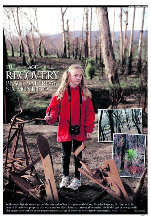
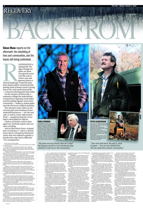
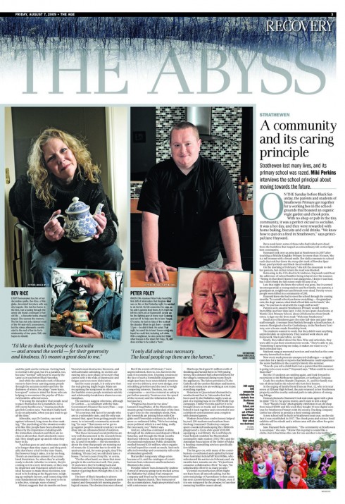
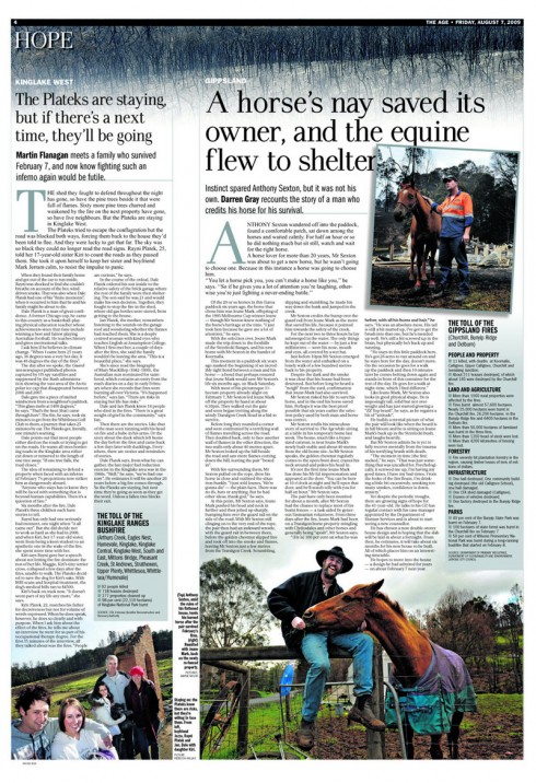
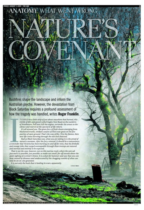
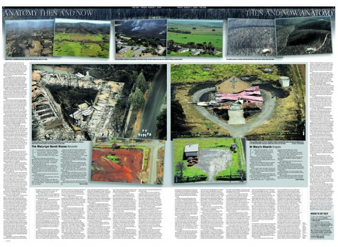
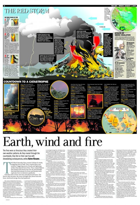
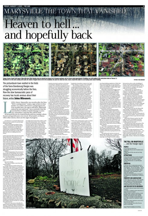
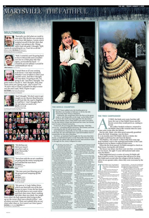
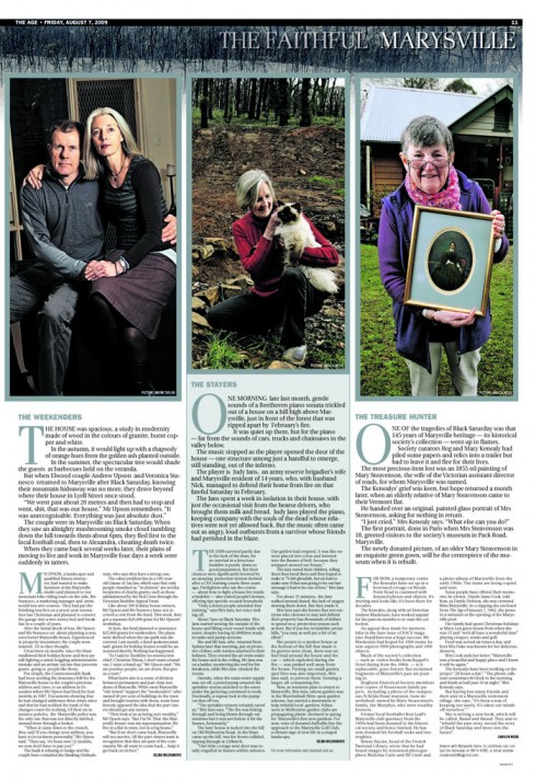
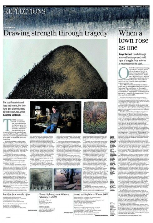
Steve Foley, The Age’s Deputy Editor, sends us pages of the special supplement published today, which represent months of planning an in-depth examination of the state’s fire and how it affected communities ; the report also follows the lives transformed by Australia’s worst natural disaster and how they have fared in the aftermath. It is an impressive piece of journalism, complete with great visual journalism and a robust online multimedia component
“Gaining the Editor-in-Chief Paul Ramadge’s support for this massive enterprise was critical to its success. As you might expect, it has made a big impact here,” Foley writes me.
It seems exceedingly rare, from reading industry blogs, that newspapers today would devote so much space (sans ads) to one subject (the last time we gave one topic 12 cleanskins was the inauguration of Obama in January). But the epic scale of this disaster, and its continuing fallout, warranted the investment, together with a superb multimedia package.
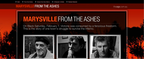
Multi media package is part of The Age’s special report on the February 7 fires
Foley reports that he is especially proud of the result, which was a huge team effort, but “I thought followers of newspaper design may like to see how my colleague and collaborator, Art Director Bill Farr, conceived the look.
Dynamic Age photography, a hallmark of our coverage in February, features prominently. We used the standard Age font, Pax, but adopted a new page structure to distinguish this separate “B” section from the rest of the paper. And we took full advantage of our presses to print double page hybrids and a panoramic centrespread.
It is refreshing, indeed, to see that newspaper editors can focus to do this type of reporting, then combine with the design unit of the newspaper to make the words and photos dance on the page.
When we see examples such as this special report from The Age, we are reminded of what newspapers can do so well——bringing us to the conclusion that print should,indeed, be eternal.
WAN’s World Trends 2009 Report

The 2009 edition of World Press Trends from WAN/IFRA is now available. I always like to review this report for its complete information on global circulation, advertising and online trends in our industry. All countries in the world where daily newspapers are published are covered in the publication.
This year the WAN/IFRA folks have decided to publish a print version but only make the book available on pdf.
Those interested go:
http://www.wan-press.org/forms/wpt2009.html
Page Architecture: using space as part of the overall design
Once the story structures have been created, and the typographic components chosen, then the next step for the designer is to take a look at the page, create various grids, and then see how column widths, white space and distance between elements will be orchestratred and built into templates. Today’s Pure Design fable shows you the way.
Open publication – Free publishing – More websites
Jacky was a hit on Sunday

Jacky captivated many of you, so he will be back next Sunday
Frank Deville’s dog, Jacky, made a cameo appearance in this blog yesterday (see above), and we joked that the Luxembourg-based pooch was an avid reader of the German newspaper, Bild Am Sonntag. Well, many of you wrote to say that you found this dog exceptionally cute and smart. So, by popular demand, Jacky will be back Sunday to tell us which Bild Am Sonntag story he sniffed as the best. Stay tuned for more of Jacky, who apparently prefers his newspaper “in print” and definitely NOT online.
Download entire first section of Pure Design: Words
Now that I have fully presented the first of six sections of Pure Design on TheMarioBlog, I am offering the entire initial section, “Words,” available for download—all 33 pages of it. This may be useful for those of you saving or printing out Pure Design and will be done following each of the remaining sections. At the end of our journey through words, type, layout, color, pictures, and process, I will publish the entirety of Pure Design in one file.
Follow me at www.twitter.com/tweetsbydesign
Follow the Marios

Two Marios. Two Views.
Follow Mario Jr. and his blog about media analysis, web design and assorted topics related to the current state of our industry.
http://garciainteractive.com/
Visit Mario Sr. daily here, or through TweetsByDesign (www.twitter.com/tweetsbydesign)
In Spanish daily: The Rodrigo Fino blog
:
To read TheRodrigoFino blog, in Spanish, go:
https://garciamedia.com/latinamerica/blog/
TheMarioBlog posting #326