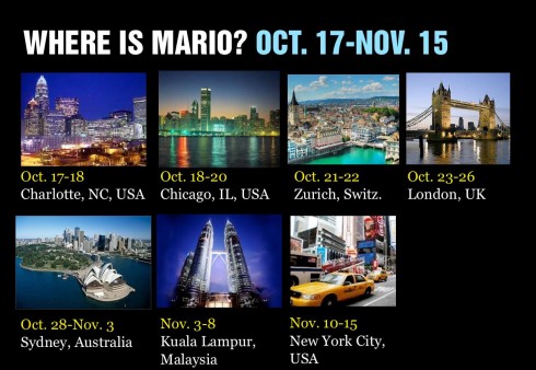
An important sign of the times

Purchase the book on the iBookstore
“iPad Design Lab” trailer on Vimeo.
The EPUB version of book is HERE:
Now available: The EPUB version of iPad Design Lab: Storytelling in the Age of the Tablet, ready for download via Amazon.com for Kindle:
http://tinyurl.com/8u99txw.
Read the Society of Publication Designers’ review of The iPad Design Lab here:
http://www.spd.org/2012/10/must-read-ipad-design-lab.php
Read the review from Dr. Pegie Stark Adam in her blog
http://pegiestarkadam.com/
TAKEAWAY: Getting traditional print editors to think of enhancing stories beyond words is not easy. Reminders help. ALSO: Changes in the redesign of USA Today AND: This The Daily Planet does not employ Clark Kent!
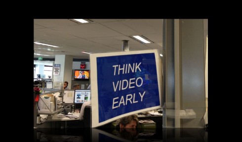
Prominent sign in the newsroom of the Sydney Morning Herald
This week, while visiting the newsroom of the Sydney Morning Herald in Australia, I am happy to see signs all over the newsroom of this major metropolitan newspaper reminding editors to think video early.
Some of the signs simply read: Think video.
While these are important messages for every editor of a newspaper to keep in mind, I am surprised we don’t see them posted around newsrooms. Indeed, many editors DO NOT think video, it is not in their repertoire, or their DNA. It should be.
Here is a clever way to make sure that storytelling is enhanced beyond the traditional words.
I would add: Think Audio. Think Pop-Ups.
USA Today: type gets darker, larger
It has been a month since all the excitement with covered the event extensively in TheMarioBlog, and now the follow up:
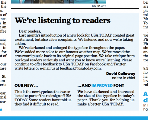
In a letter to readers this week, David Callaway, editor in chief, explains that based on a few complaints since the introduction of the new look, USA Today is making the body type darker and larger throughout the newspaper.
At the same time, the crossword puzzle will return to its original place.
Why am I not surprised?
Because these are TWO constants in a majority of the newspaper redesigns with which I have been involved:
1.Body type is usually the number one reason for complaints—-make it larger, they always say, even when you did not touch the size of the type!
2.Be careful where you put the crossword puzzle, the horoscope and the comic strips, as change is NOT welcome in these areas.
The Daily Planet, without Superman
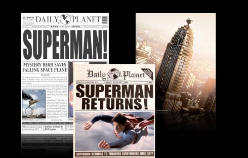
The iconic fictional newspaper The Daily Planet always holds a special fascination, especially for Superman comics fans
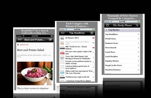
Now a Hong Kong based firm comes up with The Daily Planet a news aggregator app—-with plenty of content offerings, but lacking in design appeal
Mention The Daily Planet and, at least for people of my generation, the image that springs up in your mind is that of an old fashioned broadsheet fictional newspaper front page telling tall tales of superhero Superman saving the world. The Planet’s star team was made up of Clark Kent, Lois Lane and Jimmy Olsen.
The name is iconic enough that it continues to tempt contemporary types to use it, and so now, from Hong Kong comesThe Daily Planet, an iPhone, iPad app which brings you news updates from a variety of sources, grouped by such categories as world news, business news, local weather, people in the news, world in pictures.
The sources are the usual ones: FT, BBC, CNN, New York Times, USA Today and CBS News, among others.
With so many such news apps available, the question is, does the world need another one?
I asked Mike Tanovic, who wrote me initially to introduce me to The Daily Planet:
” News category, there are many well-known, great apps, such as Pulse, Flipboard, Newsify etc. Compared to these apps, we are targeting a different user base. All those apps have either limited or not-so-convenient way of selecting/adding news sources. Most users will read the news in default setting, and they are mostly “light readings” with interesting pictures. Although these apps are for both iPhones and iPads, we picture their typical users sitting comfortably at home using iPad to browse news leisurely”
Tanovic feels that there is room for The Daily Planet also because it is a simple, and not over-designed app. In my view, perhaps this app could use a little more art directing, since I am convinced that the two things that are important for the scanners who come to these apps are, in addition to solid content providers, easy navigation and attractive design.
There are tons of information on the web, and our goal was to allow users to get the news that they want quickly and easily. We made selecting news sources as easy as possible, and there is highlighting feature to add color to favorite news sources so that their articles will stand out from the list.
We target users on the go, who want quick news updates using their iPhones, in a bus, on their way to work, in the elevator or whenever they can find 5 mins. And they will flip through headlines from the most respected news sources around the world, they will CHOOSE what they want to read from the news sources they like. In that regards, we believe our app is fairly unique.
The app is free and ad supported.
One feature of The Daily Planet app is MapTrac under “the Planet Local” section.
“It’s something we wondered if it really belonged to our news app, but decided to add it. However users seems to like it a lot. It’s a local search function so contents will depend on where you live, but users in NYC or SF mostly find the search results quite good. They find in very useful when traveling to towns unfamiliar to them within the US,“Tanovic said.
Here we have an example that lends itself to the question: is plain white bread bare bones design, as we see in The Daily Planet’s app, the way to go? Or, are users so visually oriented that they want their apps to be more like 9-grain wheat bread?
My own question about this app, and others like it, goes beyond whether they are needed, but whether they can take simplicity to such extremes that they are not aesthetically sophisticated enough to appeal to an audience that does care about the role that design plays.
Your views?
Pop up of the day
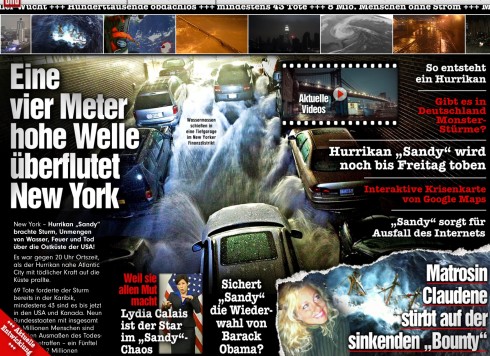
Here is an interesting composite from Germany’s Bild about Superstorm Sandy and its deadly trajectory through the United States this week.
Headline reads: A 13-feet high wave inundated New York
