Here is a wonderful example of using the techniques of linear, mobile storytelling for a breaking news story.
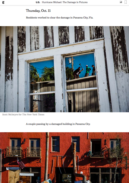
The New York Times excels in the presentation of this “photo reportage” about the devastating monster Hurricane Michael, which hit the Panhandle of Florida almost as a Category 5 storm, leaving a deadly and destructive trace in its path.
This is how the story opens, as seen on my laptop screen.
Notice that the headline is descriptive: The Damage in Pictures. This is important to illustrate a key element of linear storytelling for mobile: readers can’t see the full presentation on that first screen, so editors need to tell us what they are going to show us, in this case, pictures.

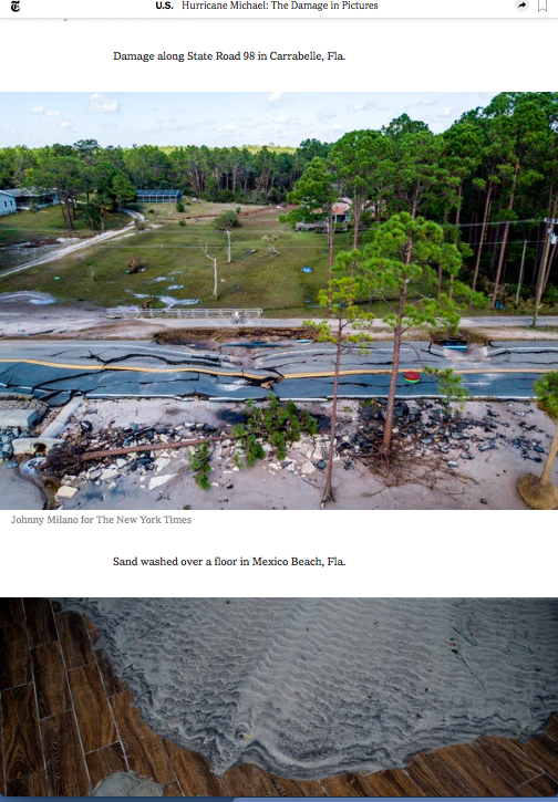
Here is how the story shows lineally as seen on your smartphone.
There are no captions, except for the first photo. The narrative drives the content of the photos. Take a look!


Creative way to present this story

Here is a New York Times story that was made in mobile linear storytelling heaven. Notice the way text and images flow in such an intuitive way that it is as if the Times is having a What’s App or text conversation with you directly. Bravo for this textbook example!
Going pink for a cause
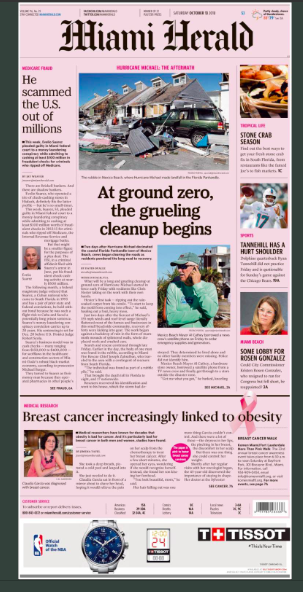
The Miami Herald appeared in pink last week to celebrate October Breast Cancer Awareness Month.

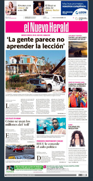
And so did its sister publication, el Nuevo Herald, the Spanish edition, trading its blue nameplate for a bright pink one.

TheMarioBlog post #2928