
TAKEAWAY: It is a new weekly magazine for The Huffington Post: Huffington is easy to navigate, easy to look at and full of highlights that make it a great case study for all of students of news apps.
And now Huffington magazine in your iPad: take a look
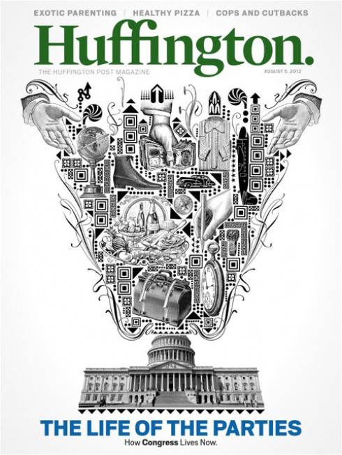
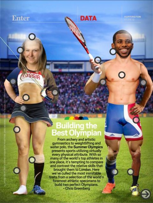
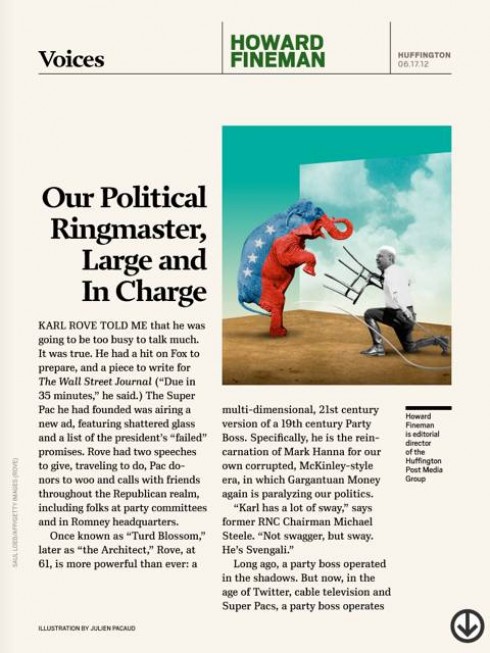
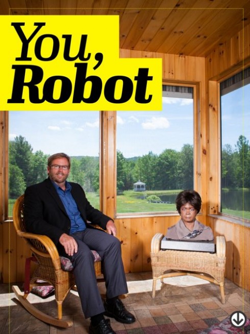
How appropriately timely to download the new Huffington magazine app. (a thing of beauty for sure) the same week that we have been discussing the fate of newsmagazines.
And on the same day, that , by coincidence, I happen to have lunch with a client pondering how to take a struggling weekly special interest publication from print to digital.
Along comes issue #10 of the new Huffington., the weekly magazine by the editors of The Huffington Post.
I have now had a chance to look at a couple of editions, and it is a must see (free download) for any student of news apps, which is all of us.
Josh Klenert, head of the UX & Design for The Huffington Post Media Group, has been the chief architect of the design.
Things that stand out:
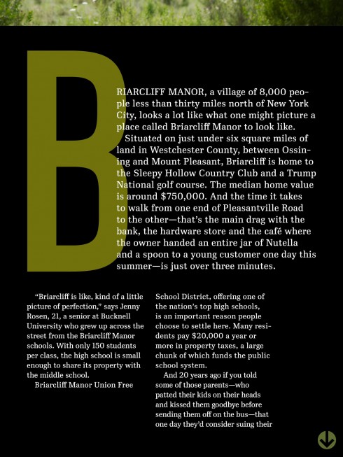
1. This is a vertical mode only app, but it fits perfectly well into that position, and one does not miss the presence of a landscape at all.
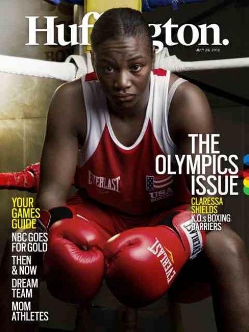
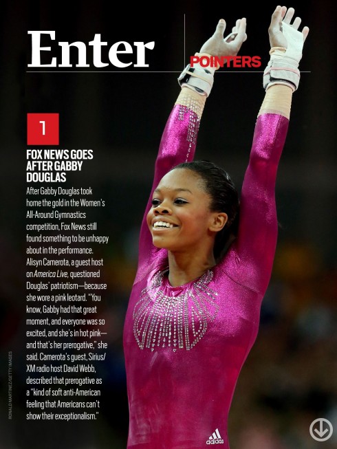
2. Navigation is at its best here: Touch the icon at the top right of the screen and you get a full carrousel nav of every screen in the magazine. But for those who like a full horizontal nav, just tap the bottom portion of the screen. I find this to be one of the highlights of this app. Full accessibility, in an attractive display.
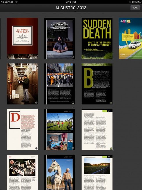
Top navigator
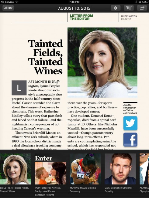
Bottom navigator
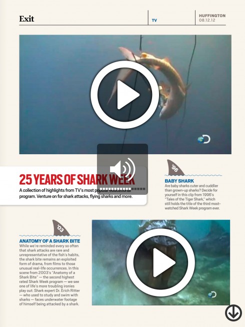
3. The look & feel has the freshness and appeal that you would find in an elite magazine, but there is nothing static here. For example, a story about sharks includes video clips, with 25 years of shark week: a collection of highlights from TV, or the anatomy of a shark bite. This is where the tablet edition of a magazine serves users best.

4. A highlight in the area of sharing/usability: there is a bubble at the end of each article, tap it and a window opens up for comments to be posted.
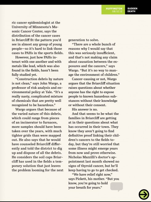
Bubble at the bottom of each article allows for instant comment posting
5. The advertising is well presented, too: the Toyota ads in the issue I reviewed offer good storytelling as well and allow for interactivity.

Josh Klenert discusses the making of Huffington.
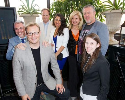
Here is the team. From left: Jeremy LaCroix, Josh Klenert, Tim O’Brien, Andrea Nasca, Arianna Huffington, David Robinson, Anna Dickson
As soon as I downloaded and viewed an issue of Huffington I knew I wanted to contact Josh to get some insights about the new app. Here are our exchanges:
Mario:
Josh, this is a great app . How did it come about?
Josh:
The original intent was to create a better vehicle for HuffPosts’ original long form journalism. It’s exclusively on the iPad now and doing pretty well. We’re on issue #10, it’s been getting about 4 stars in the app store and remains in the top 10 on the newsstand.
Mario:
Why the decision to make this app as a vertical mode only app?
Josh:
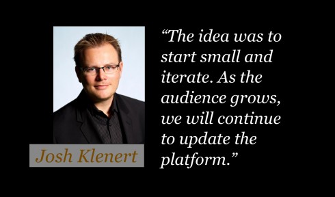
We felt most people read magazines in portrait so lets start there. The idea was to start small and iterate.As the audience grows, we will continue to update the platform. We added an easter egg of “live text” into the app. We’re playing with a few ways to allow for live text to dynamically work for landscape rather than making designers do double duty on design & production.
Mario:
I particularly like the navigation here. Any thoughts?
Josh:
We wanted the navigation to be very simple. No instructions required!
Mario:
Clever to put that bubble for comments at the end of each piece. It makes it easy for someone to just hit that and offer a comment. I imagine this is a favorite with users.
Josh:
Commenting is such a vital part of the DNA of the Huffington Post, we felt it was better to spend the time to get that into the app for launch. In lieu of a cute end slug, tap the comment bubble at the end of stories to continue the conversation with other readers.
Mario:
How was the process from start to finish?
Josh:
I went to Palo Alto in November to meet & whiteboard with Timothy L. O’Brien, Jeremy LaCroix and David Robinson. By Christmas we had a full issue and dozens of covers prototyped. In January we presented to Arianna and Tim Armstrong. With their approval we built up a small dream team of magazine designers while the tech team built the app. We released Huffington in the App Store on June 14th. It debuted as a #1 News app, #1 Newsstand app and #15 of all free iPad apps.
Mario:
Tell me about your typographic choices for the app?
Josh:
Typographically, we started with a clean slate. We worked with the Font Bureau to get a few beautiful and robust font families that would allow us to use “live text” in addition to the standard “burned in” text. Our sans serif is Scout. It’s used on page and dynamically in the app. Our body text is Ibis—drawn with digital screens in mind.
Watch video of Huffington mag app
To download Huffington. go here:
http://itunes.apple.com/us/app/huffington/id517151550?mt=8
Of related interest:
Huffington Post shakes up news video space with online video channel
https://mail.google.com/mail/u/0/?shva=1#inbox/13925dbf976ba8f7
Highlight:
Verizon and Cadillac will sponsor the Huffington Post’s new online video news show, spending at least $1 million each, says publisher Janet Balis.
Of special interest today
New stats show iPad surging again as Kindle Fire, Nook Tablet fall
finance.yahoo.com/news/stats-show-ipad-surging-again-143246155.html
First paragraph:
New stats from market research firm IHS iSuppli show Apple’s iPad surging ahead of other media tablets to gain a 70 percent market share in the second quarter of 2012.
SPD: Speaker Series Begins with “News You Can Use”

(Joe Zeff Design Illustration, courtesy of SPD)
Tickets are now available for the Society of Publication Designers’ first Speaker Series event of the fall, “News You Can Use,” scheduled Sept. 10.
For more information:
http://www.spd.org/2012/08/speaker-series-begins-with-new.php
SND Scandinavia Space 2012 conference
Still time to get a spot to attend the SNDS conference in Copenhagen, Sept. 27-29;
For more information:
SNDS workshop ever. Read all about SPACE 2012 here:
The iPad Design Lab: Storytelling in the Age of the Tablet
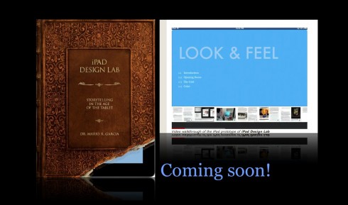
Video walkthrough of the iPad prototype of iPad Design Lab

Mario Garcia’s upcoming speaking engagements:

WAN-IFRA World Editors Forum, Kiev, Ukraine, Sept. 2-5
http://www.wan-ifra.org/events/64th-world-newspaper-congress-19th-world-editors-forum
Cumbre Mundial de Diseño en Prensa 2012: Mexico City; September 24-26
http://www.cmdprensa.com/mx2012/
SND (Society of News Design) Cleveland; Oct. 11-13
http://cle.snd.org/