Nothing stays the same.
Not the ties we wear, the length of skirts or your hair. And, I may add, not the price of gasoline, chicken or milk!
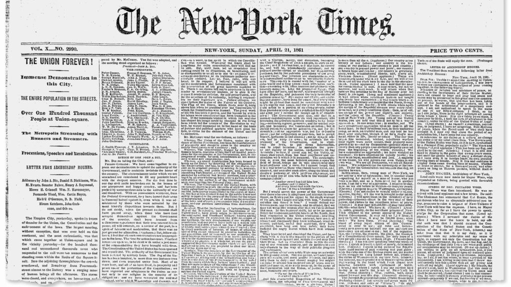
The front pages of newspapers also undergo frequent changes in the way they look. I was putting together a lecture on the role of print for my Columbia class Monday, and accidentally ran into this first Sunday edition of The New York Times, published Sept.18, 1851. It is a text-driven page with barely visible headlines and no resemblance to how today’s Sunday front pages for the Times look like:
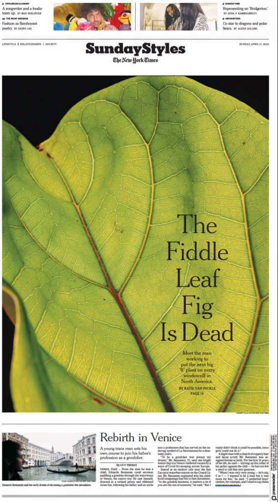
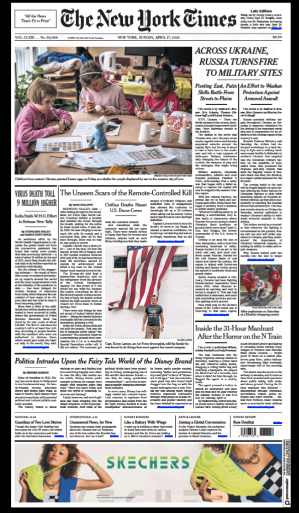
Now take a look at the current Sunday front page (April 17, 2022): color photography, newsy but modular configurations and, don’t ignore that six-column ad at the bottom of the page. It is not 1851 anymore!
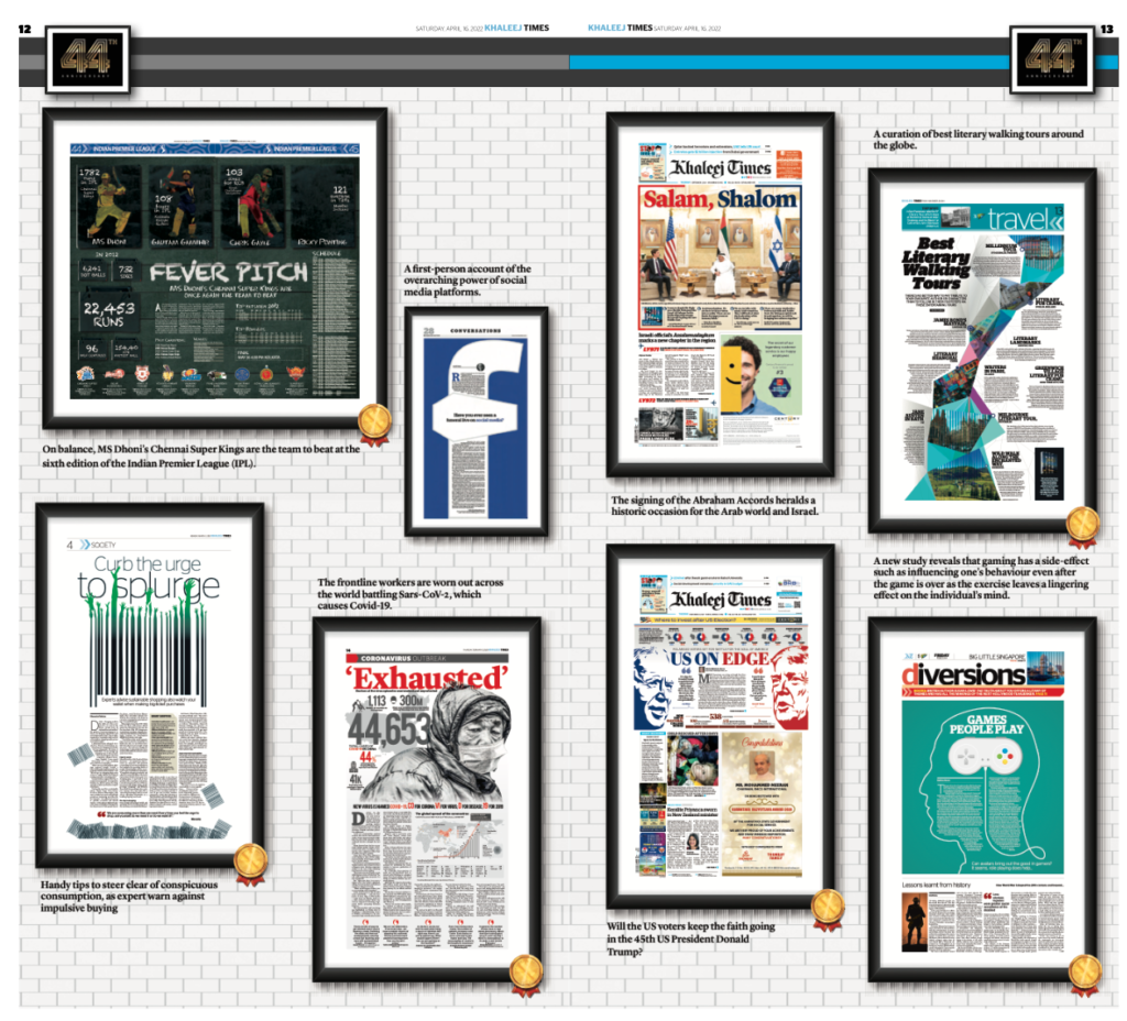
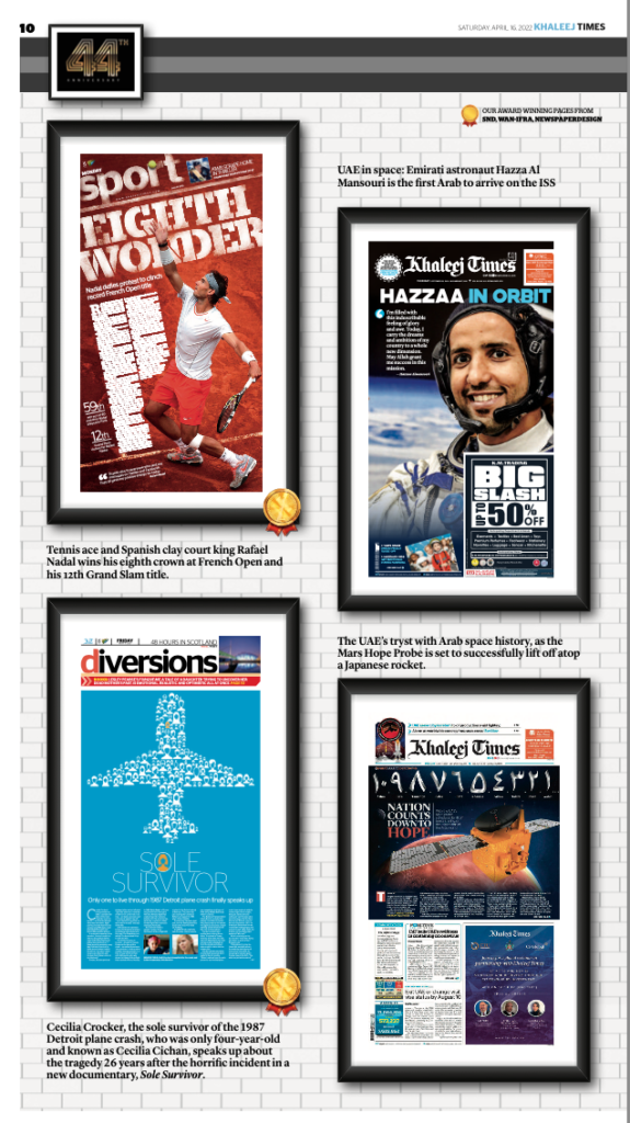
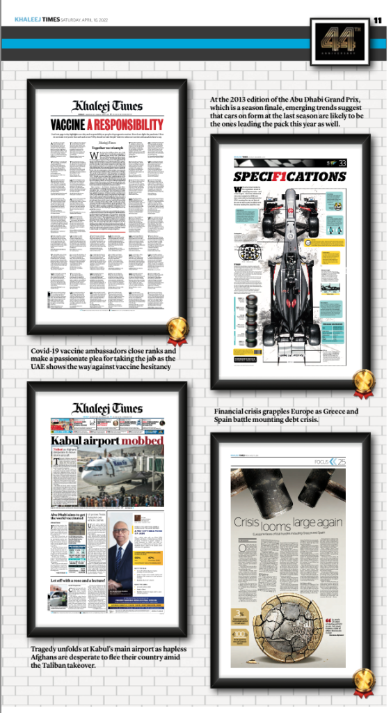
From time to time I am asked to offer my thoughts on front pages. This week it was the editors of Dubai’s Khaleej Times, who were putting together a special edition commemorating the 44th anniversary of the newspaper. Following are some pages from that edition, published Sunday, April 17, 2022:
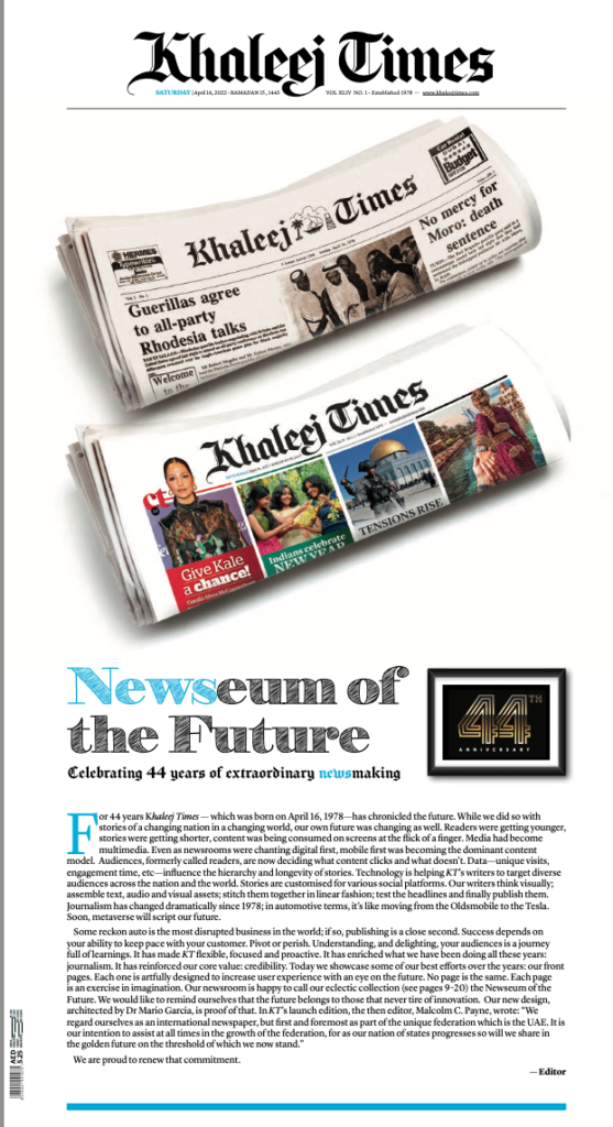
The editor’s commentary
Vinay Kamat, editor-in-chief of the Khaleej Times wrote a piece to introduce the special section in which he outlined the large strokes of why the pages of newspapers have changed—and not just the front page:
Even as newsrooms were chanting digital first, mobile first was becoming the dominant content model. Audiences, formerly called readers, are now deciding what content clicks and what doesn’t. Data—unique visits, engagement time, etc—influence the hierarchy and longevity of stories. Technology is helping KT’s writers to target diverse audiences across the nation and the world. Stories are customised for various social platforms. Our writers think visually; assemble text, audio and visual assets; stitch them together in linear fashion; test the headlines and finally publish them.
My take on front pages
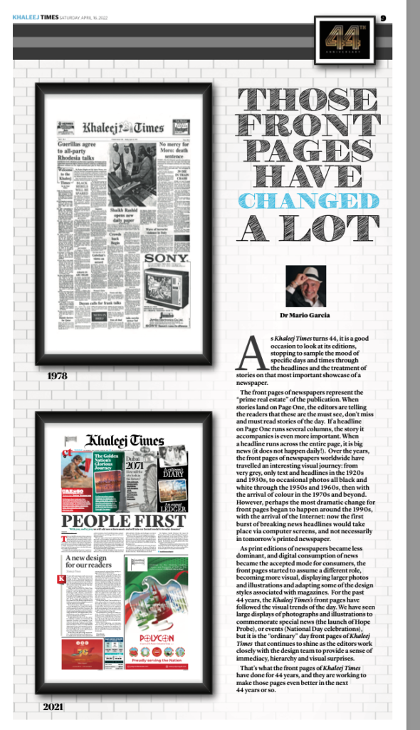
Over the years, the front pages of newspapers worldwide have travelled an interesting visual journey: from
very grey, only text and headlines in the 1920s and 1930s, to occasional photos all black and white through the 1950s and 1960s, then with the arrival of colour in the 1970s and beyond. However, perhaps the most dramatic change for front pages began to happen around the 1990s, with the arrival of the Internet: now the first burst of breaking news headlines would take place via computer screens, and not necessarily in tomorrow’s printed newspaper.
So, let me take this opportunity to state a couple of things that I always mention in my workshops. Under the “the role of print in a mobile first era” I begin with these three mantras:
- The printed newspaper is no longer the protagonist. Nobody is waiting for your front page to break the news.
- Those who come to a printed newspaper are interested in the in-depth, analytical part of many stories. Go for longer pieces, and avoid those columns of briefs. Mobile handles briefs all day long, so make the printed experience a lean back journey through content.
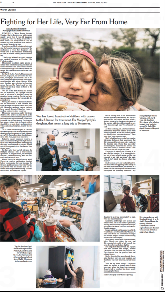
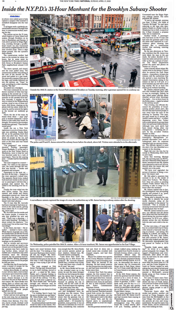
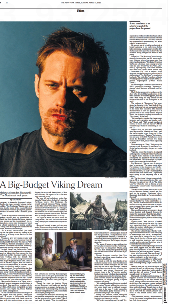
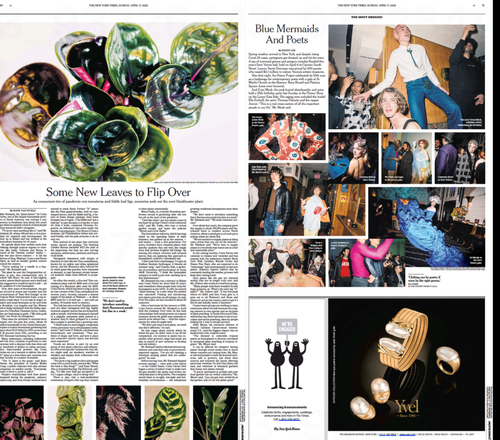
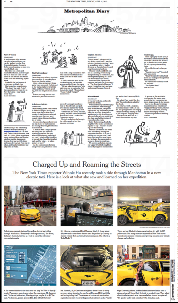
- What print can do best is to play photos and illustrations big—the small screen of the iPhone can’t do justice to good photos the way a newspaper page can. So go big with your art. Look at these pages from the Sunday NY Times, real showcases for large photos:
...and about the “biggest change” for front pages…..
I like front pages that offer a content or visual surprise on Page One. Sometimes the most surprising piece is a commentary right on the front page. Or that photo that does not go with any of the front page stories, but that is a great visual lead, to seduce and to get us to stay on the page.
Come to think about it, there is nothing new about that, and I remember me suggesting those things at Pointer Institute workshops of the 1980s.
Happy birthday, Khaleej Times!
For now, happy 44th birthday to the Khaleej Times, and many more. I am honored to work with the talented and highly motivated KT team to improve content and presentation across platforms.
Our mobile storytelling workshops now available remotely
Professors: get your review version of The Story on time for summer, fall classes
As an academic, I know the importance of having the right tools to advance our students, especially on the important subject of mobile storytelling. Please drop me an email if you would like to sample The Story in its digital edition: mario@garciamedia.com
Start writing or type / to choose a block
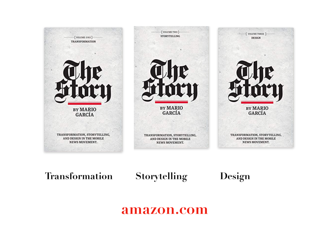
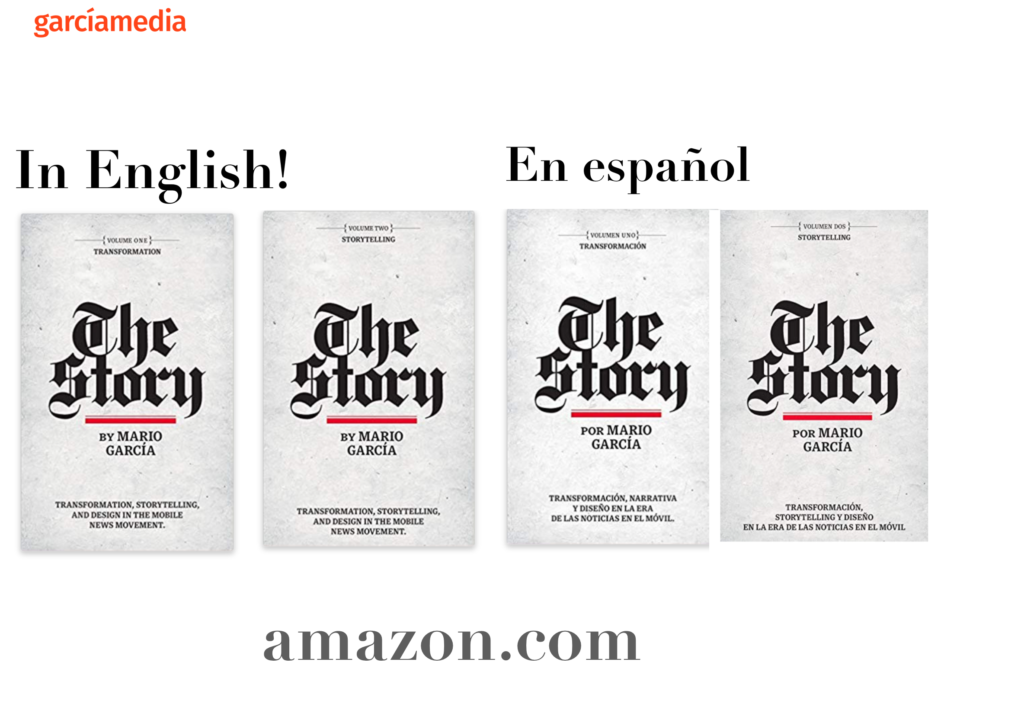
The full trilogy of The Story now available–3 books to guide you through a mobile first strategy. Whether you’re a reporter, editor, designer, publisher, corporate communicator, The Story is for you! https://amazon
TheMarioBlog post # 3348
