Updated Tuesday, April 7, 2009, 05:13 am EST
Bar codes and newspapers: don’t go there?

Earlier in this blog we profiled the idea of a Romanian visual journalist who calls his project, based on use of bar codes, “the multimedia newspaper of the future.”
Several of you have written to say that there is little new about this approach, and that, in fact, the Dallas Morning News, of Dallas, Texas, USA, tried a similar barcode inspired approach, only to fail in the attempt.
As one designer, who was close to the situation, put it to me:
You may wish to amend this to note that The Dallas Morning News invested and lost more than $50 million (might have been 65m, I don’t have the exact figure but know it was more than 50) on running bar codes throughout the newspaper that people could scan with a device called Cue Cat. (This was circa 1998, I guess? I had to redesign around those stupid bar codes.) The idea was reviled in the newsroom and with media critics (and me), and it fell flat after a year or two of experimentation. I think it might have been a partnership with Radio Shack. The lesson for me is, the newspaper is the newspaper, it is not a high tech multimedia device.
Perhaps further validation about a newspaper looking and feeling like a newspaper came through a dinner discussion I had last night with several German editors from Sudkurier, the Lake Konstanz daily, who quoted their latest focus group results: We hear it loudly and clearly, readers here do not want a newspaper that imitates the Internet. Not at all. Let the newspaper be a newspaper.
For the CueCat’s Wikipedia entry:
http://en.wikipedia.org/wiki/CueCat
Go here for our original blog posting:
https://www.garciamedia.com/blog/articles/bar_codes_and_the_multimedia_newspaper_of_the_future_a_romanians_view
For more information about bar codes and possible newspaper/mobile phones use:
http://www.moconews.net/entry/419-mobile-barcodes-finally-catching-on-in-the-us://www.youtube.com/watch?v=MgkSZS6o050
http://www.youtube.com/watch?v=bwhdXJuiO48
http://www.youtube.com/watch?v=pTq7BYieEHI
http://www.youtube.com/watch?v=qlsa5DUP4ek
http://www.youtube.com/watch?v=1GcEE2dD4GI
http://www.youtube.com/watch?v=2vS3R2u7sXA
and also : http://en.semapedia.org/
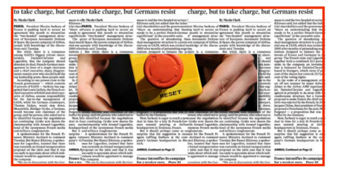
Typography is important, but……
It has been a constant in my life: you get up in front of an audience and show image after image of how a certain typeface made the redesign of this or that newspaper look so classy and elegant, or visible in the streets. Or how a color palette of soft pastels was just right for this Nordic newspaper in some Scandinavian city. Don’t forget that spectacular use of a page one photo for the newspaper in the busiest city in the world—maybe Sao Paulo!
And, while the audiences of editors and designers sat there, mesmerized by the display of the best, the most colorful and the brightest of newspapers around the world, their eyes widely open, as if watching Bette Midler and Cher perform in their lavish Las Vegas show, the topic was always, first and foremost, design, aesthetics, and those little details that make a page’s content come alive.
Design in the times of the global economic crisis
Perhaps like love in the time of the cholera—to echo Garcia Marquez’ 1985 novel—design in the time of the financial crisis values redefinitions.
Today, those same audiences are not in the mood to just sit there and go thru 45 minutes or two hours of how “design” strategies can help your front page.
Not at all.
They want to hear about the future.
They want to hear about the survival of their newspaper. They are well aware that the death of a newspaper is no longer an impossible situation. They have emotionally attended the funeral of a few in the past months, and prepare their black suits to attend others in the months and years ahead.
So at these seminars, the talk turns from Appropriate Color Palettes and Legible Fonts to Integration of the Newsroom, or The Path of the Story: how we adapt our operation to a multiplatform media world.
This is where the action—and the interest of the participants—is. Rightly so, considering that, in my view, design seems to be the last of the problems of most newspapers today.
Issues dealing with information architecture are more important.
Which platform to use for which content seems more pertinent.
Show me the way
Most of my work this day centers on facilitating workshops for editors and journalists to discuss their operation, how they define news, how they determine what medium covers what story and how.
Traditional journalists become familiarized with the world of blogs, taking cues from Twitter, Facebook and even The Daily Beast for ideas on what readers are talking about and interested in.
Designers dip their toes into the world of multimedia, learning about videos, sharpening their photographic and editing skills, discovering that the iPod is not just to play their favorite Diana Krall or Mariah Carey music, and realizing that when they “design” the page, the canvas extends beyond the printed page.
It is a fantastically new, vibrant, animated, fast moving world for the media practitioner.
We touch the reset button—if we have not already.
We don’t spend time lamenting, because there is plenty to celebrate.
Our canvas as editors and designers has just gotten bigger. The texture is not just that of ink on paper. The story can be told from a variety of perspectives.
We who believe that storytelling is the reason we are in this business will find fertile ground in which to apply our experience, skills and know how. Those who think of themselves as newspaper designers may go in a corner to examine the ligatures in that new Bauer Bodoni font, or to analyze the percentage of yellow in a color palette, or to count the picas between columns of text. The industry expects a little bit more from us, and, somehow, I think we have prepared for this for decades. We are up to the task.
Let’s touch that reset button together.
The new Goteborgs Posten Sunday is here
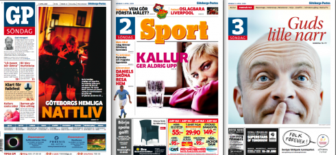
The new GP Sunday consists of three sections: news/sports/culture-arts
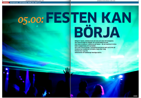
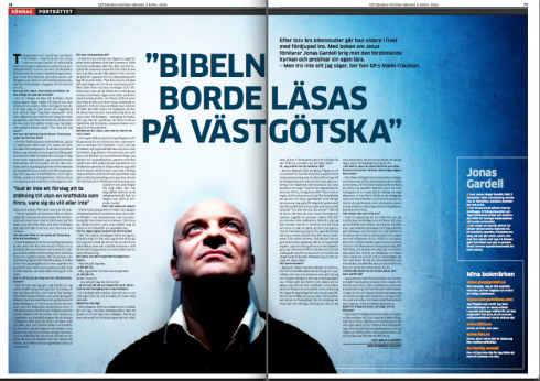
The Page One feature is developed over a number of pages on the inside.
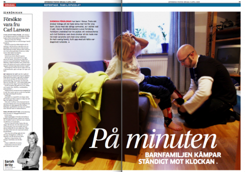
More personal features appear
We worked on it for almost a year. It was a total rethinking of the Goteborgs Posten Sunday edition, with emphasis on revamping of content, and, of course, a new philosophy on how to approach this, the most important edition of the week. All indicators are that we should concentrate on and nourish the weekend editions. Working with editors Jonathan Falck, Cecilia.Kronlein and Per.Andersson-Ek and, of course, design director Mats Widebrant, we did just that. Workshops with editors and designers led the GP team to the product that appeared for the first time yesterday. This Sunday edition is what I consider to be a model for weekend newspapers, becoming a combination magazine/book/photo gallery.
The Sunday edition consists of three books: news, sports, culture/arts/entertainment. Page One serves as a navigator, with a mini poster approach to the big story of the day, which is then developed thru four to six pages inside; more personal columns and chronicles, and greater number of features, are part of the new GP Sunday fare.
Reaction so far? According to Andersson, so far so good.
We know how it is with Swedish readers after so many redesigns. If they like it, they don’t call you. It’s been silent so far, so we are sure they liked it
Good deal, Pason. Maybe those Swedish readers even loved their new GP Sondag. And the fact that the launch of the new Sunday coincides with one of the sunniest days they have seen in Goteborg for a while, it all adds up to: We like it!
For a look at the pages of the newly designed International Herald Tribune
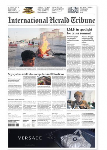
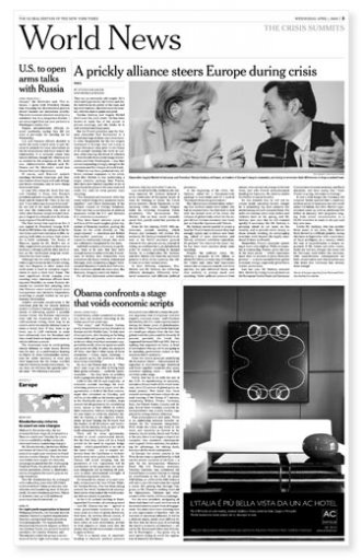
Last week we discussed the new design of the International Herald Tribune. Please go here to see the IHT”s explanation of its new look:
http://www.ihtinfo.com/interactive/ihtnewlook.html
TheMarioBlog posting #233