

Part of my day today has been a discussion of a topic that can be “red hot” in some newsrooms, especially in the United States, but not necessarily limited to North America.
It is a myth that readers attach seriousness to a newspaper with a lot of text on page one.
The debate can be summarized like this:
An editor insists that there will be at least TWO stories that can be read on page one. Yes, these stories can jump (or be continued) inside, but there must be some text for the reader to sink his literate teeth into right on that first page of the newspaper.
Another editor says it does not have to be so, that seriousness comes with how stories are presented, the type of stories chosen, and how they are handled. A newspaper’s reputation for respectable journalism comes with years of good reporting, service to readers and the community, and an eye for original content, good analysis and an opinion page that guides and influences.
I agree with the second editor.
I think the front page of today—and of the future—is one where one presents a map to the journey that is the entire newspaper, but Page One is not the destination. The reader of today is telling us: show me the way, guide me to all that is good and necessary inside the newspaper, and let me make my choices of where to go first, second and third—-or where not to go, for that matter.
Scanners sometimes read a summary on page one, and that is all they need to know about that one particular story.
I have decided to write about this, because perhaps putting it in writing will have a greater effect than when I tell editors this in a conference, which I tend to do at least twice a week.
Gravitas and seriousness are built over the years—or, better yet, each day—-with the content we choose and how we report it. It has little to do with a philosophy of page one and how much text we put on it..
HOW OTHERS DO IT
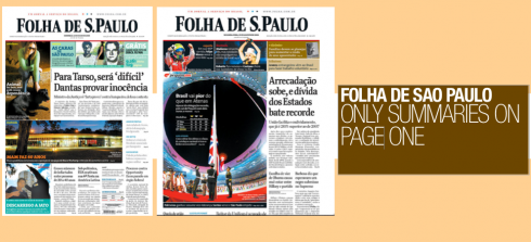
FOLHA DE SAO PAULO, Brazil:
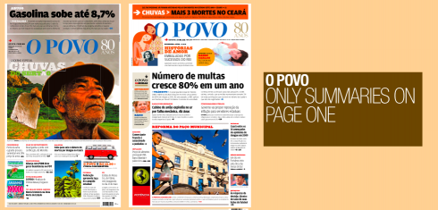
A broadsheet, Folha uses summaries that are self contained on page one, then guide readers to inside page where the entire story appears. This is the style of all Brazilian dailies. There are no jumps, simply summaries of stories. A survey of Page One gives readers a good idea of what the major stories are, allowing them the choice to read inside if they so wish.
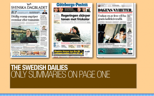
THE SWEDISH DAILIES:
Svenska Dagbladet, Stockholm; Dagens Nyheter, Stockholm; Goteborgs Posten, Goteborg.
All compact format, the Swedish newspapers use their front page to summarize stories , then readers go inside to read the complete text.


The new Poynter Online is up and running! Visit www.poynter.org and check it out: easier to navigate, less busy than previous design, and more likely to remind us of news websites in its architecture, look and feel.
Our Poynter colleague, Bill Mitchell, director of Poynter Online, tells us what’s new with the new design:
Improved navigation. Find what you’re looking for on the Poynter site quickly and easily.
Easy access. Your Poynter favorites, such as Romenesko, Al’s Morning Meeting, E-Media Tidbits, are all easily accessible.
Poynter Groups. Our new online networking feature, Poynter Groups gives you a new way to communicate with fellow journalists. You can participate in ongoing discussions on a range of topics as well as post a profile and photo.
Get Started
Explore the redesign. Get a description of the key changes, as well as an overview of the redesign and Frequently Asked Questions. Take a tour of the site redesign with this Flash video.
Update your profile. Log in at top right of any page and update your profile with your current e-mail address and mug shot. Also, join a Poynter Group to network with others in the business.
Contact us with any problems. Things not working as you expect? Let us know and we’ll address it as quickly as possible and get back to you.
TheMarioBlog posting #76