TAKEAWAY: The new front page of the Goteborgs Posten has flexed its muscles now for 30 days: today we check in with news editor Anders Goliger about the challenges of a systematic design that emphasizes visual storytelling and smart navigation to promote the content of the day.
A new Page One philosophy for the Goteborgs Posten
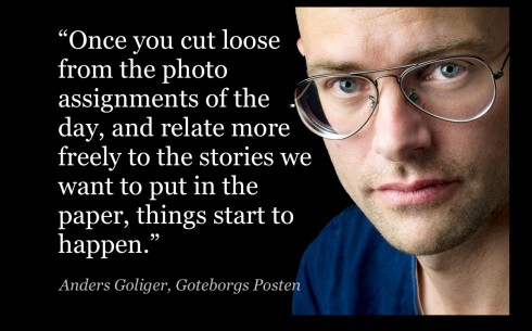
Anders Goliger is news editor of the Goteborts Posten, in charge of Page One/Photo: Stefan Berg
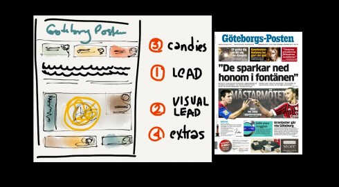
Notice how sketch shows the overall philosophy for the GP’s front page: a journalistic lead (in this case without visuals), the “belt” which promotes the best visual in todya’s edition, then the top of the page “candies” (value added stories that may be of interest, but not news), bottom of page, extra teasers.
Most successful front pages of the last 30 days at GP
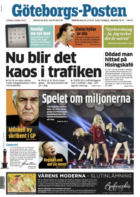
Here there is not a definitive photo for page one, so the “belt” concept groups various promos for inside stories
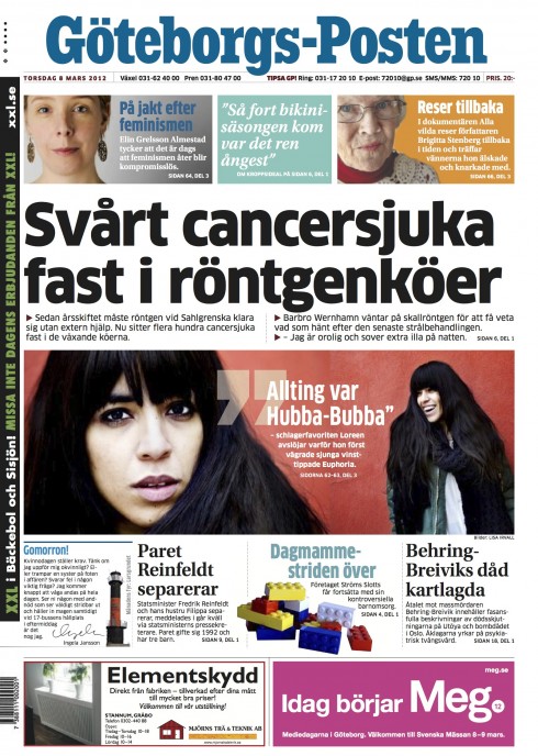
The belt in this case promotes a single story on the inside
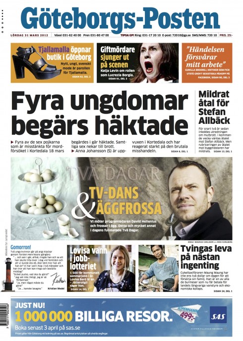
Here the belt promotes cover story from the Weekend magazine, Tva Dagar
About a month ago, the editors of Sweden’s Goteborgs Posten unveiled some design changes, especially affecting the front page.
I worked closely with design director Mats Widebrand and a top editorial headed by Ninni Jonzon, with Anders Goliger, news editor.
So after more than 30 days of the new GP, I was interested to do a follow up and see how things are going. Here I have a conversation with Anders, who is responsible for page one daily.
But before we get to the mini interview, let me explain what the concept for the new GP was.
Letting content drive the design of Page One
As we conducted various workshops that led to the new concept for the GP, our goal was to design a front page for this daily newspaper, published in Sweden’s second largest city, Goteborg, and headquarters of Volvo automakers.
We started with a basic premise:
It is not everyday that the lead story of the day has a good visual that goes with it; many days, the best photo has NOTHING to do with the lead story.
So we created a philosophy for page one that emphasizes a journalistic lead and a visual lead, knowing, of course, that in a perfect world, the two are linked. Reality, however, teaches us that this may happen 2 days out of 7, if the editor is lucky.
Navigation is important, so we created a navigation hierarchy: the elements that appear in what we call the “belt” that crosses the pages with a variety of promos to the inside are the top stories; however, there is a secondary tier of promo boxes, for other good stories that editors recommend.
The GP has a tradition of carrying a Good Morning message daily, accompanied by the visual of one of the region’s harbour lights, sent in by readers.
So the pages you see here, and the descriptions of how the process has gone from Anders reflect the success of our strategy.
A conversation with GP news editor, Anders Goliger
Mario:
Anders, as the news editor, you deal with the realities of content, space and creating impact on the front page everyday at the GP. How is this new design making things easier for you?
Anders:
It gives us many opportunities. When looking at tomorrow´s newspaper, we used to have a feeling that we could not fully use the material inside the newspaper. There were no room for the goodies in the box, and the top story was too often presented the same way. This was one of the key issues in our workshop with Dr Garcia. We are happy with the result so far: we can present the news but also highlight the powerful stories and the goodies that is becoming increasingly important in print. I think this is reflected in a playful front page, with more colour and variation. We can say what we want to say, with help from the design.
I personally feel that the orchestra has been upgraded with a new string section and a rock n roll drum set!
Mario
One of the big changes we introduced in this design is the concept of bringing together various, NOT related items into the “belt” promo that dominates the page visually. How do you go about selecting what will go there?
Anders:
The belt was the key. Combining one, two, or more stories in a flexible belt – related or not, gave way for a change in which stories we put on the front page. If the top story is text only, we can work a big belt with a combination of other stories where the photographic elements are stronger. How we pick the stories for the belt? We look for powerful quotes, interviews, people, gadgets, neat things that can be cut out and contribute to an appetizing mix. It´s much easier, and funnier, than I would have expected. The design opens doors for us – without closing the windows.
Finally: reader response. The most embraced newspapers are the ones attached. These are the newspapers with the best reach, but please note that our reach can be influenced by many things – content, presentation, weather, distribution, holidays and so forth. It doesn´t measure the front page specifically, but it does measure the overall readership for this day´s newspaper. The front page is obviously one important factor there.
Mario:
What has been the biggest challenge?
Anders:
Most difficult has been to think outside the box. Editors and designers involved, including myself, tend to look for what we happen to have in store, rather than what we can create. Once you cut loose from the photo assignments of the day, and relate more freely to the stories we want to put in the paper, things start to happen. This is how we came up with the front pages with the pacific garbage patch and the soccer game. The soccer story started as my idea for the front page, there wasn’t even an article before we formed the front page. The inside story sprung from there.
Mario:
And the reaction, both internally and outside?
Anders:
This has raised some inhouse criticism, even if we have not gone as far as Il Secolo XIX*. Some of the questions from the critics in house go like this: Are these things (in the box) related? Why should they be integrated? I have received this kind of response from the staff. The pattern is the good read, that’s how we work these front pages. So far readers has been pleased, staff more skeptic – they think it’s too much.
*Note:
Il Secolo XIX is one of our Garcia Media projects in Genoa, Italy, where the concept of the mini poster has been used successfully for two years. For more about mini posters and Il Secolo XIX:
https://garciamedia.com/blog/articles/il_secolo_xixs_mini_poster_prototypes
https://garciamedia.com/blog/articles/a_day_for_follow_ups_on_mini_posters_logos
Most recent GP front pages
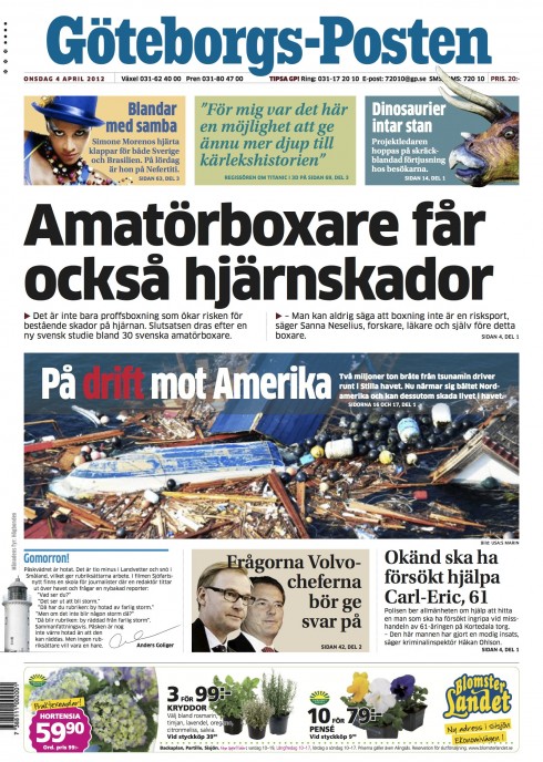
The belt emphasizes a photo from the world section inside
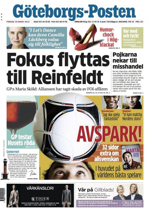
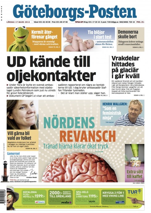
Both of these pages emphasize a collage of promos to inside stories

– USA: Campaign Aims To Prove Newspapers Are Indispensable
http://www.editorandpublisher.com/ASection/Article/Campaign-Aims-To-Prove-Newspapers-Are-Indispensable
First paragraph:
A new marketing campaign from Pioneer Newspapers, Inc. is on a mission to send one very important message: Newspapers are alive and well. But you won’t find the message just in print. It’s being broadcast in television commercials, radio advertisements, and on billboards.
– USA: Industry, digital metamorphosis at mid-point
http://www.newsandtech.com/news/article_0424f3e2-81ba-11e1-a13c-0019bb2963f4.html
First paragraph:
The U.S. newspaper industry is in a battle that, if successfully waged, will mean the salvation of a business that has educated and informed readers for hundreds of years.
– USA: Apps are lovelier 2nd time around
http://www.newsandtech.com/news/article_d93278b0-81bb-11e1-8804-0019bb2963f4.html
First paragraph:
When Apple launched the iPad two years ago, app development— already at a rapid pace because of the iPhone — ratcheted up even further.
Both newspapers and magazines recognized early on that getting their products and presence on tablets, smartphones and other gadgets was critical if they were going to reach younger readers and tap into an increasingly mobile market.
– USA: Why Bob Woodward is wrong about the internet and journalism
http://gigaom.com/2012/04/06/why-bob-woodward-is-wrong-about-the-internet-and-journalism/
First paragraph:
Anyone who has followed the media for the past half century or so knows that Bob Woodward is a giant in the field, one half of the legendary investigative team of Woodward and Bernstein — a man who helped to bring down a U.S. president and defined a generational shift in the practice of journalism. In other words, someone whose opinions on the craft of journalism are probably worth listening to. But should we believe him when he argues that the Internet is not really of any benefit when it comes to stories like Watergate? Not necessarily. As with any field that has undergone the kind of disruption the media has, the journalism of today is very different from the kind that Woodward defined 40 years ago — and arguably better.
– USA: The Verge interview: David Carr on curation, crowdsourcing, and the future of journalism
http://www.theverge.com/2012/4/3/2912487/david-carr-interview-dnp
First paragraph:
Let’s start by talking about the Curator’s Code. This was introduced by Maria Popova as a way to standardize attribution in content aggregation. You were at South by Southwest when she introduced it and you later wrote about it. Why do you think something like this is important, as far as defining some rules when it comes to content aggregation?
– UK: The Telegraph is now bundling free mobile apps with iPad edition
http://tabtimes.com/news/media/2012/04/10/telegraph-now-bundling-free-mobile-apps-ipad-edition
First paragraph:
Birmingham, England—Speaking at the Gadget Show today, The Telegraph’s marketing director Graham Horner told TabTimes that the newspaper is now offering free mobile app subscriptions to those who buy the iPad editions, and admitted that print is increasingly looking ‘hard to sustain’.
– USA: A new framework for innovation in journalism: How a computer scientist would do it
http://www.niemanlab.org/2012/04/a-new-framework-for-innovation-in-journalism-how-a-computer-scientist-would-do-it/