Update #2: Wednesday, July 27, CapeTown, South Africa, 16:48
TAKEAWAY: It is Wednesday and I start my day in Cape Town, South Africa, ready to conduct a full day workshop for the Media 24 group in charge of lifestyle-oriented publications. Soon, many of these titles will enter into the world of the tablet. What happens on a first day workshop?
Going tablet? Start with the workshop

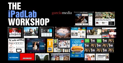
Images are part of that first “get your tablet edition going” presentation that gets the group up to speed and ready to do first sketches of their own iPad edition
Many of you often write to ask me what the first baby steps must be for you to take your printed product to a tablet edition.
I always recommend a workshop setting, where key people in the organization gather to explore ways in which they can make the transfer from print to tablet in a functional, easy and successful way.
That is precisely what I do today all day here in Cape Town, concentrating on a group of titles of Media 24, which will be the first to make the transition to tablet. These are the lifestyle content related publications.
What happens in such a workshop?
I usually begin with an overall view of what I call “the essentials” of iPad edition creation—-covering everything from the specific characteristics of the tablet (design for the finger, too), to functions (start with a good navigation system), to look and feel (sophisticatedly simple is the way), and, of course, extracting the DNA of your publication (this will take up the first part of the workshop—-who would want to come to a tablet edition of your publication, and what content would they be willing to pay for?).
The second part of the workshop is hands on, and I encourage simple sketching so that all ideas come to the front for discussion. At the end of the day, participants return to their newsrooms with a clearer idea of how to proceed, then the real work begins.
Who participates?
I encourage publishers to assemble a group, NOT according to seniority, but according to talents and skills. Who are the best people in the team who can work across platforms?
The group is usually about 12, and it includes team members from not just editorial, but advertising/marketing, technology and, of course, those whose concern is to make sure that the proper business model is created.
I plan to do a follow up to today’s workshop here later in the day.
Afternoon follow up: What are the issues on the table

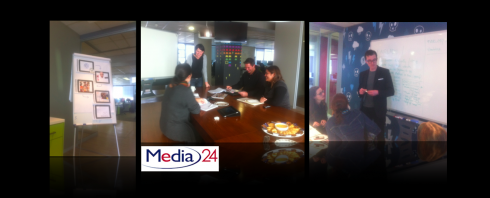
Views from the one day workshop with Media 24 editors/designers/technical team
The three groups are busy at work as they dissect the selected magazine titles to go through analysis for an iPad edtiion.
Most frequently asked questions:
First, editors who look at a 262 page magazine jump back and ask: do we have to get all of this into the app edition?
Answer: Not really, pick and choose, go by the DNA of your magazine? Translate that, but also think NEW platform-oriented content. In the end, about 65% of what is in the printed edition transfers, or less.
Second, how do we make a grand entrance and lead people into quick and functional navigation right away?
Answer: It depends on how you wish to enter, but you may pick to do an animated version of the cover (easiest thing to do), or you may open with a video that leads to the content (the non cover cover), and you may combine the cover we know from print with something that says “this is digital, it moves, it is different”.
Third: How do we determine how to organize the content?
Answer: It is different for each magazine, but I suggest that you concentrate on multi genres first, before you go to content specific situations. Discuss the various modes: reading, looking, listening, watching, sharing.
Highlight of the day
Just as expected, the team came up with three different approaches to taking its magazine, Fair Lady, to the tablet.
In each case, the sketches showed innovation and a desire to move the good that is in the printed magazine, and add longer legs in the app.
A highlight for me: the multi genre approach, how there are digital components, but good narrative reading modes, audio, pop ups.
Now the real work begins for the team. Next step: mapping out the full navigation for the app.
As I told the team: look and feel are not the FIRST thing to do here, work your navigation and get that down first, then start working on the aesthetics of the app.
Today’s pop up moment

Germany’s Bild Zeitung gives us a pop up based on a series of photos of celebrities, then and now.