This is the weekend edition of TheMarioBlog. The next blog post is Monday, June 25.
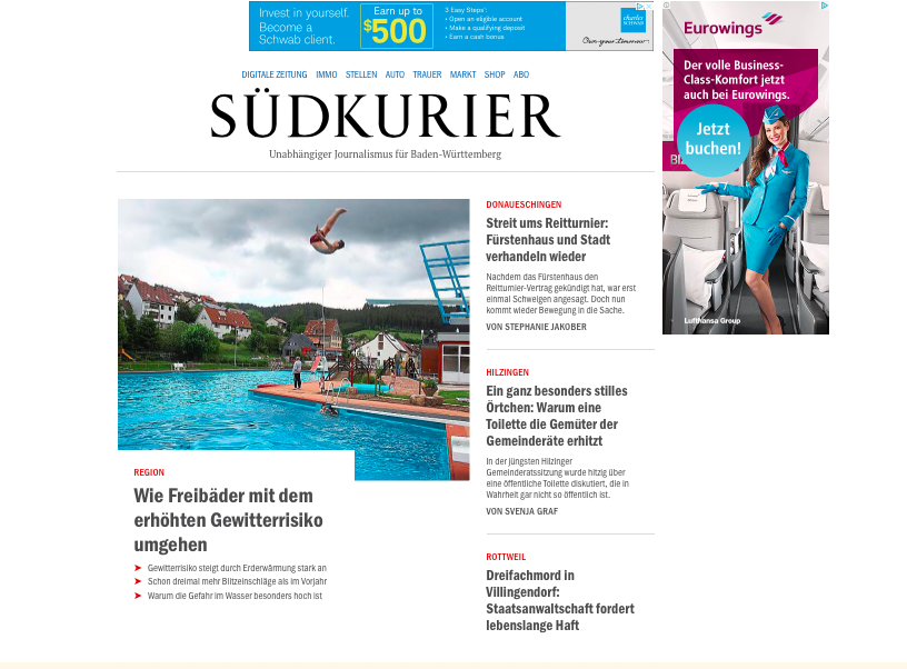
The new and more engaging sudkurier.de digital remake is here. Take a look:
The briefing
–is the strategic orientation of SÜDKURIER Online right?
–does it make sense to bring the website closer to the newspaper-brand?
–are the concepts for sales-funnel, conversion-optimization and paid content coherent?
–is our content-strategy right?
–does the story map seem complete and well-structured?
The workshops
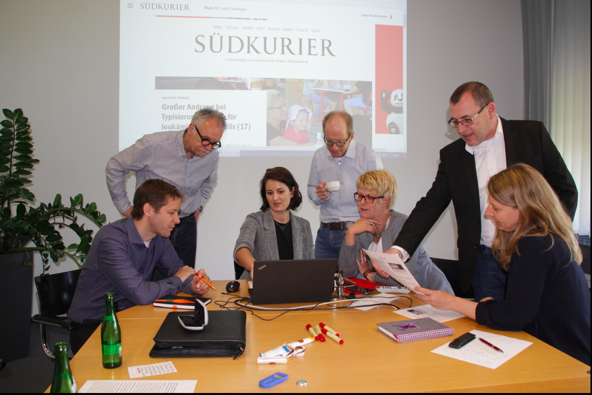
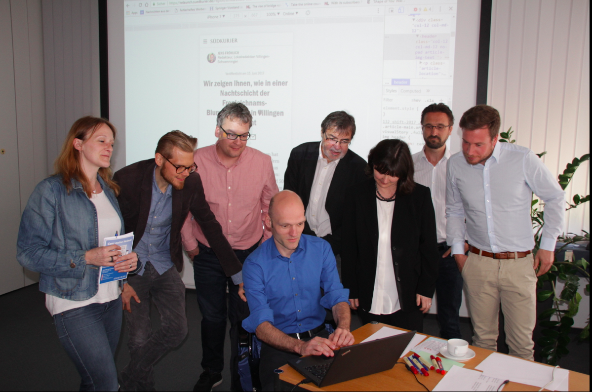
The process
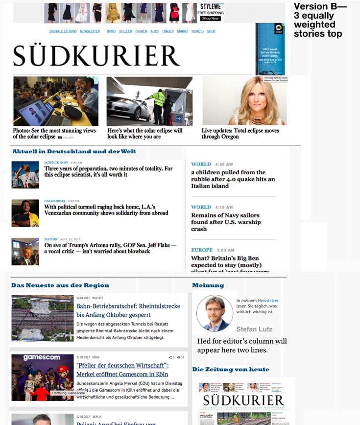
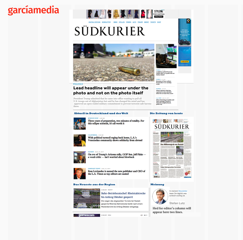

The Persona concept
„We took two of the created and validated personas, and for four months we created dozens of stories especially for them in the local editorial team of Konstanz. We also tried to focus most of the other stories on their needs. The results? Overwhelming, both in the increase of reach, user engagement and conversions.“
Sebastian Pantel, Head of Editorial Team Online
Linear storytelling
— www.suedkurier.de/9307608: A visual story about how rescuers simulated a catastrophe in a tunnel.
– www.suedkurier.de/9288111: A visual story about a 99-year-old boat that turned into a swimming bar.
– www.suedkurier.de/9754982: A photo-story about a man remembering the 1968-movement in Konstanz 50 years ago.
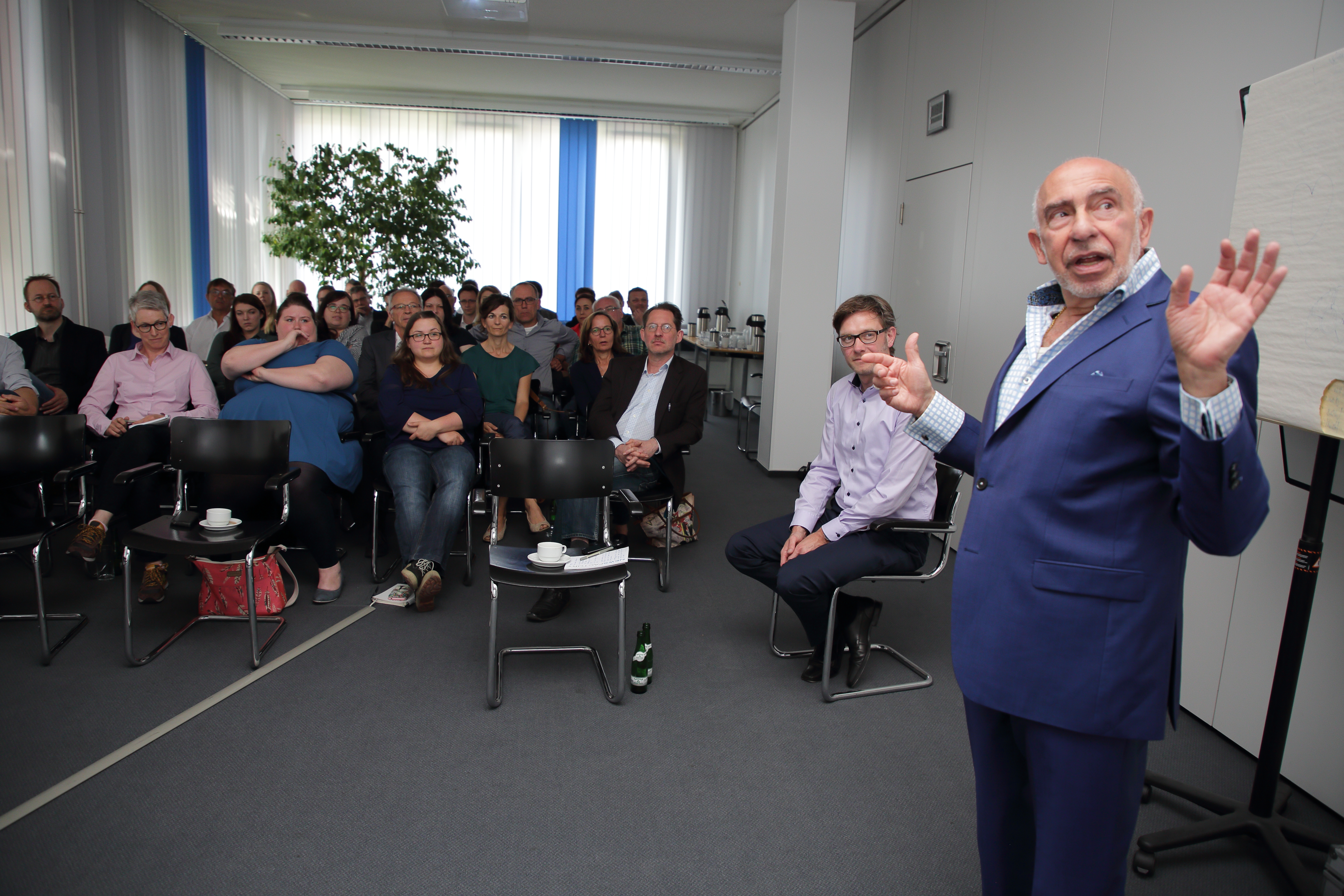
We conducted several hands on workshops, like this one here, to familiarize journalists with new styles of digital storytelling, with emphasis on linear storytelling for mobile.
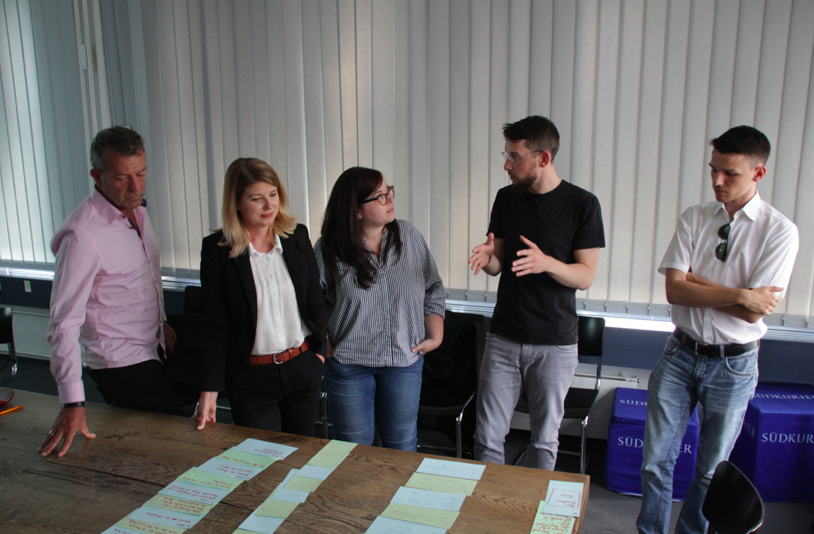
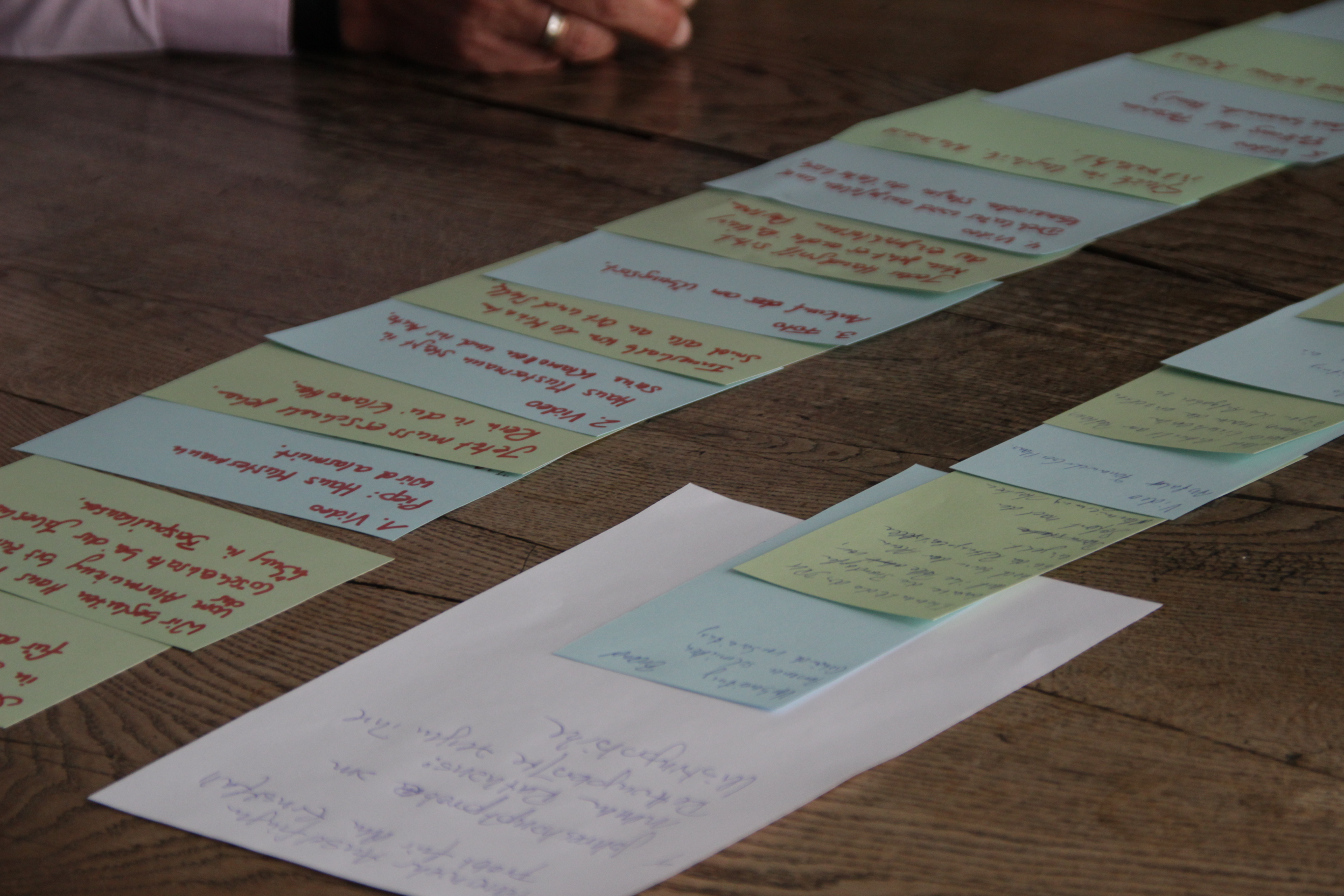
Notice that in a typical linear storytelling workshop we would have the journalists sketch their story concept in a storyboard format, using paper and Post It stickies.
The reactions
According to Günter Ackermann, managing editor, overall the reactions so far are favorable:
“This looks like a professional newspaper for which one is willing to pay. That’s what we wanted.”
Introducing the new look
The essentials
Type: Mainly used Franklin across the site, which is the main face in the print edition. Body is set in PT Serif, available from Google.
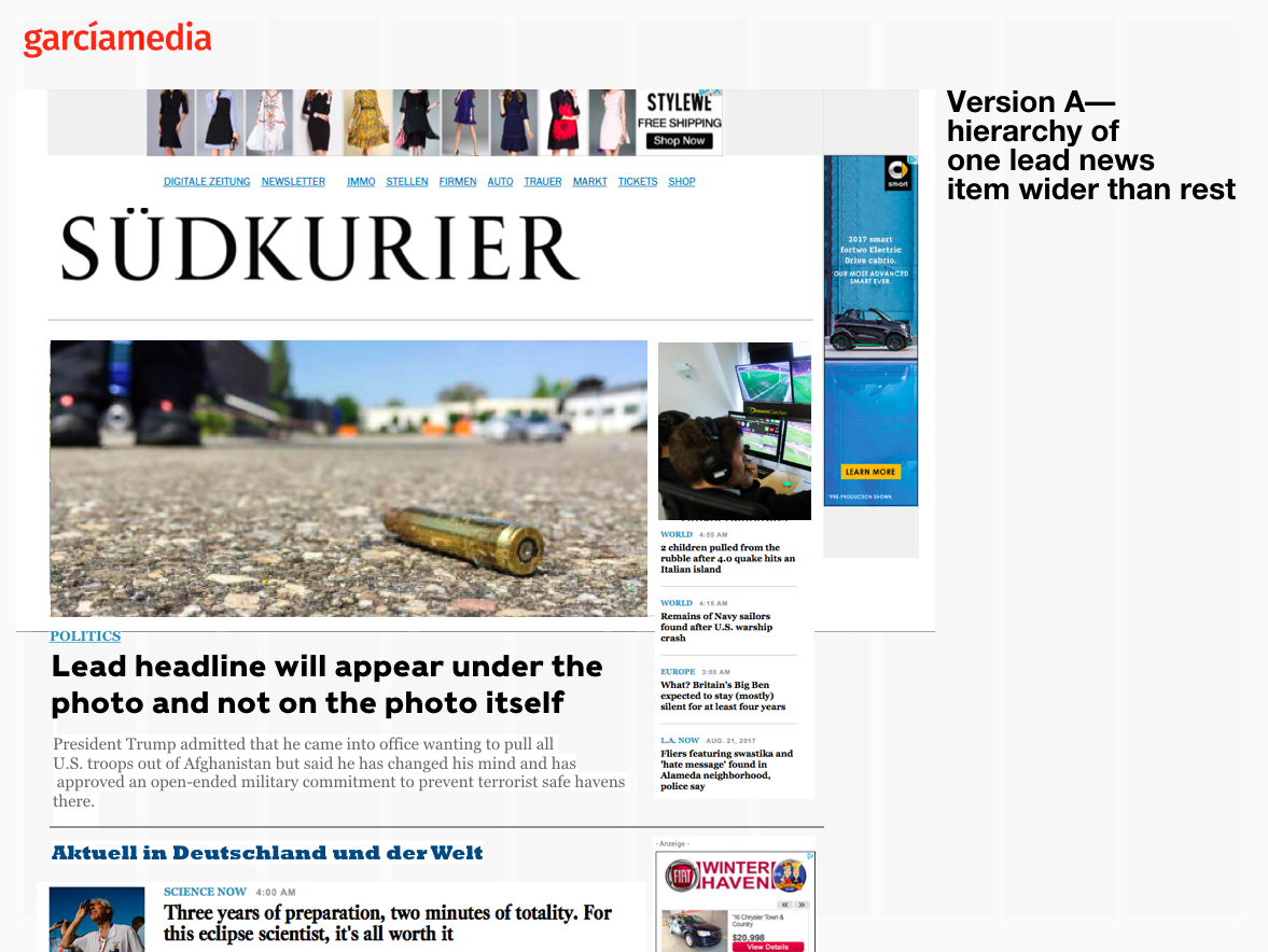
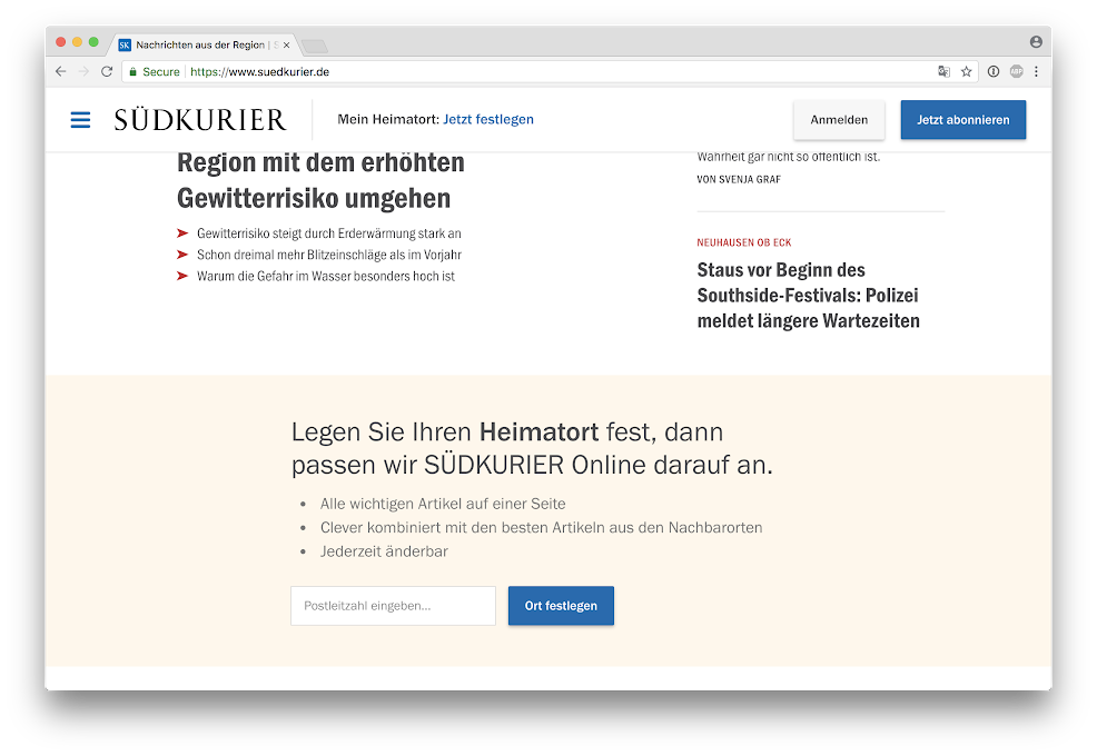
The home page
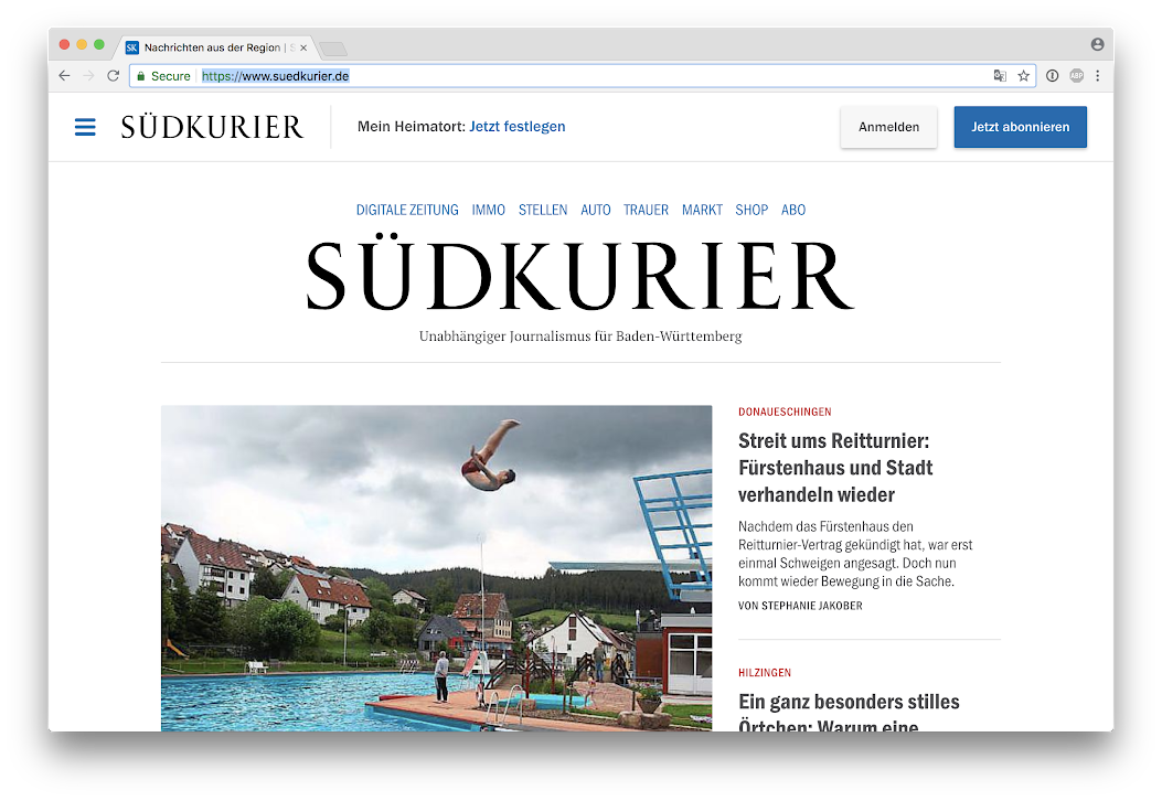
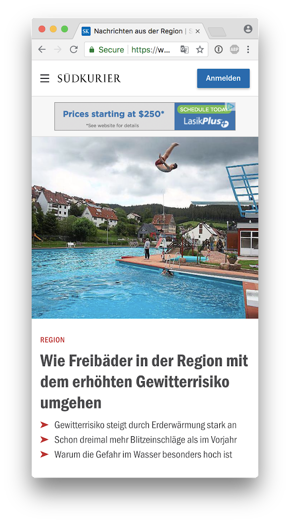
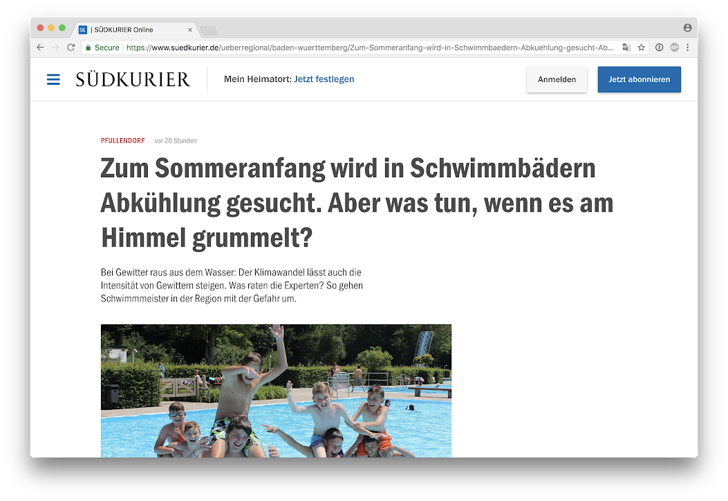
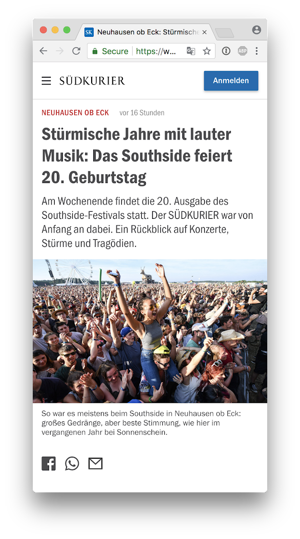
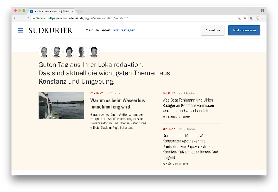
Andy explains the next feature:One feature we added, dubbed The Handshake Box, by the team. We move all call to actions into one central box on the page, instead of many different modules on the site requesting your attention. Overtime, deeper personalization will grow in these areas of the site which are placed on a champagne colored background. Our system is to use champagne when the paper is speaking directly to its readers, i.e., recommending a newsletter, or an opinion article, or just telling them the most important stories of the day in their region. In the long term, this box will serve different options depending on whether the reader is logged in, subscribed, celebrating their birthday, etc. It better helps focus the users attention at first on entering the funnel and eventually becoming a subscriber.
The print edition
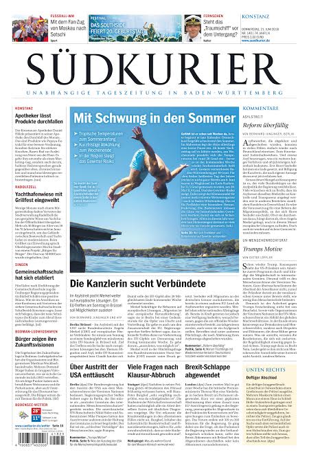
Today’s front page of Sudkurier’s print edition:
The team
Our Garcia Media team for this project consisted of Andy Rossback, chief art director and user experience expert, with our team in Buenos Aires, senior art directors Paula Ripoll and Rodrigo Fino.
Here is how Andy summarized the experience:
“The Sudkurier team was such a pleasure to work with. They are detail-oriented and forward-thinking. True innovators. Their new site and subscription model advances them near the front of the lineup among German newspapers. Well-executed, strategic, personalized.”
From Sudkurier internal team:
Saskia Mayer
Sabine Schilling
Sebastian Pantel
Julian Kögel
Michael Lauff
Günter Ackermann
Sudkurier promotional video (in German):
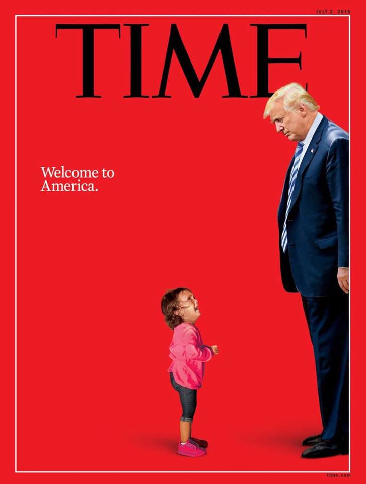
Covers we like
Mario’s Speaking Engagements
August 2, Digital House (Facebook workshop), Buenos Aires

October 6, 20, 27–King’s College, New York City
The Basics of Visual Journalism seminars
Garcia Media: Over 25 years at your service
TheMarioBlog post #2866
