Update #7, Thursday, Feb. 4, 06:58 EST. More updates likely during the day
TAKEAWAY: Feb. 3 was a historic date for newspaper readers in Genoa, the Italian city with a rich history of its own, as Il Secolo XIX introduced a new, more compact, format, along with a total rethinking of its content organization. ALSO: Change of leadership at Germany’s Handelsblatt.
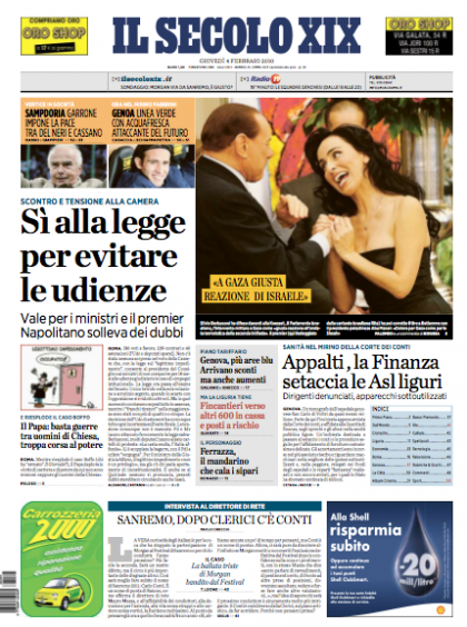
Front page of today’s Il Secolo XIX, its second day sporting a new look, new format.
Explaining the front page philosophy
As I embarked into the rethinking of Il Secolo XIX with Design Director Massimo Gentile, as well as our Garcia Media art director Christian Fortanet, we debated for a long time about an issue that plagues all front page designers: what to do for a Center of Visual Impact image, when the main story does not have good art to with it. Familiar story?
So, in what constitutes a first for Il Secolo-—-where the procedure has ALWAYS been to use a photo that goes with the lead story of the day, regardless of how boring——we adopted the idea of the main photo on page one NOT necessarily coming from the lead story. Instead, since we have a navigator bar at the top, it is possible to take one photo for an inside story (as you see today in photo of Berlusconi and admirer) and that becomes the lead visual image on the page. Of course, there is no better solution than a lead visual that corresponds with the lead story, but the occasions are rare when that perfect match becomes real.
Notice that we use the yellow strips on the photo to add a headline that makes the reader (and scanner) get a lot of information by just looking at the photo and the headline on it. The color code used calls for orange backgrounds for anything related to sports. So, today, you see that the other two promos next to the Berlusconi photo belong to sports teasers.
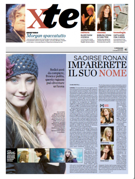
Today’s xte section: culture, entertainment, and thematic topics such as fashion, seen here. Design Director Massimo Gentile likes to apply a soft color background to give this section a distinct, more magazine-like feel.
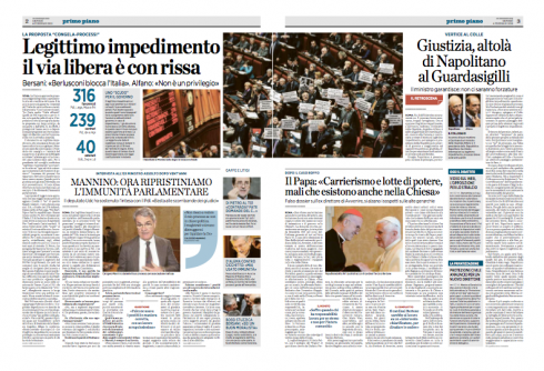
Layering of stories: this double page from today’s Il Secolo XIX shows the development of various layers of story structures to develop a story with a sense of hierarchy. This took much work with the editors, so that they would understand how the design aims to become a journalistic tool as well. Layers here: Main story (Legittimo headline), then the interview in all caps (Mannino), next to that reactions of other sources in the story, on the next page analysis and side bar.. It is a way to display a story in various segments
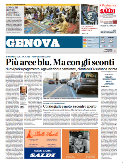
Opening of the local section for Genova area
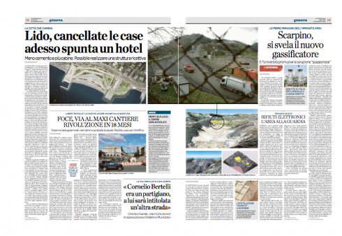
Inside page of local section: follows same layering concept as all other pages.
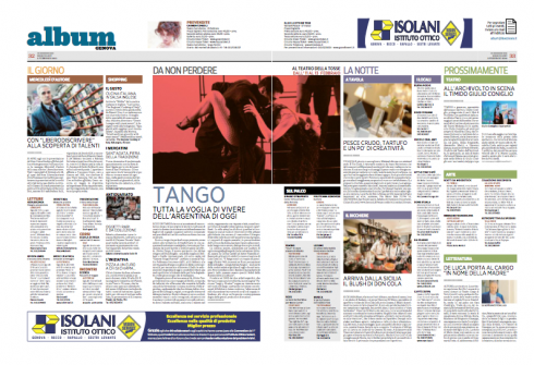
The daily double page Album page: a guide to the region in culture and entertainment, using a color code system for various aspects of cultural life
img src=“https://garciamedia.com/assets/uploads/blog/Il_Secolo_WED_new_thumb.png” style=“border:0;” alt=“blog post image” width=“420” height=“567” />
Front page of the Feb. 3 edition of Il Secolo XIX
_thumb.png)
Il Secolo XIX in constant evolution: front pages from 2006 and 2009
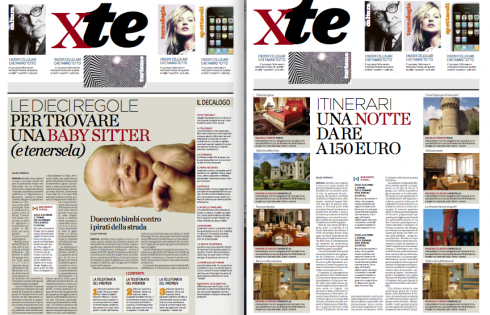
Section fronts for the new xte, which is the daily’s second book with culture, entertainment, lifestyle coverage
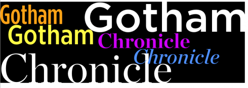
Typographically, Il Secolo XIX is designed around two fonts: Chronicle and Gotham
I have never felt a particular desire to change the name of a newspaper with which I have worked.
But today I do.
We have completed the work on the Italian daily, Il Secolo XIX-—of Genoa. The name translates as The 19th Century, but after this transformation, the newspaper should be called Il SecoloXXI if only for a day or two.
Il Secolo introduced its new look and new, more compact, format Feb. 3, and a busy day it was for Design Director Massimo Gentile, with whom we worked on this project for six months, leading to yesterday’s big day.
“It has been hard work, but we are excited with how it is turning out so far,” Massimo told me. “Now it is a matter of getting the newsroom to become more familiar each day with the changes, and to produce the best newspaper they can.”
Il Secolo’s changes do not simply involve a new more compact format, as the editor Umberto la Rocca also emphasized a reorganization of content, and, for the readers, something new to get used to: only two books. Il Secolo distributes across four regional areas of Liguria, with total changes of the front page and local pages to accommodate a very localized coverage.
As in all introductions of a new design, the final polishing and tweaking is done on the go. I will arrive in Genoa tomorrow Friday to work with the team on those important post mortems, gear up for the weekend newspaper and set Il Secolo XIX into its new course into the 21st century.
We will continue to update this blog post with pages from the new Il Secolo XIX as they become available.
For an earlier blog post about Il Secolo XIX’s rethinking:
https://www.garciamedia.com/blog/articles/for_genoas_il_secolo_xix_new_smaller_format_and_stile_itali
Steingart to become new Handelsblatt editor

It is change of leadership time at Germany’s Handelsblatt, a newspaper with which I have been associated as a consultant for almost 18 years, most recently when Handelsblatt converted to the “business express” (compact) format Nov. 2, 2009. During this time, I have worked closely with editor in chief Bernd Ziezemer, whose duties at the paper will end June 1. Bernd will be replaced by Gabor Steingart, a well known German journalist coming from Washington, where he is correspondent for the weekly magazine, Der Spiegel. Ziezemer will become managing director of Hofmann+Campe Corporate Publishing, based in Hamburg.
Wishing Bernd much continued success at the book publishers, a position to which he will bring much experience as one of Germany’s most distinguished financial journalists. And a warm welcome to Gabor, with whom I hope to continue to work closely as we monitor the progress of Handelsblatt and help it along in its constant evolution
For those who read German:
– Das “Handelsblatt” kriegt einen neuen Chefredakteur: Steingart löst Ziesemer ab
http://kress.de/tagesdienst/detail/beitrag/102418-das-handelsblatt-braucht-einen-neuen-chefredakteur-ziesemer-wechselt-zu-hoffmann-und-campe.html
With many thanks

To all of you who have sent me congratulatory notes and who have called me yesterday on the launch of the series 40 Years/40 Lessons, my gratitude. It was an exciting day. Your support and encouragement will inspire me to continue with this highly personal project. I remind those who were saying they were ready for another installment today: this is an occasional series, and I promise to announce the posting of a new segment one day before it appears.
However, I am writing as I go and finding that for this type of narrative, one must abandon all previous notions of order and hierarchy and simply let the ideas flow. In one day I may come up with material for three segments, so I quickly pour my thoughts down in their corresponding category——out of the 40 I have outlined.
With 40 years to “rediscover” in my head, I must seize the moment and be prepared to capture the essence of a memory that simply pushes forward as if saying: don’t forget me.
We try not to.

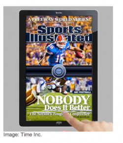
Interesting item here from CNN, based on Joe Zeff’s suggestion in his Design Blog that publishers should lure readers to their struggling magazines by giving away free Apple iPads in return for paid subscriptions.
The Myth of the Free Apple iPad—
http://brainstormtech.blogs.fortune.cnn.com/2010/02/03/the-myth-of-the-free-apple-ipad/
– Personalized news and why the iPad is no savior
http://steveouting.com/2010/01/28/personalized-news-and-why-the-ipad-is-no-savior/
– UK: 3 Playing It Cool In iPad Race, But Will Offer An E-Reader
http://paidcontent.co.uk/article/419-3-rules-itself-out-of-ipad-race-but-will-offer-an-e-reader/
TheMarioBlog post #474