TAKEAWAY: Seven months after it was launched, the FT’s how to spend it supplement app thrives, and it turns a profit. We examine it, with special emphasis on its advertising components. Tablet ads are made of this. This iPad Lab segment takes us there.
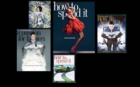
Here are some of those glossy print editions of how to spend it, the weekly supplement of the Financial Times
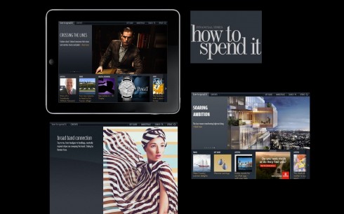
Some images from the iPad app for the FT’s how to spend it
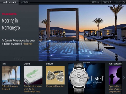
Home page of current issue
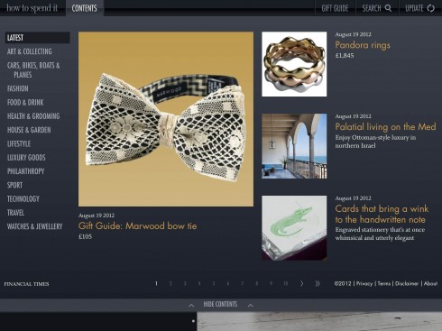
Table of contents to entire issue
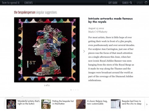
A typical grid of two columns
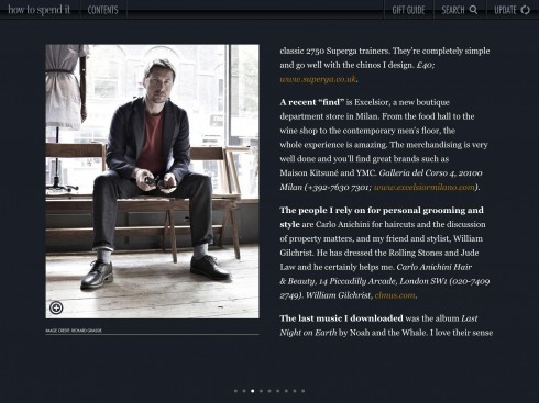
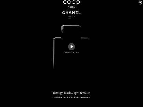
Chanel ads: click on the vertical and it leads to a full advertising suite
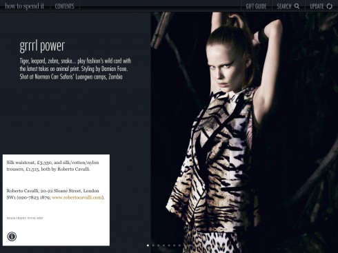
Click on fashion image, and pop up window directs you to where merchandise shown can be purchased
It appears every weekend inside the FT Weekend, the Financial Times‘s big peach robust package of economic news with sections on homes and gardens, life and arts, and, the glossy and ritzy “how to spend it”, yes in all lower case letters.
Now the guide to doing something with all that money earned in stocks and investments appears in an app. The app has been around for 7 months, and I usually take a look—-the health and lifestyle features are of interest—-”Spa Junkie at (Miami’s) Biltmore Hotel,” or “A Nike exercise tracker to take over your fitness—-and life”.
The app has captured the DNA of its glossy mother well. The app, too, presents all those images of precious stones and top of the line automobiles that you know you will never be able to afford, but, what the heck? The weekly supplement is there to help us fantasize, and, who knows? The stock market may start doing better, so that you may afford to get that great Tag Heur watch, The Mikrotimer Flying 1000, a concept watch that is capable of timings accurate to 1/1000th of a second. More precision than anyone needs.
But that is what “how to spend it” is all about: the beautiful but perhaps not needed.
The app is a total lean back experience, with great photos, attractive design, easy navigation, and, a bonus, you can go back to more than 80 complete issues of the magazine. Want to revisit that story champagne tasting from 2010, “The pleasures that lie behind a rodent-nibbled champagne cork,” it is there, too.
Navigation works well, because at any time you can go to the top left of the screen and click on contents, which produces a screen with the Latest by topics, then swipe through 10 screens for the various issues through 2012.
There is also a navigator button for Gift Guide, a Search button and each section then has its own carrousel navigator at bottom of screen for all content within a section.
The grids are basically two: one for opening of sections and a two-column grid for everything else.
Advertising suites and ads that seduce
Advertising is worth noticing here: real advertising suites, in the last issue for Piaget watches and for Chanel. This is a part of the app that deserves special attention.
For all of those who are always asking: how do we turn the corner with advertising on the iPad? Well, this is how you do it. Advertising that is inviting and that has been especially designed for this platform, so take a look.
It is no surprise then, that according to the FT press release on the app, we learn that this app, which is free to users, is already profitable.
According to FT Deputy CEO and Global Commercial Director, Ben Hughes:
“This milestone marks an important step in the continued growth of How To Spend It across digital platforms. Advertisers can now reach a large high net worth audience through the wonderful editorial environment of How To Spend It magazine, combined with the rich and interactive advertising experience that the tablet offers.”
With over 100,000 downloads since it premiered, and profitable since its launch, there is a lot to learn from not just the look and feel of “hot to spend it”, but also how the presentation of advertising especially created for the app can make the difference economically, too.
SPD: Speaker Series Begins with “News You Can Use”

(Joe Zeff Design Illustration, courtesy of SPD)
Tickets are now available for the Society of Publication Designers’ first Speaker Series event of the fall, “News You Can Use,” scheduled Sept. 10.
For more information:
http://www.spd.org/2012/08/speaker-series-begins-with-new.php
SND Scandinavia Space 2012 conference
Still time to get a spot to attend the SNDS conference in Copenhagen, Sept. 27-29;
For more information:
SNDS workshop ever. Read all about SPACE 2012 here:
The iPad Design Lab: Storytelling in the Age of the Tablet
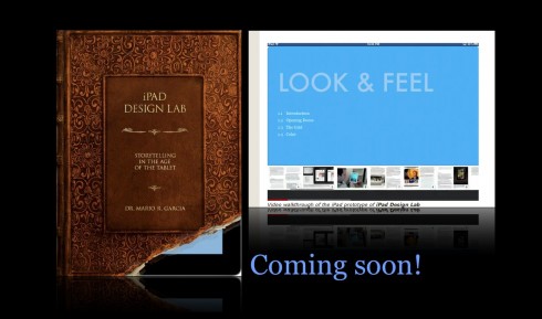
Video walkthrough of the iPad prototype of iPad Design Lab

Mario Garcia’s upcoming speaking engagements:
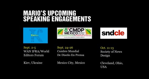
WAN-IFRA World Editors Forum, Kiev, Ukraine, Sept. 2-5
http://www.wan-ifra.org/events/64th-world-newspaper-congress-19th-world-editors-forum
Cumbre Mundial de Diseño en Prensa 2012: Mexico City; September 24-26
http://www.cmdprensa.com/mx2012/
SND (Society of News Design) Cleveland; Oct. 11-13
http://cle.snd.org/