This is the weekend edition of TheMarioBlog and will be updated as needed. The next blog post is Monday, February 8.
The process of selling good content
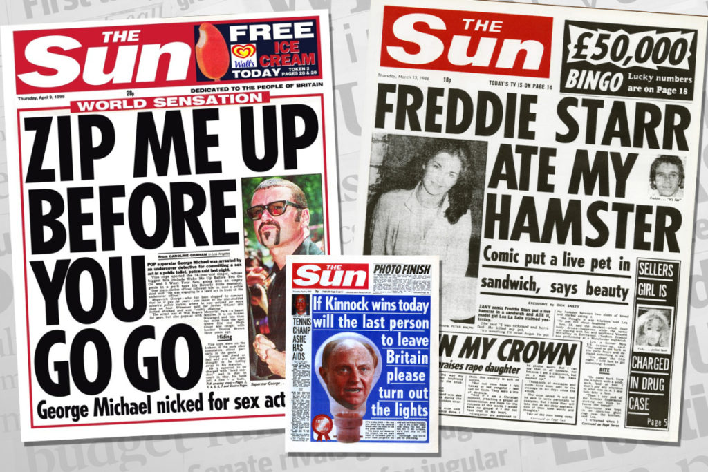
Marketing is key: Even for well established brands such as The New York Times and The Wall Street Journal, it is important to remind people that , in addition to a well known name, you also have content that is essential and here is a bargain for you to get that first subscription. Oh, nostalgia, to think of those days when newspaper marketing teams came up with all sorts of gimmicks to attract subscribers. Think lottery games, encyclopedias, travel clubs, sets of china, etc. Today, the key is to sell the authenticity of the newspaper’s journalism. See these front pages from the UK’s The Sun and its Bingo marketing promotions:
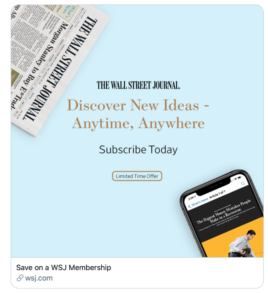
The Wall Street Journal: Look, ma, we have print if that is what you want, but also mobile edition that is easy to use. Come and get it.
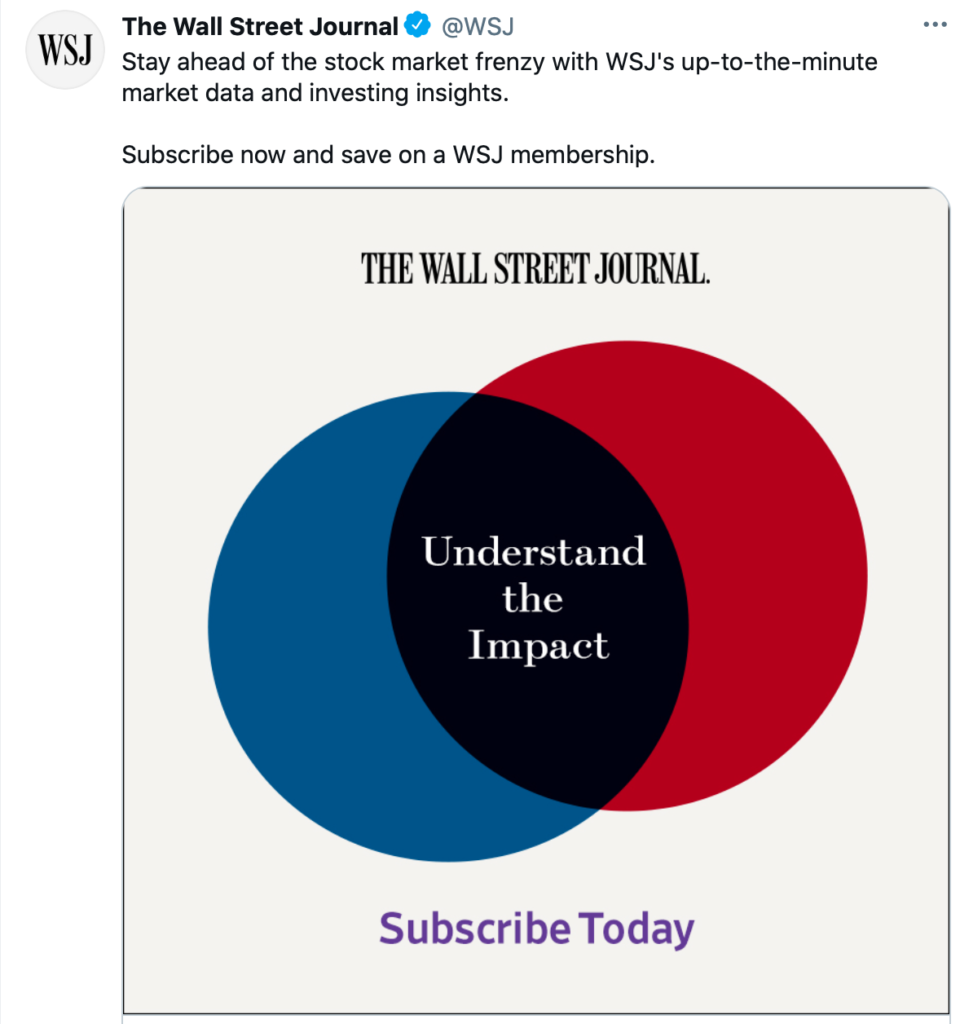
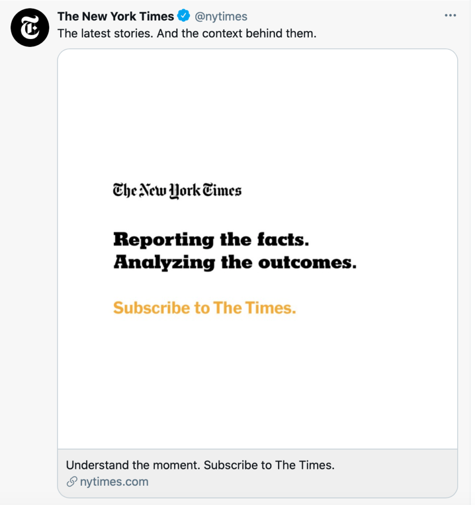
The New York Times: No visuals to go with this Twitter ad, but very direct headline set in bold. Sort of “it does not get better than us,” which I testify could be a very true statement. As a long term subscribers, I also notice that there is more analyzing of the news now than ever. It helps that I get push notifications daily when an analysis appears. Good job.

From The New Yorker: Another iconic legacy publication and how it lures potential subscribers.’

Meanwhile, at The Washington Post: Attracting young subscribers via Instagram, and an Instagram Editor! That’s a new title!
Type & color
Design Boot Camp: A ritual of the early semester for my Multiplatform Design & Storytelling class at Columbia is to review the essentials of design. We have already covered story structures and grids, but Monday we tackle the part of design that is quite exciting and calls for the most creativity: selecting type and color palettes.
So, what are two examples I will be showing the students this year.
Here you go:
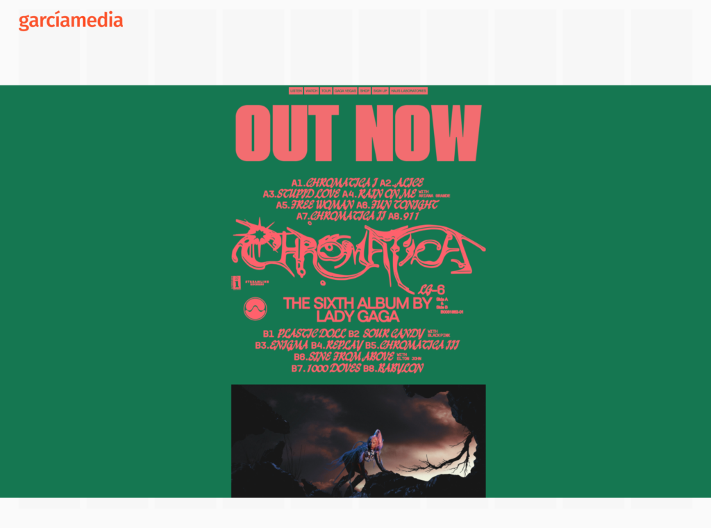
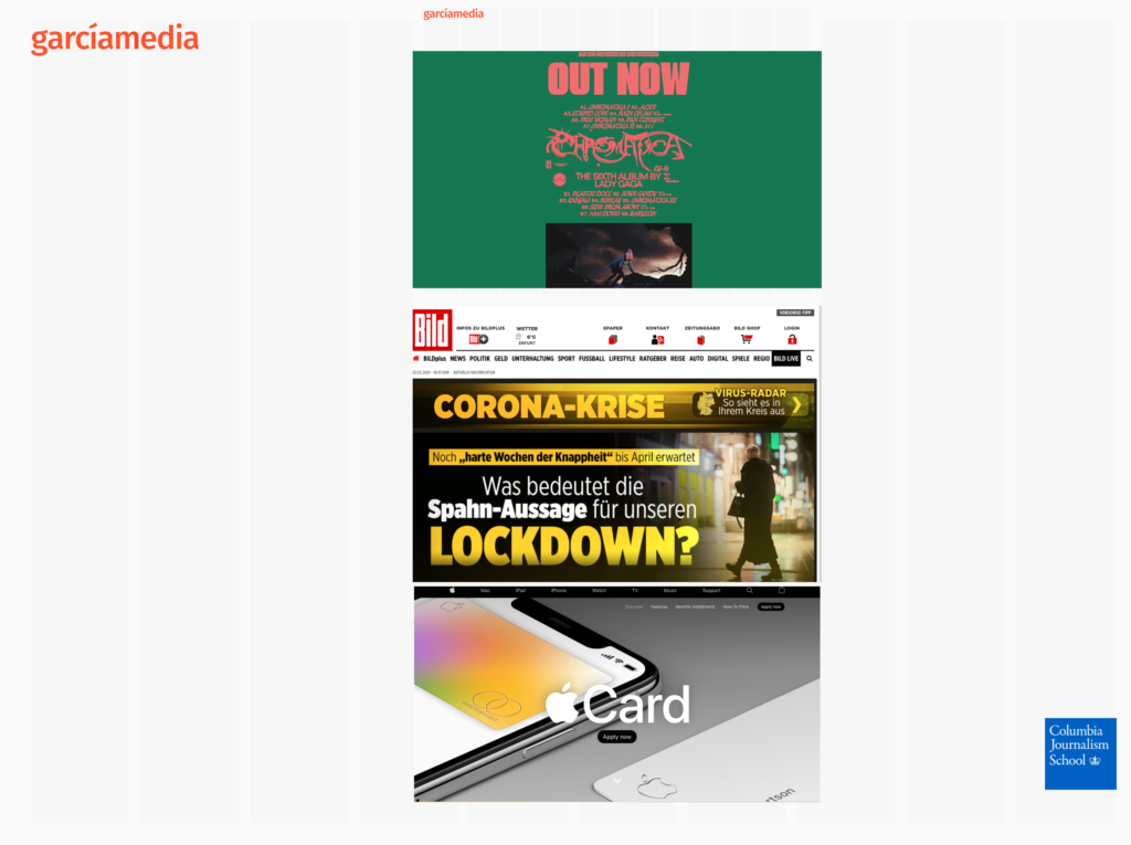
Lady Gaga’s website: These two examples allow us an opportunity to discuss color and type choices. I am not surprised that Lady Gaga’s home page opts for huge sans serif type in a hot pink, with the more organic green as background color. I am surprised that her own photo is so small and secondary, but she is trying to sell her newest album. Some of the type here is difficult to read. No question that the overall combination of color and type makes us want to take a look. However, for anyone who got this far into Lady Gaga’s website, that person is already very interested in the artist.
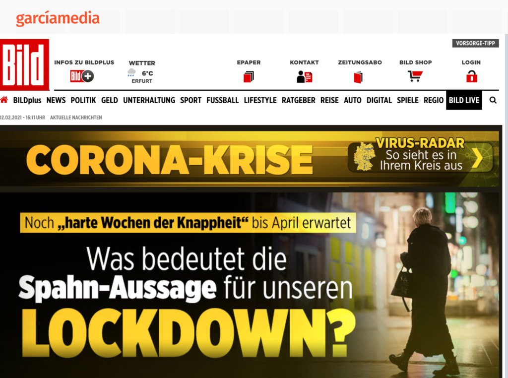
Germany’s Bild Zeitung: This is always a party favorite when it comes to teaching typography and color. Bild goes overboard with both, and it works for this newspaper that goes bold, big —-and even yellow!—with the news of the day. Headlines in all caps (loud, screaming), yellow to make us get to the screen faster. Red as part of the logo is already incendiary enough. Not every newspaper can pull this off as easily as Bild.
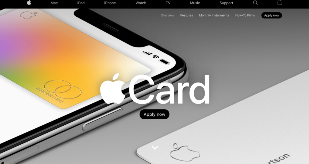
The quieter hues of Apple: After seeing the GaGa extravaganza and Bild’s blinding yellow, I want the class to sample the pastel hues, as in the Apple Card. Relaxing. Comforting. Can’t go wrong with the pastels.
Three styles: These all work for their intended audiences and content, which one is your color palette?
Another edition of Wander
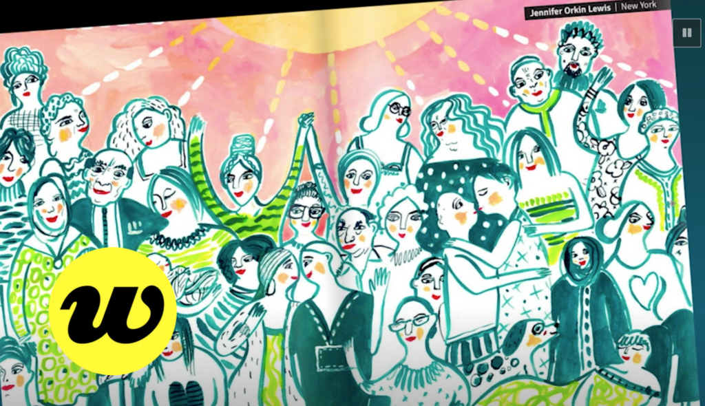
It’s a new edition of Wander , the new publication that focuses on “building a global community of creative expression.” After the first issue’s success—centered around the question “how do you find inspiration in 2020?”
There is beautiful work to sample here. I applaud the editors of Wander for continuing to showcase so much outstanding and timely work. In this edition, 34 illustrations from nine different countries.
Learn more about Wander and view the digital issue on their website wandermag.design.
Branded content and local papers
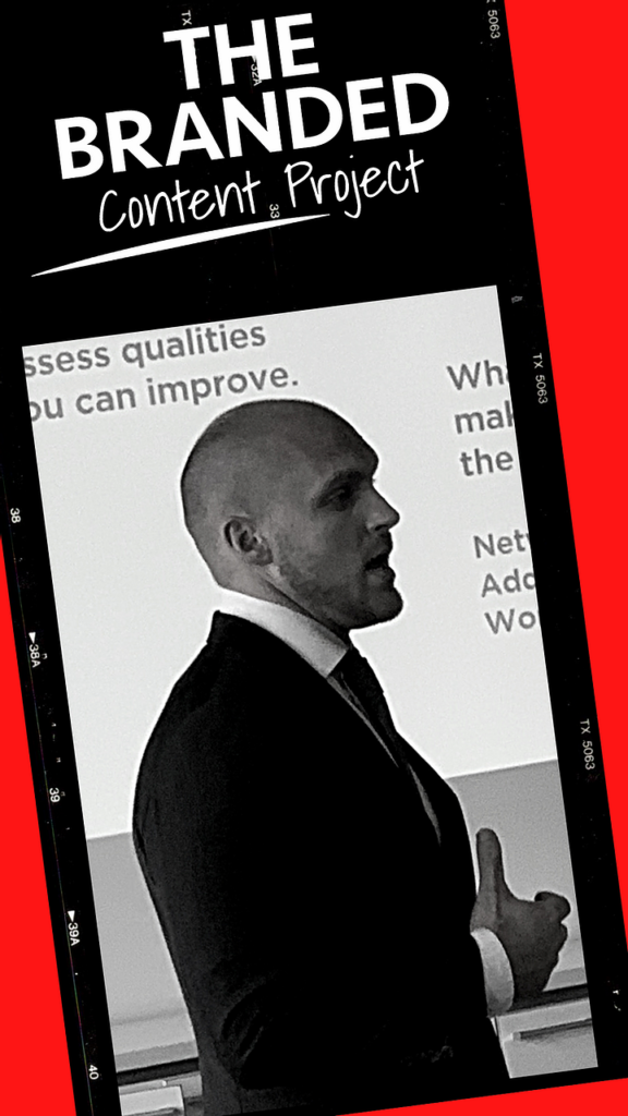
Branded content proved to be a strong revenue generator: I was surprised to read this piece about the success of local newspapers with branded content. After all, 2020 was a disastrous years in so many ways, and who would have thought that branded content would do well when so many things went wrong in the year of the pandemic?
The Branded Content Project; Recently, publisher members of The Branded Content Project took the opportunity to reflect on the past year sharing what they’re proud of and what they wish they could have done differently during this challenging period of time.
Highlight:
Multiple departments realized that it was in advertisers’ best interest to tell their story through branded content. But if they could have done something differently, it would have been to be more proactive from the get go.
Many local media outlets discovered that the pandemic actually offered the perfect opportunity for advertisers to tell their stories through branded content, triggering a new revenue stream at a time when it was desperately needed.
Branded content in TheMarioBlog:
http://garciamedia.com/wp-admin/post.php?post=1815&action=edit
http://garciamedia.com/wp-admin/post.php?post=9146&action=edit
Professors: get your review version of The Story on time for fall classes
As an academic, I know the importance of having the right tools to advance our students, especially on the important subject of mobile storytelling. Please drop me an email if you would like to sample The Story in its digital edition: mario@garciamedia.com
Start writing or type / to choose a block
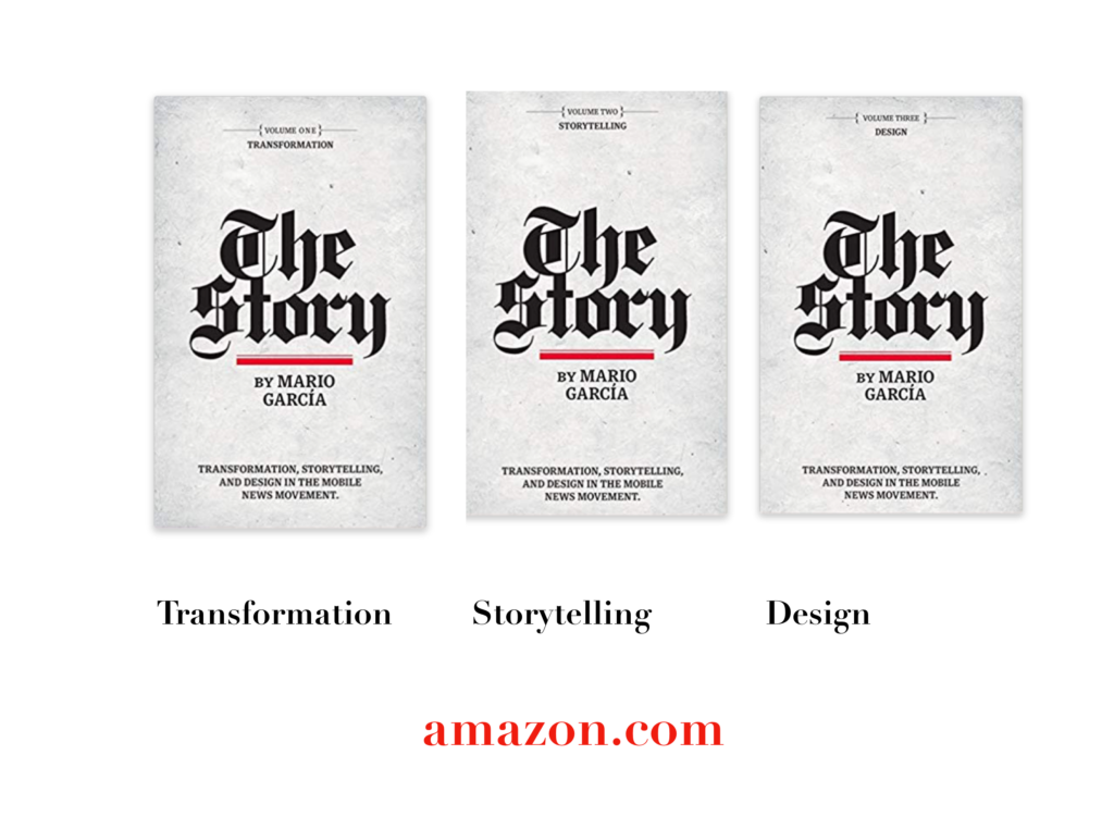
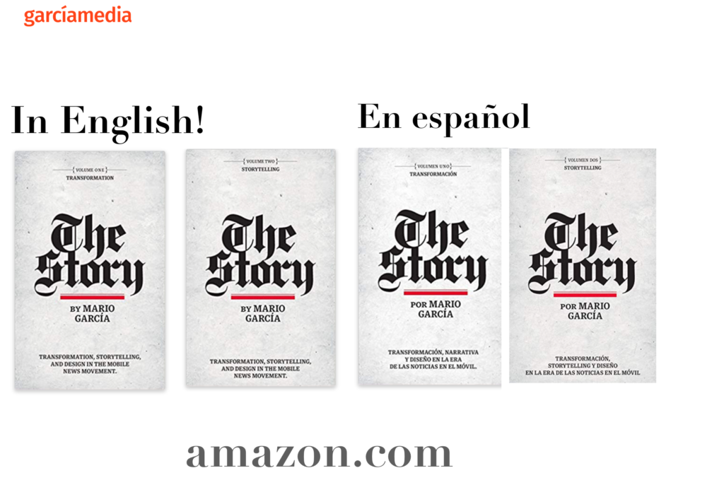
The full trilogy of The Story now available–3 books to guide you through a mobile first strategy. Whether you’re a reporter, editor, designer, publisher, corporate communicator, The Story is for you! https://amazon
TheMarioBlog post # 3269