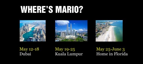
This is the weekend edition of TheMarioBlog and will be updated as needed. Next new blog post is Monday, May 14
Update #4: Saturday, May 12, Dubai, 12:40
TAKEAWAY: The word “redesign” was already overused by the end of the 1990s; however, in 2012, it should be substituted for the more appropriate term “rethink”.

Once upon a time in what seems ages ago,”redesign”was the paramount word to describe change within a newspaper. And redesign we did, first trading Bodoni-style fonts for Helvetica-svelte fonts; introducing color to gray old ladies; putting promo boxes above or below the newspapers’ flags, some of which were, in turn, changed (gasp!), creating order from chaos, and, even switching from broadsheet to compact formats. Then came the waiting for the reaction of the readers, not to mention the contest judges who would decide if the redesign was worthy of gold, silver, bronze, or a “non event” medal to the forgotten from the most trendy contests.
But that was then and this is now: in 2012 the word redesign is not adequate for what we do, although, indeed, we do redesign. However, today the redesign is one of many tasks that are involved in the process of “rethinking” an entire news operation.
It takes a while to get the teams in the newsroom to forget that it is all about the redesign, and get them to engage in a rethink.
It is easier to redesign than to rethink, of course, and less stressful, threatening and difficult to execute.
For me, the word redesign no longer describe what my team and I do when we come into a newsroom.
Starting with the briefing
I must admit that many of my projects have started with a call from an editor, publisher or art director saying something like:
“Hey, Mario, we would like you to come and redesign our……”
Usually that is the last time that “redesign” creeps into the conversation. After an initial briefing, in a majority of the cases, we all agree that a rethink is more appropriate.
In my first workshop I usually pose the question: if your newspaper did not exist as of today, if it never existed, what would we be gathering to discuss here today?
Ah, storytelling and how to present information to an audience that moves across the platforms.
So, is it practical to begin discussing the typical “redesign” topics: can we change the logo? Are we changing the format? Are we going for different fonts? More use of color?
Less text on the cover?
Not that these questions are not important, but they are so a half hour ago, if you follow me here.
I prefer to engage the group with questions that are more likely to sound like this:?
—Which platforms is your current audience using to get information? Which platforms are they likely to use by 2015—-I am not one for projecting the products beyond three years, which in today’s terms could be an eternity.
—What is the DNA of your publication and what is the strongest area of content? Usually, it is local. If so, how can you give your local coverage better display across the platforms?
—What is the philosophy of your newsroom about breaking news? Indeed, we know news breaks on Twitter. What do you do with the story following that first burst on Twitter?
—Do you have a newsroom plan in action to trace the path of a breaking story across platforms right when it is happening?
—Finally, what is the role of the tablet edition in your newsroom?
Where should one begin?
So, here we are, originally brought in to redesign the newspaper, but the conversation has shifted and the redesign is now item 3 or 4 on a list of 6 or 7 items.
And that is the way it should be. Soon the members of the newsroom who were counting on a quick cosmetic fix redesign a la dynamic 1980s or glorious 1990s, begin to realize that this is NOT what will propel them forward.
Instead, the story takes center stage, then the platforms.
After this exercise is completed, the question is, for purposes of look and feel, which of the platforms do we pick to get started with sketching?
There may be different views here, but I prefer to start with the digital platforms and then move on to print. And of the digital platforms, it is my preference to begin with the online edition, which sits between the mobile phone and the tablet, but with many common features.
After story structures have been defined and applied digitally, then application to print becomes easier, more functional, and just as much fun as it ever was.
But, remember, there is no redesign without a proper, thorough and sometimes painful rethinking of what you do and how you do it. Along the way, the big elephant in the room, and one that must be dealt with: do we have the people to execute our rethink?
Often yes, sometimes not. This is where part of the pain of rethinking comes in. I am happy to say that in my experience, most newsrooms manage to realign human resources, to create new positions, to assign new tasks to those in old positions, and, presto, change in on the way.
If the word redesign has any proper use today is in the need to redesign some editors out there who simply do not get it.
There is no true and sustainable rethinking of a product without the editors joining the process with gusto.
So, if your organization is calling me about a redesign, we will, of course, provide that, but not without a thorough discussion leading to a rethink.
Meet the “What Did I Miss?” Generation
First, we had the generation of the always connected , but that was in those long ago early days of the Internet when online was the safest way to be sure one was constantly informed.
Then, we talked about digital natives with addiction to anything with a screen and news updates.
Now, it is the “what did I miss?” generation, those truly warriors of connectivity who are even jealous of the few hours they spend sleeping and thus anesthesized from incoming news.
A piece in The New York Times profiles one such person, but I am sure he represents many more.
Since every addiction signals the arrival of a therapeutic treatment to eradicate it, I can only imagine the power of disconnect that authors like William Powers(author of Hamlet’s BlackBerry) promote.
Pages we like
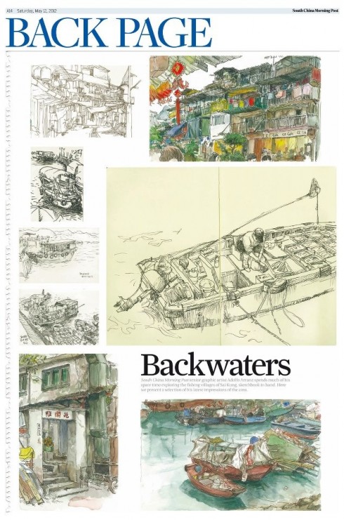
The South China Morning Post devotes its Back Page to the magnificent illustrations by staff artist Adolfo Arranz.
Follow up
O Globo’s iPad app
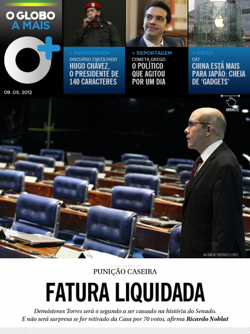
This week we blogged about O Globo’s new iPad app: O Globo +. Here is an article of interest that relates to that subject.
– Revenge of the afternoon newspaper: Brazil’s O Globo sees engagement skyrocket with a magazine-like iPad app
http://www.niemanlab.org/2012/05/revenge-of-the-afternoon-newspaper-brazils-o-globo-sees-engagement-skyrocket-with-a-magazine-like-ipad-app
First Paragraph:
A surprising thing happened when Brazilian newspaper O Globo launched O Globo a Mais, a new weekday evening edition designed for its iPad app in February. The amount of time that people spent using the app per day shot up from an average of 26 minutes to an incredible 77 minutes. The jump seemed unbelievable, even for the team behind the new publication.
The Hindu publishing new Luxury weekly supplement
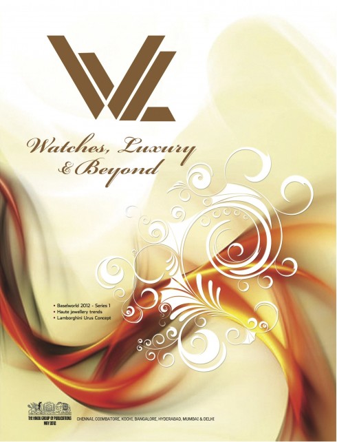
Cover of the new luxury supplement, which devotes most of its content to watches
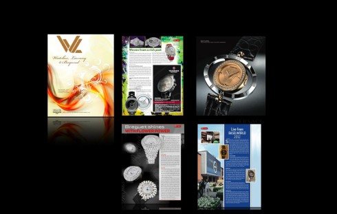
Earlier this week we mentioned that the Indian daily, The Hindu, has started publishing a tabloid supplement each Saturday devoted to Luxury items. Art director Brian Gaughan send us some sample pages from the first edition.
????
Weekend reads
– USA: Colin Myler’s ‘Daily News’ is working on a new national site, ‘Daily News America’
http://www.capitalnewyork.com/article/media/2012/05/5868016/colin-mylers-daily-news-working-new-national-site-daily-news-america
– USA: Programming Politico’s Future With Video
http://www.adweek.com/news/press/programming-politicos-future-video-140071
– USA: Papers Offering More And Better Video News
http://www.tvnewscheck.com/article/59254/papers-offering-more-and-better-video-news
– Content, function and purpose: Three lessons on mobile and tablet publishing for magazines from #PPAConf
http://www.themediabriefing.com/article/2012-05-09/Three-lessons-on-mobile-tablet-publishing-for-magazines
-The Art of Apps
http://artofapps.splashthat.com/
Register Citizen’s ‘open’ newsroom
Register Citizen Editor Rick Thomason leads a tour of its experimental newsroom, open to the public every day of the week.
http://www.youtube.com/watch?v=E55WIoh-hxA
The iPad Design Lab: Storytelling in the Age of the Tablet
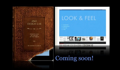
Video walkthrough of the iPad prototype of iPad Design Lab
