Note: this blog will be updated regularly during the day today Tuesday, January 19
Updated 06:34 EST
TAKEAWAY: Il Secolo XIX prepares for Feb. 4 relaunch with slightly smaller format. It is all about layers, color, differentiation and creating a distinct Italian voice. We show you what it will look like.
New decade, new format for Il Secolo
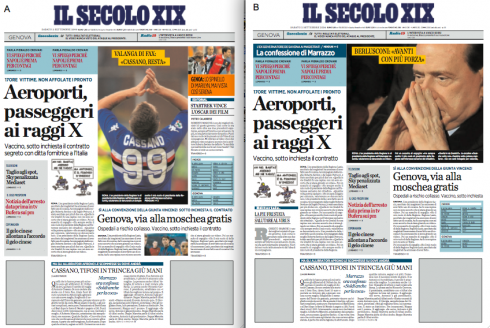
Two sample front pages from the prototype of Il Secolo XIX: notice that the navigation bar at top allows for the lead photo of the day to come from there.
Yellow strips are used to highlight headline that goes with that lead photo.
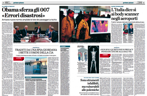
Pages 2-3, double page that allows readers to enter Il Secolo XIX with the main story of the day. Notice here the various layers, as described in the text below, which allow the editor to create various tones for the “conversation” with the reader. Main story takes the boldest headline, then secondary story a lighter version, along with all capital letters for an important—“home made”—-story that the editor wishes to highlight. Notice presence of compacts, as well as labels in burgundy hue to guide readers through the entire package.
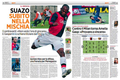
Double page of sports highlights photography, emphasis on the color orange, and strict use of the sans serif font, in this case Gotham in various weights
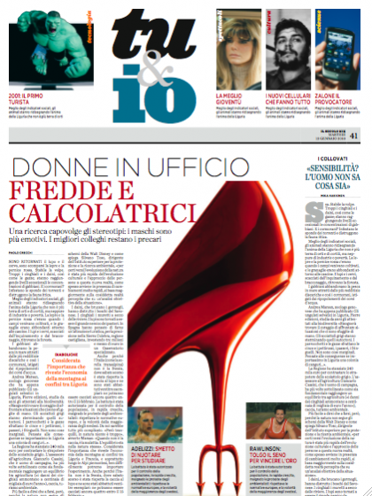
Opening of feature section——tentatively called “you and me”——displays large images, along with a top navigator to the various topics inside.
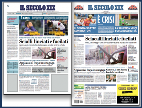
The new Il Secolo format (left) is smaller than the existing one. In this exercise, we have taken yesterday’s front page, redoing it with the same elements in the new format.
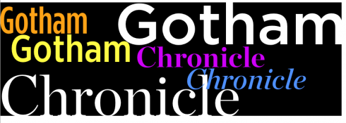
Typographically, Il Secolo XIX is designed around two fonts: Chronicle and Gotham
Italian newspapers possess a style of their own. It is not just the visual language that is different——bold headlines that intersect each other on the page like cars and motorcycles on the busy streets of the big cities, including scenic Genoa—-but also the page architecture, which has always struck me as one of the most distinctive features of Italian dailies. Call it “Stile Italiano”, if you will, and you will find it in every title. Even the size of the newspapers has seldom adhered to what we are accustomed to in other newspapers. In the era of the broadsheets, the Italian ones were either wider or narrower and shorter.
It is difficult to describe these formats. Not Berliner. Not tabloid. Not broadsheet. Again, I call it Stile Italiano, and that means a configuration similar to what which we see in such well known Italian national titles as Corriere de la Sera or La Repubblica.
At Il Seoolo XIX, entering the new decade of the 21st Century means reducing the size of its pages, introducing a look that is younger, allows for easier navigation, and takes a look at the architecture of all inside pages to create better hierarchy.
Perhaps our most important work here has been the “layering” concept that applies to how stories are displayed daily.
Anyone who has seen Italians engaged in conversation knows that the language invites a variety of rhythms and intonations. This, I think, translates to the page.
Take , for example, a page of politics——and there is plenty of those in any Italian daily. Usually, the page opens with a top story of the day. So far so good.
Except that, right next to it, the editor wants you to place a “short commentary” by an expert on this particular political topic. Fine, you create a story structure for that. Then, the editor wants you to “come up with something that is our exclusive little story attached to the major story, done by our reporter.”
Yes, sort of like home made pasta, with its unique flavor. Crafted to please. Taste it first. Maybe it is the antipasti to the sumptous meal that follows.
Again, we must give this type of stories its own look.
But we are not finished yet, because the editor also wants you to differentiate another “little story” that ties to the package, but that is not a brief, nor a compact. It may be “piccola” but it is substantial, the editor reminds me. Maybe we give it a color background, he says, and apologizes for “getting into your business of design, since I am no designer, you know.”
So we find a special characteristic for this one.
“Don’t forget to give us a good, strong way to show photos that sit alone on a page without story accompanying it,” the editor reminds us.
We please him when we create photos with a splash of yellow ribbons.
Layers, color, differentiation
The Il Secolo XIX that readers in the Liguria region of Italy will see Feb. 4 captures all that editor Umberto la Rocca has asked for. He now has all the editorial tools to create pages that will be able to use design components to talk in the different voices and inflections required by the Italian daily.
We have concentrated on layering of stories, on utilizing the colors blue and burgundy as key eye movers on the pages——with orange for sports. We have worked hard at differentiation of elements. The “stile italiano” here goes beyond the format, which is a cross between a long tabloid and a Berliner.
Publisher Carlo Perrone, with whom I have worked for almost 20 years in various changes at Il Secolo XIX only gives us one mandate: “Make sure that our more traditional readers, of which we have many, will not feel that the change of format has also led to a dramatic change of their newspaper.”
The team
I have worked on this project with our Garcia Media creative director for Europe, Christian Fortanet, along with Il Secolo XIX’s design director, Massimo Gentile. Together we have joined forces to analyze every corner of Il Secolo’s intricate storytelling patterns and to find solutions that we feel the readers will appreciate.
I will update this blog thorughout the day today and in the days ahead leading to the launch.
We now have completed a second prototype and it is those pages that I am showing here.
One always wonders what the readers’ reaction will be, but we have made sure that one thing remains prevalent here: Il Secolo is all about Stile Italiano.
Stylistic details for the new Il Secolo XIX
Following are pages from the Il Secolo XIX Styleguide, prepared for the launch:
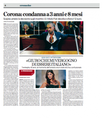
Normally, there will be a lead story, accompanied by a related item that is usually the work of the local journalists, thus the different treatment
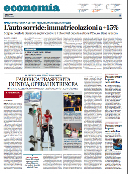
Full page of Economia shows how the various story structures interact on the page.
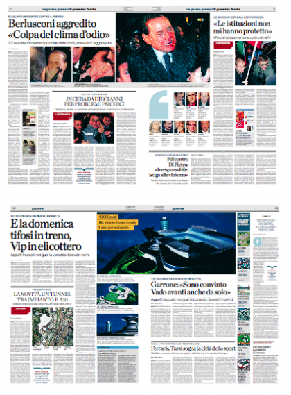
Inside page spreads for the new Il Secolo XIX
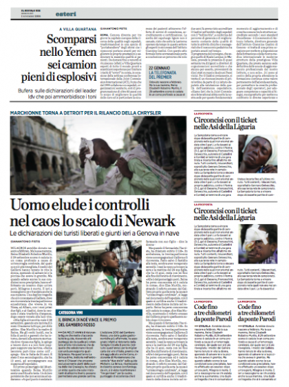
The side-saddle style of headline can be used for item at the very top or bottom of page.
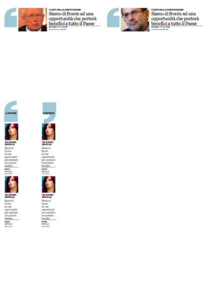
Quote accessories for selected in-depth reports

Displaying a stand alone photo at the top of the page creates drama and visual interest

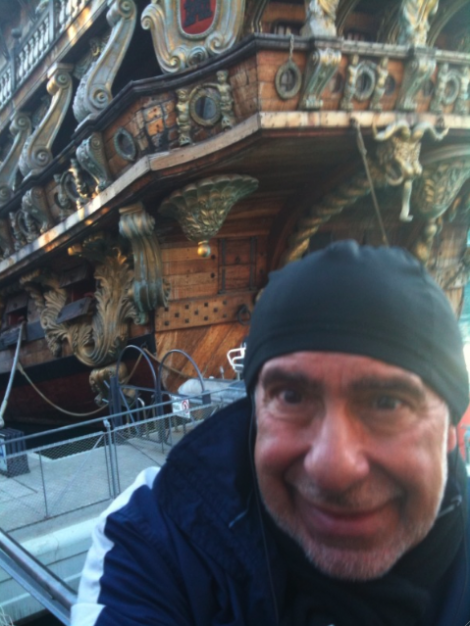
Here I am at the end of the run in Genoa this morning, right in front of this old ship that was actually used in the Roman Polanski film, Pirates (1986), starring Walter Matthau. While the rest of Europe has not seen much sun the last few days, Genoa has plenty of sun to share, but it is still cold. However, a morning run thru the old Port of Genoa is always envigorating, especially the views of the city, and all those houses staring at the sea from the hills.
For the trailer of the movie Pirates:
TheMarioBlog post #460