When small plays big
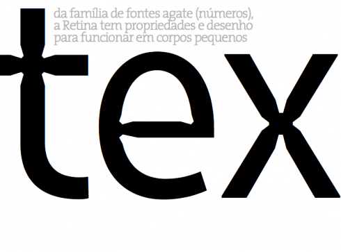
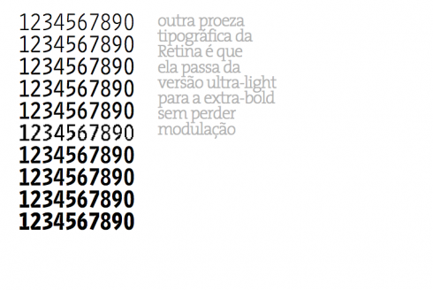
Retina was especially designed by Tobias Frere-Jones (www.typography.com) as a small size font but it is now available in all sizes. Originally, Retina was commissioned by The Wall Street Journal
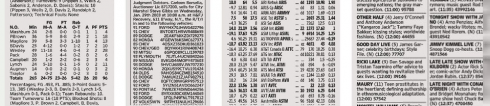
Consider what your newspaper would be without sports results, classified advertising, and, as we learned with The Wall Street Journal redesigns, those stock listings are extremely important to a large number of the readership—-even though the information is readily available online.
What newspaper and magazine does not include a long weekend guide to where to go, where to eat, what play to see, where to take the kids? It is usually set in small type.
I call it finger reading because readers tend to run their finger over the page when they search out these items, something they don’t do when reading a narrative set in 8 or 10 point. Fingers and eyes are in unison, doing the moving.
Here are some tips for designing them effectively:
*Always select the most legible typeface; sans serifs do better than serifs. For the Wall Street Journal and Folha de Sao Paulo, we picked Retina, but many other fonts do just as well.
*Pay attention to category breakers, and make them slightly larger, and bolder, and maybe set in all capital letters.
TheMarioBlog posting #256