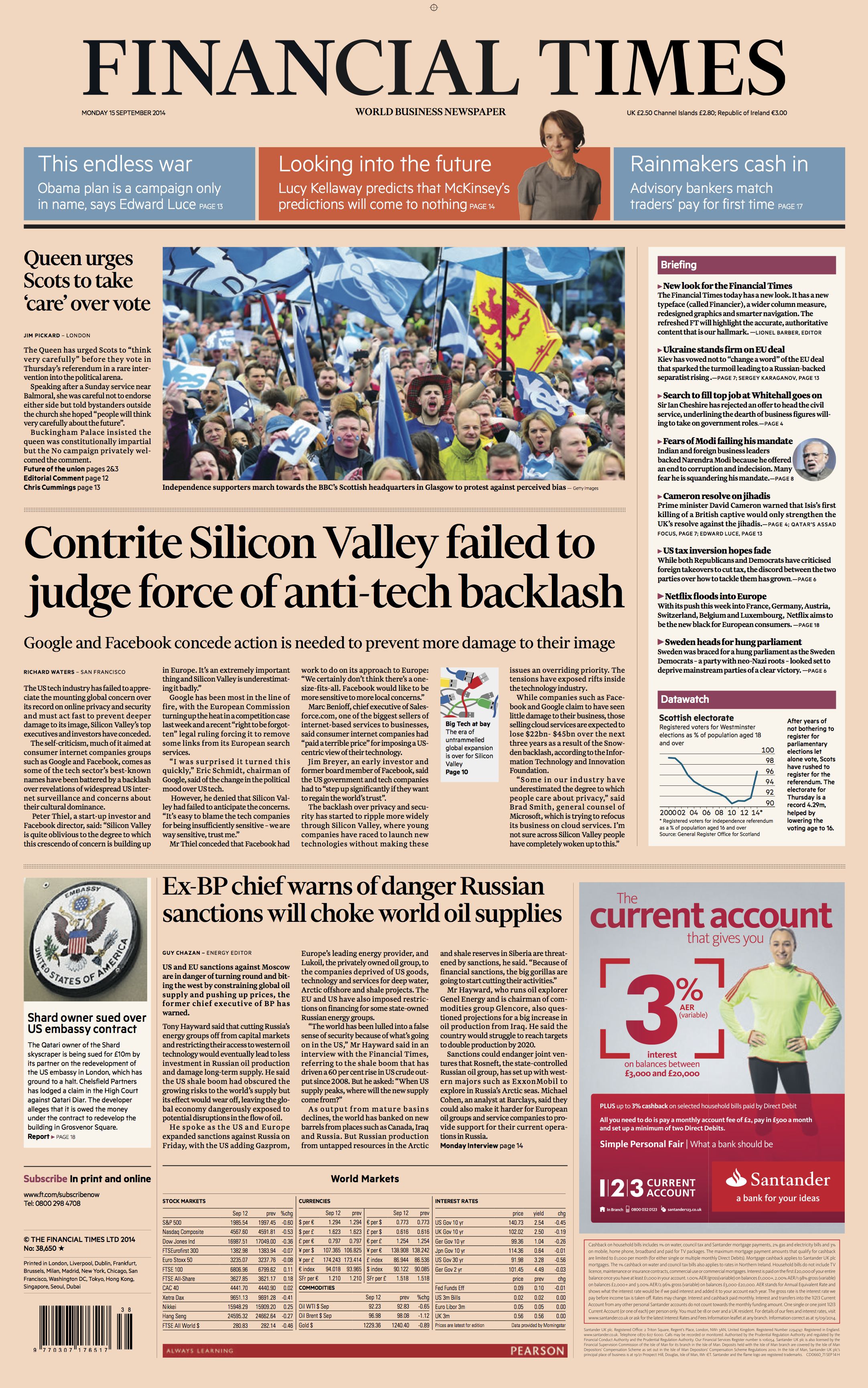
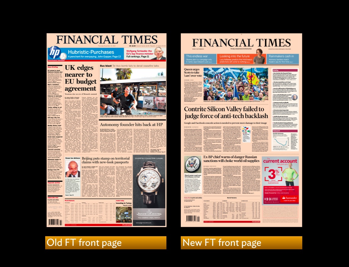
The newly designed front page of the Financial Times
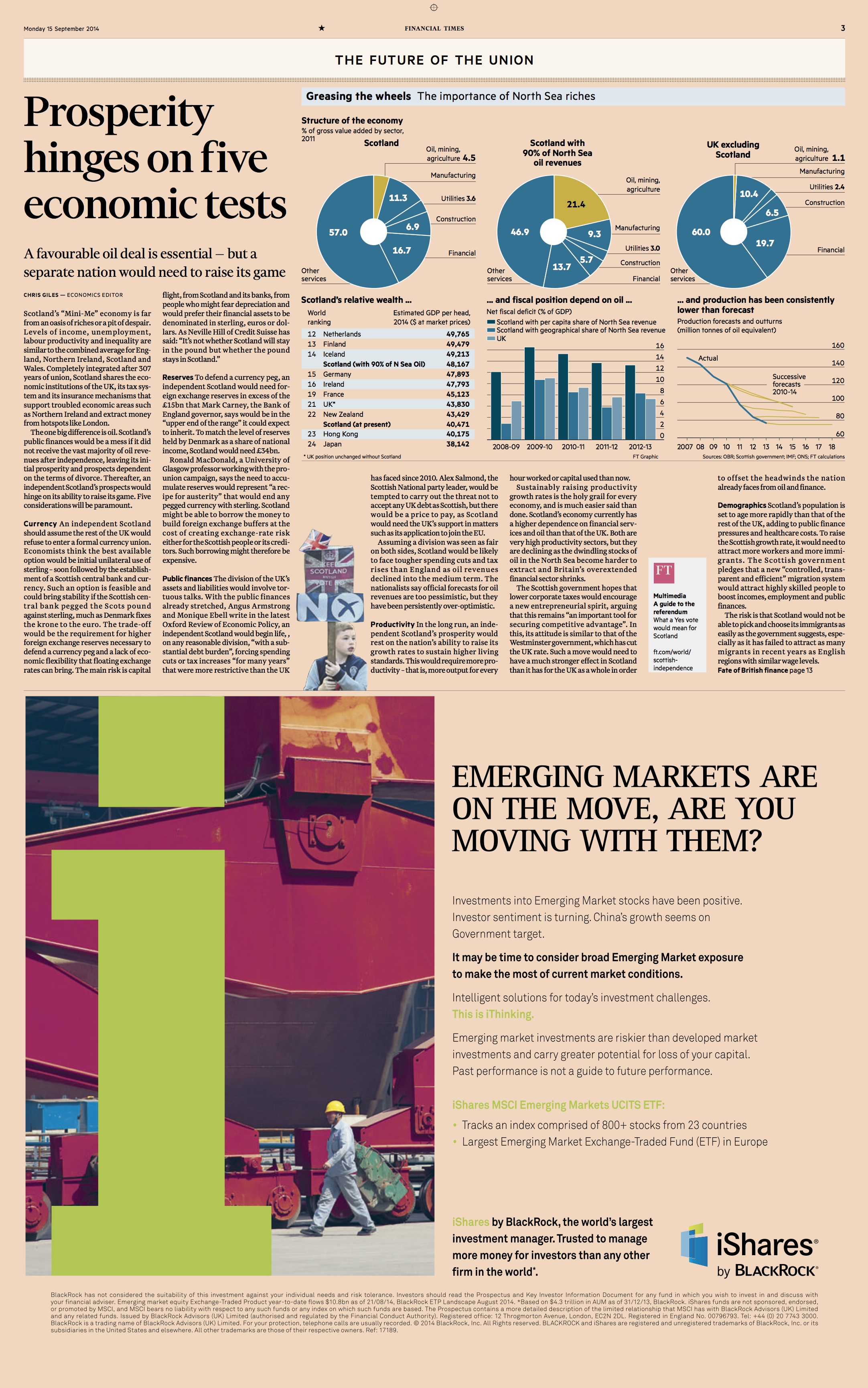
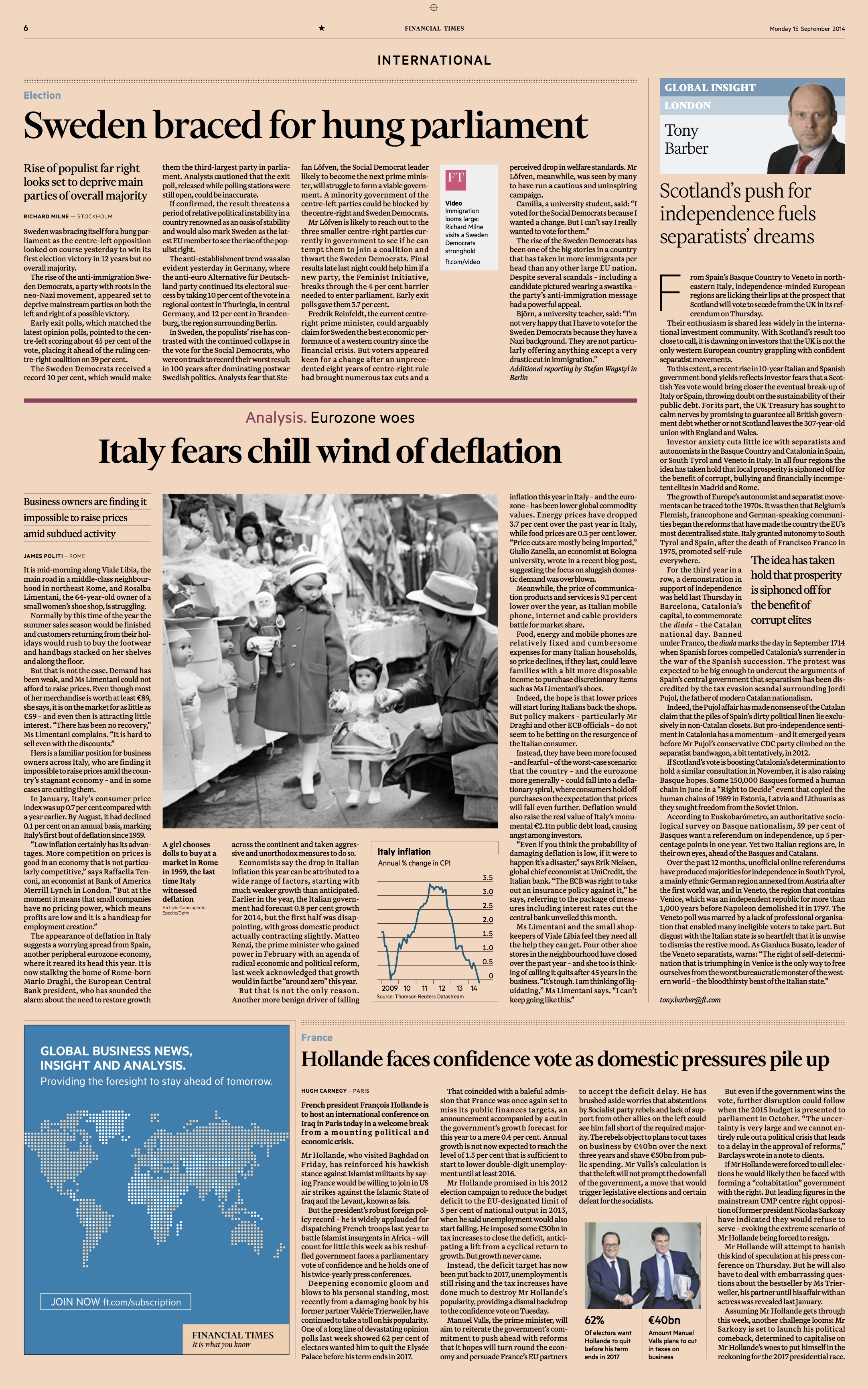
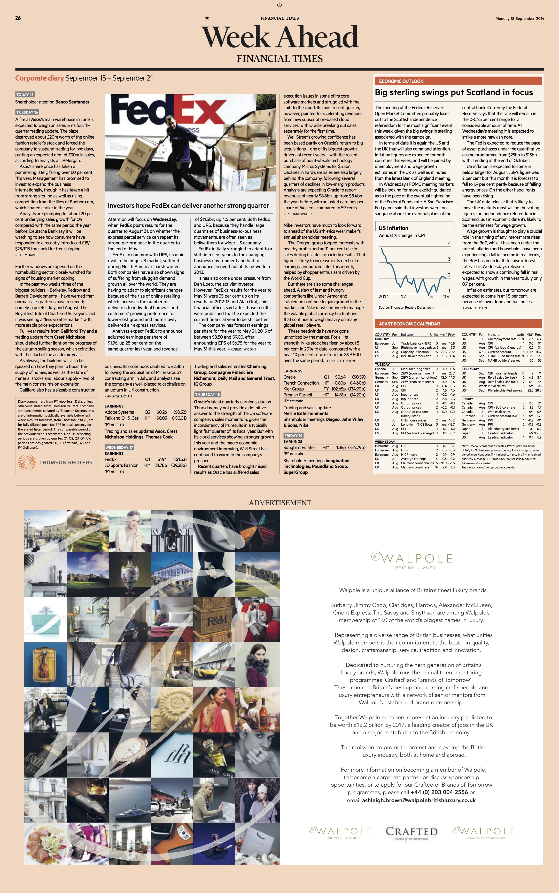
Inside pages of the newly redesigned FT: notice switch to 6-column grid (with 12-column variation).
Kevin Wilson, head of design at the Financial Times, teased me with a short mail that simply said: “Mario, it’s still pink and still a broadsheet”.
That’s good to know, but it was even better to sample some pages with the new design that Kevin sent me a couple of days ago.
Three highlights are the main centerpieces of the Financial Times’ redesign, which was led by Kevin Wilson along with design consultant Mark Leeds :
–A new typographic palette: get introduced to Financier, an elegant, old world font that charms at first sight.
–A new grid: gone is the 8 column configuration, is in the more attractive 6 column grid.
–A newspaper that’s designed to give the print edition a specific role as it redefines its purpose in the midst of the digital world.
A conversation with Kevin Wilson, FT head of design
Mario:
What was the biggest challenge to redesign the FT?
Kevin:
The biggest challenge for the redesign team was one of balance:
The newspaper wasn't broken, but we needed to update and modernise it – to show an ongoing commitment to print while refocusing our editorial priorities. The design also needed to deliver a run of pages and graphic formats that were more standardised – to make forward-planning and web-to-print translation easier.
Mario:
Your Weekend FT has more sections and a magazine: was a different thinking geared for this particular edition?
Kevin:
The weekday FT is a complex two-section paper, that readers approach in different ways. Some start from the back Companies section, and jump to specific points in the run – absorbing news, data and analysis quickly – the paper as a tool in their professional lives. Others take a more conventional route from the front page, through general news and comment. So we have to respect these different routes – any structural changes could not be undertaken for cosmetic reasons.
The typography: Introducing Financier
A highlight of this redesign is definitely the typography. A new custom serif , Financier, has been developed for the paper by Kris Sowersby, of New Zealand.
“We wanted an elegant, authoritative serif with the versatility to handle news and features stories (in the arts, science and sport, as well as finance),” explains Kevin Wilson.“The FT is a global newspaper but based and founded in London – and wanted to call on this British heritage in the type we used.”
Kevin says that during the course of the redesign they experimented with some early directions before Kris suggested exploring 'something like Gill’s Solus for text & Perpetua for display'.
“It was strong at text sizes on the new 6-column grid, and the headline/display type could handle everything from elegant capitals for the title piece, to strong news headlines. The light and bold weights, beyond the core news weights were very versatile and showed a lot of potential for features use in FT Weekend,” Kevin said.
Kris has also produced webfonts of Financier and Metric (his sans that we are using for graphics). They will be rolled out to the web and app as appropriate within the ongoing development process on digital.
Read more about Kris Sowersby, his fonts and his work with the FT Here:
https://klim.co.nz/custom-fonts/financier-display
https://klim.co.nz/custom-fonts/financier-text/
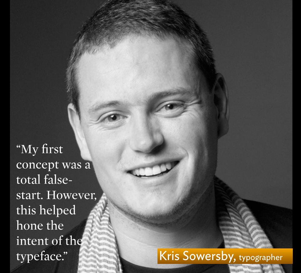
A conversation with type designer Kris Sowersby
_3.jpg)
_2.jpg)
_5.jpg)
_7.jpg)
-6.jpg)
_HEADER.jpg)
Mario:
As you created Financier, what were the priorities and guidelines that you gave yourself. After all, the Financial Times is an iconic financial daily.
Kris:
The brief from Kevin & Mark was very clear. FT wanted an elegant, authoritative serif with the versatility to handle news and feature stories in the arts, science and sport, as well as finance. Furthermore, the typeface had work across media, from wide printed broadsheets to narrow mobile screens.
My first concept was a total false-start. However, this helped hone the intent of the typeface. Mark clarified that to signal FT’s new direction it needed to move away from Miller, something sharper at small sizes. He suggested exploring an option without ball terminals. This single comment from Mark was key.
The vast chunk of newspaper typefaces have ball terminals. It’s part of their history and heritage, and I found it surprisingly difficult to move away from. So I started scratching about trying to find good models to fit the bill. Something with decent proportions for news text, no ball terminals, can gain & lose weight, and will work well on digital screens. I settled upon Eric Gill’s Solus, Joanna and Perpetua, and quickly roughed out a Text and Display cut over a couple of days. Broadly speaking, Financier Text follows aesthetic cues from Solus/Joanna, and Financier Display follows Perpetua. This is the first time I've made a typeface family with complimentary rather than corresponding styles. They feel like they belong together, rather than looking alike.
Mario:
It is a multimedia, multiplatform world, so you had to not only think of the print edition and how type would play there, but also other platforms, including digital devices. What role did that thinking play in your decisions?
Kris:
The text styles didn’t need to be typically “newspaper”. Tiempos Text, for example, is a newspaper typeface with all the classic traits: narrow width, large x-height, small cap-height, open counters and robust serifs. It’s almost a cliché: any half-decent newspaper text typeface can be described like this. I worked on the premise that the FT grid was opening up, the articles were moving towards a longer form. There was going to be some much-needed typographic breathing room!
The other crucial point was mobile screens. In portrait they have narrow horizontal width, but (theoretical) infinite vertical space due to scrolling. This informed the expected horizontal efficiency of the Financier Text letterforms, but allowed the x-height to be lowered. The ascenders are a touch taller. This effectively takes the typeface away from typical newspaper proportions towards something more elegant.
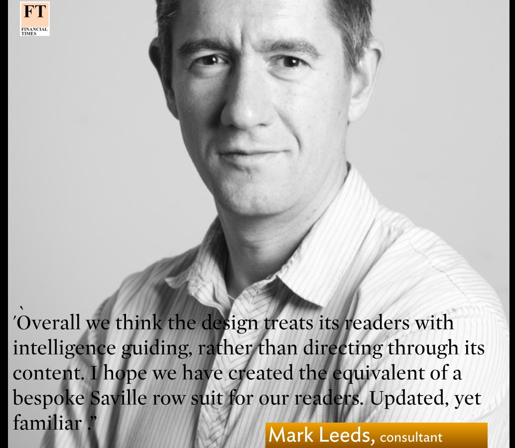
A conversation with Mark Leeds: design consultant for FT project
Mario:
In your view, what was your top priority when redesigning the FT?
Mark:
On the design we concentrated on highlighting some of the FT's reporting strengths – ( such as analysis using centred headlines and a warm red colour) and contorting that with news (ranged left headlines) and a slate blue colour palette.
Mario:
In a redesign, it is details that count: what were some important details of this redesign?
Mark:
We've added location or sector tags above headlines, which as well being useful for scanning quickly through, create air around the headlines so that they exist in their own patch of white space
The six column grid gives a comfortable, readable line length and allows us to occasionally split it into half columns adding pace, energy and vertical momentum.
Overall we think the design treats its readers with intelligence guiding, rather than directing through its content. I hope we have created the equivalent of a bespoke Saville row suit for our readers. Updated, yet familiar
Mario:
Do you feel that a lot of the good ideas got into thie new FT redesign?
Mark:
I'm sure you know better than most – what appears in print is the tip of the iceberg, there are many thoughts parked until there's an opportunity to use them. Very early on we tried an iPhone screen article which used a system that now exists as a side bar style. The metric typeface looked good. We have had regular meetings with Dan Skinner, (Head of Design and UX at ft.com) in terms of fonts, colours and where next. Thats been a really informative process – and a welcome diversion! Kris Sowersby has created a typeface fit for digital platforms
One great advantage – in a design sense – is the print product can turn off the old version one day and turn on the new the next.
The new 6-column grid
Page architecture is one of the most important elements in the design of a newspaper. The FT has abandoned its traditional 8-column configuration and traded it for 6 columns. This is a move that I welcome.
Printed newspapers provide a lean back, relaxed experience for readers, so that the very active 8-column format, which served newspapers well in the days when hard news populated the pages, is no longer the best idea. Today, print editions expand on what the reader already knows, and thus there is no need for narrow columns.
“The FT was a traditional 8-column broadsheet – with ads in a hundred different sizes, often changing between regional editions with late changes leaving gaps to fill and compromised decisions to make,” Kevin said.
With the redesign, the FT’s advertising department has rethought ad shapes, and concentrate them down to a small number of standard shapes. It ’s not business as usual for how ads are placed on the pages.
The role of the FT print edition redefined via this redesign
One salient element of the Financial Times redesign that is not necessarily visible on the pages: a commitment to print. By investing into the print edition , the FT is sending a message that its print product is here to stay, and that what it’s doing is redefine its role.
Kevin explains that these design changes are part of an evolved editorial structure, with senior editorial committing to forward-planning on deeper journalism (a particular strength of the FT).
“The brief was to produce a sharper, modern newspaper that shows off our strengths in reporting, analysis and visual journalism. We think the design matches this aim and clearly shows our editorial priorities and range to readers,” he said.
I know that many in the industry will be looking at this redesign for clues: how does one do print realistically and effectively when news breaks on digital platforms? What will this redesign address newsroom organization and how a news story travels from tweet to in-depth?
Unlike redesigns of the past, where aesthetics were the main point of concentration, today we look at these rethink efforts for clues and answers on how to handle the role of print.
Mark Leeds, consultant on the project, explains it this way:
The concise edit of the newspaper was appreciated by the reader groups we held. No one was asking for more (stories , pages etc) however they did want clarity and ease of use.
I will be paying close attention to what this redesign evolves, while I am quite impressed by how typography, a new grid, advertisement placement and navigation come together with this Financial Times redesign.
Interesting visual details of the FT redesign
The new FT redesign includes bylines with a photo of writer: highly recommended strategy and one that readers seem to like.
Elegant and distinctive columnist headings
Notice generous spacing between elements (this is not the somewhat crowded FT of before the redesign). The use of neutral space throughout brings to mind pages of The Economist magazine.
An elegant sans serif for secondary readings and info boxes
Graphics: Here is what Kevin Wilson, head of design, had to say about the role of graphics in the redesign:
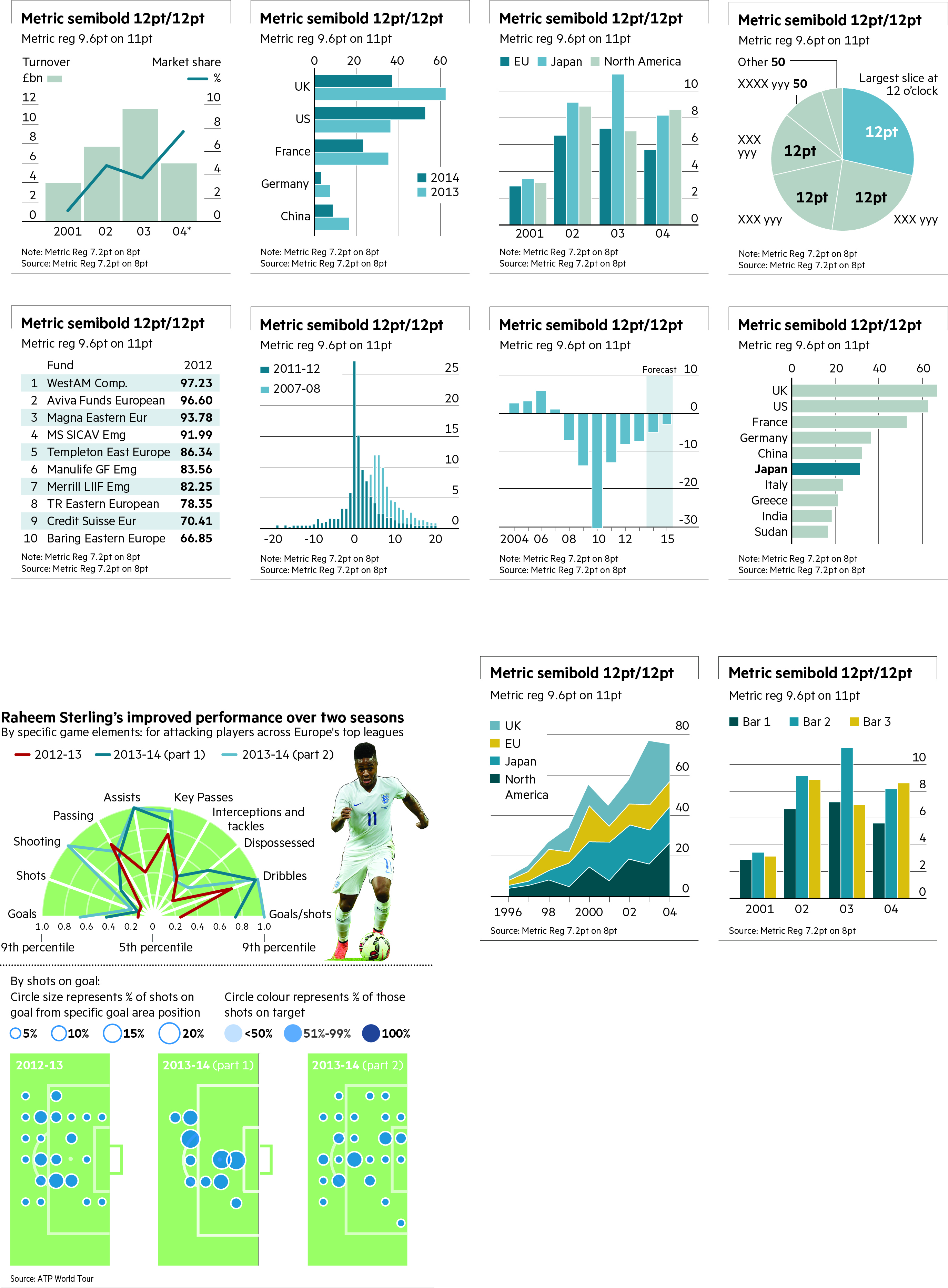
“Reader research confirmed how important and valued FT infographics are – and we are constantly developing them – both flat and interactive. This was an opportunity to make them sharper, more identifiably ours, wherever they appear – increasingly important now that our graphics are shared on social media outside their context on the website or app) and crucially to simplify the transition from web to print. So we have revisited the style, colours, scale and base formats to facilitate this – and we have developed a script to automate much of the conversion process.
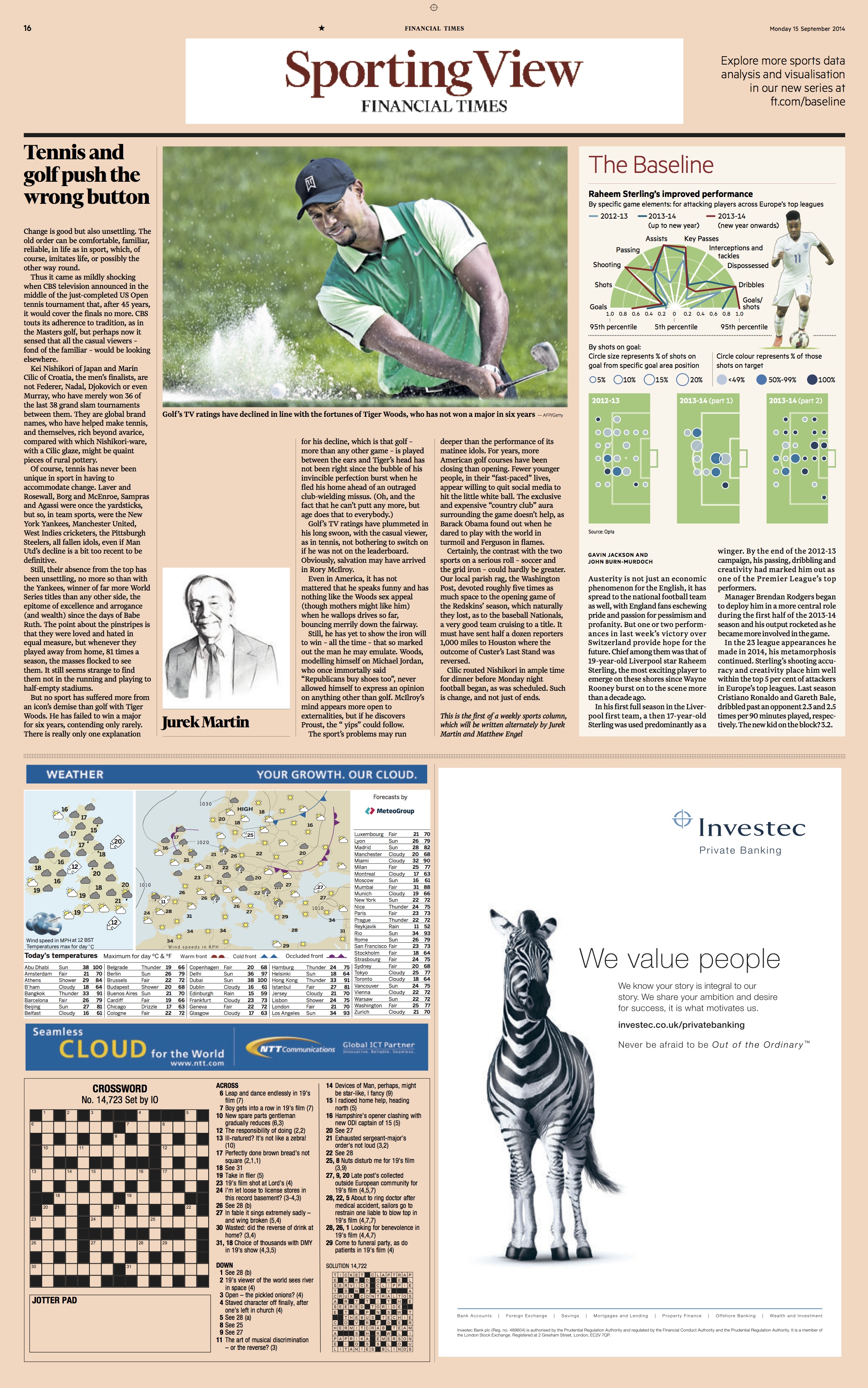
“We are introducing a new daily Datawatch feature on the front page: our selection of an interesting data point, chosen by our stats and specialist reporters. And a weekly statistics in sport column, Baseline, a data driven review of sporting success and excess.”
The FT redesign team
The FT redesign was led by Kevin Wilson, head of design, and Mark Leeds, freelance design consultant, and design consultant to FT Weekend Magazine.
Tony Major was the co-ordinator – providing the link between us and senior editors
Christopher Campbell (in-house graphic artist) redesigned our graphics
Kari-Ruth Pedersen, deputy head of design
Read all about the FT redesign here:
The official FT press release with details of the redesign
https://mail.google.com/mail/u/0/?shva=1#inbox/148783361dd4bbb3
Fun: Tips for how to fold the FT
https://twitter.com/AnjliRaval/status/511397994303094784/photo/1
Front page we like
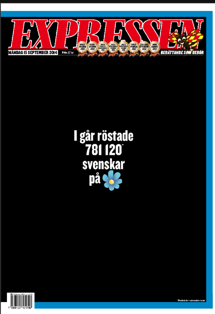
The Swedish daily, Expressen, runs black front page the day after far right wing party gets 13 percent in elections. (Page courtesy of Dan Edström)