This is the weekend edition of TheMarioBlog and will be updated as needed. The next blog post is Monday, May 3.
What a comforting feeling it was to hear a presentation showing how we consume visuals when we read. Ironically, I sat in my classroom while Dr. Zoya Bylinskii, of Adobe Research, explained the results of her latest study about the way we perceive visualizations.
I kept thinking that the Poynter Ihttp://www.poynter.org Institute Eye Track Research of which I was a part during the 1980s and 1990s, with my colleague Dr. Pegie Stark, yielded very similar results.
My Columbia University students were treated to a dynamic and insightful presentation by Dr. Bylinskii, with information that they can apply to their final visual storytelling projects.
While the work Dr. Bylinskii and her colleagues have conducted is not specifically devoted to visuals in news stories, I am convinced that their conclusions are information that would be of great benefit to editors and art directors everywhere.
Takeaways of importance for visual journalists:
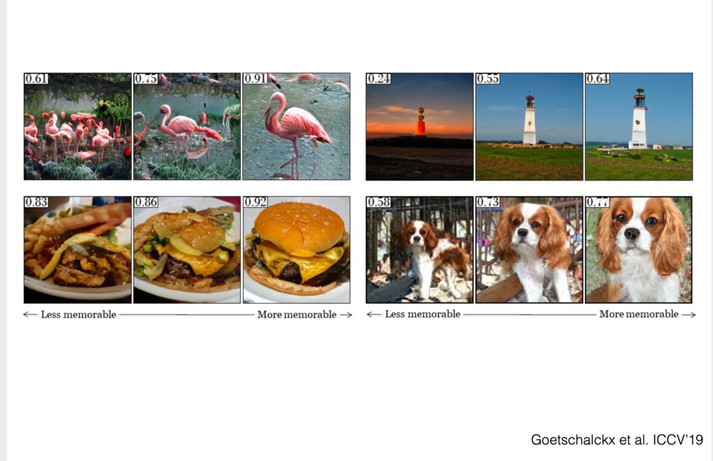
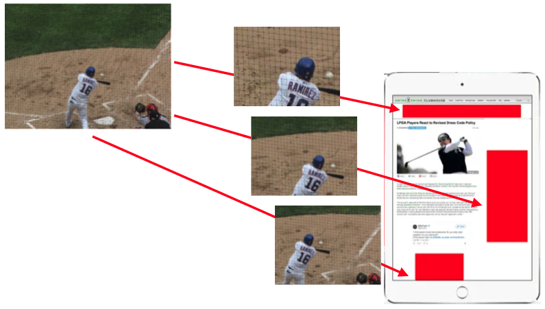
- Images that are well focused, direct and emphasize clearly an object or a face appear to be more memorable than those that are busy and congested.
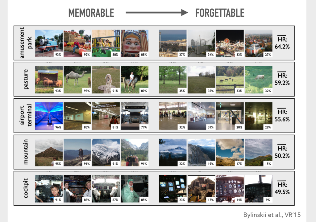
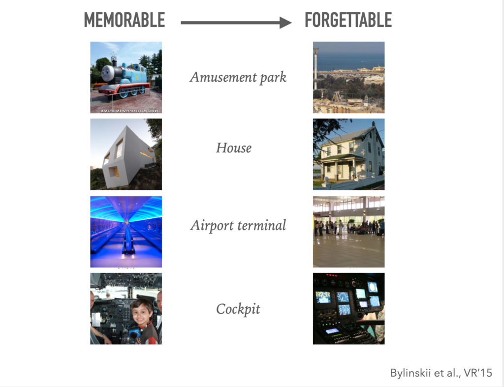
This is precisely what we have seen in earlier EyeTrack studies. However, when it comes to mobile devices, especially the small screen of the phone, where so many of us are getting information today, it is key to present clear, well focused images. Notice how this factor plays in the images shown below. The closest we get to the pink flamingo, the cheeseburger or the dog, the more highly memorable the image becomes:
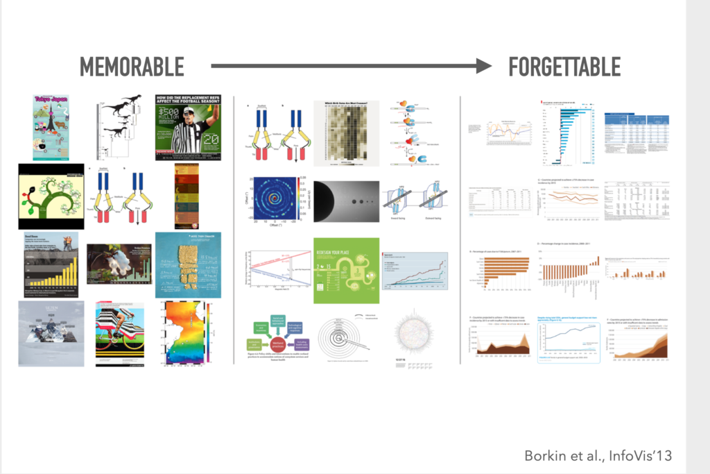
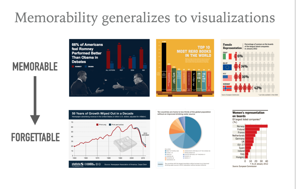
- Infographic artists since the 1970s have been reminding us that adding illustrations and objects that enhance the information presented by the numbers, the more power and better way to communicate the information. Now, the study by Dr. Bylinskii proves the point. Memorable graphics were not just fever charts or graphs, they included recognizable images.
- We know that on average, people who read news on their phones scan the first screen of a story for about 4 seconds before moving on to something else. This study uses images and comes up with reaction times that are quite similar—between 3 and 5 seconds, as we see in these images:
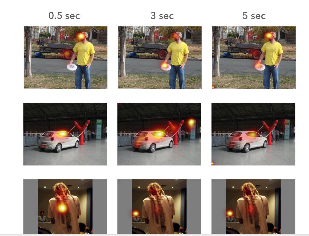
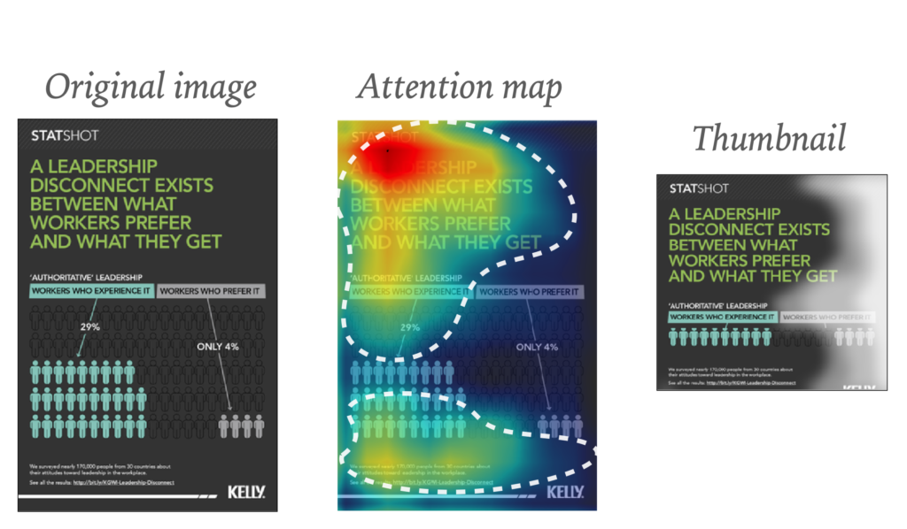
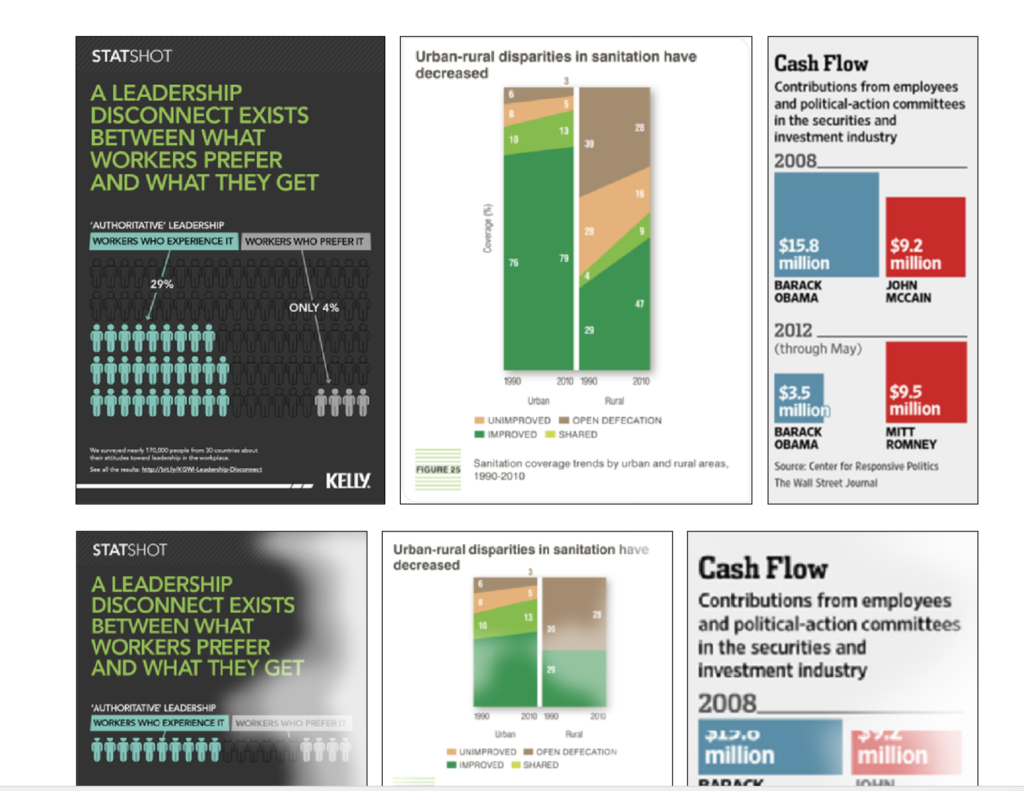
- The images below depict a computational algorithm (A.I.) predicting what people will look at in visualizations and using this information to automatically create a summary/thumbnail of those visualizations. These thumbnails, even when shown quite small, allow people to quickly remind themselves about the content of the visualizations that they refer to. At a higher level, beyond this application, this goes back to two ideas: (1) visual associations (things we recognize at-a-glance) help us retrieve the rest of the content from memory, (2) knowing how long participants will look at visuals should impact how complex the visuals they are shown are.
I asked Dr. Bylinskii how she sees the results of her studies having direct applications for editors and media designers:
What catches a viewer’s attention and what will they remember later? Cognitive science can offer insights that can be translated into design principles and recommendations. Knowing more about the human brains that will eventually consume your content can help you create more effective content in the first place
Our mobile storytelling workshops now available remotely
Professors: get your review version of The Story on time for fall classes
As an academic, I know the importance of having the right tools to advance our students, especially on the important subject of mobile storytelling. Please drop me an email if you would like to sample The Story in its digital edition: mario@garciamedia.com
Start writing or type / to choose a block
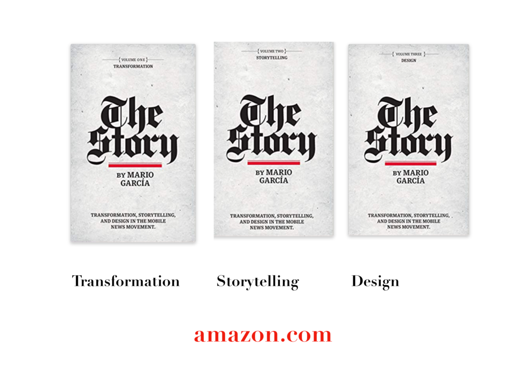
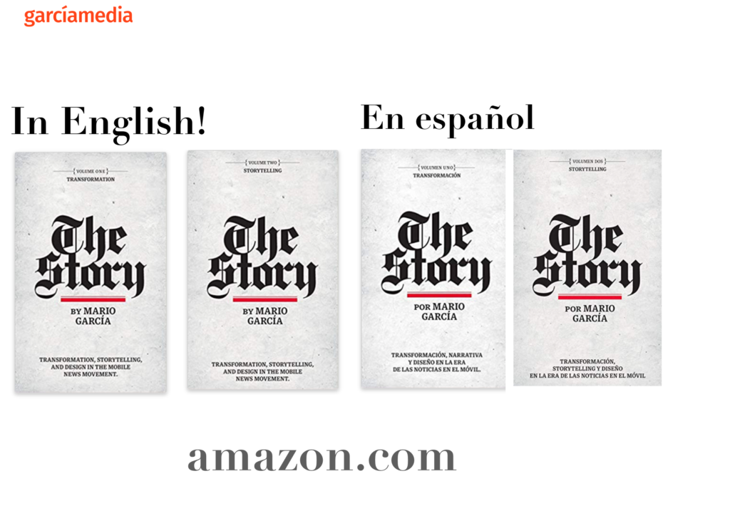
The full trilogy of The Story now available–3 books to guide you through a mobile first strategy. Whether you’re a reporter, editor, designer, publisher, corporate communicator, The Story is for you! https://amazon
TheMarioBlog post # 3312