TAKEAWAY: What happens when users are in total control of how they pace their journey through a publication? With the iPad’s arrival just around the corner, it is time to think about the “break of the book” and its meaning. ALSO: College instructors can now rewrite the textbook, too. AND: Longing for those handwritten letters that don’t come often
Every user is an editor
Let’s admit it: readers have always been masters of their own destinies.
Going back to the beginning of sectionalized newspapers, we know well that readers often started their newspaper reading session by pulling a section apart and going to it first: usually sports, but also local or lifestyle. In fact, for decades in newsrooms across America, we would hear the editors reminding everyone about the importance of allowing “the couple at breakfast” to split the newspaper: he reads sports, she reads the Women’s section (yes, that’s the way it was).
During the 1980s, when front pages became more design oriented and those famous promo boxes migrated to the top of the page, over the newspaper’s logo, we provoked readers with beautiful images and catchy headlines to the best of the inside: usually sports and entertainment (since those had the best visuals).
Then came the 1990s, online editions——the beginning of the end of content rhythm as dictated by the editors, and the start of the users’ “in charge” attitude about where they went first, second or third.
The click and go generation
The average newspaper online edition offers a variety of headlines and summaries. We pick and choose. We click and go. We move at our own pace, based on our preferences and habits, and quit when our hunger for information is satisfied for that session. We may revisit the online edition several times a day, picking at headlines and stories at random.
No doubt about it, we have created a generation of users who are impatient, undisciplined and who enjoy playing the role of editor.
Our best intentions to package things and to offer a reasonable content flow fall flat on the keyboards.
Now things are about to get even better for the users who love to play editors, and not so good for the editors who would prefer users following a set pattern of movement as they travel thorugh a publication.
iPad navigation: send me to the moon and back
With the advent of the iPad, we now will put our publications out there on the small screen, and perhaps even customized front pages and covers to cater to specific audience preferences
In the case of magazines, the multicover concept is a sure thing, in my opinion. So, if you don’t like the “story of the week” according to the friendly editor, then keep moving and you will find the cover story that suits your fancy. Click on it and go there. Once you finish, decide where you wish to go next.
Of course, it is very possible to browse thru a newspaper or magazine in perfect order, but editors who truly believe this will happen are having early iPad dreams.
So, what’s the editor planning an iPad edition to do? Create strategies that offer constant opportunities for users to know where they are, what they may be missing, and, of course, what they have already sampled.
There is no chance to turn the ear of the page here and tuck the publication away on your nightstand till you return to it.
Although I can imagine that someone is already dreaming up the software that will provide “reminders” of where we left off with our reading and guide us to the next item.
It is one more thing to add to the list of items we discuss in pre-iPad launch workshops.
Every instructor an author

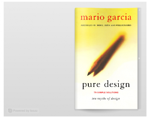
Pure Design may be up for an author’s update in 2011
Macmillan, a textbook publisher, has announced a new software that will allow college instructors to rewrite textbooks by substituting new material for what the author wrote.
This gives the “textbook update” an entirely new twist.
L. Gordon Crovitz, former Wall Street Journal publisher, is right when he writes that “the integrity and authenticity that a single author provides should not be lost.”
I remember during my years teaching university level courses that I constantly updated material for my students, but did so thorugh my lectures, not by rewriting the textbooks we used.
By the way, I am anticipating a total update of Pure Design perhaps for 2011, just in case any profs out there are already rewriting it!
What happened to handwritten letters?

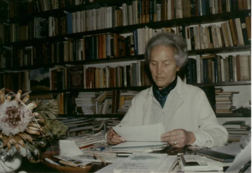
I still keep a two-page typewritten letter from the doyenne of German journalism,Marion Gräfin Dönhoff, urging caution during the redesign of Die Zeit
When was the last time you received a handwritten letter thru the mail?
Well, I got one such letter last October, from a family friend, who still believes in handwritten notes and letters, which recipients like me much appreciate.
As I check my delivered mail at home, I usually make a pile (to my left) of all the junk mail and advertisement (an ever growing pile of wasted paper, stamps, etc.), then I make a middle pile for bills that still arriva via the US Post Office to my Tampa home. As I move through all the correspondence, I am unconsciously waiting for a letter, preferably handwritten, addressed to me, with the return address of someone I know. It seldom happens.
It is all emails these days, or greetings and catch up news thorugh Facebook or Twitter. Birthday and greeting cards come via Yahoo, or American Greetings.
So, it is no wonder that the US Post Office is in trouble. On March 2, the Postmaster General John Potter announced that major cuts, including an end to weekend delivery service, would be needed to prevent a projected $238 billion loss over the next decade.
Sorry to hear that, but I understand.
Ironically, as I do research for my 40 Years/40 Lessons series, I am often digging into our rich Garcia Media archives, where fat folders rest against each other in our filing cabinets. I find myself stopping for long periods, reading actual “letters” I wrote to clients during the course of a project, and the ones they sent to me. It is a joy to see how we communicated then, perhaps a more formal way of addressing each other, with better writing and obviously more time to reflect upon what was written, or to process what was written to us.
This is why I am happy that my files are rich in traditional-style letters, like a memorable one from that doyenne of German journalism, the late Marion Gräfin Dönhoff,, and former chief editor and columnist for Die Zeit. At the time of that memorable redesign, Ms. Gräfin Dönhoff, already in her 80s, was still very much an active part of the staff of the liberal weekly with which she had had a 60-year-association.
The newsroom at the time was not so happy with the design changes coming to their newspaper, but Ms. Gräfin Dönhoff, always a visionary, knew that changes were necessary. What a surprise to receive a two-page typewritten letter from this highly respected journalist: “I ask you to proceed with caution,” she wrote. “Die Zeit is a newspaper of many traditions, and we feel that, while change is necessary, we must preserve a lot of what has made this newspaper great.”
I followed her advice. I still keep the letter.