TAKEAWAY: With November 11 less than a month away, we put finishing touches on all aspects of the New Straits Times’ rethinking. Today we work with the tablet team, creating the new 2.5 version, checking navigation, adding texture and details.
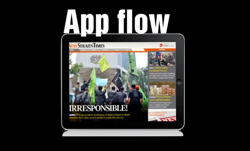
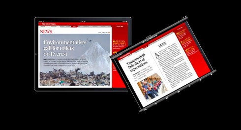
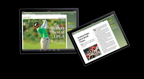
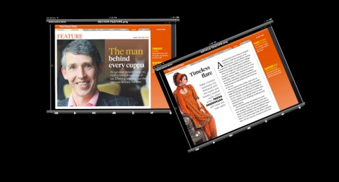
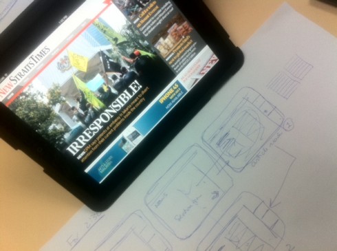
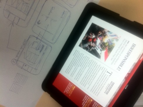
We have now concluded the prototype stage for the new tablet edition of the New Straits Times which launches 11-11-11. As you can see in the sketches here, illustrating the app flow, we have tried to create a simple navigational strategy. Landing page includes a horizontal navigator to sections, which appears at the top of each screen (users can find their way out of a section and into another in 10 seconds or less); click on the lead story and it takes you to the opening section of where that story belongs; once in that mode, vertical scroll navigator on the right offers all the headlines in that section. We are trying to work on the texture of the article reading screens now, adding secondary readings. Still work in progress.
One of the most exciting aspects of our work with the New Straits Times and its total rethinking, which culminates with launch of all that is new on November 11-11 (the now iconic 11-11-11 for the team!), is the fact that whatever we have come up with will be translated across platforms.
I have already mentioned that the newsroom is in the process of getting a complete reconstruction to accommodate the type of configuration where journalists from both print and digital platforms sit closer to each other, allowing for better communication.
The fact that the newspaper’s logo, the NST brand will change (you will get to see that November 11, but not earlier ) means that we have to carry the new image to the mobile, online and tablet editions.
As a result, we at Garcia Media have been taking a close look at all those platforms, not just cosmetically, but in terms of storytelling, and how each platform is used to its best advantage.
In terms of the tablet, which has been our main topic of discussion Tuesday, we are taking the original 2.0 iPad edition to the next level. More than a 2.5, i t is almost a 3.0.
Our emphasis has been on creating a navigation that is accessible, easy to use and allows the user to move from point A to point D or E in ten seconds or less.
The strategy
Simplicity and elegance are the key in our new approach to the New Straits Times tablet.
I have sketched a total of about TEN screen design templates that will do the job well.
First, a landing page that presents the most important story (editor’s choice) of the day, complete with a constant horizontal navigator to guide the user across the app, but also with scrolling nav units within sections. In addition, a solid concept for the article reading page, where most of the activities happen for the tablet user. Also, photo and multi media pages
As any practical news app should be, this one includes Top News Update button and e-reader for those who wish to flip through the pages of the printed NST.
Right now, with a few weeks before the 11-11-11 launch, our emphasis is on testing navigation, seeing how the look and feel appear on the iPad itself, and meeting with the technical guys from WoodWing to make sure all is on target.
So far, I like what I see, and we plan to add a little bit more texture to those article reading pages. A user simply does not wish to see text on the screen: make room for a secondary reading, a quote, a number. Spice things up.
Finally, let’s take the first pop up steps with this new version of the NST iPad tablet.
To be continued!
Earlier New Straits Times posts this week:
Emphasizing the New in the New Straits Times: Part 2
https://www.garciamedia.com/blog/articles/em
Emphasizing the New in the New Straits Times: Part 1
https://www.garciamedia.com/blog/articles/monocle