TAKEAWAY: How can we appeal to the emotions of a newspaper reader better, thru design, or content? Or, is it a combination of the two?


New York Post: controversial front page shows a man about to be killed by a moving train: most readers become angry with the newspaper for showing this scene

London’t Daily Mail: Family of nurse who committed suicide following prank call from two Australian radio DJs: readers sympathize with the family, especially the children left orphan

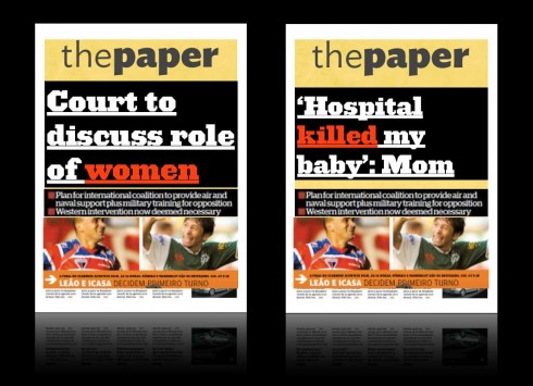
Is the mere use of a WOB (white on black) big display an emotion-inducer? Or, does it depend on what the headline says?: all the WOBs in the world may not stir many to read the story on the left, but the one on the right would be popular even if set in 36 points black on white
The subject is one that I think about from time to time, but that resurfaced at a meeting in a newsroom this week as various front pages were shown for consideration.
What is the role of emotion on a front page?
And, is the real emotion evoked by the content, or by the design?
Something to think about. I believe that when we look at a front page, we form a variety of opinions/perceptions in about 10 seconds: such as, this newspaper (or magazine) is young, old, boring, energetic, informative, relaxing. In that sense, design elements and how they are used do play a role.
However, it is content that sends our emotions in different directions, sometimes on a roller coaster ride, as in that recent and much discussed front page from the New York Post showing a photo of a man about to be fatally struck by a train.
Not all emotions are negative, however, and sometimes it is an illustration that stirs our emotions, or just a headline.
However, if I have to choose about the ultimate determinant of evoking emotion, I would have to say it is the content. Headlines and photographs are the most effective and quick ways to stir us emotionally.
Which is why those newsroom discussions where a manager asks for the design to convey emotion are always rather abstract. A sketch of a prototype is just that, a cold representation of what could be. When one hears a comment such as : The front page of Prototype A appeals to the emotions better than Prototype B, it is usually a story that makes the difference, or a photo, but, inevitably, the discussion gets back to a design element which someone thinks makes us react in a certain way.
Emotions are stirred with real pages that carry real content. A simple splash of 300 point type over a black background does not create emotions if what one says in that headline is vague and uninteresting; however, a well written headline about a story that moves the reader could appear smaller and against a white background and do the job with the emotions.
It is one thing for the front page of a newspaper or the cover of a magazine to arouse our curiosity, it is something quite different to stir us emotionally—-that, I believe, will be the result of a photo, illustration or headline. Simply put: design aids with perception and seduces us visually as it makes us curious and interested; content, on the other hand, hits our emotional chords. Let’s not confuse the issue.
Of related interest:
“Designing for Emotion” by Aarron Walter:
http://www.abookapart.com/products/designing-for-emotion.
This book looks at the benefits of embedding personality into website design. Walter argues that you can put emotion into a design:
When you present your brand’s personality clearly, your audience can relate to it as if it were just another human. It creates empathy and helps your audience see a better version of themselves. Humans want to connect with real people. We forget that businesses are just collections of people—so why not let that shine through?
Take advantage of our iPad Design/Ad Lab workshops

Do you want to take your brand to the next level by creating a tablet edition? Garcia Media can help. We now offer one- to two-day iPad Design Lab workshops on demand to jumpstart your presence on this exciting new platform. We also offer iPad Ad Lab workshops to develop engaging advertising models for your app. Contact us for more information.

Purchase the book on the iBookstore
The EPUB version of book is HERE:
Now available: The EPUB version of iPad Design Lab: Storytelling in the Age of the Tablet, ready for download via Amazon.com for Kindle:
http://tinyurl.com/8u99txw.
Take a video tour of iPad Design Lab
“iPad Design Lab” trailer on Vimeo.
Read the Society of Publication Designers’ review of The iPad Design Lab here:
http://www.spd.org/2012/10/must-read-ipad-design-lab.php

Keep up with Mario Garcia Jr.. via Garcia Interactive: helping transform online news since 1995.
www.garciainteractive.com
Here’s a gift you don’t have to wrap!

It’s official. The Christmas/holiday shopping season is here.
Here is a suggestion for someone on your list: my digital book iPad Design Lab: Storytelling in the Age of the Tablet. No need to stand in line nor buy wrapping paper. Just send it to someone you think might enjoy a book about this magnificent new platform we call the tablet and how to maximize its potential for storytelling.
Here is how you can get the book:
The original version of the book is the multitouch textbook version available on the iBookstore for iPad (iOS 5.0 and up): https://itunes.apple.com/book/ipad-design-lab/id565672822. This version includes video walkthroughs, audio introductions to each chapter, swipeable slideshows, a glossary and a sophisticated look and feel.
Apple only sells multitouch textbooks in certain countries at this time, unfortunately. Copies are available in at least the following countries: Australia, Austria, Belgium, Canada, Finland, France, Germany, Great Britain, Greece, Italy, Latvia, Luxembourg, The Netherlands, Poland, Portugal, Romania, Slovakia, Spain, and the United States.
For those in other countries and without an iPad, we have made the book available in a basic edition for other platforms. This basic edition includes the full text of the original, along with the images and captions, but lacks the other features such as audio and video. It is available on the following platforms in many countries:
Amazon Kindle: http://amzn.to/SlPzjZ
Google Books: http://bit.ly/TYKcew