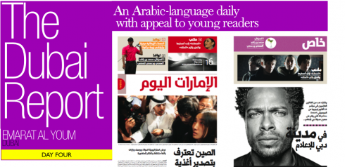
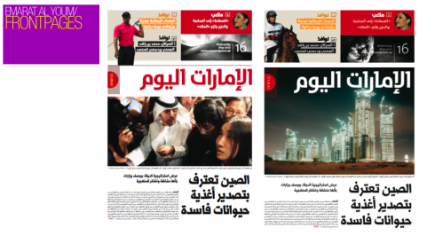
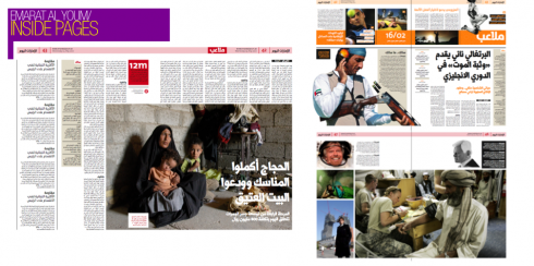
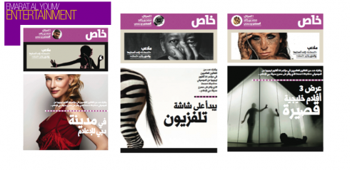
Thanks to designer Al Trivino, who worked on the design concept for Emarat Al Youm, we show you here a series of prototype pages of that daily published here in Dubai.
To be sure, during this week of August 17 while I have been working out of Dubai, I have not seen many real pages that come to the level of designed of the prototype pages Al has sent me. However, we all know that the prototype—-an exercise on what could be, done with plenty of time to contemplate, and with one foot in reality and three feet up in the air—-can be quite different from what appears daily, as editors and designers face the reality of deadlines.
It is obvious, however, that what Al created has served as a good foundation for the overall architecture of the pages: good sense of hierarchy, big headlines for lead stories, a major Center of Visual Impact per page. These basics are adhered to. What I don’t see is the more art directed touches that we see on the entertainment prototype pages here.
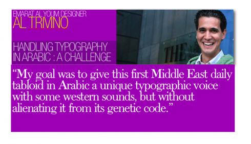
I asked Al Trivino to bring us up to date on the challenges of working with the design of newspaper in Arabic. Of course, the first challenge—-and one and I have faced myself—is the fact that reading is done from right to left. The front page is, indeed, the last page of the section, by western standards. Here Al gives us a fascinating behind the scenes about type selection:
“ Well, the real challenge was not dealing with architecture nor navigation, or even with a rather mediocre photo editing. The challenge was to give this newspaper a distinctive look in a market where four or five Arabic fonts are used and reused.
“So, I would say that typography was the real protagonist here.
Since I cannot speak nor read Arabic, the great challenge was to give this, the first tabloid daily in the Middle East a unique voice, with western sounds, but without alienating it from its genetic code.
“ I went to the University of Reading, in the UK, and studied all I could about the development of non-Latin alphabets. I also stationed myself at the door of the American University of Dubai, where, at the time, there was an interesting projet trying to match great European typographers with young Arab typographers from the Middle East. The idea was how to make the Latin and Arabic alphabets coexist without noise.
“That is how we arrived at TheMix Arabic, the Arabic version of Lucas de Groot’s TheMix. I thought this would be the ideal font for an target audience of readers 20 to 40 year olds. This was the perfect font for that young Emirati culture of the Starbucks generation. It is sort of a western sans serif.
“Pascal Zoghbi, from Lebanon, collaborated with Lucas in the completion of the alphabet, and to create the formats It was Pascal also who created the star font for this project; Imarat Headlines, a display font with tons of personality and good angles.
“I started prototyping with Adobe Arabic, of John Hudson, formatted by Fiona Ross. However, the editor thought it gave the newspaper too much of a Persian feel. So, at the end, we ended up, much to my disappointment, using the same typography they had before, with very slight variations, especially for numbers.”
For current pages of Emarat Al Youm:
http://www.pressdisplay.com/pressdisplay/ar/viewer.aspx

It happens all the time, and People Magazine is there to remind us: the same dress as worn by two or three different celebrities, then a reader’s poll asking: Who Wore it Best?
This is another area where Paris Hilton never wins, for example.
In the world of design someone should do a segment titled Who Did It First?
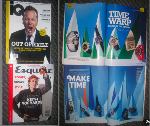
Here in Dubai, I provide with you a first such entry: the newcomer to the men’s magazine scene, IQ, apparently LOVED the way Esquire magazine handled a feature on wrist watches, so it did a high level “localization of the concept” and here it is.
No comments from here except to say that we would prefer Paris Hilton wearing the same dress as Nicole Ritchie anytime over a magazine copying another magazine’s concept.
By the way, the original Esquire handled it best—-and, more importantly, it created it.

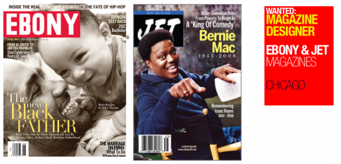
Good friend Bryan Monroe, of Ebony/Jet Magazine, drops us a line to tell us he will start advertising for a Magazine Designer job in his Chicago-based publication.
Anyone interested? Here is the information.
Ebony and Jet magazines, the largest and oldest Black-focused magazines in America, are looking to hire for a magazine designer immediately. If you are talented, hungry, aggressive, experienced and ready to work for historical publications doing quality journalism in fresh and innovative ways, you may want to apply.
The position would be based in Chicago, at Johnson Publishing headquarters on Michigan Ave., overlooking Lake Michigan. To apply, please send a resume, clips or examples of your work and a cover letter to:
Cathy Reedy
Art Production Director
Ebony & Jet/Johnson Publishing Co., Inc.
820 S. Michigan Ave.
Chicago, IL 60605
Email contact: cmontgomery@ebony.com
Magazine Designer
Qualifications include:
3-10 years experience in newspapers or magazines as a visual journalist
Excellent design skills and creative ability coupled with strong talent in executing stellar pages on deadline
Strong technical skills on the Macintosh, using Quark XPress, Adobe Photoshop, Adobe InDesign, Adobe Illustrator
Solid ability to conceptualize creative, journalistic solutions to story telling problems
Ability to work with freelance illustrators
Ability to brainstorm, direct and execute on-point, topical story ideas
Solid photo editing skills
Excellent color, design and typographic skills
Ability to collaborate and work well with artists, designers, writers, photographers, editors and online journalists
Ability to work in a news-driven, deadline environment as well as features design arena
Solid understanding of the African American community
Comfort designing for the Web and desire to work online
![]()
Last day in Dubai, putting finishing touches on a variety of mini projects at the Gulf News, and conceptualizing with the team as the newspaper prepares to celebrate its 30th birthday September 30. Flying home to Florida tonight.
Blog posting #71