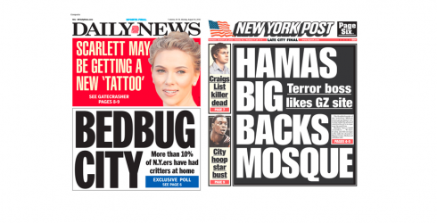
TAKEAWAY: A reader of TheMarioBlog sends in her question: which of these New York City downmarket tabloids is more elegant?
And the question is…..

Monday edition front pages from the New York Daily News and New York Post
It was one of several emails I get daily, with pdfs attached: someone wants an opinion on a page, a section header, or whether to use round or square corners for boxes.
Yesterday, the question brought together two terms that are usually not connected: elegance and the downmarket street tabloids. Specifically, this reader wanted my opinion on whether I thought that the front page of the New York Post was less elegant than the New York Daily News.
The two front pages from yesterday’s editions appear here. I think that one gets a sense of perception for such things as elegance in about ten seconds when looking at a page. In my view, on this particular day, the Daily News has a more elegant front page than the Post. The Post reverts to the very traditional WOB (white on black) for its main front page headline. The Daily News, in turn, combines the strong red background for the top story with just plain white for the second story. The elements coexist in a cleaner , more visually appealing environment on this Daily News page.
A better question would be: which of the two front pages sold more copies in the streets of the Big Apple yesterday?

Elegance is within you, how you were it, right? More importantly about elegance: you know when you see it
TheMarioBlog post #613