TAKEAWAY: Each day brings a better edition for the new concept El Tiempo, and it is great to sit there with editors and designers to plan ahead. We toss a lot of “what ifs” up in the air during planning sessions. It is the fun and passion that can make that newspaper come alive for the readers.

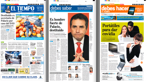
Tuesday’s assorted pages from El Tiempo
It is now Tuesday and we have been in constant motion as El Tiempo inches its way up from an exciting prototype to the reality of a real published newspaper in the street. The fantastically good news is that, as Rodrigo Fino and I evaluate pages and contemplate reader and advertiser reactions, nobody has come to us to make ONE SINGLE CHANGE in what has been produced. That, dear friends, is always the best testimony we can have to know that the concept is solid. Of course, no concept is perfect, and definitely not three days into its exeuction.
For me personally, it is now a matter of reviewing pages as they are produced, making sure that style is adhered to, discussing photo editing, headline sizeing, look and feel with both the editor of the page and the designer executing it. The hours go by fast.
From time to time someone walks in with news of “a reaction” to the new concept for El Tiempo: surprisingly, the reactions are mostly positive, with readers adapting quickly to what is a totally different newspaper from the one three days ago. Advertisers, too, are looking favorably at the first section, Debes Saber, specifically, since now the general traffic generated by the mixing together of topics is attracting new eye balls to their product advertisement.
Of course, there are the production staff meetings: how can we get that orange in Debes Hacer a little bit stronger? Was this the best choice of photo for Page 3? Adjustments are made, and we wait for tomorrow’s newspaper to see the improvements.
A redesign first appears, then, like a baby, it crawls, then it walks, then it runs.
This one is not crawling yet.
The fun of playing in the sandbox
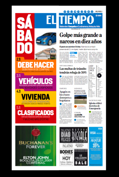
Front page prototype for the Saturday edition of El Tiempo: notice the “flap” over the front page is used as a giant navigator for this edition, full of ads on “shopping day”/
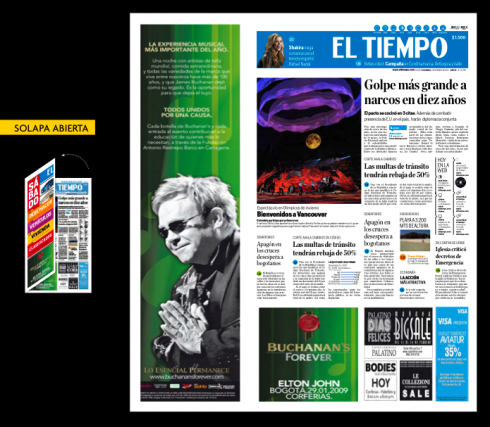
Here is how the “flap” appears when one opens it to see the front page directly under it, including advertising
The Sunday El Tiempo editor , Victor Vargas, appears with story ideas for Sunday’s paper: good to see that the planning is going well, and that the discussion leads to what the best photo treatments might be for a coming story about the elections in Brazil, and how two women may hold the future of what happens there, in their hands. There is a sense of excitement in the air and Vargas visualizes how he would like to see the images of the favored candidate to win the election, Dilma Rouseff, and the environmentalist candidate, Marina Silva, who ended up in third place, but now holds all the votes that she may decide to pass on to one of the two candidates in the second round election, Dilma or Jose Serra
Rodrigo Fino and I sit with Vargas and even toss around possible headlines, with me tossing around the title of that 1960 Italian film, Two Women, but Rodrigo coming up with the real clncher here, inspired by a favorite Brazilian novel that was made into a movie, Doña Flor and her two husbands. Rodrigo suggests something like: Brazil and its two women (Brazil y sus dos mujeres). We will see what appears in El Tiempo Sunday, but the fun of discussing these ideas is what makes it all interesting and worthwhile. Remember, editors and designers playing in the sandbox. The results are usually good and lots of fun.
Planning the Saturday front page “flap”
It is not just daily and Sunday splashy openers for the new concept El Tiempo.
Saturdays are special, too, and we use a colorful use of the “flap”—-that half page that wraps around the front page, usually with advertising. In Spanish it is referred to as the “solapa”.
In this case, we have taken the “flap” to become a giant navigator for what is the shopping day edition. Colombians do most of the shopping on Saturday. As a result, the Saturday edition is packed with advertising for real estate, automobiles, jobs, a fat newspaper, unlike the Saturday editions of some US newspapers , which can be flimsy at best.
Notice that we have used bright colors for strips to navigate the reader to Debes Hacer (the orange section, a very important one on this day of GO DO SOMETHING), then purple for CARS, RED for classifieds.
But the beauty of this treatment is that the advertiser who would normally go there STILL PAYS for the flap, it simply “donates” it to the newsroom to use a navigator, then you see the content of the ad as you open the flap over page one. Take a look!
…and soon the El Tiempo iPad app
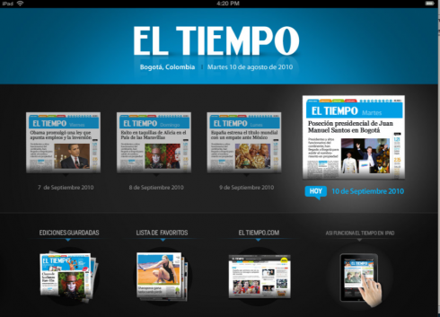
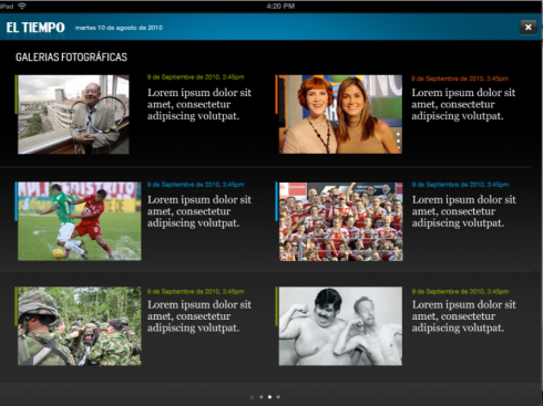
Preparations are in the finishing stages now for what will be an easy to use, journalistically-inspired iPad app for El Tiempo. I give you here a couple of images to show you how the concept ,created for the printed El Tiempo, carries through here. The El Tiempo iPad app should be available in the coming weeks.
To read our other posts about El Tiempo’s new concept
El Tiempo: reactions to the new concept
https://www.garciamedia.com/blog/articles/el_tiempo_r
El Tiempo launches new concept today
https://www.garciamedia.com/blog/articles/el_tiempo_launches_new_concept_today
El Tiempo :selling the concept to editors, readers, advertisers
https://www.garciamedia.com/blog/articles/el_tiempo_selling_the_concept_to_editors_readers_advertisers
El Tiempo at 100: a fresh proposition journalistically, visually, digitally
https://www.garciamedia.com/blog/articles/el_tiempo_at_100_a_fresh_proposition_journalistically_visually_digitally
To read the entire case study of El Tiempo’s new concept in Spanish, see Rodrigo Fino’s blog:
http://www.garcia-media.com.ar/