
Here is a case where the headline provided us with instant seduction: How to avoid building products that fail
It’s all about needs.
Those of us charged with designing anything are going to be interested in an article with this headline. This one is by Rian van der Merwe, written for Medium, and I recommend highly
van der Merwe writes:
“…it’s extremely dangerous to execute ideas without first identifying and testing assumptions about the value of those ideas. We shouldn’t jump to a solution before we understand the problem. And that’s what this post is about.”
While there is lots to ponder in van der Merwe’s piece, to me this was a key and resounding statement that I can identify with. Not that I am 100% sold on the idea of constant testing—a practice that seems more prevalent today with publishers and editors inhabiting a media landscape that is shaky and unpredictable.
Test, yes, but I am a believer in letting instinct be part of the creative process. I think the late chairman of Apple and genius product developer Steve Jobs might agree.
Where I do agree with van der Merwe is that one should not jump to a solution—or strategy— before one understands why he is providing it in the first place.
Let me bring this thought home to the design of a publication in any platform. During the creative process today, especially with mobile devices, there is often a desire to insist on adding more functions than are truly necessary.
Why? Simply because the person in charge wants this phone news app to be “different”. What do users want when they pick that smartphone to read news?
Easy navigation is the top answer. Get me where I want to go soon. After that: clarity and hierarchy. They may not want four layers of navigation, for example. They may not want excessive use of art (as in photo galleries and videos). Sometimes one such element is all. Finally, they want hierarchy: what should I look at first, second, third.
You often hear me using the old cliché: There are so many ways to skin a cat. It is a phrase I used consistently in the heavy days of print newspaper design. How many ways can you find to tease stories from the page one to the inside?
In our efforts to wanting to be different, we sometimes indulge in finding solutions for problems that do not exist.
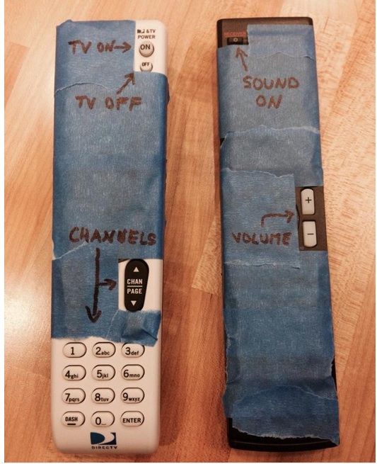
This piece reminded us how important it is NOT to do that. There is one visual in the piece that tells the story in two seconds: a TV remote with all that the buttons it includes, versus what we truly need to maneuver around programming. I reproduce it here.
Let’s spend more time designing for a functional, pleasant user experience and less to satisfy our own needs for “more”.
Less is best applies here.