TAKEAWAY: It is clean, easy to follow, and promotes print well: The Economist’s redesign of its website is worth taking a look.
A rich online edition design
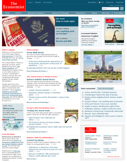
Clean, easy to navigate, and sporting a new horizontal navigational bar: The Economist
Top of home page for The Economist, which introduced its new online design last week
At a time when tablets, and specifically Apple’s iPad, dominate our conversations, along comes a fresh new look for The Economist’s online edition, and it is worth looking at how innovative it is.
The first thing that catches my eye is the abandonment of the perennial vertical navigation bar on the left, substituted here for a good horizontal navigation bar. This allows more space to display the news of the day, which, by the way, is grouped according to topics, a major development to help users in a hurry——which is all of us.
I also like the way The Economist, one of my favorite must-read publications, promotes its print products so prominently.
All elements of multimedia are grouped, so if the user wants to go directly to videos, graphics, audio, blogs, then the “basket” of such goodies is readily available.
Take a look, and I am sure you will find that one can still do wonderful things with online editions.
One more comment is appropriate here: as publications begin to complete the quartet of mobile, print, online and tablet, it seems we are more ready to give each platform its very distinctive qualities. This new online edition of The Economist shows us the way.
TheMarioBlog post #591