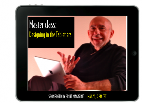
TAKEAWAY: Don’t know if we can even call it “research’ but it is some early information to guide us about how people use their iPads. The big surprise (is it, really?), websites work reasonably well on the big tablet. ALSO: Master Class online with Mario, sponsored by Print Magazine, May 26

It would be the first of many journeys abroad, that one fascinating trip to Argentina, to complete my first project outside of the United States: La Nueva Provincia, of Bahia Blanca, Argentina. I remember it well. That is what the 7th installment of 40Years/40Lessons, my sort of career memoir, is all about. Coming soon.
Spruce up those websites
We are spoiled by the benefits of research, so it is no wonder that clients daily ask me if we have some conclusive research about how people use their iPads.
Too soon, I tell them, let’s wait. However, we now have a little something to at least discuss in these iPad planning meetings. Jakob Nielsen’s Alertbox offers us a glimpse into their investigation, based on how 7 users approached their iPad.
I urge you to go read it here: http://www.useit.com/alertbox/ipad.html
One interesting finding, which we had already heard much about it: people prefer to read websites on the tablet, as it is a larger screen, and, in my own experience, the New York Times website looks splendid on the tablet, and I go there all the time. Obviously, it is more comfortable to read a news website on the tablet than on the smaller iPhone screen.
I agree with this quote from Nielsen’s post:
For more than a decade, when we ask users for their first impression of (desktop) websites, the most frequently-used word has been “busy.” In contrast, the first impression of many iPad apps is “beautiful.” The change to a more soothing user experience is certainly welcome, especially for a device that may turn out to be more of a leisure computer than a business computer. Still, beauty shouldn’t come at the cost of being able to actually use the apps to derive real benefits from their features and content.
Mario Garcia Jr, Garcia Interactive, adds:
“It’s important for organizations that want to give their users the best iPad experience to consider optimizing their websites in addition to any app development. An optimized site takes advantage of the product’s unique interactivity which users will expect from a site on the iPad. Plus there are other usability considerations. For example, buttons for fingers need to be bigger than buttons for a cursor.”
For more on Mario Jr’s views on the subject:
http://garciainteractive.com/blog/view/57/
To me, the second most important point of this research is about the “print metaphor”.
Nielsen argues that swiping for the next article is “derived from a strong print metaphor in many content apps. In fact, this metaphor is so strong that you can’t even tap a headline on the “cover” page to jump to the corresponding article. The iPad offers no homepages, even though users strongly desired homepage-like features in our testing. (They also often wanted search, which was typically not provided.)”
Yet, I personally feel that, at least for the 1.0 tablet versions we see, the print metaphor is important to maintain: the turning of the pages, the look and feel of the familiar newspaper or magazine page is important. However, we must combine this with the more digitally oriented experience of offering navigational options. For a while, the design of news tablet applications must travel that thin line of reminding you of the familiar print modes, while allowing you the touch and go that users expect from their tablets.
Unlike Nielsen, I don’t see the print metaphor as “crushing”, probably more like an aid to link print and digital editions.
However, this is a great beginning to help all of us who are navigating the exciting, but totally new, waters of tabletland, some guidance, and much to think about.
The virtual classroom

I am honored to be invited to give an online Master Class, May 26, duration one hour.
The class, sponsored by Print Magazine, will allow me to present my views about designing for what I call “printnets”, readers/users who travel well from print to digital,and who use a series of platforms to receive information.
I am excited to be able to participate in what has already been a successful series of master classes by various designers. As someone who has been in front of a class for most of my 40 years in the business, it will be exhilarating to face a class online. And, yes, participants will be able to interact and ask questions, as I am told.
Details of the class
Highlights of what I will cover in my class:
• Strategies for storytelling and designing in the times of the iPad and beyond
• What to be aware of in terms of type, architecture, and multimedia
• The difference in reading patterns between the page and screen
• To identify examples of work that succeeds, and work that doesn’t, on tablet devices
• The process behind some of the best work being done today. I plan to highlight examples from a variety of sources.
If you are interested
Those interested in participating in this class should apply here at My Design Shop:
http://www.mydesignshop.com/product/masterclass-mario-garcia/DesignCasts/
By the way, My Design Shop is the online shop that Print magazine created last year to sell the magazines and books published by its parent company F+W Media. It’s where you register for the Master Class. That site also sells items there that have been published in the magazine. For example, wthe site is currently promoting its Carry Hope project, which is 13 designers who made tote bags for their favorite charity, and all the proceeds go the charity that they have chosen.