This is the weekend edition of TheMarioBlog and will be updated as necessary. The next new post is scheduled for Monday, May 7
TAKEAWAY: The Poynter EyeTrack: Tablet research testing has started, and preliminary reports of early tests show that a majority of tablet users prefer to swipe horizontally.
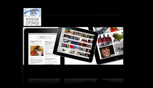

Dave Stanton, Sara Quinn and I discussing final prototype for Poynter EyeTrack: Tablet in my home this week
The excitement builds up as the Poynter Eye Track: Tablet project gets into the most interesting phase of testing with subjects. This time, the now popular Poynter Eye Track series moves in the area of the tablets: how do users who read news on their tablet behave? Which type of landing pages are more appealing and functional? How do users react to photo galleries, videos and graphics?
It is all part of what is going to be tested, and the tests have begun.
Unlike previous Poynter EyeTrack studies where the results waited to be compiled in one grand finale, this time, knowing that we live in the culture of Twitter, where so many things quickly become “so 15 minutes ago”, we will be providing results of the tests on a regular basis.
I am sure the industry appreciates this.
This week Sara Quinn, Poynter faculty and project leader, David Stanton of Smart Media Creative, and I had an EyeTrack: Tablet workshop in my house in Tampa to finalize details, review strategies and, most importantly, discuss exit interview questions.
As we have found out with previous EyeTrack research projects, it is not possible to test all just with the special glasses. Some reactions we need to gather in the old fashioned way: ask the question and get a reaction. The industry is also keen on finding out answers to many questions of which we can now “suppose” what the answer would be.
We hope that the Poynter EyeTrack: Tablet project will guide us in a number of these questions.
What have we found out so far?
Here are the takeaways:
iPad users have an overwhelming instinct to swipe horizontally through a full screen photo gallery, regardless of portrait or landscape orientation.
I am not surprised here at all, and neither is our Poynter research team. In focus groups I have personally observed a more intuitive move to gesture in the direction of swiping than scrolling.
Early indicators, observed with about a hundred people in an initial, small slice of the study at multiple sites around the U.S, tell us it is so.
Participants who were given an iPad in landscape orientation swiped horizontally 93% of the time. In portrait, they swiped horizontally 82% of the time. This is statistically significant evidence for a horizontal inclination and that the swipe direction isn’t just a random behavior.
“Breaking the research into smaller questions “allows more faculty, researchers and students to get involved,” said Jeremy Gilbert, assistant professor of media product design at Medill School of Journalism. Medill students are conducting part of this early testing. Other subjects are being observed at the University of Florida, at Poynter and, soon, in Denmark.
“Breaking the research into smaller questions “allows more faculty, researchers and students to get involved,” said Jeremy Gilbert, assistant professor of media product
design at Medill School of Journalism. Medill students are conducting part of this early testing. Other subjects are being observed at the University of Florida,
at Poynter and, soon, in Denmark.
I am not surprised here at all, and neither is our Poynter research team. In fact, our Poynter team decided to test user instincts here because already most tablet mags navigate horizontally between stories and vertically through them. But most photo galleries move horizontally through a single story or topic.
In focus groups I have personally observed a more intuitive move to gesture in the direction of swiping than scrolling. Early indicators, observed with about a hundred people in an initial, small slice of the study at multiple sites around the U.S, tell us it is so.
The prototypes tested
The major prototypes in Poynter’s EyeTrack: Tablet project include three styles of entry pages. Development is underway.
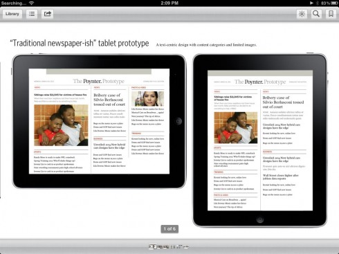
Here is the model for a classic and traditional news app, a style of presentation which is made popular by such apps as The New York Times.
Are readers more likely to enter and to stay within a news app that has this look and feel?
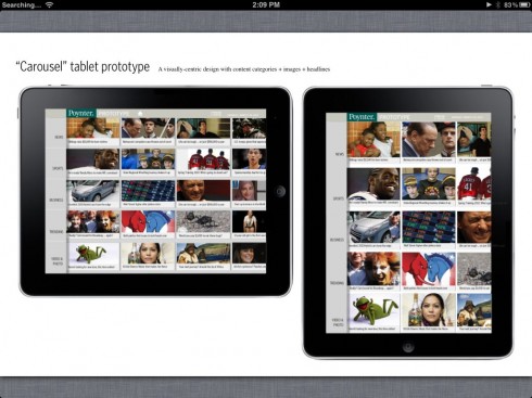
The carrousel navigator: made popular by such apps as NPR and CNN, the carrousel invites swiping, based on a series of images.
It is a visual invitation to navigate the app. The Daily uses it as a choice for navigation, showing an image of full screen pages
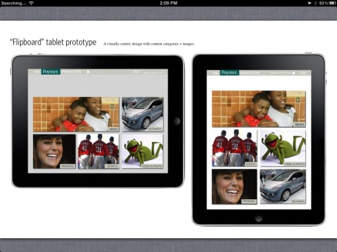
The Flipboard-style navigator: as the name implies, here is another visual invitation. Made popular by Flipboard, here the user clicks on an image and gets to the story.
Such apps as that of Switzerland’s Tages Anzeiger capitalizes on this style. Very inviting and direct and often used as a secondary navigational option.
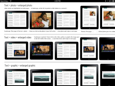
Here are the screens to text such variables as text and photo, text and video, text and graphic
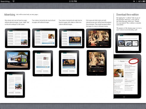
Various advertising styles to be tested
How you can help!
And here’s a way you can help. We’re currently looking for 20-30 great stories with strong “shelf life” to be included in the prototype testing. The stories should exemplify storytelling in a variety of forms for tablet—written, video, photo and both static and interactive graphics. If you’d like to suggest a story or project now, please let me know. We’re in need of stories about sports, business, global news, science, popular culture, and more.
You can read more about the project and how to get involved here:
https://www.facebook.com/PoynterEyeTrack
Previous blog posts about Poynter EyeTrack:Tablet:
Poynter eye-tracking research to determine best strategy for news on tablets
http://www.poynter.org/latest-news/media-lab/mobile-media/151844/poynter-tablet-research-tap-touch-pinch-swipe-eyetrack-stories-staffing-revenue-and-more/
https://garciamedia.com/blog/articles/the_poynter_eyetrack_for_ipad_a_progress_report_and_some_prototype_screens
https://garciamedia.com/blog/articles/the_tablet_magazines_and_the_cash_register_some_good_news
New EyeTrack study: learning how news apps tablet users’ eyes and fingers move
https://garciamedia.com/blog/articles/new_eyetrack_study_learning_how_news_apps_tablet_users_eyes_and_fingers_mov
Poynter to Launch EyeTrack Research for Tablet
http://news.yahoo.com/poynter-launch-eyetrack-research-tablet-204105980.html
Poynter EyeTrack: a history
http://www.starkadamdesign.com/training/Eyetrack.html
About Poynter’s earlier EyeTrack studies:
2007: The Myth of Short Attention Spans
http://www.poynter.org/uncategorized/81456/eyetrack07-the-myth-of-short-attention-spans/
EyeTrack 2007 video
http://www.youtube.com/watch?v=3FKQPCn_ais&feature=youtube_gdata_player
Where in the world is Mario?

I am at home in Tampa all of this week: enjoying all that nature I have right outside my back door, with the Hillsborough River as a backdrop; some of the trees in my backyard at 400 years old, and sit on an environmentally protected area of Florida, a swamp, where sometimes the most beautiful birds appear, plus huge turtles, the occasional snake, and, on occasion, sleepy alligators. But I have a deck that is 10” high so no danger of alligators approaching us! It is a peaceful and serene setting that I am always happy to come home to.
The iPad Design Lab: Storytelling in the Age of the Tablet
Video walkthrough of the iPad prototype of iPad Design Lab