Updated Sunday, July 19, at 05:34 EST
TAKEAWAY: Cricket fanatics in the UAE today wake up to a very special Saturday morning surprise, as the Gulf News celebrates 100 years of cricket in style for the sport’s many fans. ALSO: Walter Cronkite’s death on newspaper front pages Pure DesignToday’s installment: Longer isn’t boring PLUS: At the venerable Wall Street Journal a more colorful presentation? AND: Update on Hindustantimes redesign, one week later
Walter Cronkite: Dean of Anchormen
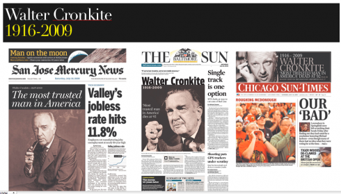
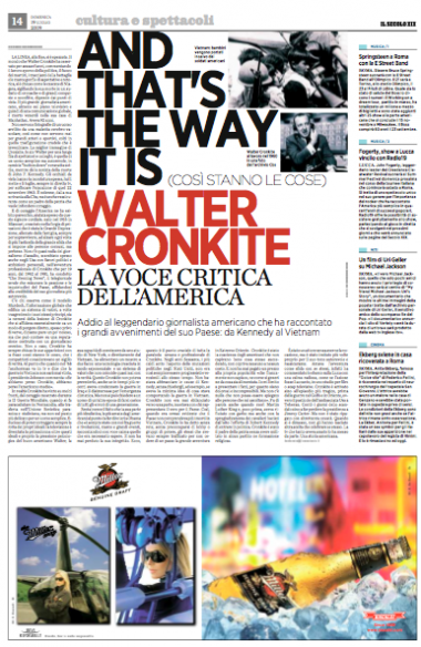
My generation grew up with Walter Cronkite as a dinner guest each night. His calm, efficient and always insightful presentation of the news was a part of the evening ritual in American homes everywhere. He has been called “the most trusted man in America”. He died Friday at the age of 92. With him we come to the end of a journalistic era—-one in which, as Cronkite said many times, an anchorman was a news presenter, and, in his case, a managing editor. His job was to offer the facts. He never considered himself a TV personality, although he was one of the medium’s biggest. I was curious to see how American newspapers covered the Cronkite obituary. The ones shown here picked my interest. In each case, Cronkite has been put on page one, where he belongs.
Interesting to note that foreign newspapers have covered Cronkite’s death as well, including Il Secolo XIX of Genoa, Italy.
More to come.
Best of Sunday’s Bild Zeitung
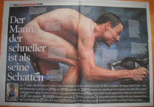
Double page Armstrong photo/graphic—the non story that tells the story.
The Tour de France 09 dominates sports news and American cyclist Lance Armstrong is watched by many as he tries to win the event again—for the 8th time. Bild am Sonntag today captures the excitement of the race with a double page photo/graphic with the headline “The man who is faster than his shadow”. It is the type of treatment that BZ does best: the big photo that becomes an informationa; graphic. In this case, texty captions point out to different parts of Armstrong’s anatomy to tell us what his strengths and weaknesses are. This is the story treated as a non story, extremely visual and informative. Well done.
Cricket’s celebration is Gulf News’ opportunity
See also interactive graphics about the cricket special
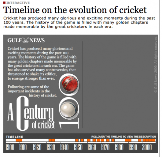
Go to the following link for interactive graphics:
http://www.gulfnews.com/indepth/cricket/index.html
Interactive graphics created by Gulf News artist Jacob Hernandez
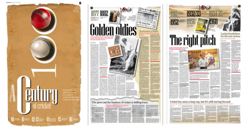
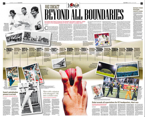
Supplement opens with poster-style page, then presents timelines to key moments in cricket’s history
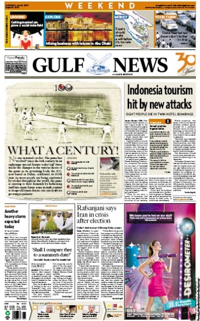
Here is today’s front page of the Gulf News, introducing the cricket special
Douglas Okasaki, designer at the Gulf News, proudly sends us what the sports department has produced for publication this Saturday, to celebrate 100 years of cricket. Starting with a poster cover, the 5-page supplement uses an earth tone color palette to tie the package together visually, along with typography that sets it apart from the rest of the newspaper’s look and feel. A double-page spread presents a timeline about major events of cricket since 1960 to the present.
Well done, and one of those packages that surprise and please readers to the max, which means they come back for more!
Note: Miguel Angel Gomez is design director for the Gulf News
![]()
http://archive.gulfnews.com/indepth/cricket/sub_story/10332210.html
http://archive.gulfnews.com/indepth/cricket/puffs/mid_left/10332530.html
http://archive.gulfnews.com/indepth/cricket/puffs/mid_right/10332460.html
http://archive.gulfnews.com/indepth/cricket/sub_story/10332454.html
Clever headlines we like
The weekend’s Wall Street Journal includes a page one headline that entices us to read the story it accompanies:
The Yo-Yo Has Had Ups and Downs,
But It’s Far From End of Its String
Colorful, indeed. While on the subject of the WSJ, has everyone observed the slow but robustly colorful changes taking place in this legendary icon of financial journalism?
We are beginning to see more color photography on Page One, not to mention a nice colorful “candy box” at the top of the sacred What’s News column.
As someone who worked with the WSJ’s design in some previous incarnations, ti is obvious that the overall philosophy for the look and feel of the WSJ has undergone a dramatic and historical shift to a design that is more contemporary. Fewer and fewer of those legendary woodcut headshots of people in the news appear, a thought that would have never occurred to anyone I worked with there before.
Of all the changes I observe at the WSJ from day to day, this is the one that I like least. I think that those pencil sketches are such part of the DNA of the WSJ that they should not be abandoned.
About more color photos? Perhaps a little restraint should be used, so that the photos don’t give the front page, specifically, the appearance of just another general interest American newspaper front page.
Weeekend follow up: Hindustantimes, Delhi, India
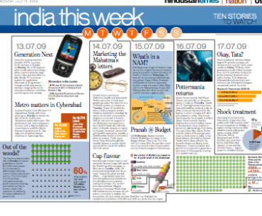
Introduced with today’s edition: India This Week, a page devoted to highlight important events coming up the week ahead
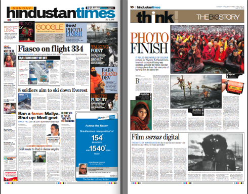
Sunday’s front page, inside commentary page
Sanjoy Narayan, editor in chief, Hindustantimes, which launched its new look a week ago, reports the following reader reaction:
As you already are aware, we relaunched the paper with your spiffy new design last Saturday and the reaction has been overwhelming. I have been swamped with feedback from readers across age-groups who are delighted by the new look of the paper. I’d like to thank you for making this possible. Now, it is for us to keep the standards up and constantly improve the editorial content.
(Note: Anup Gupta is design director, Hindustantimes)
Pure Design: longer isn’t necessarily boring
Ironically, as I reread this “fable” from Pure Design, I tell myself that this one is even truer today (about the prevalence of long texts in newspapers) than it was in 2002 when the book was originally written.
I said in 2002 about long texts: this is not a bad thing.
I repeat it today, but with more emphasis. Not that we need to create newspaper pages that are so heavy with text that they suffocate the reader (and, especially, the scanners). However, we have seen in the Poynter EyeTrack 2007 research evidence that long texts are, indeed, read thoroughly by many. Readers read long texts online as well, and perhaps more completely than in print.
The more that printed newspapers move in the direction of the book, as I predict, the more that their role will become one of analyzing, interpreting and examining news events. This cannot be done in compact-style stories.
What Pure Design does in this segment is to ask editors/designers—-and reporters—-to beware of the perils of long texts that are not easy to navigate. Use subheads, quotes, secondary readings and whispers and all those other tools that will make a reader get thru the mass of text more comfortably.
Long texts, yes; long texts that scare readers away, no.

Pure Design installment #10 for download:
Redesign while you still look good.
Follow me at www.twitter.com/tweetsbydesign
Follow the Marios

Two Marios. Two Views.
Follow Mario Jr. and his blog about media analysis, web design and assorted topics related to the current state of our industry.
http://garciainteractive.com/
Visit Mario Sr. daily here, or through TweetsByDesign (www.twitter.com/tweetsbydesign)
In Spanish daily: The Rodrigo Fino blog
:
To read TheRodrigoFino blog, in Spanish, go:
https://garciamedia.com/latinamerica/blog/
TheMarioBlog posting #309