Sidelined by dental surgery
Dear readers of TheMarioBlog: As I have had three molars removed Tuesday, I am recuperating and therefore there is no new blog post today. Thanks for your understanding.s
It is a subject that dominates the news on a daily basis.
The topic is worthy of a Netflix movie, or an Amazon mini series, truly.
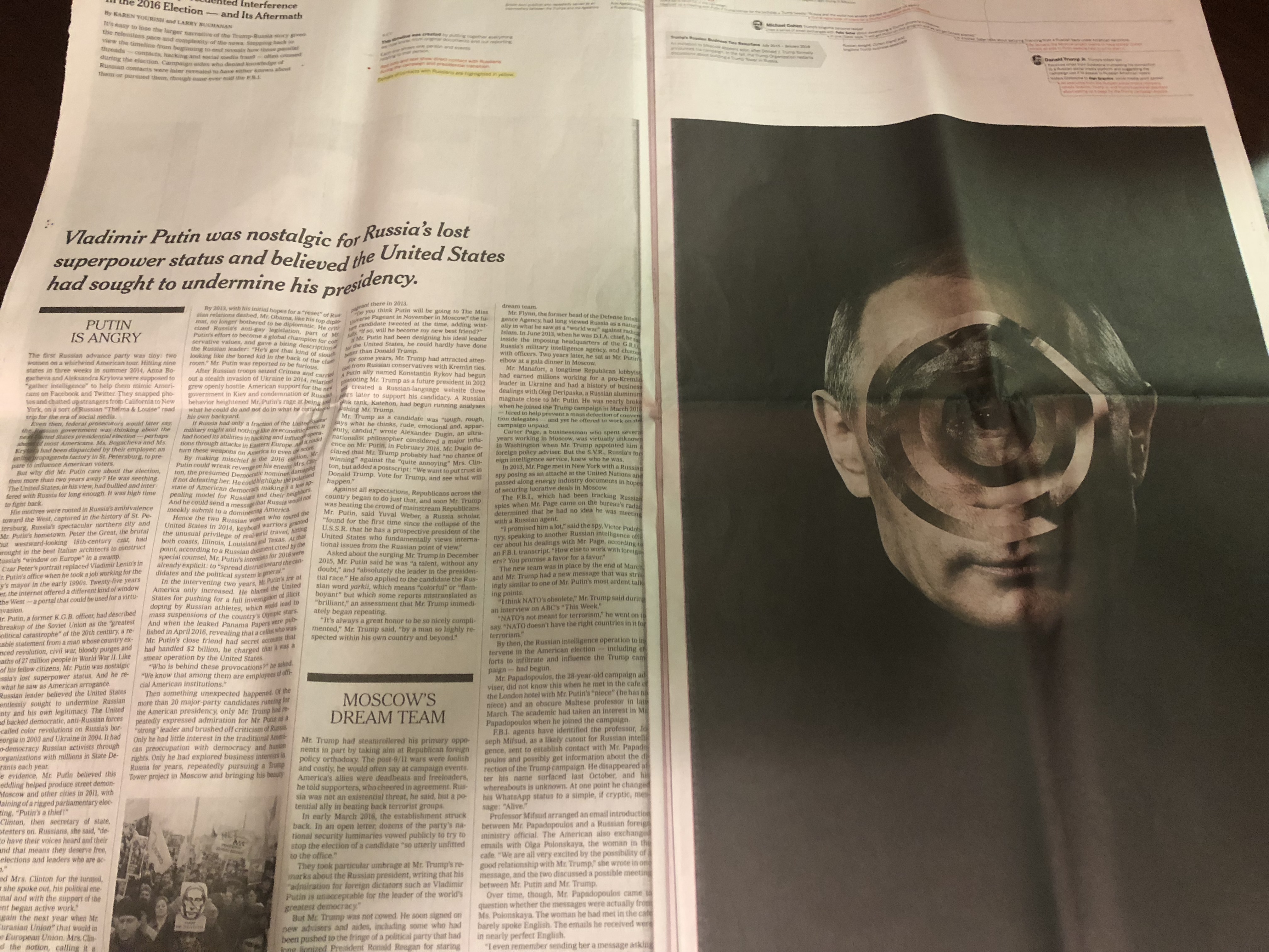
It is all about “unraveling the Russia story so far” in this ad free, 12-page in depth reportage where the visuals are mostly about the faces of two men: Trump and Putin.
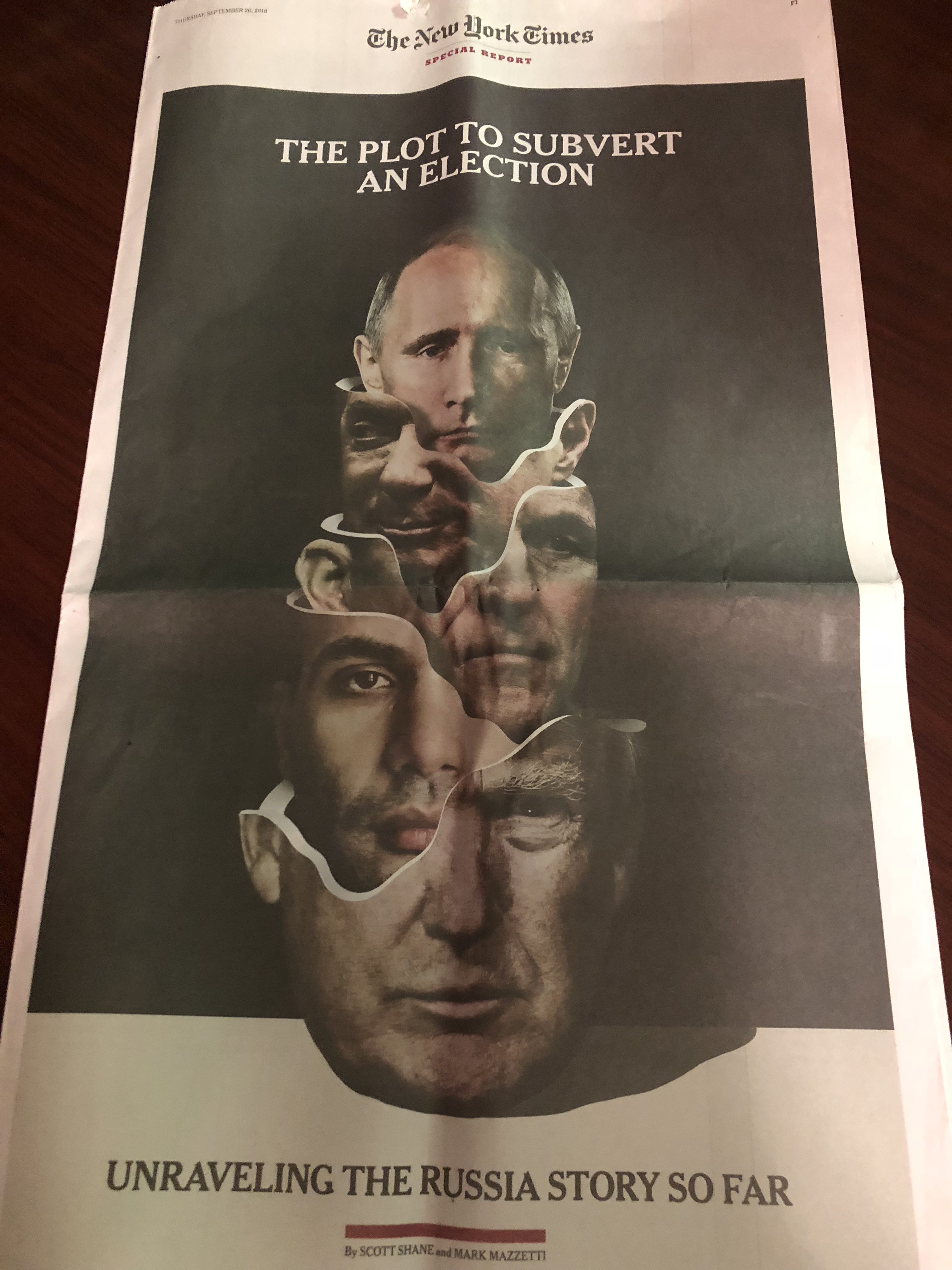
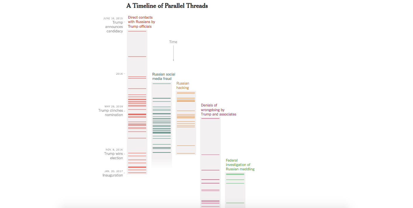
For those who like details, this reportage offers plenty, not only via the longish narrative, but also with precise timelines that detail the “full scale of Russia’s unprecedented interference in the 2016 election—and its aftermath.”
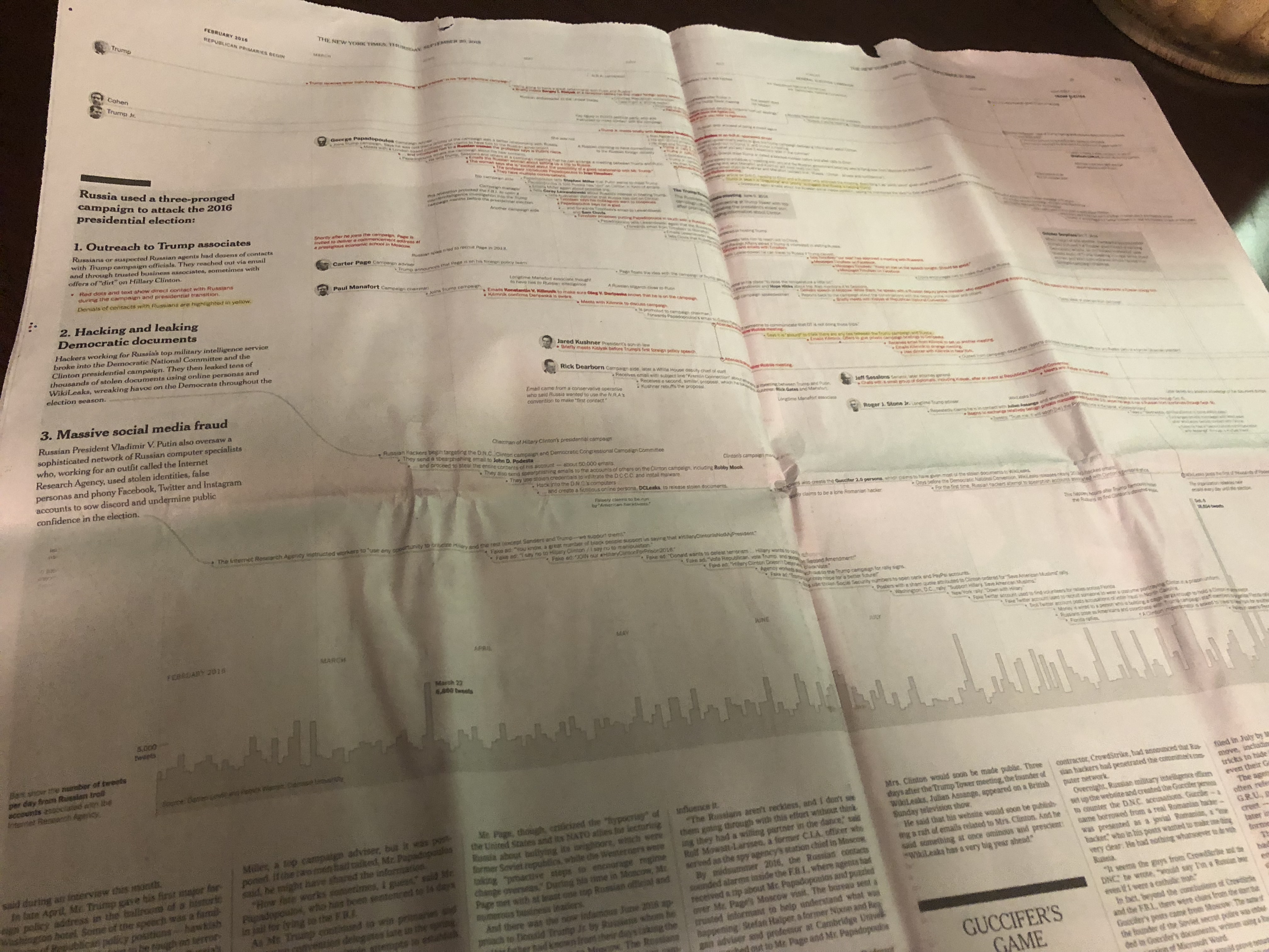
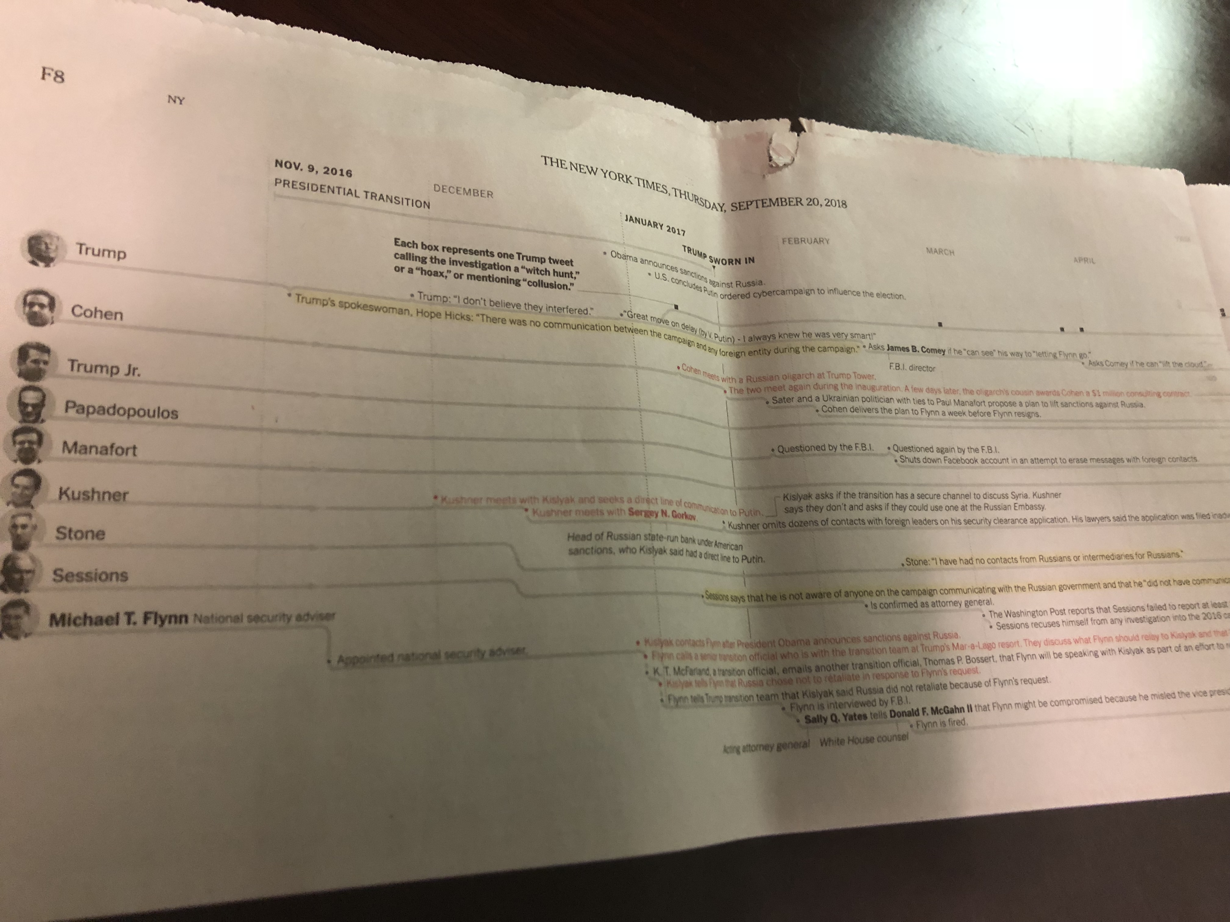
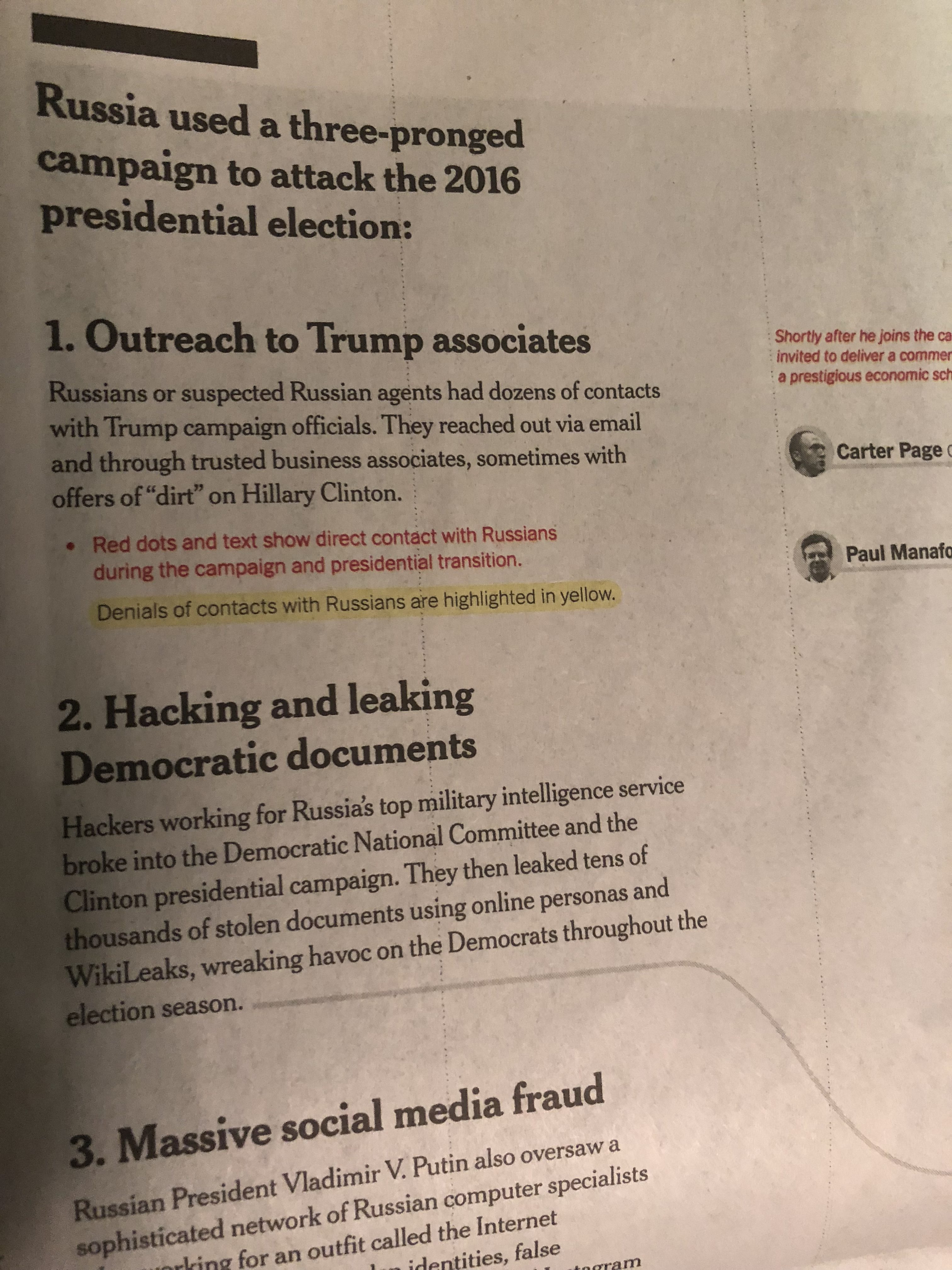
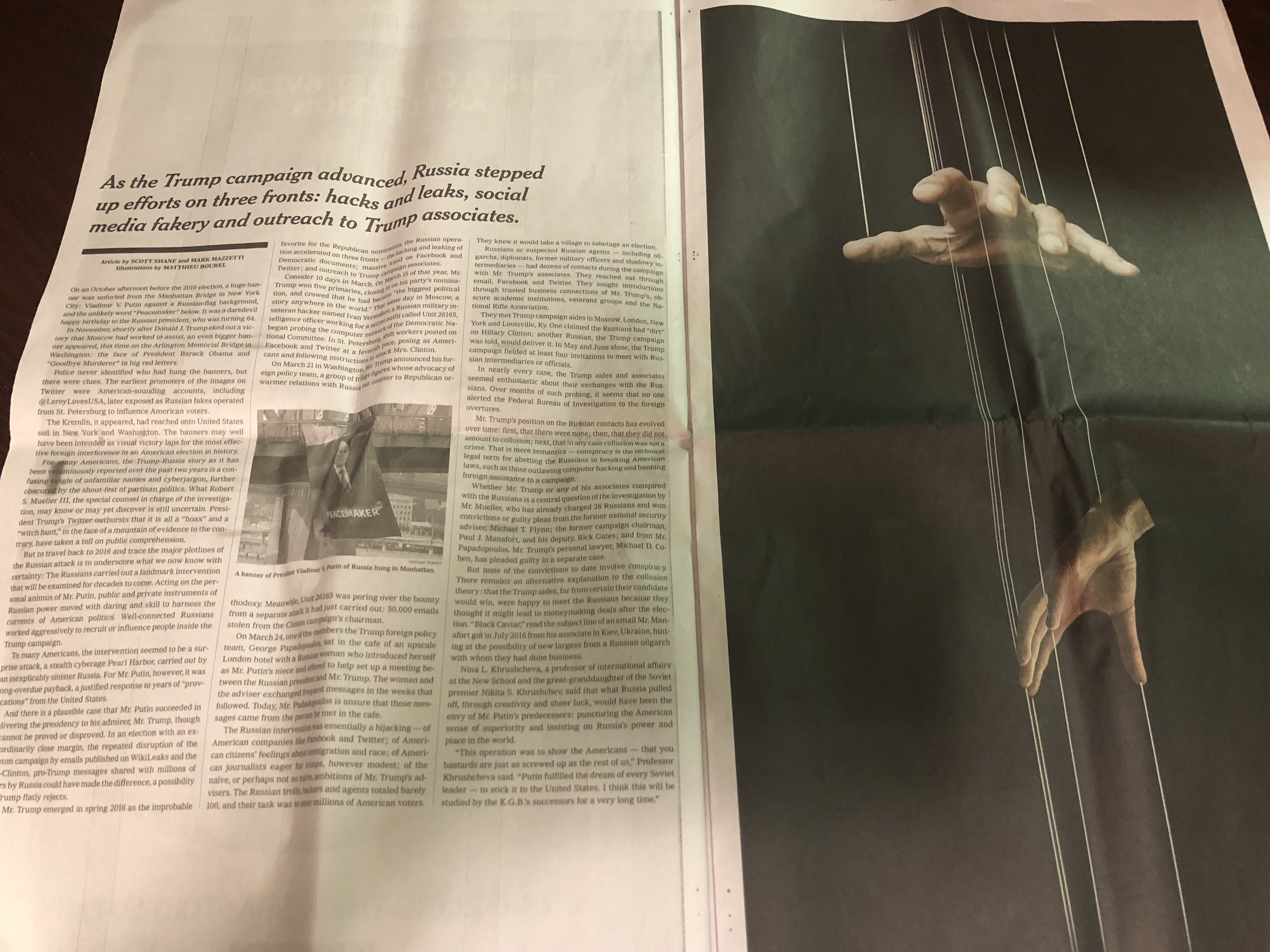
Long text made easier to digest
Designers take notice of the way a single long narrative was made easier to digest via segmentation (with large subheads to separate and categorize content), plus what are more like large summaries instead of headlines. The story has one title headline on the cover of the supplement, but the rest are explanatory summaries set in large type to move the reader along. Clever.
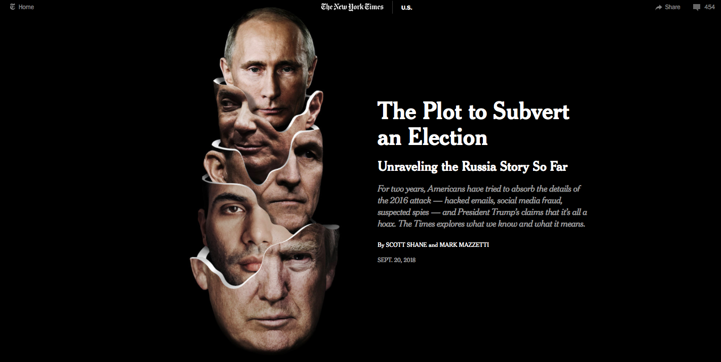
Here is the digital version of the story
This is important here, to see how The Times is already providing us with textbook case studies of how to treat stories differently for various platforms. The print version of this monumentally important reportage, as seen above, is just the right way to present the story for print consumption: ample use of white space, large type, summary headlines, good subtitles, and a graphic that spreads horizontally across the landscape of the page.
For digital, however, the story is refocused, and we see that there is a mobile-driven presentation of the material, with the valuable addition of video clips to enhance the narrative.
Take a look!
- The opening—following the same look and feel as the print version.
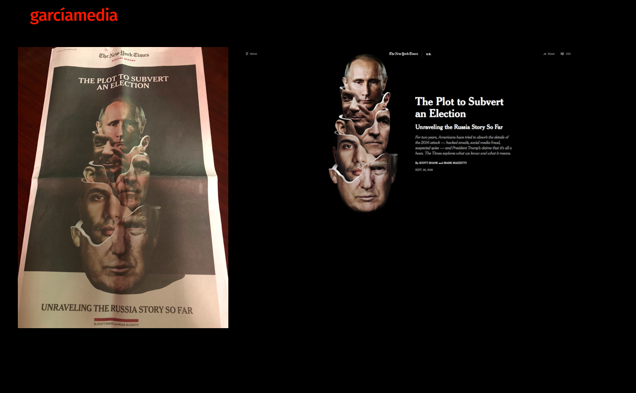
2. Adapting the timeline graphic to a more vertical platform.
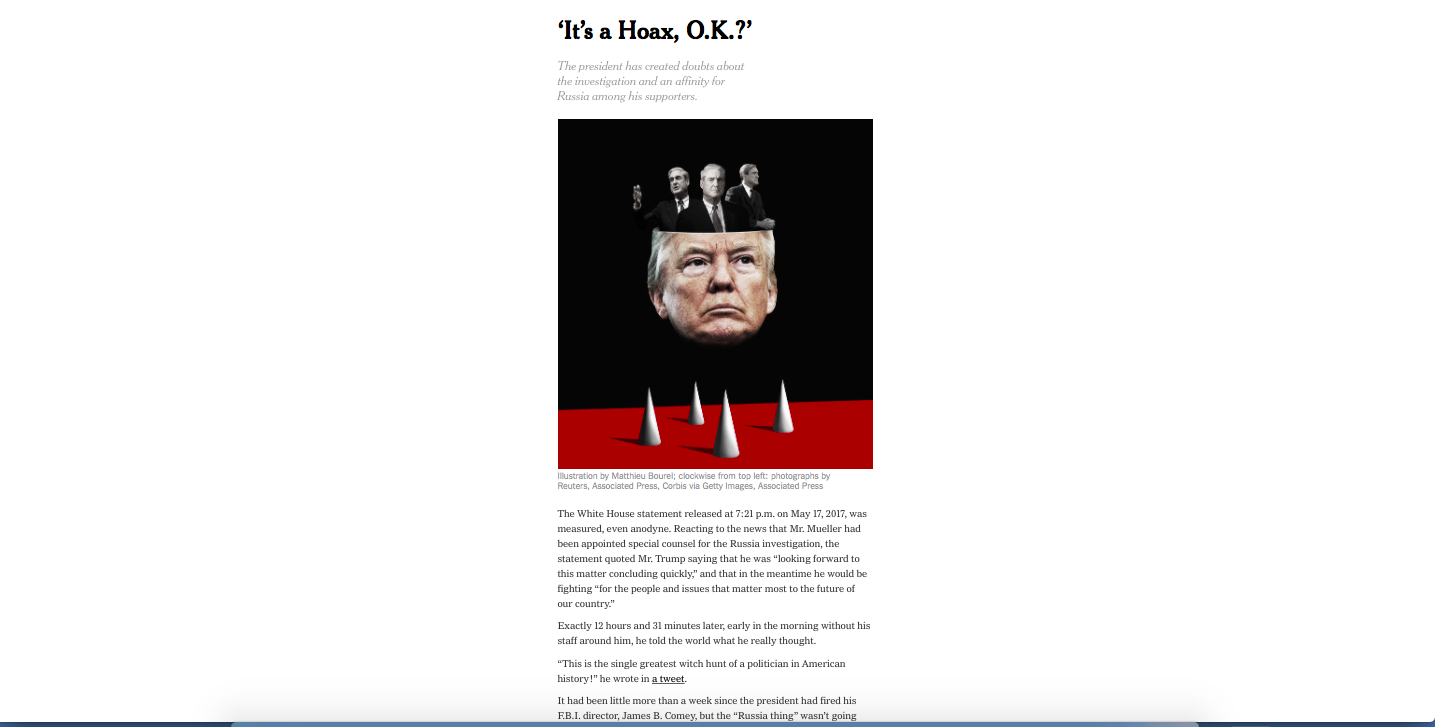
3. Effective use of subheads to advance the long narrative.
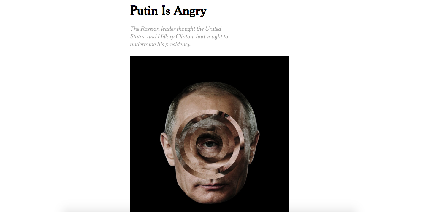
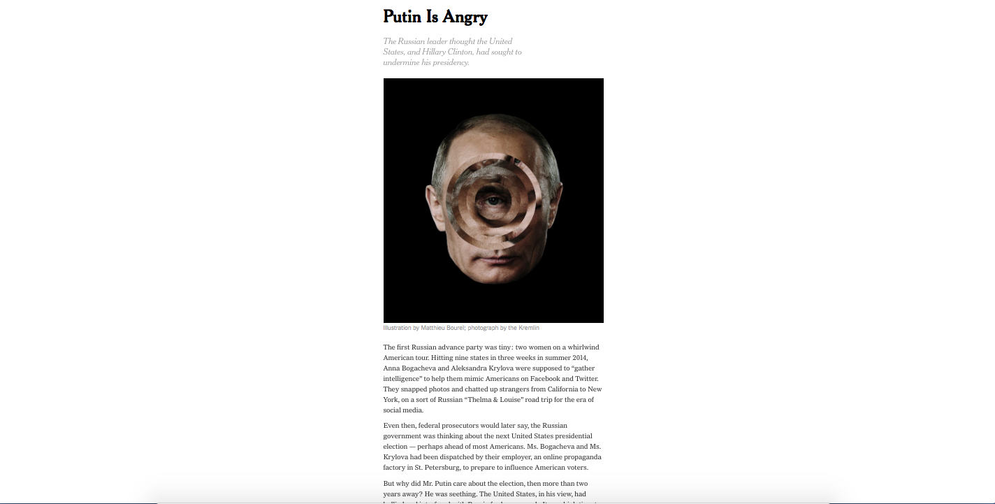
4. Linear storytelling for mobile.
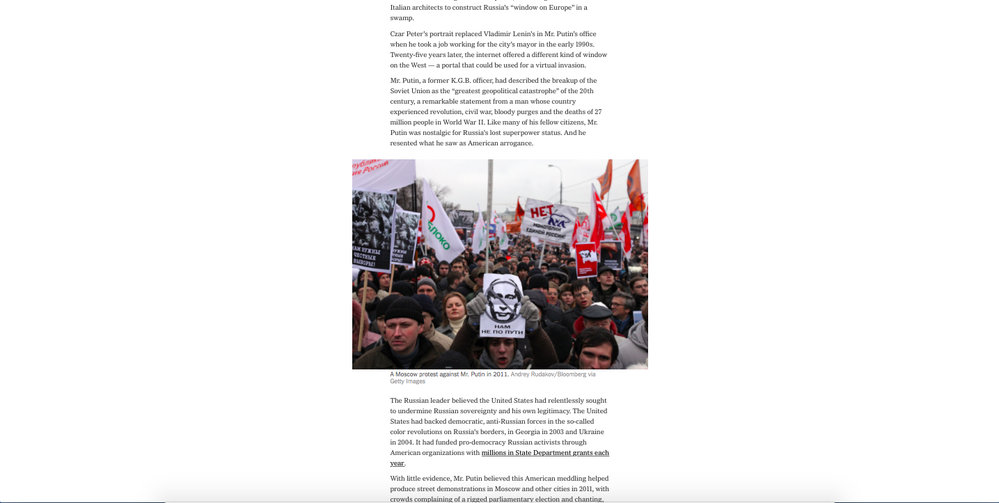
5. The addition of video clips.
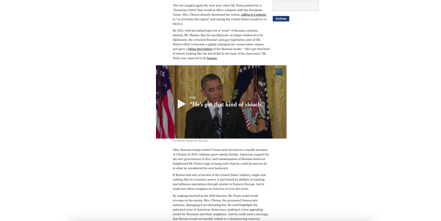
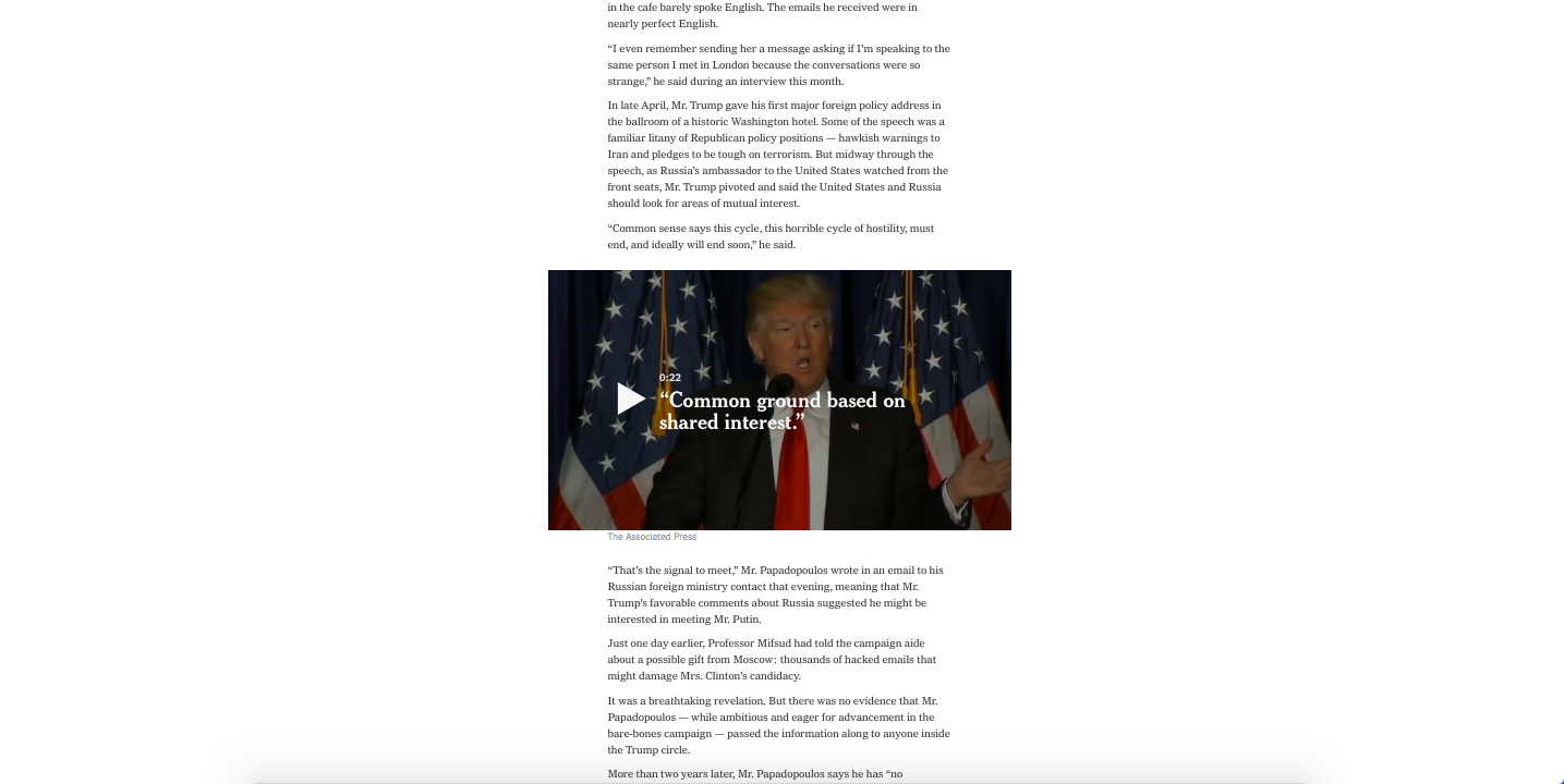
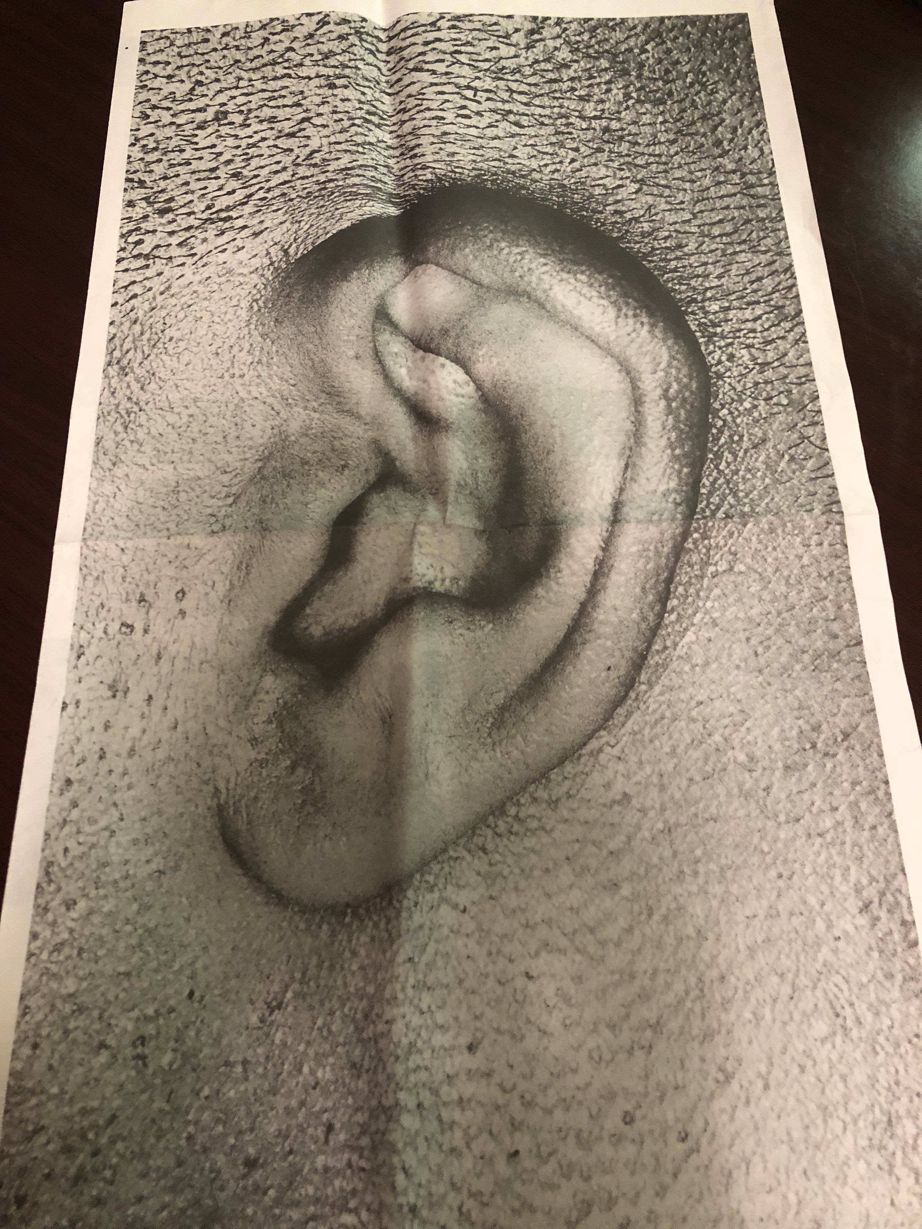
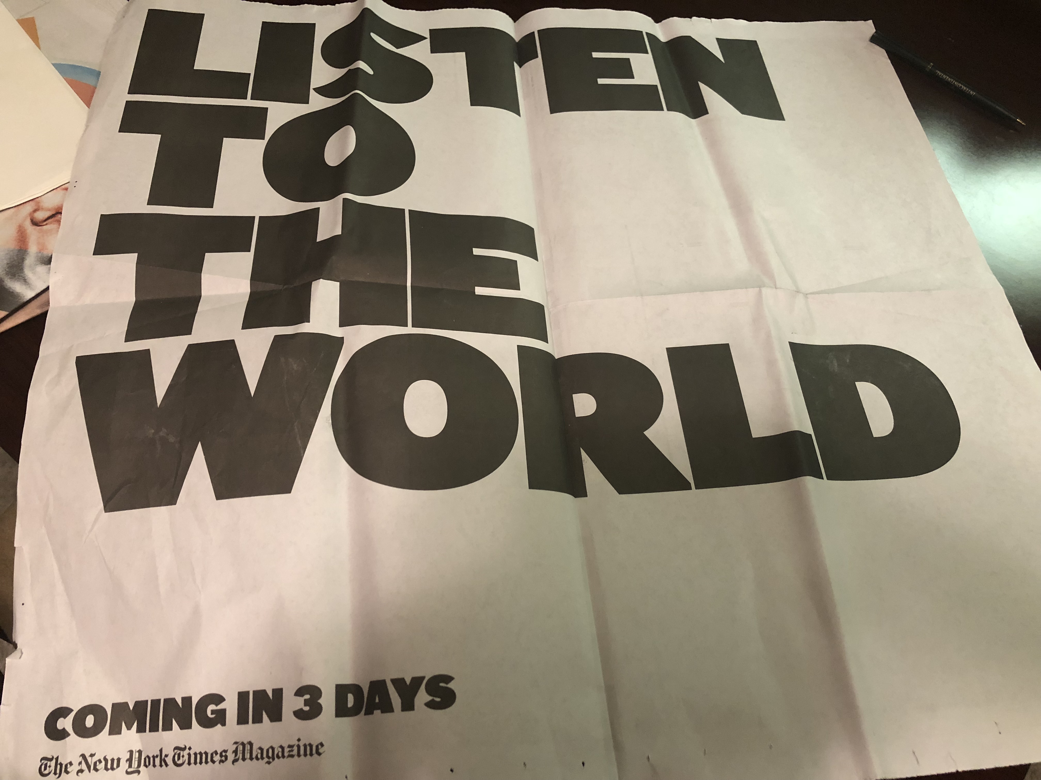
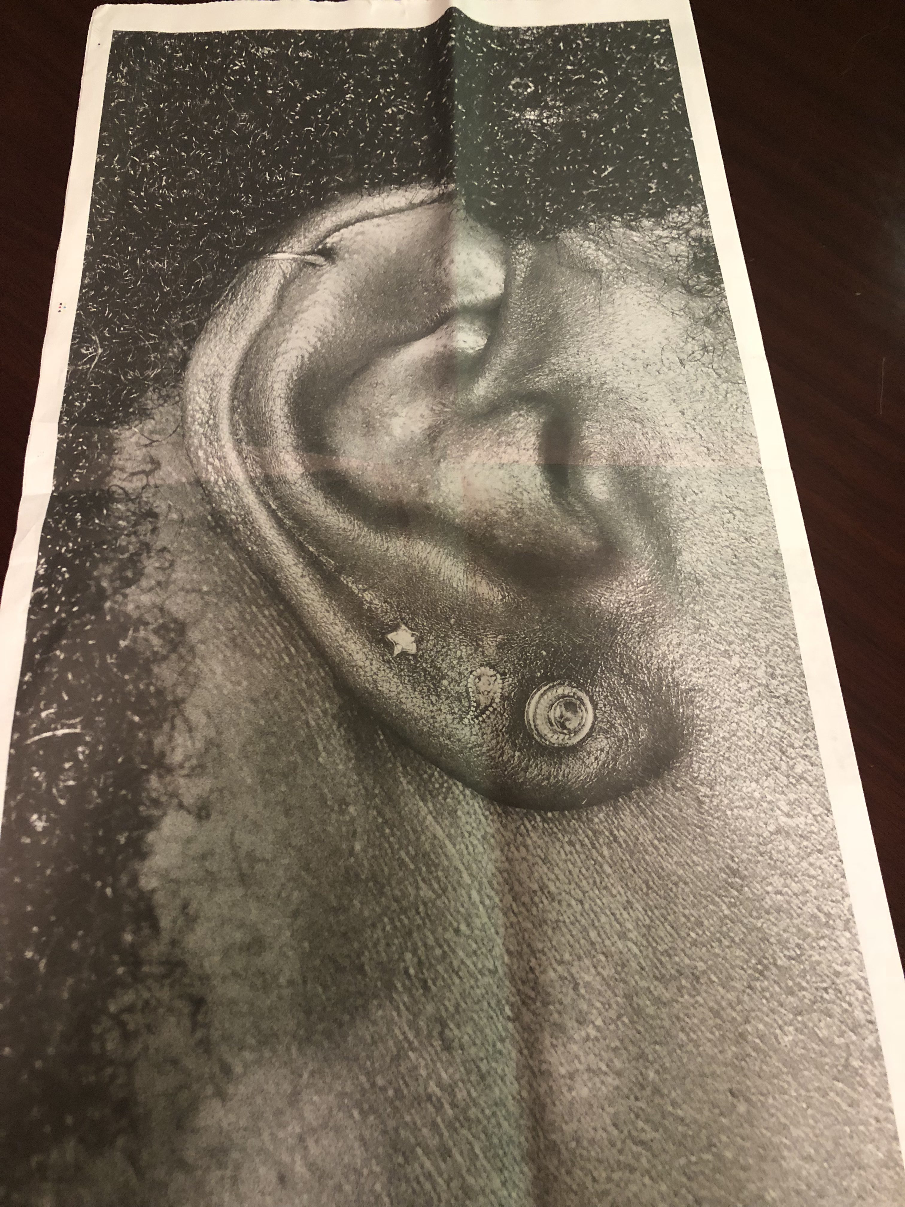
…and what is this next print surprise about?
TheMarioBlog post # 2915