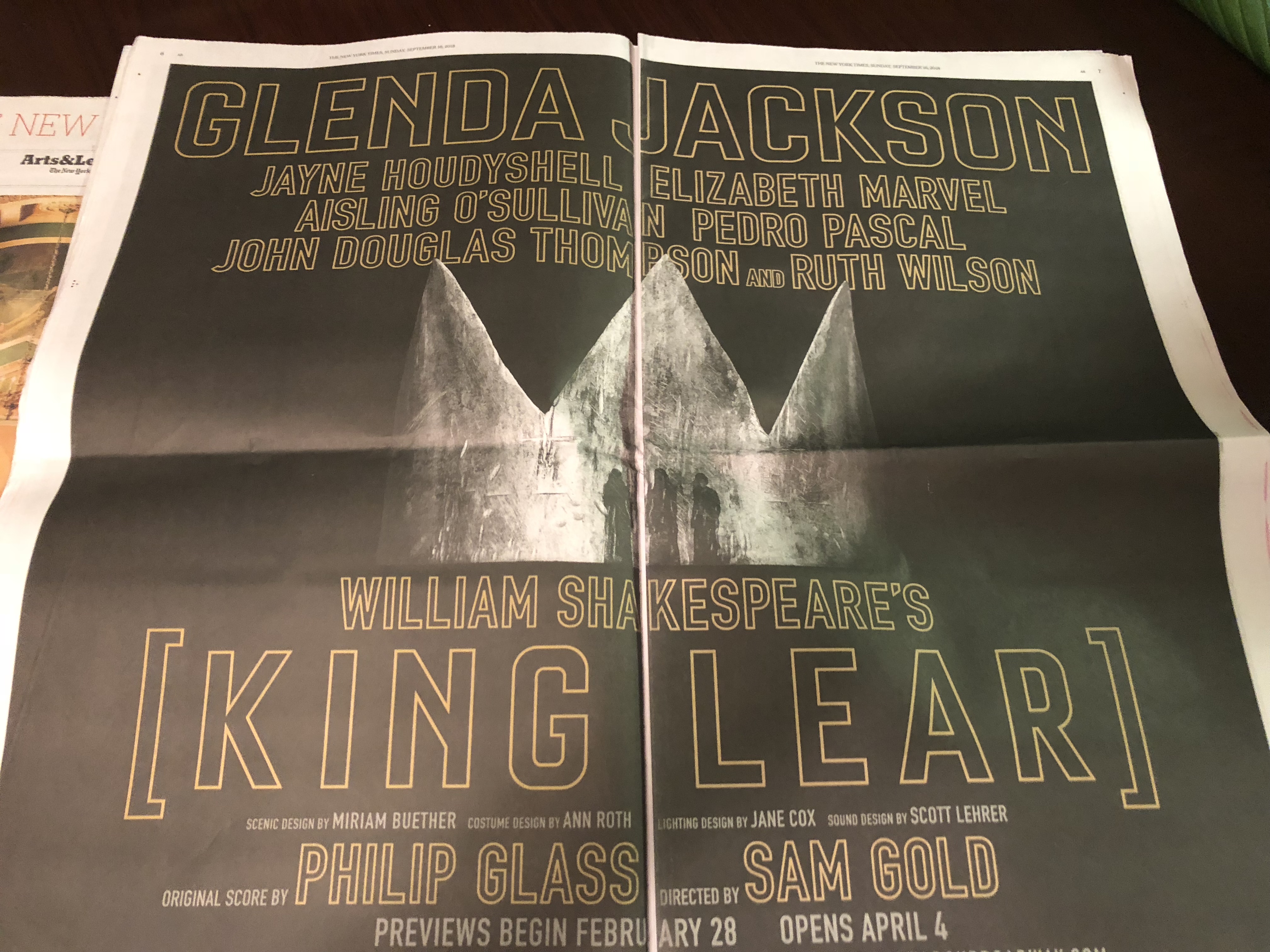
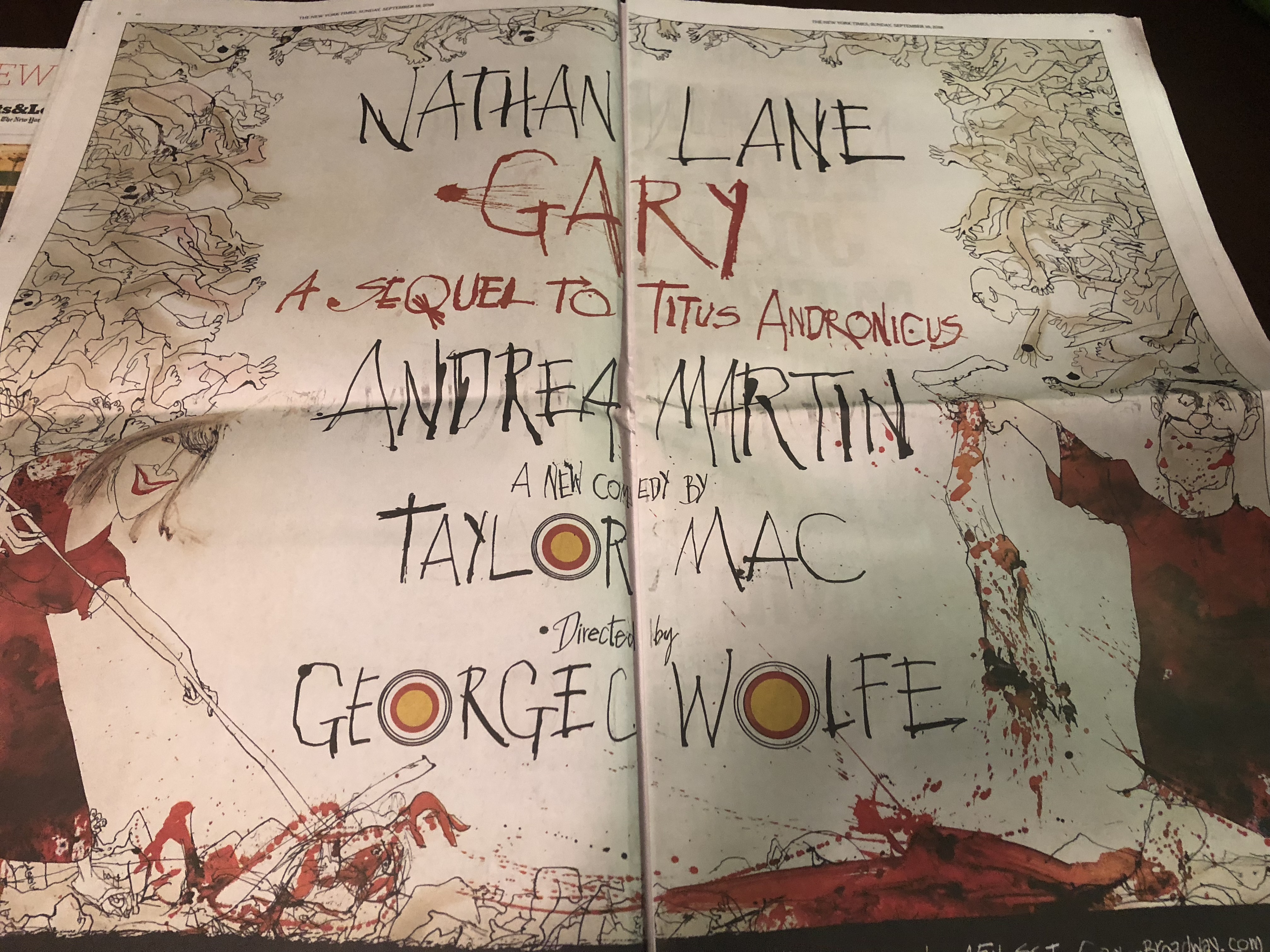
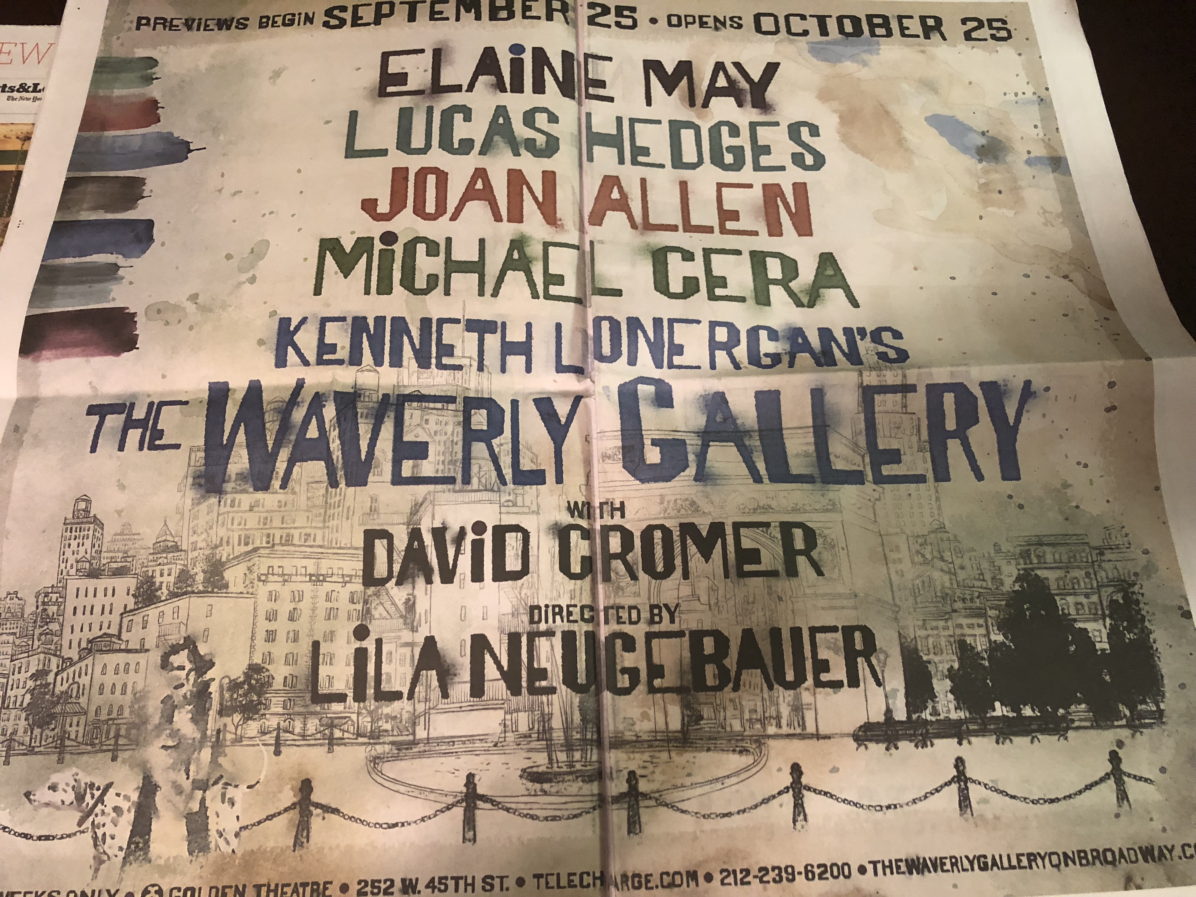
Rejoice all of you print lovers. This is not just doing print happily—but profitably as well.
There is plenty of reason, as in five supplements of The New York Times (September 18, 2018) devoted to a generous and visual preview of the arts in New York as the first leaves of fall begin to fall in Central Park.
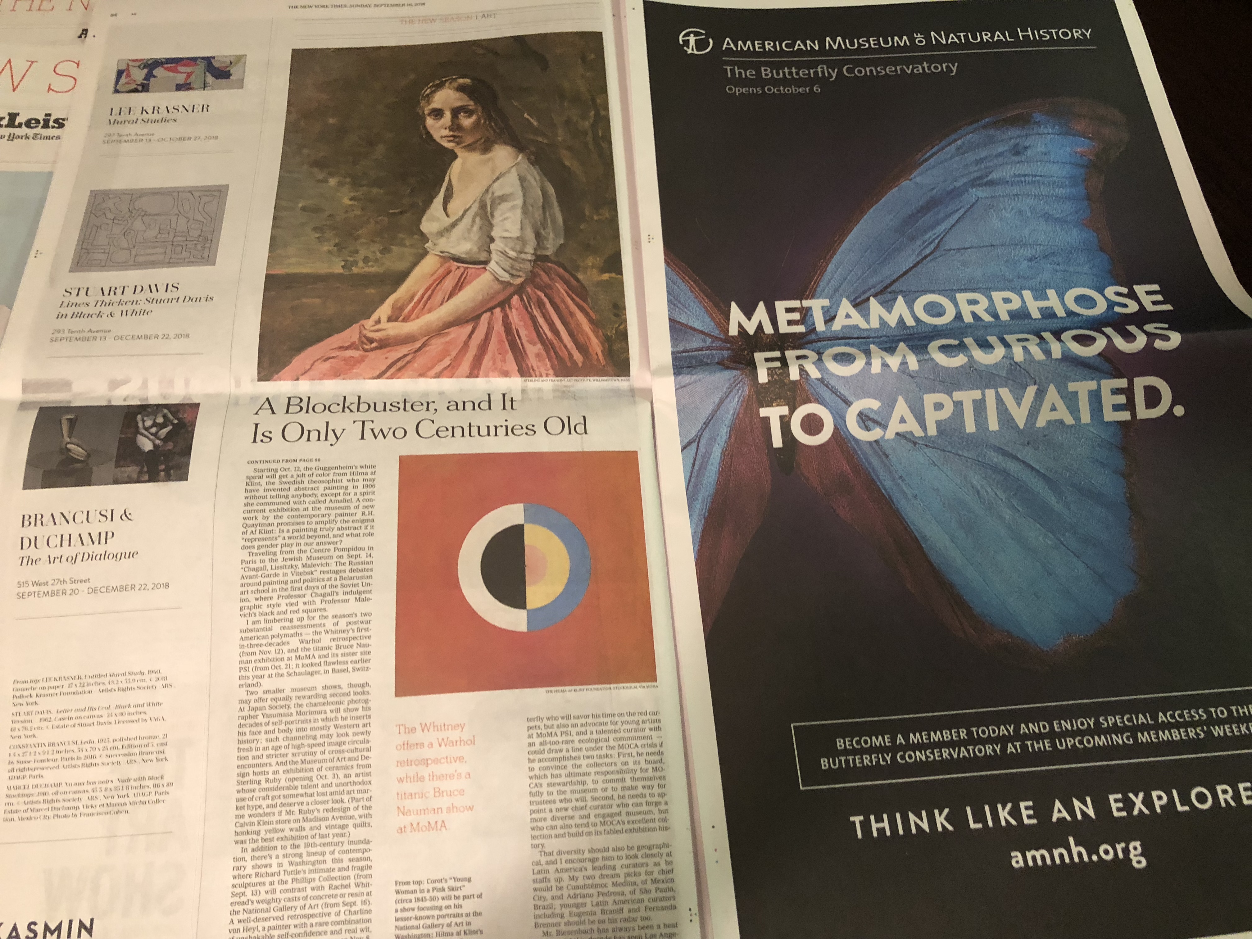
I don’t know about you, but I love to see all those one (or double) page ads for Broadway shows and the new films. Here is one of those areas where digital simply can’t compete.
These pages offer a visual banquet, one of those where there are so many delicious dishes to the eye that it is hard to pick what you want to eat, and you end up filling your plate more than you should.
The Times’ preview of The New Season is divided into five supplements: two are devoted to Art/Pop/TV, two to Theater/Classical/Dance, one to Film.
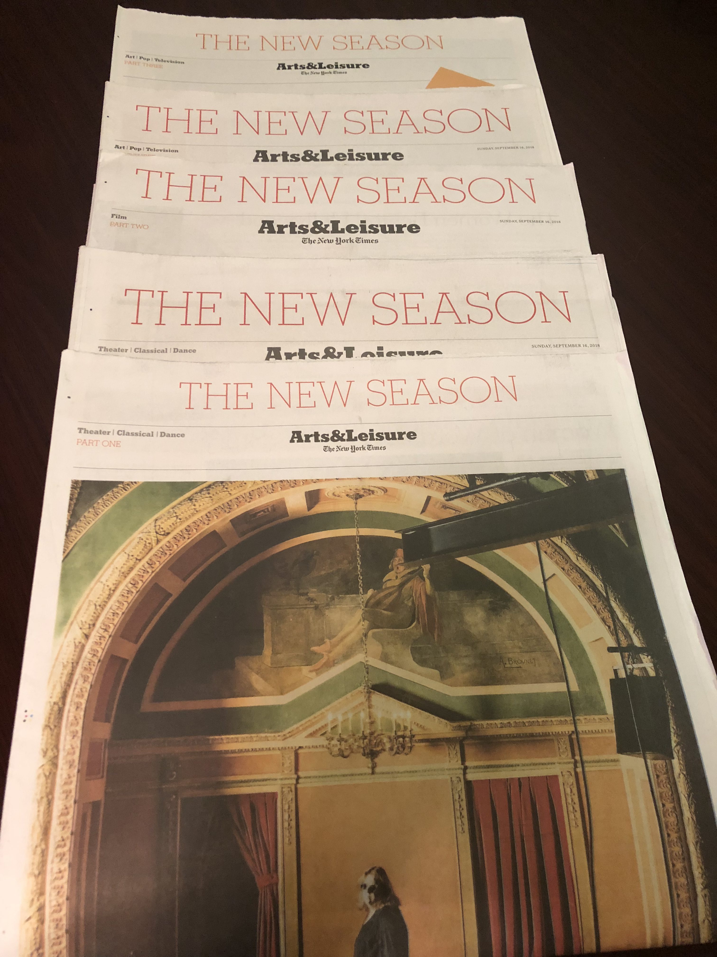
The content and those (fabulous) ads
What works so well here is the combination of well designed pages for the content of each supplement, along with mostly elegant and easy on the eyes full page ads for shows we would like to see.
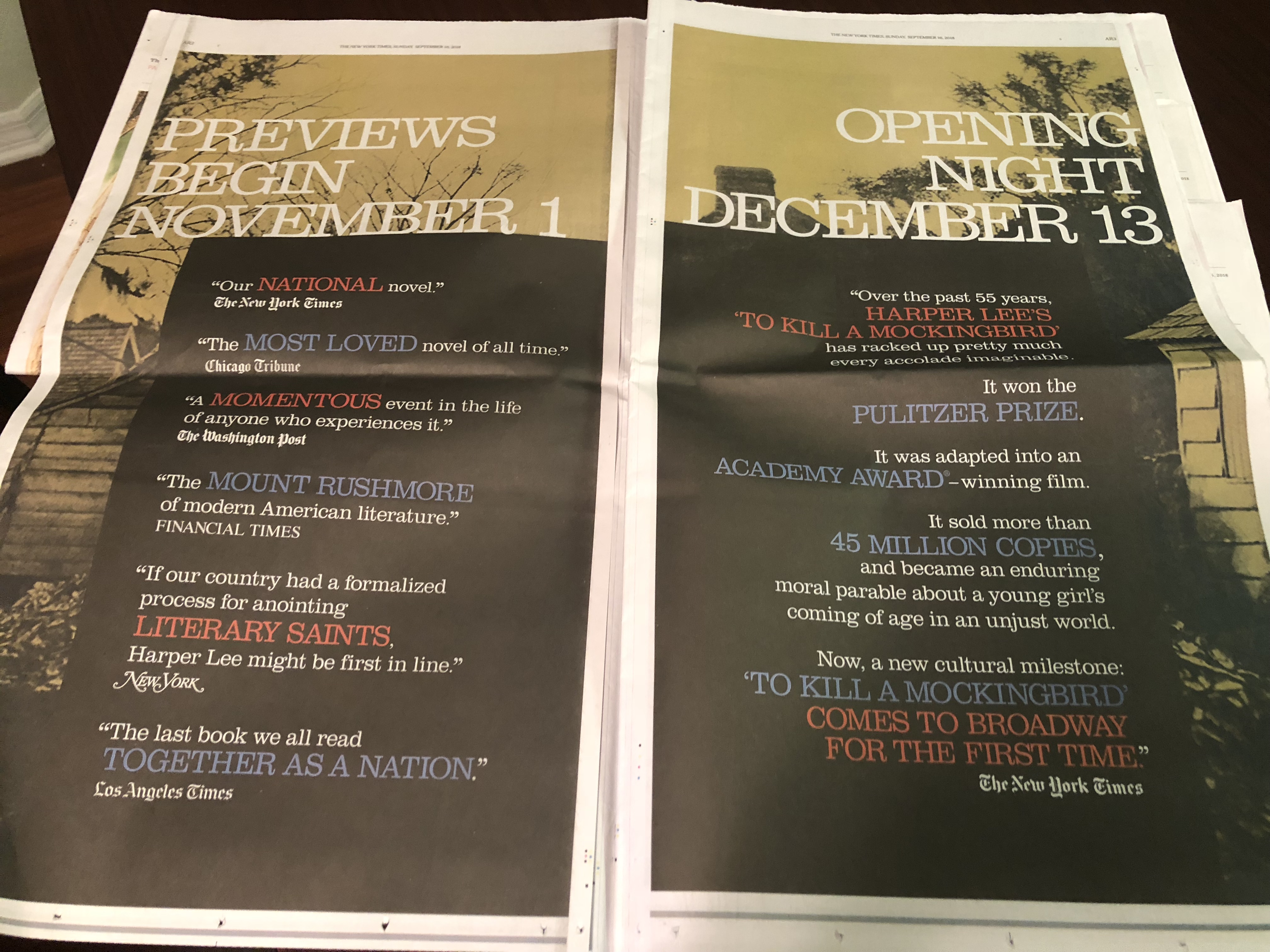
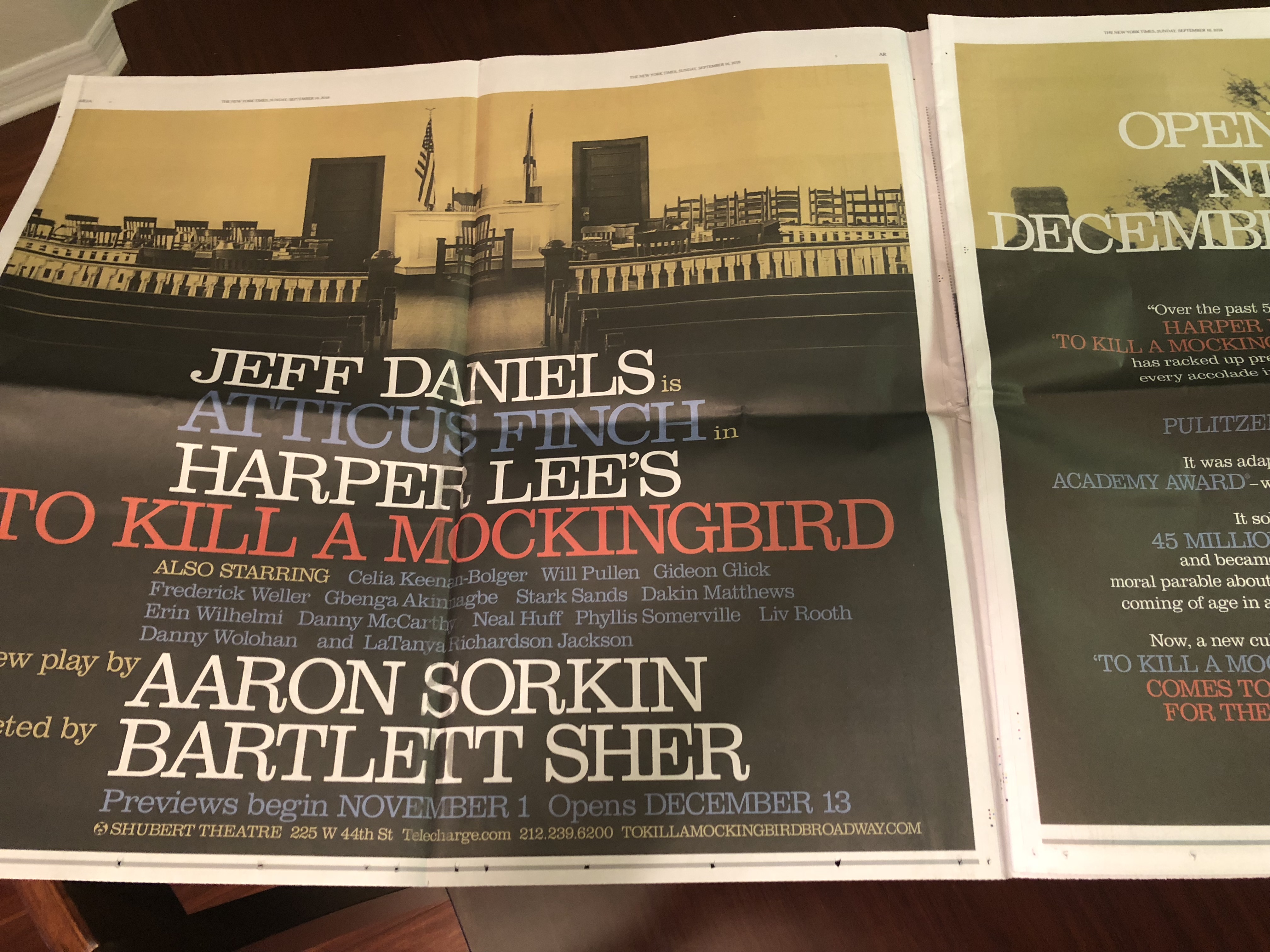
The double page ads
As we see the display of ads like the one above, we realize that these supplements are not only essential to inform the Times’ audience about the best in entertainment for fall, but also a fantastic opportunity to open space for attractive advertising that generates what I am sure is tons of money. Win win.
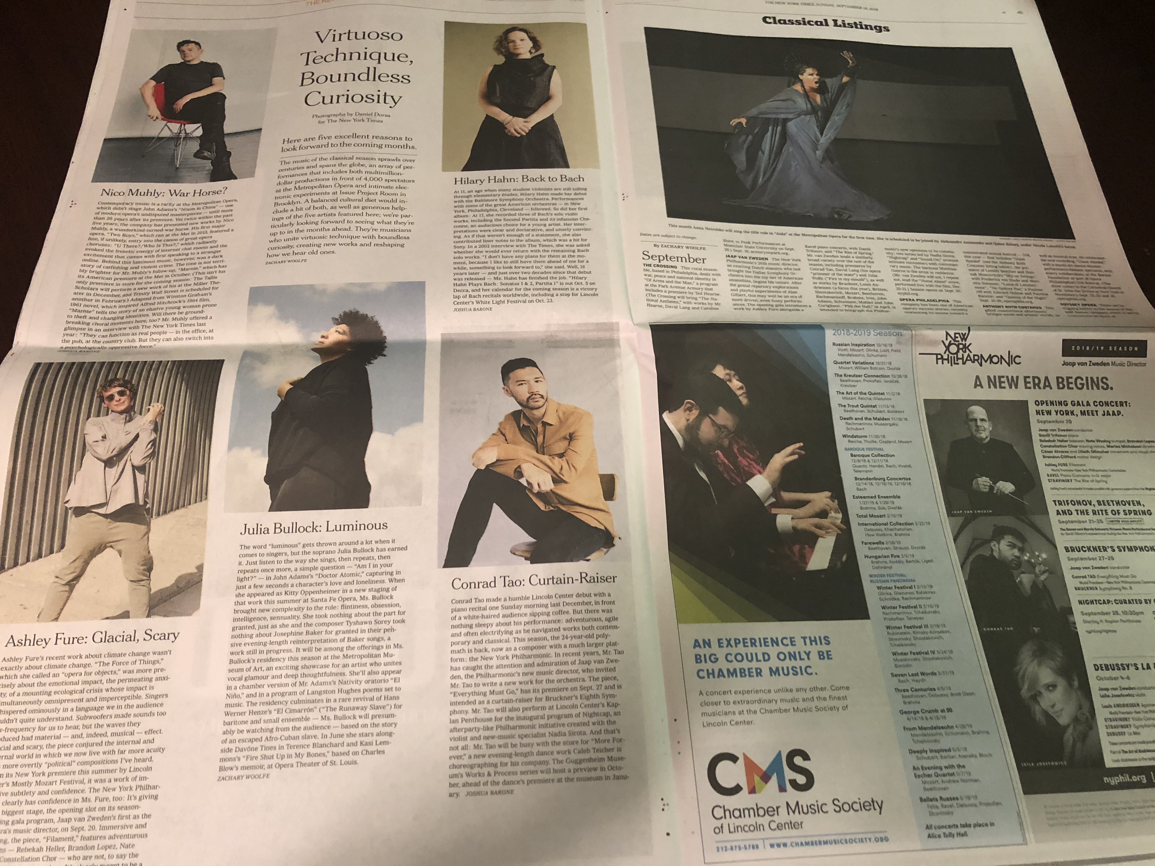
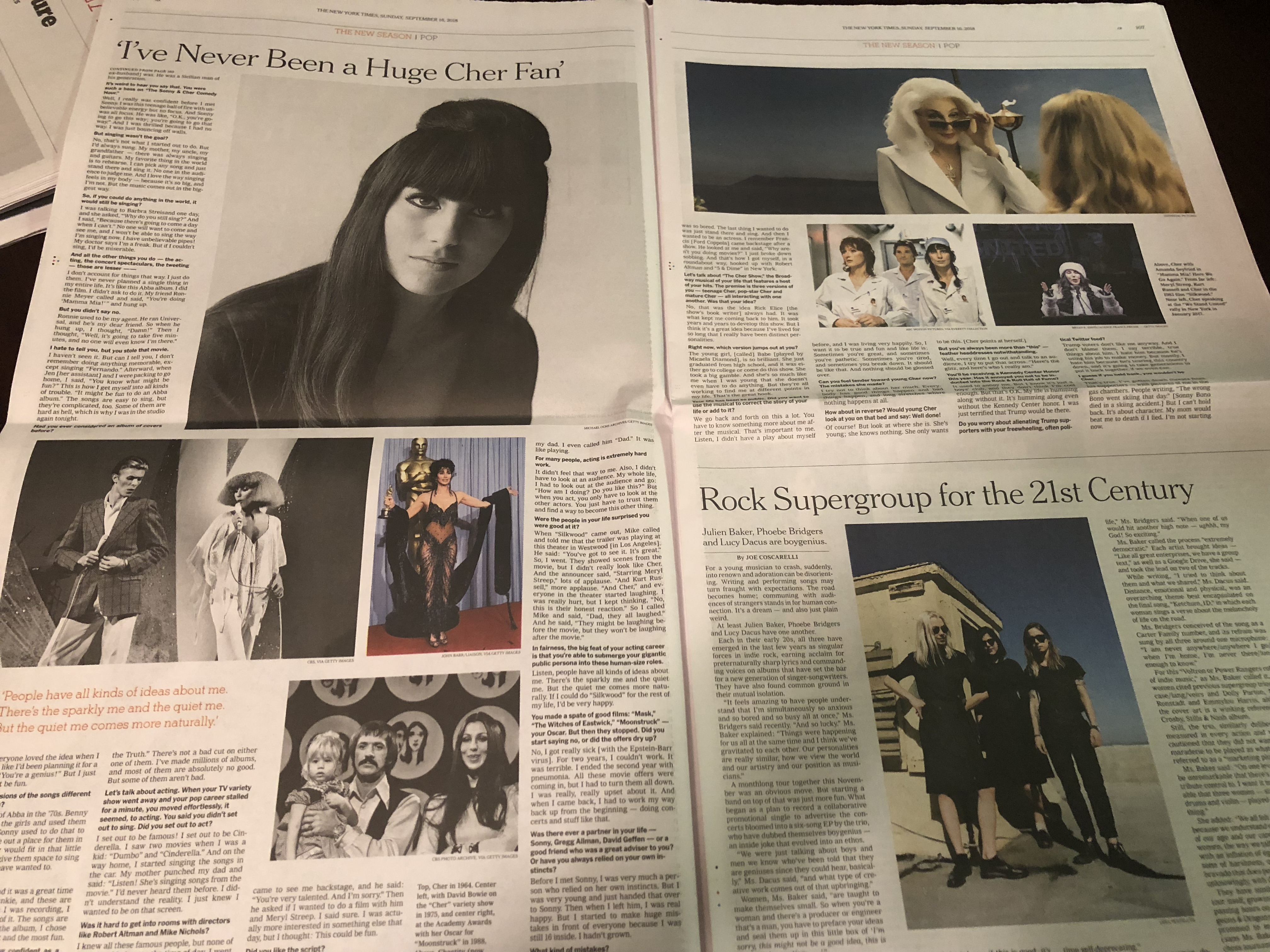
The inside page design
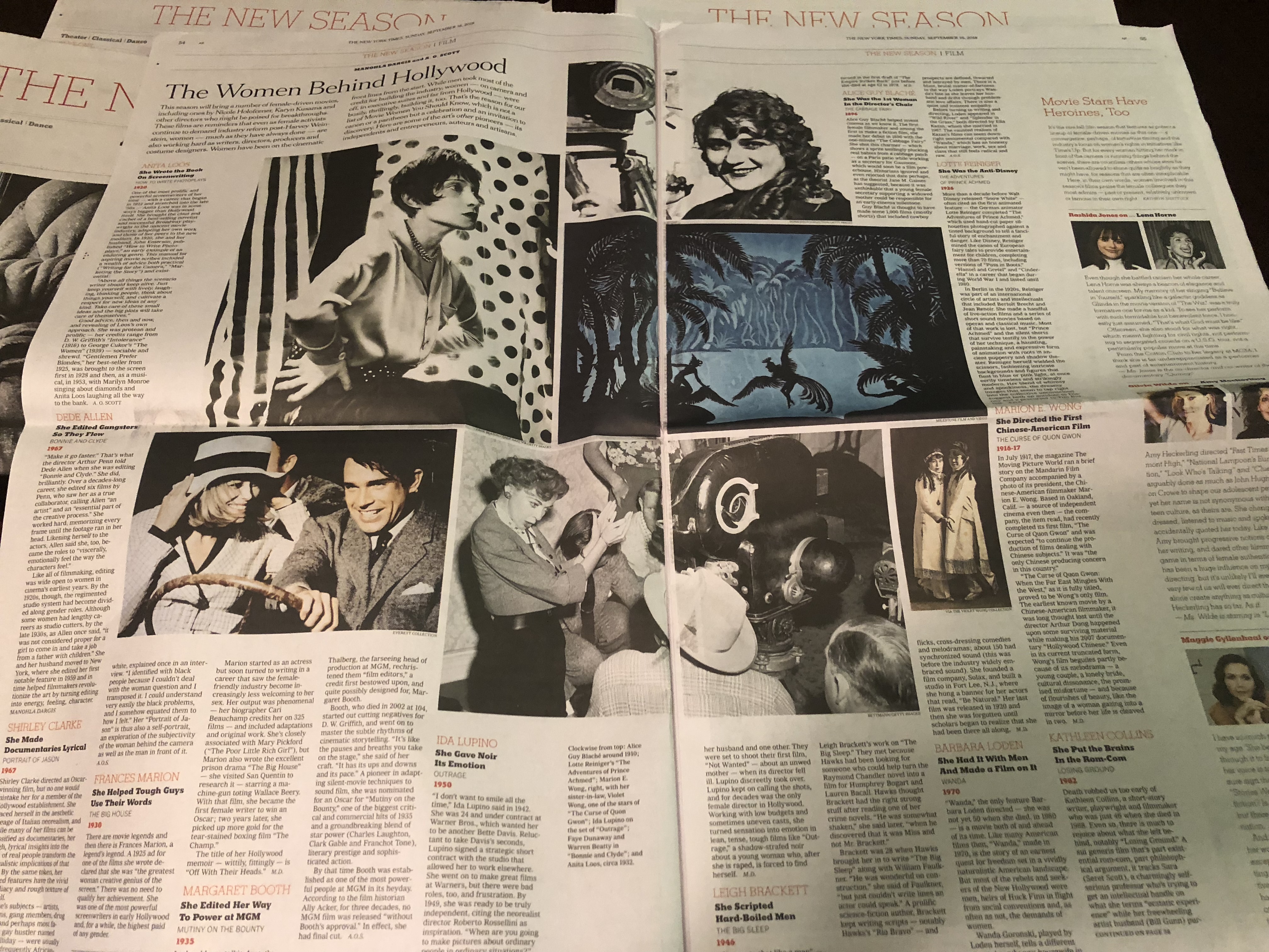
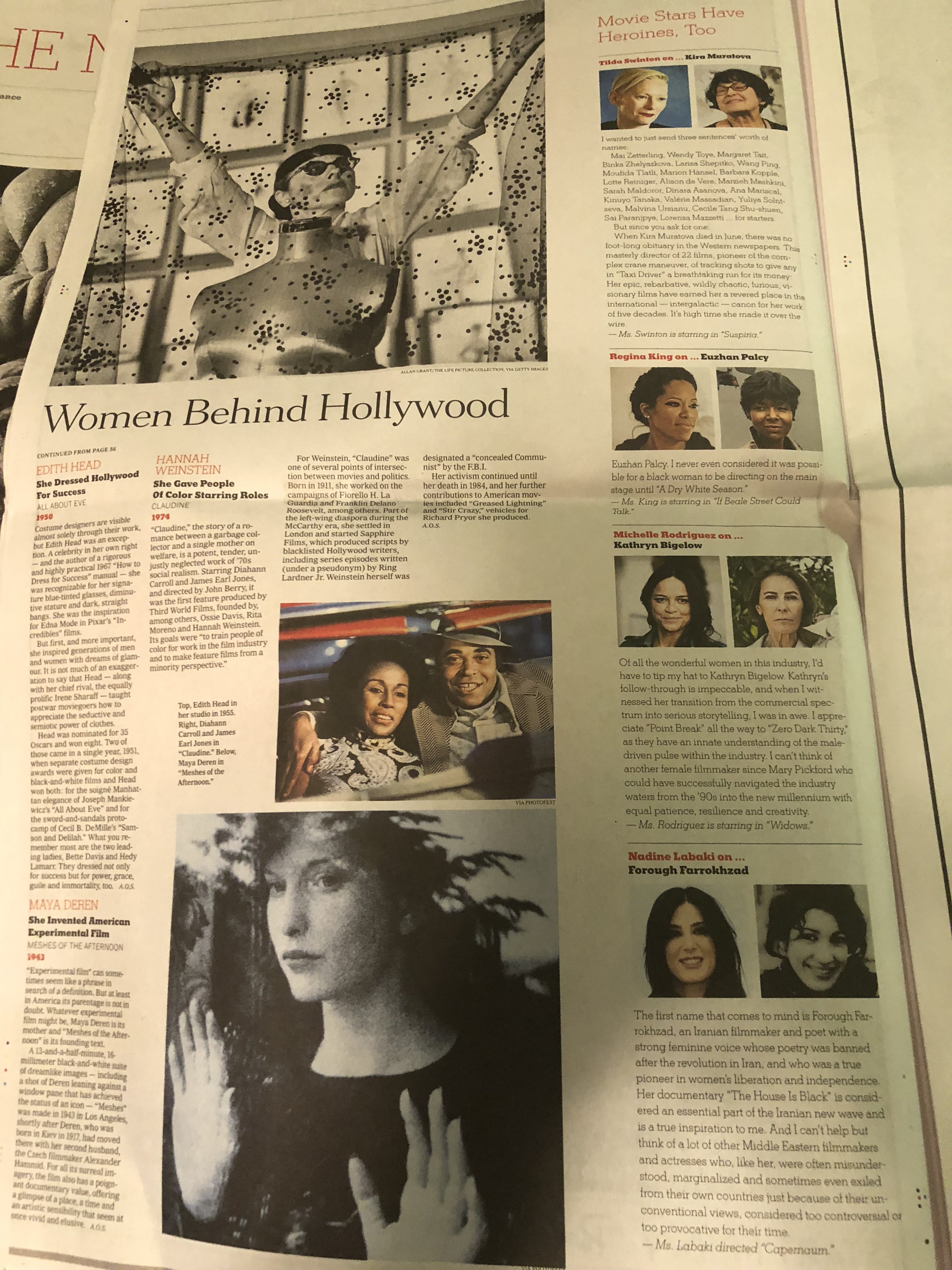
While the ads dominate visually, the content of the supplements is well designed, with emphasis on the clustering of visual elements as we see here:
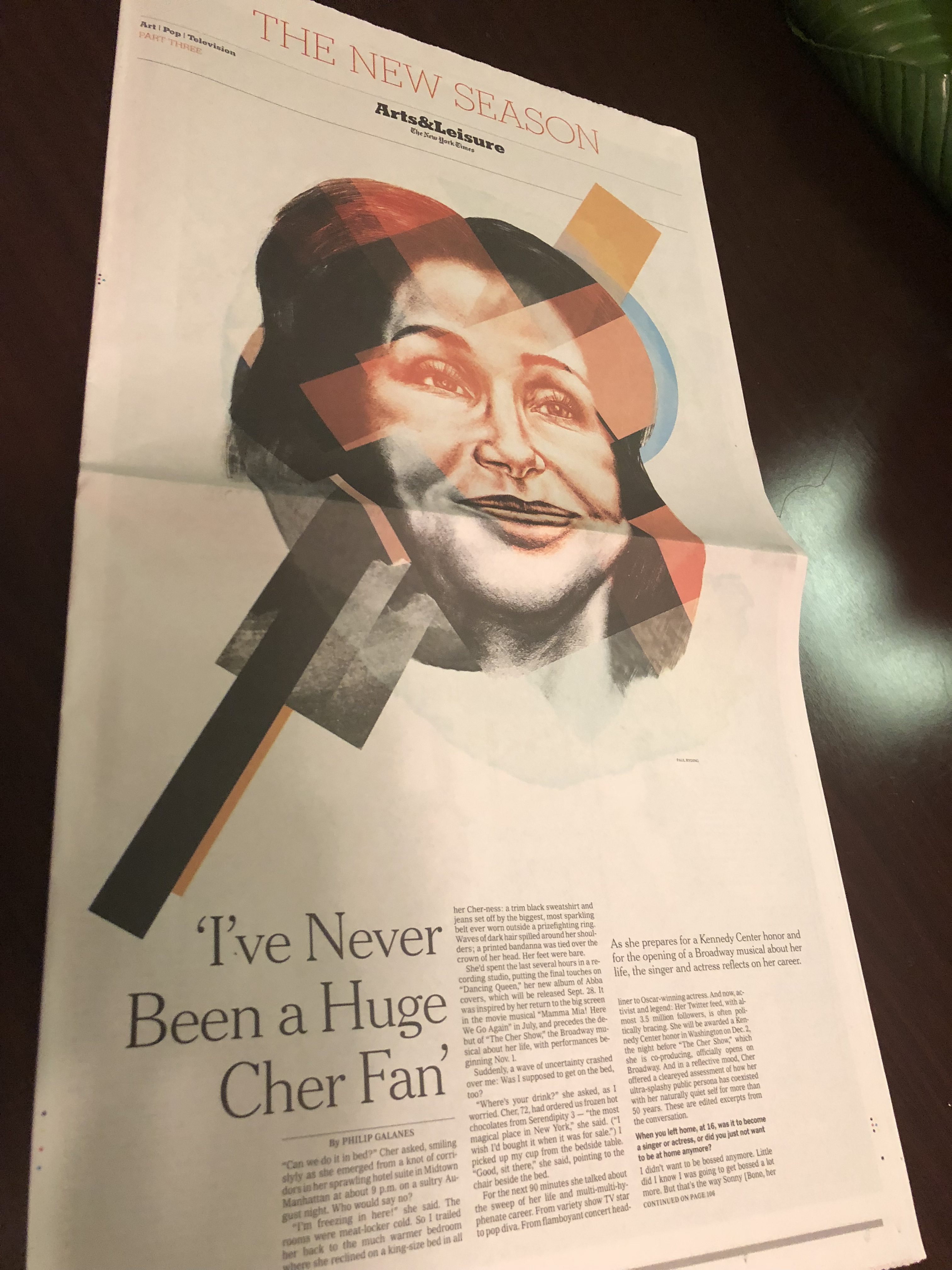
The single page profiles
Effective interplay of the large image and the longer text positioning here.
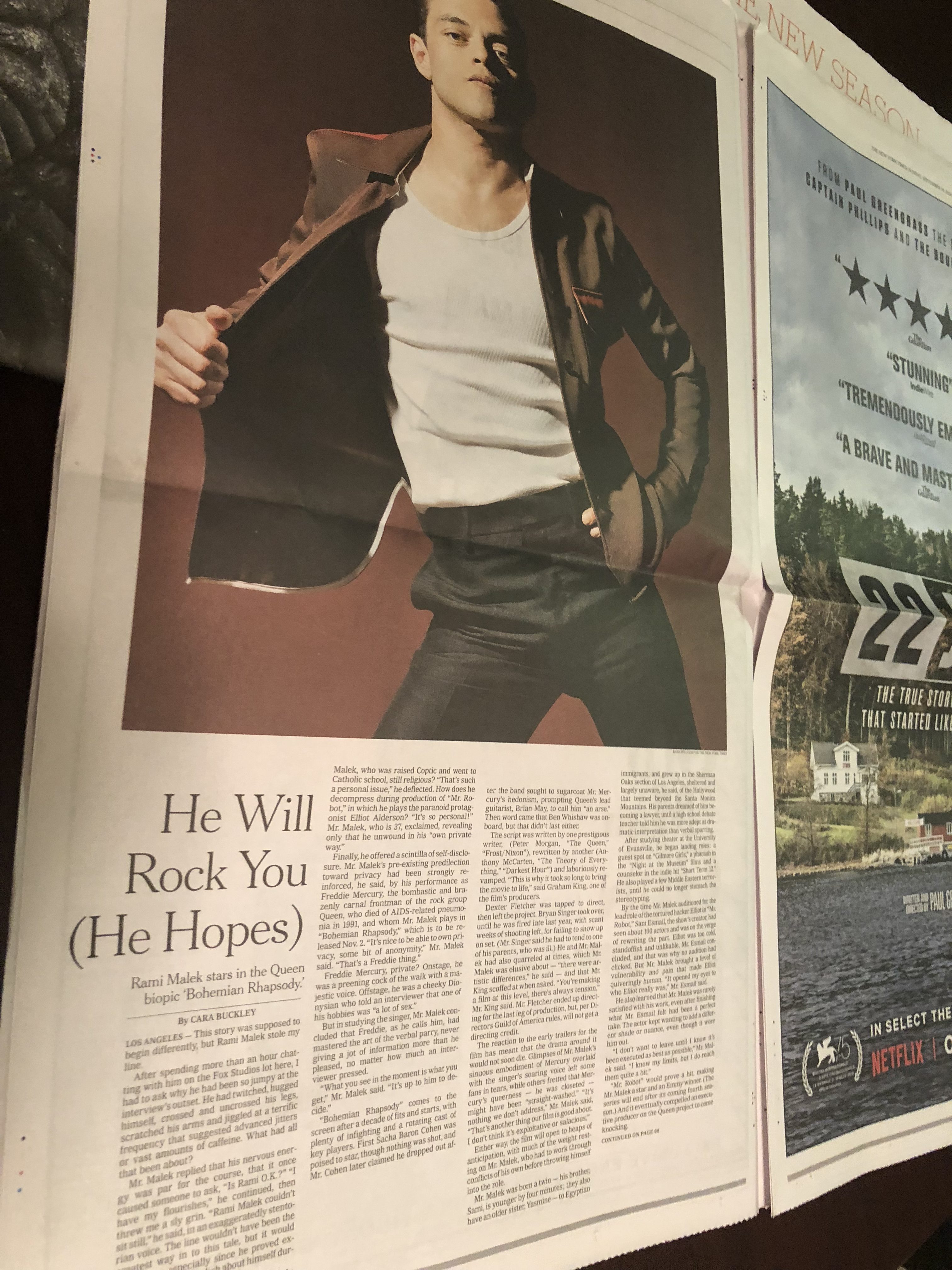
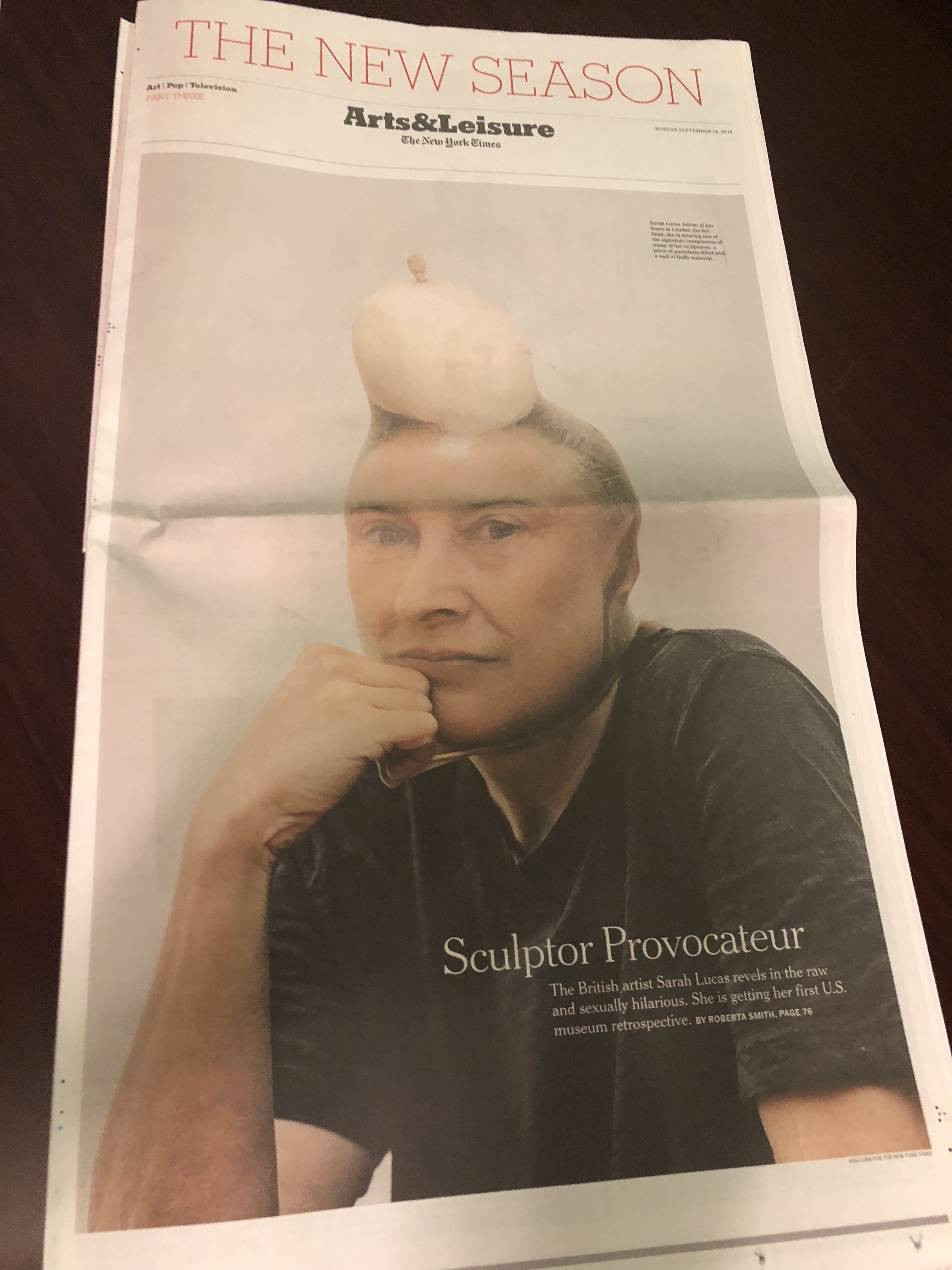
I have only shown you a few of the pages here from this rich 5-supplement package.
Enough for you to realize the power that print can have when the content, the concept, the design and the advertising come together to provide us with a visual feast. I wish more newspapers would do print happily, celebrating what print can do best.
Here is the example of how to do it!
TheMarioBlog post # 2914
