The Virginian-Pilot is the latest prominent newspaper to announce that its design will be outsourced starting in 2018, to Canadian production company Pagemasters North America, a subsidiary of The Canadian Press. The Pilot will eliminate four full-time and two part-time positions from the Norfolk newsroom.
This is a shock. The Pilot has won numerous awards from the Society for News Design (SND) for its consistent design excellence; designers and editors often turn to its Page One for inspiration. The Pilot is a standalone newspaper owned by Landmark Media Enterprises, a family-controlled company.
The Pilot is not alone. Seven news companies in the United States—Advance, Lee, Gatehouse, Gannett, McClatchy, Civitas, Digital First—now outsource design to 25 design hubs, encompassing more than a thousand separate products (dailies, weeklies, and niche/specialty publications). Some of these design hubs produce two thousand pages a week, others two thousand a month. The trend began about a decade ago with Digital First, and picked up in 2012 when Gannett centralized its design operations, according to research conducted for a 2017 Society of News Design seminar.
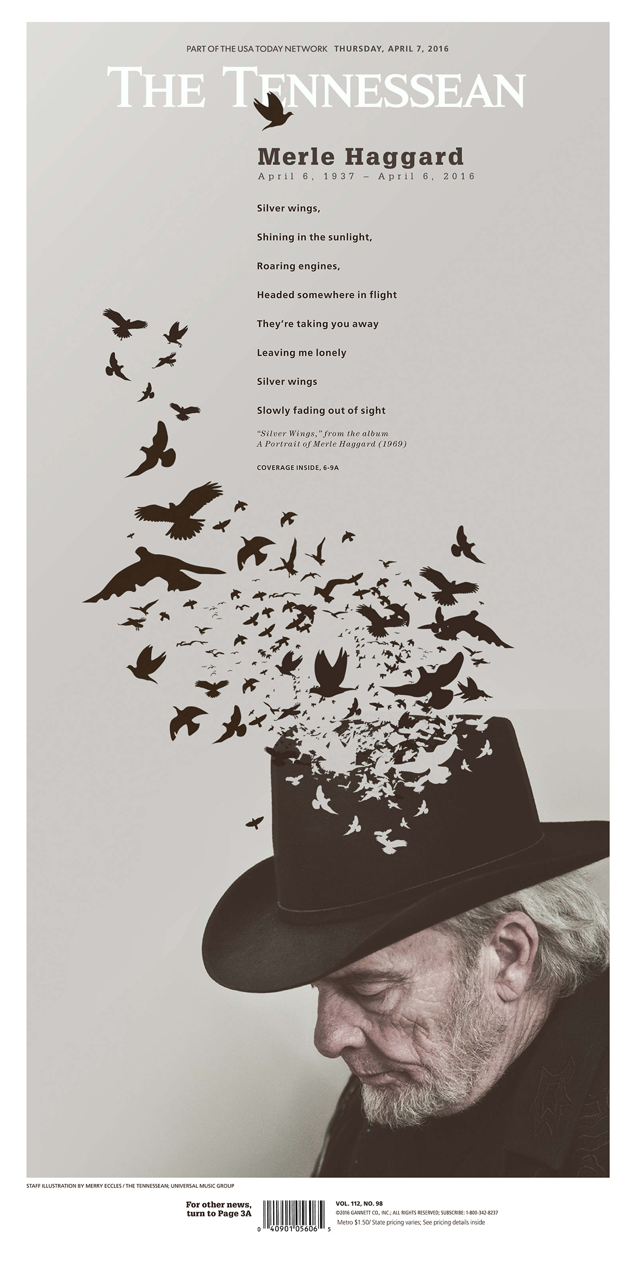
What has distinguished the Pilot from so many other newspapers is its clever and creative art direction. The Pilot uses the large canvas of its broadsheet format to present poster-like treatments of stories. While elements of continuity such as typography, color, and grids created the foundation of its design, designers and editors emphasized art-directed elements that made a story stand out—even hours after the news was introduced online. Take a look at some of the Pilot’s front pages in recent times:
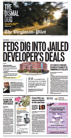
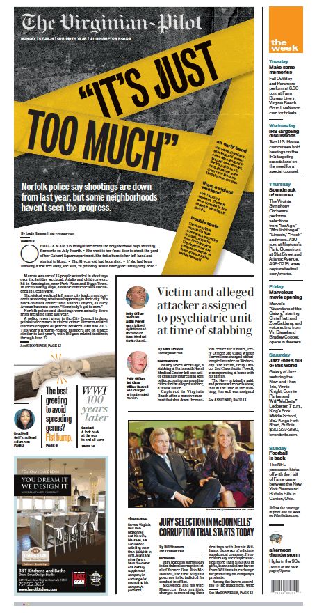
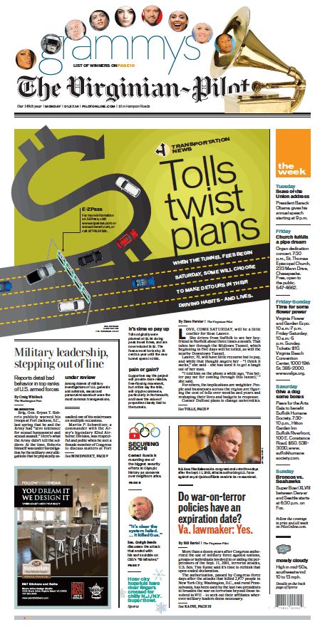
The economic realities are clear: By outsourcing design, the newspaper saves money. But does consolidation come at the expense of creativity? Does the creative process take a step back when design moves away from the newsroom where stories are conceptualized?
Outsourcing is controversial
Effective design marries words and images, what I refer to as WED: writing, editing, and design. For WED to happen successfully, a designer talks to the writer of the story and the editor of the section where the content will appear. A photographer or illustrator is also often part of the dialogue.
Outsourcing design is not necessarily negative; its success depends on maintaining WED, even if everyone is not in the same place.
With the design at a distance from the originating newsroom, tin-person collaboration between writers, designers, photographers and illustrators can suffer. The serendipity that happens when people meet even briefly to discuss a story line and how to present it becomes more difficult, though not impossible.
J. Ford Huffman, formerly a USA TODAY deputy managing editor, was part of a group that Gannett consulted with to get ideas about how to make the design-center process work well – in what Huffman calls “staffing, structure, synergy and design sensibility” — before consolidating design operations.
“I raised practical, managerial and aesthetic considerations,” Huffman said.
Collaboration also ensures the design process preserves a distinctive brand, even while being part of a design hub. “I think it’s crucial for individual news products – print or digital — to look and feel ‘local’ to readers, by design.
“Otherwise news pages—in print and in digital—begin to look as similar as strips of homogeneous franchise restaurants and their signage. Everything that looks the same can seem to read the same, offer the same. Or taste the same. If you look at McDonald’s market share you can see a major example of how a mass menu is having less appeal.”
Some designers aren’t concerned. Pegie Stark, design director of Bay magazine of the Tampa Bay Times, believes that a design center need not jeopardize creativity. Stark was senior designer for the Postmedia Group in Canada from 2012 to 2014 . At the time, Gayle Grin served as creative director and project leader for the redesign of eight of Postmedia’s newspapers in a project that involved creating a single look for all.) Disclaimer: I was one of the assistants to Gayle, working closely with Pegie Stark, Carl Neustaedter and Reed Reibstein.)
“We were designing papers all across Canada from the Montreal Gazette to the Vancouver Sun. We designed all kinds of news, including breaking news, with staffs we either did not know and could not see. So it became essential to have rapid and thorough emails and phone calls to discuss the details of stories, photos and designs. If we didn’t make that effort, we ran the risk of losing our credibility and the trust of the papers,” Stark said.
Grin, who was also creative director for Canada’s National Post, a four-time winner of the Society For News Design’s World’s Best of Newspaper Design, and oversaw the establishment of the Postmedia’s hub in Hamilton, Ontario says that the key to maintaining good design is to have clear and consistent patterns — via templates. She does not see this as a detriment to creativity. “Design stars evolved from this rigidity, using the style guide and still pushing boundaries within that structure,” she said. “Even for the National Post, this has worked. It was painful for the National Post to let go of the majority of its design to the hub. Sometimes the hub even does the front page. And you know what, strong architecture, consistent style guides, and feedback make this successful and efficient.”
It’s not all negative about design hubs
Brian Steffens, Communications Director, Reynolds Journalism Institute at the University of Missouri, conducted a 2017 Society For News Design conference panel that included the leaders of five hubs: Gannett, Gatehouse, Lee, Advance and McClatchy.
“On the minus side is that the growing number of papers now being designed in hubs has required unified fonts. One or two of the hubs started out using the fonts of the original paper, but after awhile it became too ponderous to keep track, so many/most of the papers are all using the same fonts. Seems to blunt the individual character of the papers, but I can see why they do it,” Steffens says.
“Most of the papers were able to keep their nameplates. Some were redesigned as the paper was completely redesigned (a redesign for some of the smaller papers would likely not have happened for some of the smaller titles) … in those cases it was usually an improvement.”
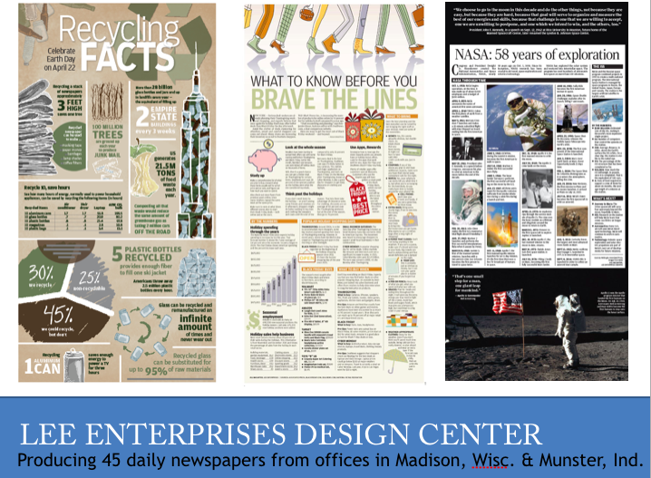
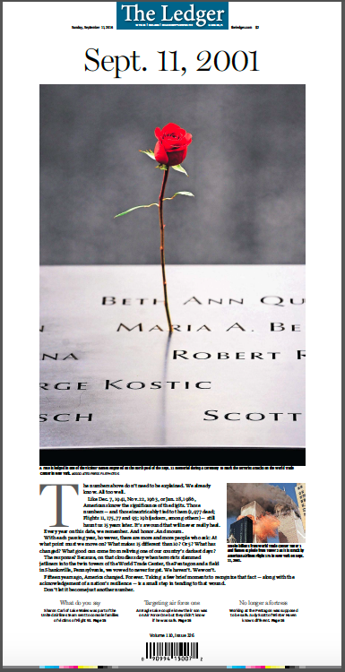
Steffens referred me to some of these pages, produced by various design hubs around the country, to show that, indeed, creativity and good design can prevail in these centers:
–From the Gannett Center
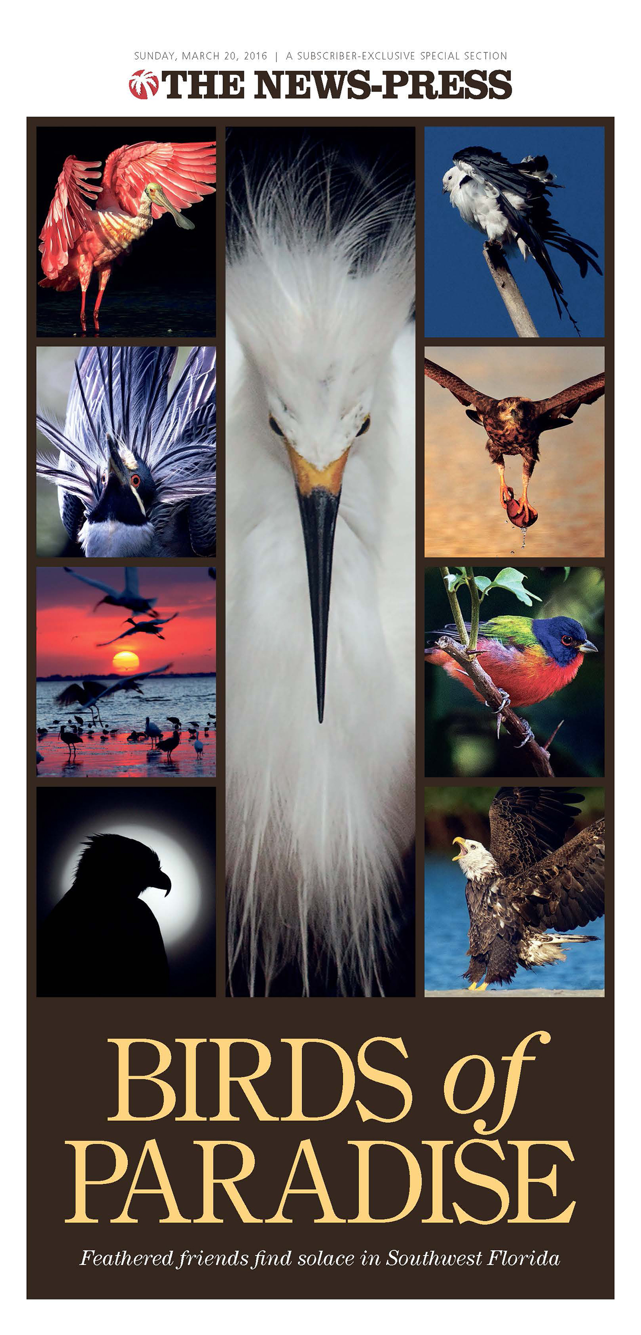
From Lee Enterprises Design Center
From GateHouse Media
Templates: key to efficient production
To maintain daily production, the design of a publication, regardless of platform, must be based on the concept of repetition, which is what templates accomplish. In my own experience, templates and formulas represent about 65 percent of the design components of a publication. The other 35 percent is the creative part—the role that art direction plays.
When design is outsourced, the process becomes more heavily templated because the idea of a design hub is to get as many pages as possible out and published.
Steve Dorsey, vice president for innovation and planning at the Austin American-Statesman and 2011 President of SND, feels that newspapers with the design quality of The Virginian-Pilot “and their impressive dynasty of compelling, informative, emotional, visual service to their community (and the industry) would never come from a design studio, It’s simply not possible.”
“I have to agree that the art directing can only suffer if pages are mass-produced or heavily templated. Moreover, not having visual journalists involved in the editing process, is a key gap in the process now. Some of the most memorable and remarkable news design work in the past decades would not have happened had those designers not been integral members of the editing team. Design is editing. Design is not “production” or “layout”.
Yet, Dorsey also sees the positive side of design hubs:
“I DO think the design centers like Gannett, and GateHouse, and others have elevated the level of design among their client papers — especially for the smaller and medium papers that gained unprecedented resources from the shared design services. Many of the smaller ones never even had designers on staff, let alone illustrators. So those tiers have been elevated, for sure.”
Joe Greco is Director of Creative Development at GateHouse Media’s Center for News & Design in Austin, one of the largest design hubs in the country, with over 200 editors and designers, producing an average of 16000 pages per week, Disclaimer: I worked with Joe and his team in the original redesign of all the GateHouse Media titles.
“Depending on your role in the organization, there are pros and cons of centralizing the production and design. In our organization, it’s a perceived loss of control. We tell editors that the local content decisions are theirs. They give us a lineup and our designers follow it to the best of their ability. From our perspective in Austin, our challenge is communication. We work remotely with editors most on our staff will never meet, covering towns our staff likely may never visit. “
Cost-cutting can be beneficial for some
Small newspapers, which usually have no art directors or graphic departments, can benefit from those resources as part of a design center.
“Smaller papers often get better design from the hub. Smaller papers cannot always afford top talent, or they repurpose somebody from the copy/news desk to do that. It’s the old Gannett conundrum: folks used to say Gannett, as they were buying up papers, made the smaller papers better, and dumbed down the metros. That may or may not be true, but that was the widely held perception,” Steffens said.
How effective are those savings when design is outsourced?
Rob Schneider, who was Presentation Director of The Dallas Morning News from 2007 to 2014 and is now Creative Director at the Dallas Business Journal, still worries about the gradual erosion of quality.
The Dallas Morning News outsourced its design to GateHouse in 2017, eliminating 25 newsroom jobs.
“When you outsource the production, you’ve ceded the argument of quality vs. quantity. It becomes an exercise about what is good enough.
“Production isn’t just an assembly line, but a journalistic function about clarity and accuracy. Fewer people are designing more pages, fewer (or no) copy editors are editing copy or writing headlines, cutlines, etc.
“You are saying we will spend less and be less precise and often less accurate. Typos are going to happen. Mistakes are going to happen. And your hope is that people paying for the product can live with it,” Schneider said.
I am happy to know that at the moment the Pilot is not outsourcing our front page design Wednesday through Sunday, which are peak circulation days.. Let’s hope the Pilot will continue to offer readers examples of the visual serendipity they are accustomed to.
Society of News Design New York: Celebrating 40 years
Mario’s Speaking Engagements
April 18-19, 2018-–Newscamp ,Augsburg, Germany.

May 26, 2018 —Associacion Riograndense de Imprensa, Univesidad de Santa Cruz (Unisc), Brazil

June 3-6, 2018—The Seminar, San Antonio, Texas.

Garcia Media: Over 25 years at your service
TheMarioBlog post #2781