Updated Wednesday, Oct. 28, 12:25 EST
We will continue to update this very special blog post throughout the day today
TAKEAWAY: It is the end of my Tuesday and I face one of those interesting work questions for which there is no precise answer Do we associate Internet with everything lower case? Hmmm, what do my expert friends say? Read their reactions here, and more to come. We will continue to update the blog with your comments and examples.
H versus h or……?
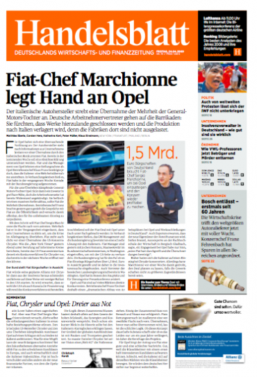
The new front page of the “business format” Handelsblatt : notice placement of the online refer at bottom of lead story text
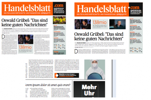
Here is close up of how our current online refer looks, with a capital H drawn directly from the newspaper’s logo
As you know, we are on the countdown to relaunch of the Handelsblatt, one of Germany’s financial dailies, which converts to a compact—-call it business format—-Monday, Nov. 2.
In meetings today, the question came up: Why do we use a capital H (for Handelsblatt) to lead readers to online content?
Is a capital letter a sure way to reflect online content? Don’t we usually relate the Internet to lower case?
The question throws me. Not that I have given much thought to this, I confess. However, when Handelsblatt Art Director Nils Werner and I discussed online refer possibilities, we thought that the beautiful H coming straight from the Handelsblatt logo would be the answer. It would create a brand, and, set against the orange background, well, nice.
That was that, and we have printed a prototype that everyone liked with it. So, to be faced with the question just a few days before the launch made me turn to my expert friends out there. And, of course, if any of you have something to say, I’d like to hear it.
Maybe this ie one of those issues that nobody discusses, but everyone probably has an opinion on ! Let me hear yours.
The original concept with Handelsblatt.com
Original Page One sketches showed a .com as part of the logo, and then the square with dot for the Internet refer
An interesting sidebar here: our first concept for page one of the new compact Handelsblatt included a logo that integrated .com right on Page One. Then we would “extend” the concept of the dot with the orange and black for the refer to the Internet, as you see in small inset. I remember hearing a chorus of voices that said:” Well, the idea of .com in a logo of a newspaper is so 1990s”. So, after several discussions, we abandoned that and opted for the H, the subject of today’s discussion.
Some reactions to my question:
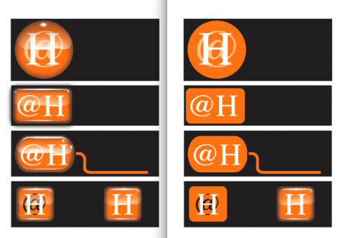
Mario:Here are some options for you By the way, the design looks awesome! Congratulations! Now, back to the logo. I was thinking about what your editors may have said about the online logo. I think I understand their concern. They seem to feel that the logo doesn’t say “online.” The upper case is not the issue. I think it’s the design of the logo itself. I incorporated the @ symbol that some of the options. But I feel that the flat orange square doesn’t say online. It kind of sits there. And on the teaser next to the black background, it looks more like part of the whole design and not a button.
I think we need to make this look like a button. So what I did was give you some options using the 3D effect, which is used a lot with the online navigation buttons. See what you think. I even threw in a design using a circle and even a mouse. Honestly, I think these designs work well even without the @ symbol. They also would look nice to have at the beginning of the url address in the navigation window at the top. I’m also sending you the designs without the 3D look.
Jeff Goertzen/Graphics Editor/Denver Post, USA
Jeff Goertzen, of the Denver Post, offers these exciting solutions—-all with the capital H
It’s all about branding. If the market is familiar with an upper-case “H”, then don’t change it for the web. We have to think about multi-platform branding, not separate print and web branding. For example, if Handelsblatt goes to the Kindle, should the “H” be gray? Or set in Caecilia? No! It should be the familiar H from the logo—-even if you have to embed an image of it.
Roger Black/Roger Black Studio/New York
The rules of grammar are not exclusive to any one platform. What we use in print should be used in the online. If the perception is that lower case is associated with the internet, it simply is because web authors lack either grammatical discipline or grammatical understanding. Anything else is fashion, which as we all know changes with the seasons and is the best way to date your product (and keep designers in business). However, I am more surprised the questioners fail to recognise the importance of branding here. Visual identity aside, this is the direct link between two worlds. It needs to be as unobstructed as possible.
Rob Layton, lecturer, newspaper designer/Bond University, Queensland, Australia
I’m a decided opponent to different brand strategies online and offline. The visual differences between online and offline should be a necessary consequence of the medium (font choice, layout), not an superficial differentiator.
Ironically, one of our main clients has two brands. DIE ZEIT and ZEIT ONLINE. Market research has shown that a large portion of the zeit.de users were convinced that it’s website is only updated on a weekly basis. In order to make sure, that the user understands right away that ZEIT ONLINE and DIE ZEIT have different updating frequencies (and a different content offer) this change proved to be neccessary. Usually newspapers argue the different brands from the book keepers perspective (two companies, two brands)—so the Washington Post before they finally made both brands identical. Of course, the user doesn’t really care about book keeper’s logic.
Oliver Reichenstein, lead designer of zeit.de, tagesanzeiger.ch and krone.at
The short answer is the square brand colour with the cap ‘H’ should work, and here are the reasons why I think so:
1) Whatever the case, the objective is very clear – create a distinct connect between the print and the online product (and probably many others too could have the same). Since the overarching image that stays with me in the ‘after-burn’ after i see the front page is clearly that of the square in the brand colour and ‘H’ I would certainly go with the cap.
2) Yes, many internet users believe that internet is all about ‘lower case’ as the urls are fed so, therefore anything that is associated with it should reflect it. I think the truth is while the url in ‘lowercase’ is only a function of the medium, the internet, where the information being served, it has nothing to do with the branding of the Online product. On the contrary the Online property is best represented with a look that can then be extended to other areas and in this instance by the square in the brand colour and the cap ‘H’ – a direct take-out from the brick and mortar presence of the product.
3) Lastly, the square in the brand colour and the cap ‘H’ is a much more complete and simple form than the ‘h’ in the same patch. It does not have the uncomfortable negative spaces the lowercase ‘h’ generates in the square. It also form a much more compact unit that can then be taken to other applications with equal impact.
Anup Gupta, design director, Hindustantimes, Delhi, India
My reflection about this dilemma is that you should stick with the upper case ”H”.
My motivation is: The name is as you say Handelsblatt.com. An upper case ”H” has a nicer shape and is more suitable than a lower case in the colored box.
Besides this i´m familiar with the discussion about Internet or internet. We have had it here in Sweden as well. At first internet was a proper noun (i think it´s called) so it should have an I. Exactly like Mario with M or Robert with R. But nowadays internet spells with a lower case ”i” and this being so i no longer a proper noun. Normally most of the things on internet is in lower case such as web addresses, email accounts and so on. By this i think i know how Mr. Von Holtzbrinck think and mean.
Robert Macli, graphics designer, Raring Design, Stockholm,Sweden
The lowercase h does not fit in with the mood/style of the rest of the design. even if it is “internety.” One concern might be the typeface with the thin strokes but it has been used successfully on the rest of the publication.One thought. do you put the H in a orange block? is that legible? readable?
I showed the samples to both of my afternoon classes which include five students from abroad. they all felt the H worked.
Randy Stano, professor of practice in journalism and visual journalism, School of Communication/University of Miami, Florida
The H needs to be caps. It stands out from others newspaper that use the lower case for their web link. So it is unique. It is an elegant touch. It stands out and reads better in all caps, and it keeps with the tradition of the paper.
Dr. Pegie Stark Adam, chair-design studies/Algonquin College, Ottawa, Canada
Based on what I have seen on relaunch.handelsblatt.com, the identity of the website appears exactly the same as the identity of the print edition: same bold use of orange, same nameplate (“Handelsblatt,” not “Handelsblatt.com”), same “Mondrian” styling, etc. So differentiating the two with just a change in capitalization would probably be so minor that it would only seem confusing, not appropriate.
So I think that keeping the capital H is definitely the right decision (unless you were to change the color scheme and some other elements on the website to give it more of a contrast with the print paper). I immediately liked the current web teasers when I first saw them in the prototypes; they are distinctive enough to signal a special kind of content without being disruptive.
Reed Reibstein, Yale University, Class of 2011/Garcia Media intern
It seems to me, the reversed “H” in the orange box is a logo for their internet site. Just like the Wall Street Journal uses WSJ.com logo (see attached). WSJ is in caps, reflects the name of the paper and extends the print brand. This is the first publication that comes to mind, but we know there are others.
Kelly Frankeny, creative director, Garcia Media/New York

The Wall Street Journal’s blue all capitals WSJ.com logo
I don’t think the internet URLS are case sensitive. WSJ.com used all caps in their logo before they stopped using it. So I don’t think it would make any bit of difference. I’d stay with the capital H
Mario Garcia Jr, president Garcia Media/USA
I think that the lower case h may establish a better connection to the Internet
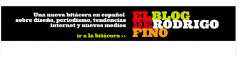
Rodrigo Fino, Garcia Media Latinoamerica/Buenos Aires
Uppercase is perfect. Lowercase was used because of technical restrictions years ago. Today all internet browsers and email programs understand uppercase.
Jan Kny, art director, Garcia Media, Hamburg, Germany
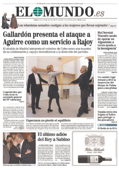
In Spain, EL MUNDO goes all caps
Printed front page of EL MUNDO, adding .es to the logo
The online edition logo for EL MUNDO.esWhile on the subject of caps versus lowercase for logos, yesterday El Mundo, of Spain, introduced new branding. It is now EL MUNDO.es, whether in print or online. It is a way of this editorial group announcing to the world that they are, indeed, a multi media set up. In both cases, print and online, it is all caps EL MUNDO.
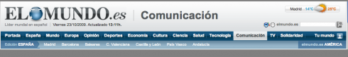
It is the guardian with a “g”
It is all lowercase branding for the guardian, print and online; but, alas, see the Google treatment of Guardian and guardian.co.uk
The capital G appears again for this subsidiary: Guardian Print CentreOk, so some of you write me and ask me to take a look at London’s the guardian—-lowercase all the way, both in print and online. Good and attractive no doubt. And, as Rodrigo Fino reminds me, “this newspaper has not lost one ounce of its credibility. It is still serious, respected, good quality journalism.”
Interesting to note the following. As I went online searching for images of the guardian, I found out the following (see the illutration here):
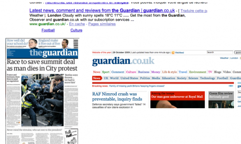
1. First, ironically, Google itself makes a dinstinction in its listing, using the Guardian to refer to print and guardian.co.uk.
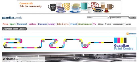
2. The company’s printing company, where they print other publications, it is called Guardian Print Centre, with a capital G.
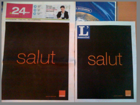
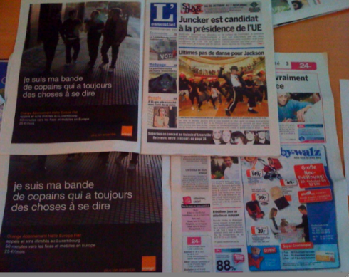
Those wrap around ads are back: in Luxembourg
Wrap around ads for Orange, phone giant, in L’Essentiel and Point 24 of Luxembourg
L’Essentiel does it right, with a real Page One; Point 24, not so good, no real Page OneToday’s front pages of two Luxembourg free dailies, L’Essentiel, and Point 24, are wrap around ads for phone giant Orange.
In the case of the L’Essentiel, the regular page one appears on the position of Page 3, which is a good thing. Unfortunately, Point 24 decided NOT to have a front page, so the wrap around ad leads into a busy Page 3. Not so good. It is OK to have wrap around ads, but when you do, you must give Page 3 the status of a Page One, preferably ad free.
Who is Jacky?
Jacky belongs to Frank Deville. The Luxembourg-based pooch is an “avid reader” of the German newspaper, Bild Am Sonntag. Every Sunday Jacky picks stories and interesting graphics in Bild Am Sonntag , the German newspaper.
Follow me at www.twitter.com/tweetsbydesign
Follow the Marios
Two Marios. Two Views.
Follow Mario Jr. and his blog about media analysis, web design and assorted topics related to the current state of our industry.
http://garciainteractive.com/
Visit Mario Sr. daily here, or through TweetsByDesign (www.twitter.com/tweetsbydesign)In Spanish daily: The Rodrigo Fino blog
:
To read TheRodrigoFino blog, in Spanish, go:
https://garciamedia.com/latinamerica/blog/TheMarioBlog post #407